Blog

  • Handle With Care: Yrjo Edelmann

    Handle With Care: Yrjo Edelmann

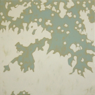
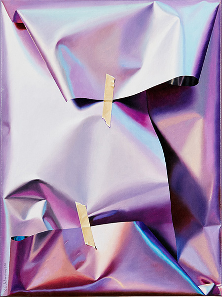
    I have yet to wrap a single Christmas gift.  But the online orders are due to arrive any day and I am supplied and ready to dive in.  I love this part!!  Every year, I would wrap my gifts just so, often thinking of what type of wrapping the giver might enjoy as much as making it look artful and pretty.  Some may think, “what’s the point”?  It’s what’s inside that matters, right?  Well, not entirely.  You see, to me, the gift is the entire process– spending the time choosing something the recipient will enjoy, carefully and lovingly wrapping the gift, and seeing their surprise and delight when opening it.  In these paintings ( yes, paintings! ), Swedish artist Yrjo Edelmann presents us with meticulously painted images of hastily and carelessly wrapped packages.  Are these treasures or leftovers from “the gift closet“?

    Magnetic Field Energy by Yrjo Edelmann An Important Property of Green by Yrjo Edelmann Critical Solution and Close Packing of Two by Yrjo Edelmann Packaged and Stringed Grey Powder Fields by Yrjo Edelmann A Packed View Over Harmonic Blue Fields by Yrjo Edelmann

    Now, just because a gift isn’t perfectly wrapped doesn’t mean that the giver didn’t put a lot of thought and effort into it.  Maybe wrapping just isn’t their thing.  Maybe they’re being ironic in a isn’t it more artsy this way kind of way.  But don’t we give more care to the things we find important?  Would you wrap a Picasso all willy-nilly?

    Sometimes I think we are so materially blessed in this country that we are rarely truly grateful for even the smallest of things.  I remember my grandmother telling me the Laura Ingalls-ish tale of being delighted in receiving an orange every Christmas as a little girl.  An orange! Not an orange iPhone, not an orange Lexus.  A piece of fruit.  And she looked forward to it every year.  This season, its my hope and challenge to give and receive freely and thoughtfully and with a gracious heart.  Every gift will be as precious to me as an orange.

    To see more of Yrjo Edelmann’s work, please visit the website of his representing gallery, Galleri GKM.

    All images via the Galleri GKM website.

  • Life, Lived Larger: Andrew Salgado

    Life, Lived Larger: Andrew Salgado

    For many, our life may seem filled with adventure.  And at times, it is.  But most days, its a normal sort of existence, the kind that consists of work, laundry, dirty dishes and too much tv.  These large scale paintings by Canadian artist Andrew Salgado have made me stop and think about how to live a bigger life.

    Now and Forever by Andrew Salgado Modern Painters by Andrew Salgado Subject by Andrew Salgado Stare by Andrew Salgado Year of the Silencer by Andrew Salgado

    I’ve always been a small person.  Always a little slip of a thing ( until getting married that is, Mr. Forager put curves on me! ), one of my long time best friends who towers over me has always called me “Little One”.  Because next to her, I was always the little one!  But this littleness isn’t just physical.  I have a naturally shy, retiring nature, the complete opposite of a “larger than life” type of personality.  I don’t hate the spotlight, but I don’t go out of my way to seek it out, preferring to be the one behind the scenes, these days behind the computer.

    These large scale portraits by Salgado are full of texture and vulnerability and delicious messiness.  Sometimes, I think we let our quest for control and order get in the way of a bigger life.  It’s so in my nature to stay safely in my shell, coming out only when coaxed, like a little hermit crab.  But where is the adventure in that?  How many of us will be able to look back on a life lived largely and to its fullest?  I’m striving against my own temperament in my quest but its a fight I’m willing and eager to take on.

    To see more work by Andrew Salgado, please visit his website.  Salgado has solo exhibitions coming up in 2014 in South Africa, New York and London.  You can also follow the artist on his Facebook page.

    All images are via the artist’s website.

  • Design Foraging: Sarah Ashley Longshore at Anthropologie

    Design Foraging: Sarah Ashley Longshore at Anthropologie

    I love everything that Sarah Ashley Longshore does.  You can see all the evidence right here on the blog.  And when she teams up with one of my favorite retailers, well, I just can’t resist sharing the artsy goodness with you!  The artist’s latest collaboration with Anthropologie features her iconic Audrey Hepburn paintings on a tres chic line of travel bags and weekenders.

    Sarah Ashley Longshore Weekender, City of Lights Sarah Ashley Longshore Weekender, Big Apple Sarah Ashley Longshore, Jetsetter Hatbox, London Sarah Ashley Longshore, Jetsetter Hatbox, London ( detail ) Sarah Ashley Longshore, Jetsetter Traincase, Tasseled Traveler

    These remind me so much of “the golden age of travel”, when taking a plane ride meant getting dressed to the nines and a matching set of luggage was the ultimate luxury.  Inside each of the larger bags is a wonderful little “handwritten” note from the artist.  A perfect gift for that artsy girly girl!

    See more of the Jetsetter line at the Anthropologie website.  You can see original work by Sarah Ashley Longshore on her website.  And follow her own jet setting adventures on Instagram!

    All images via the Anthropologie website.

  • Spoiled Earth: Brooks Salzwedel

    Spoiled Earth: Brooks Salzwedel

    In our travels, Mr. Forager and I have been very fortunate to have seen some amazingly beautiful places.  Unfortunately, for many, the opportunity to see unspoiled beauty is rare.  Our landscapes are filled with strip malls and fast food joints, rather than untamed forests.  In his resin cast work, Los Angeles artist Brooks Kalzwedel examines this dichotomy of urban development versus wilderness.

    Untitled #1 by Brooks Salzwedel Reclaimed Tipping Tower by Brooks Salzwedel Tendril by Brooks Salzwedel Tangled and Half Nature, Half Power by Brooks Salzwedel The Dinosaur and the Statuette by Brooks Salzwedel

    In these heavily layered pieces, Salzwedel’s landscapes are disrupted by electrical towers and sprawl, almost seeming to be choked by encroaching development.  The mechanical elements look to be nearly parasitical, especially in Tendrils ( 3rd down ), they seem to have incorporated themselves as a part of the root.

    Such beauty, yet so filled with sadness for what is lost.  If you’d like to see more of Brooks Salzwedel‘s work, please visit his website.  If you’re in the San Fran/Oakland area, you can see his work being shown with Mayumi Hamanaka in the two person exhibition, Temporal Void at Johansson Projects in Oakland until January 16, 2014.

    PS–Thanks to The Jealous Curator for reminding me of Brooks’ work!

    All images are via the artist’s website.

  • Artsy Lately: Christina Foard

    Artsy Lately: Christina Foard

    I know I should be unbiased and objective.  But art is subjective ya’ll and I have my faves.  And this artist, dear Artsies, is one of them.  If you’ve been reading the blog for awhile, you’ve seen her work before.  If you’re new, well then I’m happy to introduce you!  Jacksonville, FL ( soon to be Athens, GA ) artist Christina Foard continues to amaze me each time she puts brush to canvas.

    Foard_That Sweet Night Foard_Oil Spill Garden Foard_Sliding Falls Foard_The Not So Still Life Foard_Tangled Below the Surface

    Christina creates work that is so incredibly layered with texture and color, with physical and visual depth, photos on a digital screen barely do them justice.  Not to mention size– Christina often works on a large scale, Sliding Falls, 3rd down is downright monumental at over eight feet wide.

    There is so much to see, so much to take in on each canvas, your eye almost isn’t sure where to begin.  But once you dive in, it is so wonderful to get lost in beautifully interconnecting lines and shapes.  Your eye will eventually find its way through to the lovely, light filled swaths of color, a beautiful respite among the glorious chaos.

    If you’d like to see more of Christina Foard’s latest work, please visit her website.  If you’re in North Florida, Christina will be showing work in the upcoming Our Shared Past exhibition at the Cummer Museum of Art & Gardens, opening December 17th.

    All images are via the artist’s website or Facebook page.

  • Drawing the Journey: Mel Prest

    Drawing the Journey: Mel Prest

    At the end of our traveling, I think it might be interesting for Mr. Forager & I to map out all of our journeys, connecting the places we’ve lived and visited.  As we enter into our 3rd year of traveling together, I have a feeling our map might eventually look like one of these mixed media pieces.  San Francisco artist Mel Prest uses an eccentric system to plot out grids of dots corresponding to Japanese metro routes, connecting the dots to reveal a complex system of connections.

    VSCJP Berlin S-Bahn by Mel Prest VSCJP NY Metro I by Mel Prest VSCJPLZ_Amsterdam Metro + Rock and Roll by Mel Prest VSCJP NY Metro 2 by Mel Prest VSCJP Berlin U-Bahn by Mel Prest

    Grid points are based on spelling out map relationships as Japanese characters.  The artist connects the grid points, including mistaken lines ( in gold ) so that the mistake, instead of detracting from the beauty, adds to it.

    I am especially intrigued by this aspect of Prest’s work.  Although the path we take or the place where we find ourselves wasn’t necessarily what we wanted or intended, it can still add meaning and beauty to our life’s journey.

    To see more of Mel Prest‘s work, please visit her website.

    All images via the artist’s website.

  • Color Harvest: Radiant Orchid, 2014 Pantone Color of the Year

    Color Harvest: Radiant Orchid, 2014 Pantone Color of the Year

    Well, it’s that time of year again!  The folks at Pantone have made their pronouncement predicting the color that will be most on trend for the coming year.  The Color of the Year 2014 is.. drumroll.. Radiant Orchid!

    CH_Radiant Orchid

    I’ll admit, at first I was underwhelmed.  I haven’t been a huge fan of purples since  Christmas 1985 in which every single gift I received was of a lavender hue.  It was the favorite color of my 13 year old self, but I eventually tired of it and moved on, pretty much abandoning it forever.  But once this news got out, I decided to do a little foraging for color amongst the art on my Pinterest boards and what ho, I spy a bunch of this very shade!

    So maybe my inner 13 year old is subconsciously seeping through into my pins.  Or, more likely, these artists know what Pantone folks have discovered– this particular shade, dubbed Radiant Orchid, is much more versatile than it may seem upon first glance.

    It can be soft and feminine, as its floral moniker implies.  These artists know that pairing this color with creamy neutrals and fellow floral shades creates a feeling of delicate suppleness.

    Radiant orchid_soft_collage

     clockwise from top left casey matthews | riley lester | ada wang | bahman farad | laurence amelie | christina baker

    When paired with darker shades and jewel tones, Radiant Orchid takes on a rich, earthy quality.  Pairing such a feminine color with more heavy, masculine tones makes these abstract pieces perfectly balanced.

    Orchid_Rich and earthycollage

     clockwise from top left elizabeth condon | eva lundsager | scott cumberland | charline von heyl

    And of course, artists know when to capitalize on a color’s inherent pop factor.  In the work below, these artists have used Radiant Orchids bright and bold sensibility to bring vibrant fearlessness to their work.

    Orchid_bold pop_collage

    clockwise from top left julie cockburn | eva eun sil-han | shannon rankin  | francois nielly | andy gilmore

    Are you a fan of this lavender shade?  If you’re an artist, are you using it in your current work or have plans to try to incorporate it in 2014?  Designers & consultants, think your clients will be itching for artwork to incorporate this color into their interiors?  Artsy minds want to know!

    All image sources are linked above.  Some images are cropped details of the original.

  • The Softness Under the Surface: Sara Maragotto

    The Softness Under the Surface: Sara Maragotto

    When an artist chooses to concentrate their attention on one certain subject, I’m always amazed by the diversity of ways in which they explore that form. Especially when an artist is  seeking to look beyond representation to abstraction.  In this series of Minerale paintings by  Italian artist Sara Maragotto, the artist delves into the world of rocks, examining their opposing qualities of solidity and vulnerability.

    Maragotto_minerale_8 Maragotto_minerale Maragotto_minerale_17 Maragotto_minerale_4 Maragotto_minerale_6


    We think of mountains and rocks as solid, immovable objects.  But they have their vulnerabilities, just like everything else on this earth.  Rocks can break and erode, sometimes quickly, but more often slowly over long periods of time.

    In this series of mixed media paintings, I see Sara Maragotto, examining these characteristics in an abstract way.  She retains the hard, sharp lines and surfaces, yet diffuses them with soft brushstrokes and washes of color.  We can see what may be a weaker area beneath the surface, ready for exploitation by water or wind.  I have no idea if this is what the artist had in mind when creating these works, but it is what my own eye has found.  What do you see?

    To see more work by Sara Maragotto, please visit her website.

    All images are via the artist’s website.

  • This Artsy Life: Weekend 49 [Catching Up & Settling In]

    This Artsy Life: Weekend 49 [Catching Up & Settling In]

    As most of you know, Mr. F and I find ourselves in a new spot every three to six months and each time requires a bit of effort to get settled into our new adobe.  Add to the upcoming Christmas holiday & all that entails into the mix and we had a recipe for a busy, not so relaxing weekend!

    The pared down possessions we travel with means there is no room to carry holiday decor around with us, but we always find a way to do a bit of budget & space friendly decorating ( more on that later this week! ).  Now this little apartment in the snow feels so much more cozy and Christmas-y.

    IMG_1757

    our sweet little tree & snow covered view

    IMG_1748

    a forager must have glittery pine cones!

    While Mr. F did fun stuff like getting the oil changed & changing over our renter’s insurance ( told you, big fun! ), I was busy doing a live podcast for iCreateFlix ( listen here ) in which I chatted with host Cara Rae about how Artsy Forager came about, the way the artist/gallery relationship is changing, how artists can use social media to promote their work and of course, gushing about how much I love Pinterest.  My interview for the Thriving Artist Summit also went live yesterday!  ( Get access here, only available now through Wednesday 12/11! )

    IMG_1761

    it wasn’t all fun & decorating

    But as the darkness was setting in on Sunday evening, the errands had been run and the business taken care of and we were finally able to settle in and relax in our new home.  There may have been a little slow dancing involved..

    IMG_1760

    mr. f got his cooking mojo back

    IMG_1763

    beer experiments, always a fun way to end the weekend

    The holidays can be such a hectic time of year, making time to slow down and enjoy each other helps to bring everything back into perspective, doesn’t it?

    Want to see more from This Artsy Life?  You can catch up on past posts and follow Artsy Forager on Instagram!

  • In Sunshine and Shadow: Jill Sykes

    In Sunshine and Shadow: Jill Sykes

    As you may have noticed if you read my recap of the past few weeks, we’ve experienced a myriad of climates and landscapes recently.  While the sunny skies of Southern California were a welcome sight, there is still something so enchanting about the starkness of winter branches against a cloudy sky.  It seems ironic then, that these paintings by Los Angeles artist Jill Sykes should remind me so much of wonderfully overcast days.

    East by Jill Sykes Arden by Jill Sykes Ai Fiore by Jill Sykes Skylark by Jill Sykes Saffron by Jill Sykes

    When the sun is high in the sky, of course, it creates the most lovely shadows.  Yet sometimes it feels as if the individual forms of the landscape get lost in the blue.  On a day filled with clouds, though, everything stands in deep contrast with the whites and greys.  The individual branches of each tree are so much more pronounced, we can see the world without the distraction of color.  As lovely as any old black and white film.

    The way Sykes silhouettes her branches creates an intriguing tension between the subject and background.  Leaving us to wonder in some cases which is which.

    If you’d like to see more of Jill Sykes‘ work, please visit her website.