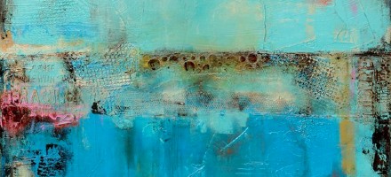
In case you can’t tell by the blog’s background, I have a favorite color. I love most of the blue family, but am always immediately drawn to the color turquoise. Or, as my niece Kendall calls it “toy-quoise”. So it should come as no surprise that my favorite artwork includes a heavy dose of my beloved hue. Here are some turquoise favorites I’m digging this week:
Gypsy Blue by Erin AshleyThe Search For Green by Jeanne OpgenhaffenEnhanced Sunspots After Galileo I by Rachel BrumerWish You Were Here by Josh ReamesUnobstructed Effort by Sharon Booma
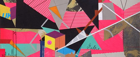
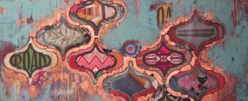
With the advances in communication and technology, our world in many ways seems much smaller than it once was. But it also feels like we’re losing touch even as the lines of communication are more open and free. How many times have you been guilty of texting instead of calling? Substituting online interaction for the real people just outside your door? The work of mixed media artist Clark Goolsby reminds us just how fractured our world has become.
Plastic Messiah, mixed media on linen over panel, 18×24
Culture and news spreads more rapidly than ever, for better or worse, lives can be changed overnight thanks to media exposure. Families text, Twitter and Facebook each other while in the same house, even the same room, instead of having a real conversation. Almost all of our needs can be met online– work, news, reading, shopping, etc. and the more we rely on it, the more insidious it may become.
Unknown Degredations, mixed media on wool over panel, 16×20
Goolsby’s use of line recalls the wires and cables that connect us and make all of this communication possible. But we also see in his use of graphics lettering & images and brightly hued, fractured geometric forms that this bombardment of media, though enticing, takes it toll on our psyche and our relationships.
Untitled III, mixed media on canvas, 12×12
I’m as guilty of the overuse of technology as anyone. I write this blog. I use Facebook & email as my primary means of communication with friends & family who are far away. But nothing beats a day spent outdoors with my husband or having a face to face conversation with a friend.
Untitled Shape I, mixed media on canvas, 54×68Scrape, mixed media on canvas, 30×24
Do you have a strategy to avoid communication overload? Please visit Clark Goolsby’s website to see more of his work. But after you’ve spent some time with his work, turn off your computer and talk to a loved one face to face. 😉
When you were young, did you ever dream of living in make believe places? Like Willy Wonka’s Chocolate Factory, The Jetson’s futuristic abode or maybe the Smurfs’ village? The work of Tory Cowles reminds me of the bright, whimsical worlds that inhabit our childhoods.
#495, mixed media, 60×48
Given that Cowles’ background includes working in interior design, woodworking and carpentry, it makes perfect sense that her abstract mixed media work would have an architectural quality.
#562, mixed media, 48×48
She’s creating landscapes full of whimsy and imagination, an abstracted, make-believe toyland where you might feel like you looking right into Candyland.
#642, acrylic on canvas, 72×60
Cowles’ work reminds me of hours spend building houses and worlds out of anything we could find– blocks, spools, pipe cleaners, my grandmother’s colorful Tupperware. Worlds that appeal to the child in all of us, yet are sophisticated enough for adult eyes.
#596, mixed media, 48×60#569, mixed media, 48×48
To see more of Tory Cowles’ work, please visit her website.
Featured image is #495, mixed media, 60×48. All images are via the artist’s website.
Spring has finally taken hold and color is exploding everywhere! And speaking of bursting color, make sure you go over to Escape Into Life today to see the work of German artist Markus Linnenbrink. He is masterful in his use of bright and brilliant hues!
Sammy Davis jr, Kee Joo and Peter Lawford by Markus Linnenbrink, c-print, epoxy resin and wood, 31×24
Body language speaks louder than words. Many times, our posture and expression may belie what we’re really thinking, despite the words coming out of our mouths. The paintings of Santa Fe artist Ali Cavanaugh shout with quiet profundity.
I’ll Smile As I Wait, 12×12
Cavanaugh’s inspiration comes much from her dependence upon visual language, due to the loss of much of her hearing to spinal meningitis at a very young age. Utilizing simple compositions with bright palettes and extraordinary light against white backgrounds, Cavanaugh tells visual stories not only of what is meant to be communicated, but also what is kept hidden.
Ply, modern fresco, 12×12
Her figures employ their bodies to communicate– folding their arms and hands to tell the world what perhaps they dare not speak.
Place One End On My Memory That Holds An Imperfection, 30×22
Even these tools of communication are often concealed, hiding behind brightly colored socks, as if performing in an impromptu puppet show. They are trying to convey truth, yet it still remains obscured.
An Arc, Placing Me in a Vivid Illusion, modern fresco, 16×20Divide the Timeline Into Then.. and Now, modern fresco, 22×30
Be sure to visit Ali Cavanaugh’s website to see more of her incredible work and to find out where you can see her work in person.
Featured image is Place One End on My Memory That Holds an Imperfection. All images are via the artist’s website.
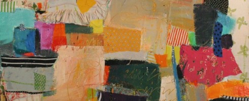
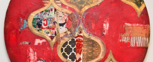
The first time I saw the work of Jill Ricci, I was completely smitten. Her palette, use of texture, pattern and materials lend such a glamourous edge to her work. Wonderfully feminine and sophisticated yet rustic-ly urban. I’m giddy to have her as the Facebook Featured Artist for May! So much so that I find myself going to the Artsy Forager Facebook page just to gaze at her cover image. Is that weird?
Breathing Room, mixed media on canvas, 48×24
Her work reminds me of the things I love so much about New York– the glamour and elegance of the city, its history and architecture, how it teems with life and colorful characters.
Decadent, mixed media on canvas, 48×36
But even as we idealize the city, it hits us with its grittiness, its realness. As the song goes, “If you can make it there, you can make it anywhere.” Ricci’s work shares that same energy, stubbornness and passion.
Star-Crossed, mixed media on canvas, 14×14
Like apartment windows in the city, each portal in Ricci’s work is a glimpse into a different world– graphic niches to discover and explore.
Thoughtful, mixed media on canvas, 48×30Happening, mixed media on canvas, 30×40
If you haven’t done so already, head over to the Artsy Forager Facebook page to see an album of more of my Jill Ricci faves– tell me which is your favorite! And of course, check out her website for even more gorgeousness!
Featured image is Bullseye, mixed media on canvas, 48×24. All images are via the artist’s website.
Note: The title of this post is a reference to the original Dead or Alive song, not more recent versions featuring people who are possibly young enough to be my children. Children of the 80s unite!
I love art of all shapes and sizes. Large scale, small, square, rectangle, ROUND. Artists who take on the circular composition get extra kudos. Check out some examples I’m loving this week!
Andy Says by Jill Ricci, mixed media on wood, 24″ diameterNational Soil Destruction Leading to Self Implosion by Steve Williams, mixed media, 48″ diameterEmily by Ben Hughes, oil on canvas, 22″ diameterNo. 555 by Nicholas Bodde, oil and acrylic on aluminum, 80cm diameter
Any other orb-obsessed artists I should know about? Tell me about ’em in the comments!
Featured image is Andy Says by Jill Ricci. Be sure to head over to the Artsy Forager Facebook page where Jill Ricci is this month’s featured artist! All images are via the artists’ websites, linked above. Special thanks to The Jealous Curator for introducing me to Ben Hughes’ work!
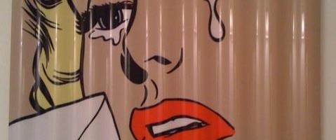
Advertising imagery has become such an integral part of our cultural landscape that products are often instantly recognizable simply by their logos. Like his Pop Art predecessors before him, Jacksonville, FL artist Mark George takes inspiration from the inescapable world of advertising, putting his own spin on the Mad Men era.
Of course, there are obvious parallels between George’s work and that of Pop Art icon, Roy Lichtenstein. Yes, the imagery also takes its cues from advertising imagery and comic books. But where as Lichtenstein enlarged his imagery to the point of replicating in paint the Ben-Day dots that comprised printed materials of the day, George chooses to flatten out the imagery even further.
The lack of visible brushstrokes and use of smooth, reflective surfaces emphasizes the slick nature of the mid-centuray imagery. While the severely cropped faces and “torn” edges of his panel suggest that these are relics abandoned to a different kind of future.
But what interest me most is the emotionality to be found in the faces of George’s subjects. There is a sad, melancholia about the imagery, bordering on the disturbing. In this respect, his work could be seen as our past looking back upon itself with current eyes, shocked and saddened by what is seen in hindsight.
What do you make of the faces of Mark George’s subjects? Please visit his website to see more of his work. If you’re in South Florida, he will be participating in a show, Jet Set Glamourat Harold Golen Gallery in Miami, opening tonight!
I absolutely adore work that is marries striking visual elements and imagination stirring imagery. Come and take a magical ride through Geoff Mitchell’s work with me over on Escape Into Life today!
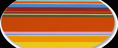
The way colors play off one another has always attracted me. There are certain designs I find myself staring at over and over again simply for the juxtaposition of hues and how they relate together. The work on Nicholas Bodde strikes my chroma-loving heart to the core.
No. 741, acrylic on aluminum, 80 cm diam
Bodde’s work is beautiful in its simplicity and in its joyful exploration of color. Parallel, horizontal stripes race across the canvas in a controlled riot, almost like we’re looking out a car window while whizzing by a carnival or planted fields of flowers.
O.T., acrylic on aluminum, 100 x 56 cm
Especially in the works featuring wide bands of blue or orange at the top of the canvas, these seem like distilled landscapes. Complex scenes broken down to simple bands of color.
O.T., oil and acrylic on aluminum
In this way, the placement of colors on the canvas and beside each other takes these away from being just painted stripes of color and into sophisticatedly designed patterns and compositions. And they simply make me happy.
No. 749, oil and acrylic on aluminum, 80 cm diamO.T., oil and acrylic on aluminum, 100×55 cm
To see more of Nicholas Bodde’s work, please visit his website. How are you embracing color these days?
Featured image is O.T., acrylic on aluminum, 100×56 cm. All images are via the artist’s website.