The juxtapositions of uber-traditional garb and the ultra modern in these paintings by Andy Price really caught my eye. See more from this artist in my Artist Watch over on Escape Into Life today!
In our current gypsy-like state, Mr. Forager and I try to travel as lightly as possible. But we do acquire things along the way, some we find unnecessary, contributing to a local Goodwill every where we go, but others we hold onto tightly– art and books. Small pieces of our own art enrich each temporary home, while the books we carry with us enrich our minds, spirits, and souls. The work of Southern California artist Lisa Occhipinti centers around books, not just their physical pages but our emotional and spiritual connection to them.
Perfect Balance, mixed media, 12×24
The artist incorporates pages from various tomes in her work, sometimes in a conspicuous way, like the pretty coffee table books we may buy but never really read.. or in a more subtle way, like the self-help books and other guilty pleasures we keep hidden in the nightstand.
Un Voyage Comique, mixed media, 24×36Note on the Type, mixed media, 12×12
Delicate drawings and inky washes call to mind margin notes and doodles peppering well read stories. Almost as if the reader of Occhipinti’s visual story is distracted not because the story doesn’t hold their interest, but they lost in becoming a part of the tale being told.
Sargasso, mixed media, 36×48
To see more of Lisa Occhipinti’s work, please visit her website. I chose to focus on her painting work, but you’ll also find wonderful book-y sculptures and photography on her site.
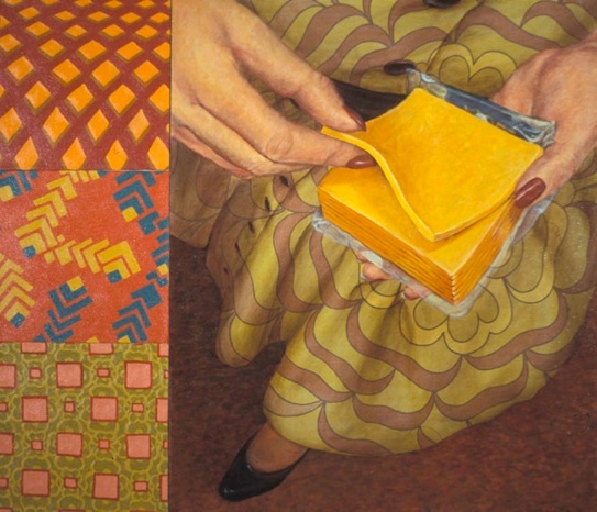
Have you ever thought about how certain fabric patterns remind you of someone? Crazy mod-retro prints make me think of my sister-in-law, who loves all things vintage, while subdued plaids in soft blues and greens make me think of nature-loving Mr. Forager. Seattle artist Jane Richlovsky uses patterned textiles in her work, incorporating them in such a way that the personality of the era shines through.
Cake Mix #7, oil on found textile, 4.5×6
The artist depicts domestic scenes from the mid-twentieth century, actually painting on found vintagey patterned textiles. The result is a interesting visual style– one in which some details of the scene show depth of space, while others, usually the shapes on which the patterns come through, are flattened as the patterns appear more as cut-outs of the forms rather than strictly conforming to the shape it is covering.
A Wonderful World of Your Own, oil on found textiles, 31.5×32Designed for Living as You Want It, oil on found textile, 10x5x15
Richlovsky’s work reminds us that not all was as it seemed in the “good ol’ days”.. the flatness of the patterns meet the Norman Rockwellish technicolor scenes of life we remember from movies, yet there is a cynical and almost sinister undercurrent to some of the paintings.
Easy as Peeling a Banana, oil on found textile & canvas, 31×36
To see more of the work of Jane Richlovsky, please visit her website.
While living in the desert, I’ve noticed that people tend to embrace color in bolder ways than you might expect. I think it’s a side effect of being surrounded by so much beige sand! In today’s Friday Design Finds, I’d like to share with you some examples of the work of Ed & Kate Coleman, an artsy husband & wife team who aren’t shy about using color in their wonderfully textured ceramic creations.
Seriously, wouldn’t coffee be that much more glorious when sipped from one of those mugs? And their wall tiles are perfect for adding color, texture, and some dimension to a boring wall. Want to see more from Ed & Kate Coleman? Check out their website, where you’ll find their complete product line and a listing of galleries who carry their work. There are a bunch– bound to be one near you!
It was a happy accident that I found out about new Palm Springs contemporary gallery, Stark + Kent . I happened to see Samantha French mention an opening at a gallery in Palm Springs on Facebok just a week after Mr. Forager & I were scheduled to arrive in Southern California. Kismet! Even better, when I checked out S+K’s website, I discovered they were representing another pair of artists previously featured on the blog, Signe & Genna Grushovenko. I knew this would be a gallery to get to know better.
Painting by Michael Soltis at Stark + Kent
Begun by two friends with a passion for art and a love for artists, Ross Rhodes and Mike Soltis, Stark + Kent seeks to be a place where both the seasoned collector and the art world novice will feel at home and find work to love. The space is filled with work that captures the eye and the imagination, a well edited and tightly curated space boasts a nicely varied collection of work.
Artwork by Signe & Genne Grushovenko, Samantha French, Christine Flynn, and Alison PaulArtwork by Michael Soltis and John Westmark
Although you won’t find “typical” Palm Springs work here, the connections in the work to Southern California are a bit more subtle. Which is a joy to find in a town with streets named after movie stars and a giant Marilyn Monroe sculpture in the center of town.. *wink*
Gallery exterior
I do hope if you find yourself in Palm Springs, you’ll stop in at Stark + Kent! But even if you aren’t in SoCal, you can peruse their website, full of fabulous work and more to come, I’m sure!
In my college painting classes, my painting prof used to always say that knew I was in class because he could literally hear me painting. You see, I have a tendency to dig my brushes into the surface of the canvas, a sensation and sound I quite enjoy ( though it’s pretty tough on expensive brushes! ). The work of Florida artist Amy Donaldson has that same kind of textural energy, I can almost hear the scrape of her brush and palette knife against the canvas.
You’re Beautiful, mixed media on canvas, 60×60
Donaldson’s process is one of an additive and subtractive back and forth between the palette, paint, and canvas. Inspired by her ( and my! ) native state of Florida, Donaldson creates abstracts that hint at the broadness of a landscape, yet have the surface of an aged, graffiti covered wall.
Adore, mixed media on canvas, 72×60mixed media on canvas
In expressive abstract quality of her work, Amy’s paintings let us get lost in the play of color, light, and texture, each bouncing our eyes in excitement across the canvases.
In His Presence, mixed media on canvas, 60×72
Would you like to see more of Amy Donaldson’s work? Please check out her website and Facebook page.
All images are via the artist’s website. Artist found via Stellers Gallery in Ponte Vedra Beach, Florida.
With holiday craziness last month, the Art Association Pinterest contest took a short little hiatus. But this month, Erin from artsocial and I are back with what we think will be our most fabulous contest yet!
For all you AA newbies ( wait, that sounded wrong ), here’s how it works– You create a Pinterest board around one work of art ( which we provide ), filled with anything and everything that pops into your mind while gazing at the catalyst piece.
The artwork providing our catalyst this month is Cocktail Party by none other than Artsy Forager’s Featured Artist for January, Christina Baker! Talk about a perfect place to start!
Cocktail Party by Christina Baker
Are you ready to start pinning away and maybe win some art? The art we’re giving away this month is FABULOUS.
Step 2 | You create a Pinterest board titled Art Association, like mine here, where you pin any and all images you associate with the featured artwork ( like word associations, only visual )– here’s a sneak peek at some of my associations
Step 3 | Leave a link to your Art Association pinboard in the Comments section of this post
Step 4 | Follow both art social and Artsy Forager on Pinterest ( if you already are, you’re ahead of the game and doubly awesome )
Here’s what you can win–
Are you ready? You will be entered for a chance to win this original painting by Christina Baker! Christina created this piece, inspired by Artsy Forager ( aww, shucks!! ) specifically for our contest. And it could be YOURS!**
Roses Over the Bridge, acrylic on canvas, 12×12
The pinner with the most amazingly fabulous Art Association board ( as judged by me and Erin ) will be chosen on Wednesday, January 23rd at 5pm (mountain standard time). I can’t wait to see what associations you guys make with Christina’s work.
Pinning begins… NOW!!
**So sorry but the contest is open to US residents only.
Would you like your artwork to be featured as an Art Association subject? Shoot me an email at artsyforager@att.net or Erin an email at artsocialonline@gmail.com for more info.
After posting an image from our trip to Vegas on the Artsy Forager Facebook page yesterday, very insightful artist Gigi Mills wondered if perhaps all of Vegas could be considered one giant art installation? It is after all, full of manufactured manifestations. Which got me thinking about the environmental installation work of Lothar Gotz.
Lothar Gotz creates site specific abstract “wall paintings”. His work encompasses single walls, rooms, even entire floors and buildings, swathing vertical surfaces in planes of saturated color.
Winterreise 2010, acrylic and mineral paint on wall, Fundacio Joan Miro, BarcelonaDrawing Room 2008, vinyl on wall, National Gallery Prague
The colors and shapes move in and out of the vertical surface, giving the eyes freedom to wander beyond the walls to see an abstract landscape of the artist’s own making. The walls themselves recede and though the viewer may be boxed in by these partitions, Gotz’s paintings make them come alive, so that we hardly notice the facade.
What Makes Boys Dance 2012, Domo Baal
To see more of Lothar Gotz’s work, please visit Rahn Contemporary, his representing gallery in Zurich.
All images are via Rahn Contemporary, except where otherwise noted. Artist found via The Painter’s Table.
I’ve finally joined the world of Instagram, which definitely has me taking more photos than I normally would with just my camera. Which is leading me to think more carefully about what I choose to photograph and how I choose to frame the composition. So needless to say, I’ve got photography on the brain! In my Artist Watch today on Escape Into Life, I’m featuring a photographer much more accomplished than I. Check out the work of Brian Taylor here!
Our currently semi-vagabond lifestyle dictates that Mr. Forager and I travel light. Any purchase of a new object is always weighed against whether it’s truly necessary, how much room it will take up when in transit, or if it is too beautiful/wonderful/amazing to live without. In his work, Illinois artist Chad Wys takes on our obsession with possession, questioning whether we can truly possess a piece of artwork, what our possessions say about us, and how we objectify the world around us.
Arrangement in Skintones, c-print ( edition of 10 ), 30×30Nocturne 111, c-print, 24×30
When we purchase a piece of artwork, what is our motive? I believe the majority of art is acquired for aesthetic reasons– something about the work, whether it be the subject, the colors or the composition, appeals to us. But what about artwork that doesn’t appeal, isn’t pretty? Is it any less valuable?
Golden Tea Party, paint on found porcelain, 8.5x7x5.5Opus 1, c-print
And what do the objects we possess say about who we are? And what makes the things we own or the things our ancestors owned so special? Or are they not really special at all?
To see more of Chad Wys’s work, please visit his website.
Thank you to artsocial for reminding about this artist! All images are via the artist’s website.