Category: Abstract Art

  • The Poetry of Shapes: Susan Melrath

    The Poetry of Shapes: Susan Melrath

    “Rich colors draw me in, patterns guide me through, and flat, poetic shapes allow me to rest.”  — Susan Melrath

    It is just these rich colors and flat, poetic shapes that drew me in to Susan Melrath’s work.  Susan takes complex forms like flowers, architecture and figures and condenses them to their most basic shapes.

    Crimson Kiss, acrylic on canvas, 36×36

    By doing so, the viewer becomes more drawn in by the emotionality brought to the surface through her use of vibrant color applied to the forms, rather than by the subjects themselves.
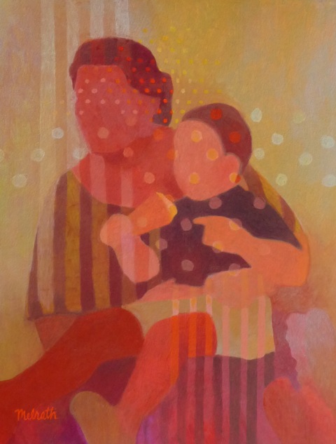
     

    Cafe, acrylic on paper, 11×19 framed

    Though I love ALL of Susan’s work, it is her Garden series that speaks something to my soul.  Perhaps it is how I am amazed by the flora to be found here in the Northwest.  ( Wildflowers!! )

    Out of the Blue, acrylic on paper, 22×22 framed

    She takes what could be a mundane subject and with the use of pattern and color creates something extraordinary.  It’s a little bit Pop-Art, a little bit Fauvist, kind of Cubist without the hard edges ( Cone-ist? ).The flowers seem to be underwater, floating in a happy haze of pattern.  Or maybe it’s drizzly rain?  We ARE in the Northwest..Sometimes it seems that we are seeing the flower’s shadow, rather than the plant itself, looking through the shadow to the play of patterns and light beyond.  Which makes the work groovily mysterious.

    Moonflower, acrylic on canvas, 24×24

    Susan created a floral series called “Bloom” for a recent Art & Sustainability show at the Sightline Institute in Seattle, integrating technology and traditional painting, posting a mobile tag by each painting providing more insight and information about each work of art.  You can see the progress of one of these works and hear Susan speaking about the work here.  And because I always personally find these things to be so much darn fun, here’s a time-lapse video of Susan completing a painting.  What’s up next for Susan after her technology driven show?  Unplugged, artwork created during a one-week period in which artists went without TV, internet, social media and texting.  Because great art is always about finding balance.

    Be sure to check out Susan Melrath’s website to see more of her work and learn more about the artist.
  • Friday Forager Faves:  Horsin’ Around

    Friday Forager Faves: Horsin’ Around

    Artists have long held a fascination for horses.  Some of the earliest cave drawings were filled with equine imagery.  Modern artists are no different.  Today’s faves feature artists with a penchant for ponies.  Enjoy!

    Maribel Angel
    Thomas Hager
    Marsha Glaziere
    Jim Draper
    Dolan Geiman

    Happy Friday!  Hope your weekend is filled with lots of horsin’ around and such.

    To see more work by these Friday Faves artists, check out their websites:

    Maribel Angel

    Thomas Hager

    Marsha Glaziere

    Jim Draper

    Dolan Geiman


  • Pick of the Crop:  Not Your Average Joe

    Pick of the Crop: Not Your Average Joe

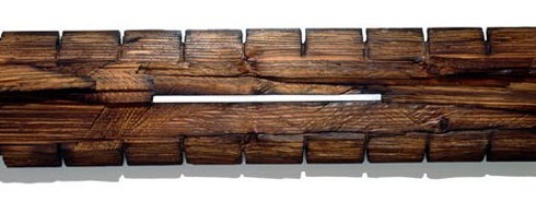
    Here in the Northwest, the trees are so spectacular that they grab your attention and demand to be noticed and admired.  St. Augustine, Florida artist Joe Segal’s work does the same.  His sculptures are a celebration of these kings of the forest, their textures, patterns, their cycle of life.

    Segal_Break

     Instead of a literal translation of branches and limbs, Joe instead chooses to focus on the core of what gives a tree its strength, character and economic value, the hard, fibrous wood.

    Segal_Within VIII

    By cutting, stacking, carving, painting, even burning the wood, Joe re-envisions the pattern of the tree’s life.  He takes the normal processes for which and by which wood is harvested and calls our attention to the beauty of the materials in their simplest forms.

    Segal_Center VII

    The steel used to cut the tree becomes instead, the connecting force that holds the wood together.  Pieces of stacked wood, recalling a firewood pile, are juxtaposed with charred wood creating an interesting “before and after” effect.

    Segal_Cleave VII

    Working with the nature of the materials, rather than against them, going with the grain, if you will, Joe is exploring the rhythms of the natural world and reinterpreting them into beautifully designed works of art.

    To see more of Joe’s work, check out his Pick of the Crop page here at Artsy Forager, where you’ll find a link to his website.  I hope you love it as much as I do.

  • Introducing Julia Hensley

    Introducing Julia Hensley

    As many of you know, my hubby George and I have been planning to move to the Pacific Northwest, pretty much since we started dating a little over a year ago.  But first we had to #1, get engaged, #2, sell his house in Tulsa, #3 plan a wedding, #4 get married and #5 sell my house in Jacksonville.  We have finally accomplished that last objective ( well, almost, our closing is May 18th ) and are planning the next stage of our life together.

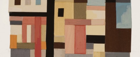
    I have an ongoing list of artists I’d like to feature on Artsy Forager, but sometimes fate steps in and pushes a certain artist ahead of the rest.  I happened to be checking out a design blog I follow and spotted a painting the blogger had purchased from Seattle artist, Julia Hensley.  I surfed on over to her website and was impressed by what I found.   I discovered via Facebook, that today is Julia’s birthday! 

    So, in honor of Julia’s birthday, our upcoming move to the Northwest and just because her stuff is just genuinely awesome, I’m sharing her work with you.

    Chinatown, oil on masonite, 13 1/2″ x 11″

    65th and Roosevelt, gouache collage on bristol board, 9″ x 12″

    Hot Day Bremerton, gouache on bristol board, 7 1/2″ x 4 3/4″ 

    ( this might be my favorite )


     Flat Iron, acrylic on bristol board, 8″ x 12″

    Sunday Downtown, acrylic on paper, 19″ x 24″ 

    Hope you enjoyed meeting Julia, be sure to wish her a happy birthday!

    You can see more of Julia Hensley’s work here.

    Or check out the blog that led me to her, From The Right Bank.

  • Loss of a Legend: Hamish MacEwan

    Loss of a Legend: Hamish MacEwan

    Yesterday I learned of the passing of one of the great leaders of the art community in Jacksonville, Hamish MacEwan.  Hamish was born in Scotland, eventually coming to the US and earning a Masters of Art degree from Harvard University.  His career brought him to Jacksonville and though he gained notoriety as the head of the arts department at Episcopal High School in Jacksonville and producer of cultural programs for Jacksonville’s local PBS Station.  It is in his paintings and personal relationships that Hamish’s real legacy is found.

    Vertical Interior Exterior I by Hamish MacEwan

     I can still vividly remember my first encounter with Hamish.  I had only been working at Fogle Fine Art for a short time, when Hamish came into the gallery on Beach Boulevard in Jacksonville.  I had, of course, already been familiar with his work from living in Jacksonville and working for SuperStock, who handled the licensing of much of his artwork.

    Vertical Horizontal Break I by Hamish MacEwan

    He came into the gallery looking like a character from a Rosamunde Pilcher novel, dressed in cordoruoys, tweed jacket ( complete with elbow patches! ) and hat.   His voice had that beautiful Scottish lilt and he was the epitome of a Scottish gentleman.  I always remember his hankerchiefs, because they reminded me of my own grandfather, also an old-school hankerchief user.

    Vertical Interior I by Hamish MacEwan

    Hamish was a prolific artist, painting every day even into his 90’s.  In 2009, Fogle joined forces with MOCA Jax to do a retrospective of his work the year Hamish turned 90 years old, “90 in “09” showcased the artistic journey of this remarkable artist.  I was fortunate to give Hamish a ride home after the opening at the gallery.  He was blown away by all the attention and so appreciative and humbled by this celebration of his life of work.

    Vertical Interior II by Hamish MacEwan

    After I dropped Hamish off that night, I watched him amble along the sidewalk to his apartment, leaning on his cane.  I pictured him the next day, same as always, painting in his studio.  I like to think that he is still painting.

    Goodbye, Hamish.  Thank you for the creative legacy you have left us all.

    All images via Fogle Fine Art.

  • Masterworks Monday: The Cubists

    Sorry for the late post today– we’ve had some big things happening, so I’ve been a bit preoccupied.  More on that later!  For this week’s Masters Monday, we’re going a little more modern– enter Pablo Picasso and cubism.  Cubism is an early 20th century art movement that was begun by Picasso and Georges Braques in which objects were depicted from a multitude of viewpoints in a seemingly random fashion.

    Juan Gris. Breakfast. (1914)
    Breakfast by Juan Gris

    For me, cubism was a quite a breakthrough while taking figure drawing classes in college.  Once figure drawing started clicking for me, ( it was horribly frustrating at first, but my professor at UNF, Paul Ladnier, told me that one day it would just “click” and it would be smooth sailing– I didn’t believe him until it actually happened that way! ) it was then that Paul suggested I try a little cubism.  That’s when things REALLY started to get more fun and interesting!  I loved exaggerating the planes and forms.

    Pablo Picasso. Girl with a Mandolin (Fanny Tellier). Paris, late spring 1910

    Girl With a Mandolin ( Fanny Tellier ) by Pablo Picasso

    I realize Cubism isn’t everyone’s cup of tea, but for me, it was the introduction into a different way of seeing, a new perspective on how we look at the things we see.

    Images via http://www.moma.org

    Read more about Cubism on MOMA’s website!

  • Friday Forager Faves

    Friday Forager Faves

    Happy Friday everyone!  If you’re in North Florida, no, that light coming through your windows is not an April Fool’s Day joke– the sun is finally shining!  If you haven’t made it to the beach yet,  here are a few of my favorite beachy pieces to get your through until then..  each one brings a little somethin’ different, dontcha think?


    1.  Oceanic 29 by Thomas Hager

    2.  Day Dreamin’ by Mary St. Germain

    3.  Spontaneous Simplicity by Theresa Daily

    4.  Seaside Reflections by Christina Foard

  • Springing Forth

    Springing Forth

    WINTER TRANSITIONS;  SPRING STORMS is R. Roberts Gallery’s celebration of the transition from the grey, dreary days of winter into the fresh bloom of spring.  The show features the work of three very different artists, mixed media artist Madeline Peck-Wagner, sculptor James Oleson and encaustic painter Kathleen Wobie.

    As you enter the gallery, you may almost miss James Oleson’s tiny bust sculpture.  This diminutive piece, made of repurposed metal, will definitely make you stop and take the time to really check it out.  I couldn’t believe I walked right by it when I first came in!  Beyond the bust is one of Oleson’s horse sculptures.  With its stilt-like legs and flowing tail, this equine could be right out of a Tim Burton movie.  Oleson also has some much larger scale sculptures that are interesting in their own right.

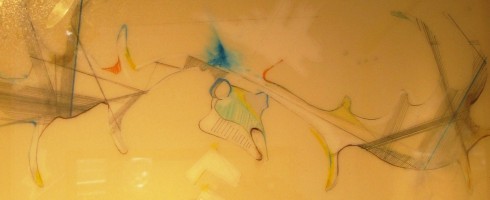
    Speaking of equines, Madeline Peck-Wagner’s mixed media works were defnitely, for me, the star of this show.  She takes subject matter that could be trite and cringe-worthy ( think cheesy Southwestern art ), but treats it in a unique, contemporary and elegant way.

    These are delicate line drawings possessing an intense presence and power, much like the impressive animals depicted.  The cross-hatching & precision of the lines are reminiscent of architectural drafting, giving the figures depicted a strutctural, landscaped quality.  Conversely, blots and washes of brightly colored paints call to the spiritual significance such animals, both living and decayed possess.

    Just as the delicate, bare branches of winter transition into the full, heady blooms of spring, so we move from Madeline Peck-Wagner’s graceful lines into Kathleen Wobie’s encaustics, thick with wax, paint & color.   Kathleen’s pieces, in the context of this show, seem to depict spring at its height– full of pastel tones and sunshiney warmth.


    For me personally, I found the larger, abstract piece below to be Wobie’s most successful of this show.  This piece, rather than being the literal translation of winter to spring that the piece above is, instead represents more the feeling of spring– of rebirth, renewal and the joy of being alive.

    As we in North Florida transition into spring ( though some days lately, it feels as if summer is already upon us! ), take the time to drop by R. Roberts to see how these artists make the switch and enjoy this last show in the gallery’s current space.  R. Roberts is doing some transitioning of their own, can’t wait to see the bountiful blooming that is sure to be in store!

    R. Roberts Gallery is located at 3606 St. Johns Ave in historic Avondale, in Jacksonville.

    Winter Transitions; Spring Storms will be on display through April 23rd, the gallery is open Tuesday-Saturday 11am-6pm.

  • Friday Forager Faves

    Friday Forager Faves

    A few of my favorite things this week.. in honor of the beginning of spring, a little light, some flowers and birdsong.

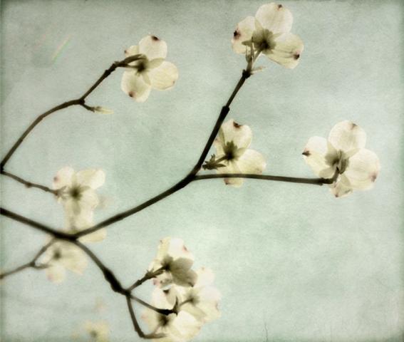
    1. Dogwood Branch by Pamela Viola

    2. Get Lucky by Christina Baker

    3.  Fading Boundaries by Maribel Angel

    4.  Everyone Loves a Parade by Casey Matthews

  • Seeing Much, Much More

    Seeing Much, Much More

    SHAWN MEHARG: SEEING LITTLE MORE is the latest exhibition of work at the Williams-Cornelius Gallery located inside Daryl Bunn Studios in Riverside.  If, like me, all you’ve ever seen are Shawn’s more representational works, you’ll be as pleasantly surprised as I was to discover this new series of abstracts.

    I am a huge sucker for lots of texture, so this show had me at hello.   These abstracts are LOUSY with texture ( and I mean that in the best possible sense! ), color and depth.   Layer upon layer of paint, charcoal, etc., give way to artwork in which the viewer can get lost.  There are a few pieces that are lighter in tone, but for the most part the color is heavily saturated, but somehow still remaining translucent, giving the feeling of looking through wet stained glass.

    Lots of edgy endings in color and straight lines add to the stained-glass effect.  There also seems to be a reflectory vibe happening, especially in the darker pieces– they could be reflections of city lights in pools of water on asphalt streets.

    The visual depth is especially evident in the pieces in which the canvas seems to be opening up into a world beyond– as in “City Mouth” below.

    I don’t want to give too much away.  If you’re in Jacksonville, go see this show for yourself and find out what “more” you can see.

    Williams-Cornelius Gallery is located inside Daryl Bunn Studios, 643 Edison Ave in Jacksonville.

    The gallery is open Monday- Friday, 9am-5pm.