Category: Mixed Media

  • Salvaged Surfaces: Valerie Roybal

    Salvaged Surfaces: Valerie Roybal

    When was the last time you wrote a hand-written letter?  Or read a book made of paper instead of on your Kindle?  Wrote a check? As we shift closer and closer to becoming a paperless society, it seems that by foregoing that physical connection with common materials, we are losing some little part of the soul of our humanity.  Albuquerque, New Mexico artist, Valerie Roybal takes the forgotten ephemera of the past and resurrects it, giving it a new life through her work.

    Transmutation, mixed media

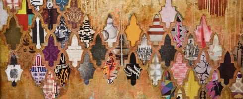
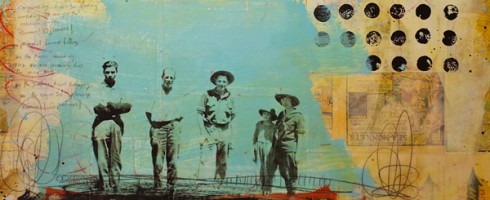
    Just as much of the joy of a handwritten card comes from the process– the choosing of just the right design, taking the time to sit down and write, the physical sensation of putting pen to paper, walking it to the mailbox– so is Roybal’s work process-driven.  From her artist statement, “Order, association, and reverence emerges from the sorting, arranging, and placement of each accumulated piece into a whole.”

    Transmutation 4, mixed media

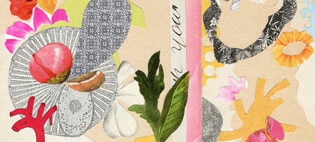
    In her “In the Library” series, the artist uses that process of sorting and arranging to create compositions reminiscent of stacked book spines.  There is a kind of random orderliness to these not unlike a library of treasured collections.

    In the Library 14, mixed media

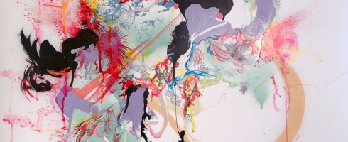
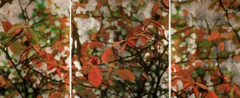
    Through her work, Roybal also explores natural physiological processes such as cell mutations.  The resulting compositions possess the seeming precision of scientific illustrations, but with the bursts of life and color that remind us of the wonder of the organic world.

    A Brief History 3, mixed media
    Transmutation 5, mixed media

    To see more of Valerie Roybal’s work, please visit her website.  Thanks to Hillary at Stellers Gallery Ponte Vedra for introducing Artsy Forager to this artist!

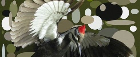
    Featured image is Transmission, mixed media.  All images are via the artist’s website

  • Artsy on Escape Into Life: Hilary Williams

    Hey ya’ll!  It’s Tuesday, so don’t forget to mosey on over to Escape Into Life to check out my post featuring the work of Hilary Williams.  You might remember Hilary from my Artsy Forager post on her work here.

    Good Neighbors, acrylic & screen print on fabric & wood panel, 24x24x2

    Hilary Williams on Escape Into Life

    While you’re at EIL, spend a little time exploring the site– it is a fantastic source for inspiration in all forms!

  • A Tale of Patina, Pattern and Pop: Jill Ricci

    A Tale of Patina, Pattern and Pop: Jill Ricci

    In our modern and sleek world, we find fascination in old things and places.  These are objects with a story, subway walls wallpapered with layer upon layer upon layer of poster ads or the stratum of paints on a bedroom wall, showing us the history of its owners.  These are the ideas New Jersey artist Jill Ricci strives to convey in her work, those hidden discoveries.

    Upper Playground, mixed media on canvas, 36×48

    By combining elements of advertising ephemera, fabric, wallcoverings and abstraction, Ricci’s work manages to feel at once ancient and modern.

    Ovation, mixed media on canvas, 24×24

    With contemporary graphics layered under the patina of paint, these pieces almost feel like we are peeling back the scales from the antiquated to find that what is hidden beneath is not obsolete, but avant-garde.

    Release, mixed media on canvas, 36×48

    The artist’s layering collected materials mirrors society’s ever abiding search for the next big thing.  We are constantly looking for the latest gadget, fashion or whatchmacallit that will give us joy.  But perhaps, joy doesn’t come from the newest thing, but looking back with fondness and learning from what has come before.

    Roam, mixed media on canvas, 36×48
    Jack’s Garden, mixed media on canvas, 48×36

    To see more of Jill Ricci’s work, please visit her website.  Her work can currently be seen in shows at Jules Place in Boston, MA and at Parlor Gallery in Asbury Park, NJ.  Check these artsy spots out if you’re nearby!

    Featured image is Cherish, mixed media on canvas, 48×30.  All images are via the artist’s website.

  • Created Chaos: Sarah Spitler

    Created Chaos: Sarah Spitler

    I am busy spreading holiday cheer today ( OK, actually running around like crazy trying to get stuff done ), which is kind of fitting for the work of today’s featured artist.  Sarah Spitler’s abstracts come from the artist’s concern with chaos manifested.  And because of aforementioned chaos of my own today, I’m going to let Sarah’s work speak for itself.

    Inveterate Detritus ( Something Forgotten Known Only to Ourselves ), ink, acrylic, enamel and spray paint on Mylar and canvas, 36×36
    Iniquities Not Consigned to Oblivion, ink, acrylic and enamel on Mylar, 16×16
    Vorticital Obsolescence, ink, acrylic and enamel on Mylar, 16×16
    Geopolitical Tumescence, ink, acrylic, gold leaf and enamel on Mylar, 10×10

    Be sure to check out more of Sarah Spitler’s work on her website and don’t miss reading her artist statement— deep stuff there, definitely read it and then go back and look at her work again.

    Featured title image is Monomythical Geopolitika, ink, acrylic, spray paint and graphite on Mylar, 28×22.  All images are via the artist’s website.

  • Artsy on Escape Into Life: Liz Tran

    I’ve been so busy painting this morning ( Yes, you read that right!  I may or may not share the finished work with you.  Depends on how I feel about them.. ), that I almost forgot to let you know about today’s Escape Into Life feature.  Now, that would just not do at all, because I am a huge fan of today’s artist, Liz Tran.

    One After Another, mixed media on panel, 30×24

    Joy positively radiates from Liz’s work.  They twinkle and wink and flirt with you.  So at what can be a stressful time of year, fill a cup of egg nog and enjoy some happy time.

    Liz Tran on Escape Into Life

    And just in case you missed it, check out her recent Artsy Forager feature here.

  • Would You Like Art With Your Coffee?

    Would You Like Art With Your Coffee?

    It’s no secret that here in the Pacific Northwest, we love our coffee.  Caffiing up is taken very seriously around these parts.  Our coffee house experiences are not limited to the ubiquitous Starbucks.  The most wonderful, interesting coffee joints are the independent  shops, where they might roast their own beans onsite ( these are the places my hubby prefers ), the baristas are extremely knowledgeable and are generally a whole heckuvalotta fun.  So I was very excited that Seattle artist Marsha Glaziere has created a series of works inspired by the coffee houses of Puget Sound.  She’s put 13 of the series into a 2012 calendar, here’s a peek at the cover art:

    Cover of Eclectic Coffee Houses of Puget Sound, a calendar featuring artwork by Marsha Glaziere

    The calendar is a prelude to her upcoming book, eclectic COFFEE spots in Puget Sound, a “table coffee book”. ( Get it? 🙂 ) An excerpt from the book’s introduction gives us a peek into the driving force behind this new series:

    “It is very hard, if not impossible, to live in the Pacific Northwest, specifically the Puget Sound region, and not become seduced by, and ultimately become part of, the pervasive coffee culture that thrives in this part of the country—come rain or shine. 

    In our increasingly-fast-paced world of electronics, hyperactivity, and constant change, gathering with friends, even coffeehouse strangers, perhaps fulfills our deep-seated desire for community. Whether we engage in conversation or focus on a book, our computer or on the artwork exhibited, being anchored in the company of others may be as satisfying as a cup of coffee itself.”  

    Joe Bar in Capitol Hill ( January )

    As a lover of both independent coffee houses and Starbucks ( what can I say, I’m a sucker for their diabetic-coma inducing drinks ), I was so excited to see that Marsha had chosen to document these places that will surely be remembered as an important part of life and culture in the 21st century.

    Diva Espresso in West Seattle ( June )

    Marsha’s artistic style fits so well with her subject, the sketchy, seemingly fleeting movement of her lines, her use of negative space and primarily light washes of color provide a spontaneity and lightheartedness that seems perfect for capturing these modern day salons.

    Espresso Vivace in Capitol Hill, Seattle ( September )
    The Woods Coffee in Boulevard Park, Bellingham ( December )

    This calendar is ideal for the art and/or coffee lover on your gift list!  You can see all thirteen calendar images and place your order here.  While you’re there, be sure to wander around the rest of Marsha’s website to see more of this artist’s incredible work.  And buy a calendar!  You’ll be checking someone off your shopping list AND supporting an artist.  Win-win!

    Featured image is Starbucks, The Original at Pike Place Market ( March ).  All images are via the artist or her website.

  • Curious Amalgamations of the Unrelated: Geoff Mitchell

    Curious Amalgamations of the Unrelated: Geoff Mitchell

    It seems to be human nature to look for meaning in everything.  We agonize over the meaning of baby names before choosing monikers for our offspring, we overanalyze  other people’s words to find out what they really meant, we take silly quizzes that tell us what our favorite color says about who we are.  And of course, we look for meaning and subtext in artwork.  Guilty, as charged, officer.  What is the artist trying to say?  What message is being conveyed?  In the case of Geoff Mitchell, it is a case of what the artist is striving not to communicate.

    Mayonaisse by Geoff Mitchell
    Mayonaisse, mixed media on panel, 20×20

    The artist, whose show, Entries of a Diary Thief, opens at Florida Mining in Jacksonville, FL next Friday, creates work driven by the sense of “pareidolia, a psychological misperception involving a vague or obscure stimulus being perceived as something distinct and significant”. ( quote via Florida Mining )

    Trinket by Geoff Mitchell
    Trinket, mixed media on six panels, 24×36 overall

    In other words, our tendency to create meaning where there is none.  The artist describes his use of representational imagery as being done  “in a free associative and purely intuitive manner. I mix and layer images together in a way that is reminiscent of an abstract painter layering color.” ( via Florida Mining ) So any “meaning” inferred by the viewer is not intended by the artist himself, but instead by the viewers personal association with the imagery therein.

    Zipper by Geoff Mitchell
    Zipper, mixed media on panel, 20×20

    So, with that being said, I leave you to draw your own conclusions about Mitchell’s work.  His sense of color, composition and design are undeniable, which is what makes the unrelated imagery so compelling and visually arresting.

    Derby by Geoff Mitchell
    Derby, mixed media on panel, 12×18
    Drop by Geoff Mitchell
    Drop, mixed media on panel, 20×20

    Please visit Geoff Mitchell’s website to see more of his work online.  If you’re in North Florida, don’t miss his show opening December 9, 2011 at Florida Mining.

    Featured image is Topaz, mixed media on panel, 60×20.  All images are via the artist’s website.
  • Of a Mod Nature: Mary Chomenko Hinckley

    Of a Mod Nature: Mary Chomenko Hinckley

    Camisoles and combat boots.. cayenne and chocolate.. some things just don’t seem like they would go together.  Take, for example, the work of Mary Chomenko Hinckley.  This is an artist who enjoys finding the harmony in the disparate.

    Golden Winged Warbler in Ellipse Field, digital pigment print on silver rag, 28×21, 40×30 or 52×40

    Like pairing the detailed natural images of ordinary birds against mod-style backgrounds whose colors may echo or complement those of the bird, but the contemporary patterns give these ol’ birds a new spin.

    Belted Kingfisher, Unique Variant 3/5 Digital Pigment Print and Colored Pencil on German Paper, 28×21

    In her work, the artist is exposing the relationship between objects that seem completely unrelated.  By juxtaposing these seemingly incongruent objects, she finds harmony in the new relationship.  Plus, I think they give these guys the cheeky little personalities they deserve.  Birds are fun, what can I say?

    Red Bellied Woodpecker in Ellipse Field, digital pigment print on silver rag, 28×21, 40×30 or 52×40
    Gannet in Ellipse Field, digital pigment print on silver rag, 28×21, 40×30 or 52×40

    To see more of Mary Chomenko Hinckley’s fine feathered friends and her other work, please visit her website.

    Featured image is Pileated Woodpecker in Ellipse Field, digital pigment print on silver rag, 28×21, 40×30 or 52×40.  All images are via the artist’s website.

  • Abstractions of Atmosphere: Susan Goldsmith

    Abstractions of Atmosphere: Susan Goldsmith

    This year, autumn has been a completely new experience for me.  Having never experienced a full autumn outside of my home in northeast Florida ( short trips north don’t really count ), one of the things I was most looking forward to this year was enjoying a cool and brightly colored Fall.  And Southern Oregon did not disappoint!

    For me, there is just something about this autumnal time of year that makes the natural world more evident and magical.  Things slow down, trees and animals prepare for the long winter ahead.  Blazing sun is replaced with fog and clouds, making the amber colored leaves that much more striking.  California artist Susan Goldsmith captures the essence of the natural beauty of autumn in her mixed media work.  I want to buy one so that I can gaze at it in the middle of summer, dreaming of the return of cool days and warm colors.

    Brandy Creek Falls I, oil, oil pastel and resin on panel, 20.5×20.5 ( via Davis & Cline )

    In her work, Susan uses digital photographic prints as the base layer of her paintings, applying them to the surface then enhancing them with paints and/or pastels, so that the resulting effect is not one of merely an embellished photograph, but rather the impressionistic reinterpretation of the original composition.

    Redbud, oil, oil pastel and resin on panel, 40×20 ( diptych, 20×20 each, via Davis & Cline )

    What the viewer is left with is a lovely sense of atmospheric abstraction, light and mood, that bursting forth of vibrant color against grey skies which is so characteristic of autumn.

    Hachiya Persimmons II, mixed media and resin on panel, 17×17 ( via Lanoue Fine Art )
    No. 153, mixed media and resin on panel, 24×24 ( via Lanoue Fine Art )

    I first caught glimpse of Susan’s work at Davis & Cline in Ashland, OR, but have sense discovered her connection to another favorite gallery resource, Lanoue Fine Art in Boston.  Of course, you can also see her work on her own website.

    Featured image is Brandy Creek I, silver leaf with pigment print, oil, oil pastel and resin on panel, 61.5×21.5 ( overall size ).  Images are via Susan Goldsmith’s representing galleries, as noted.

  • Vintage Pop: Melody Postma

    Vintage Pop: Melody Postma

    Vintage photos and ephemera, bright colors against faded backgrounds, pop culture iconography.. these are a few of my favorite things and they can all be found in the work of Melody Postma.

    Absolute Beginners, mixed media on panel, 36×36 ( via Lanoue Fine Art )

    This Clearwater, FL native and graduate of SCAD shares my own fascination with old photographs, utilizing their documentary/slice-of-life style and pop culture graphics of years gone by to create work that calls to us from the past.  We see our parents and grandparents in these faces, recalling memories of favorite games, candy, the way of life as we like to remember it.

    Languishing in the Calm, mixed media on panel, 36×36 ( via Lanoue Fine Art )

    Looking at these images and icons leads me to wonder.. Will audiences in the future be impacted as emotionally when they look back on today’s culture?  Will we see artists exploring the good ol’ days of the 00’s, the digital revolution, reality shows and social media?  Will the cultural phenomena of today hold as much charm as other decades?

    Might Cause Double Vision, mixed media on panel, 42×42 ( via Lanoue Fine Art )

    Or is it just that we always look back with nostalgia at times that held precious memories or periods that we’ve idealized?  Maybe it’s the 21st century cynic in me, but I’m just not sure we’ll look back on the current era quite as fondly.  Or maybe it’s that most of us didn’t live through the eras we’re most nostalgic about.  And perhaps that what Melody Postma is getting at.

    A Memory Hard to Ignore, mixed media on panel, 36×36 ( via Lanoue Fine Art )
    There’s Treasure Children Always, mixed media on panel, 36×36 ( via Lanoue Fine Art )

    To see more of Melody Postma’s work, please visit her website.  Her work can also be viewed at Lanoue Fine Art in Boston, Hubert Gallery in NYC, Gallery Brown in L.A and Trudy Labell Fine Art in Naples, FL.

    Featured image is An Afternoon With Whitman, mixed media on panel, 36×36.