Category: Daily Artsy

Artists featured in a solo spot on Artsy Forager

  • Take to the Waters: Anne Neely

    Take to the Waters: Anne Neely

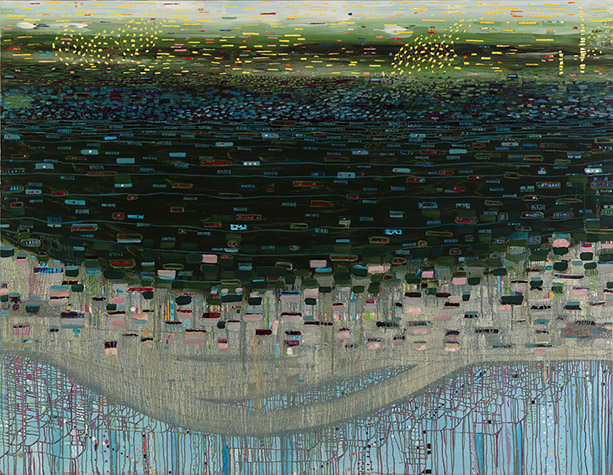
    Water is one of those resources we tend to take for granted until we find ourselves without it.  During the six months we spent in the California desert, Mr. F and I discovered just how essential its presence was to our psyches and overall happiness.  Not only does it nourish us physically, but something about this liquid nurtures our souls.  Boston artist Anne Neely explores the importance of waters seen and unseen in her Mopang series.

    Turlach-Turlough by Anne Neely
    Turlach-Turlough, oil on linen, 72×60
    Pond Park by Anne Neely
    Pond Park, oil on linen, 36×44

    The series is named after the Mopang Aquifer in Maine which was saved after an attempt to establish an ash dump near it.  The artist plunges depths, showing off water’s sparkles and light in her use of color, shape and line.

    Riverside by Anne Neely
    Riverside, oil on linen, 32×24

    We are lucky enough to have a beautiful little man-made stream and waterfall running through the backyard of our current rental.  Just a few minutes gazing into the clear waters and listening to the splashing instantly calms me.  The mere presence of water reminds us of our most basic needs and we relax in its cool calming being.

    Off Island by Anne Neely
    Off Island, oil on linen, 32×24
    Waterlines by Anne Neely
    Waterlines, oil on linen, 14×11

    If you would like to see more of Anne Neely‘s work, please visit her website.

    All images are via the artist’s website.

  • September Featured Artist: Susan Hall

    September Featured Artist: Susan Hall

    I know today is a holiday for most folks here in the US, so you’ve probably out picnicking, enjoying your last bit of summer beach time or barbecuing with the fam.  But I just couldn’t wait to share with you our new Featured Artist for September!  I am an enormous fan of this artist’s work.  Seriously, I fall more in love with the work of Susan Hall every time I see it.

    Wing by Susan Hall
    Wing, oil on panel, 35×40

    Every painting transports me to such a calm and peaceful place– it’s like a visual dip into a cool spring on a hot day.  Each figure, whether human or animal, seems lit from within and the canvases radiate with serenity.

    Devotion by Susan Hall
    Devotion, oil on panel, 43×51
    Morning Light by Susan Hall
    Morning Light, oil on panel, 35×40

    And I’m sure you’ve noticed her use of texture– each piece has subtle textural patterns overlaying the composition, lending to the ethereal, gossamer-like quality.

    Listen by Susan Hall
    Listen, oil on panel, 43×48
    Harmony by Susan Hall
    Harmony, oil on panel, 43×51

    Owning one of Susan’s pieces would be like having your own personal serenity portal.  Just a few moments’ gazing and my stress levels plummet!

    Want to see more of Susan Hall‘s work?  Please visit her website and be sure to check out the Facebook album full of my favorite works by Susan.  For you Texas Artsies, Susan will be showing at the Houston Fine Art Fair this month and for my Seattle Artsies, you can see Susan’s work at the Affordable Art Fair in November!  A list of galleries who carry her work can be found on her website here.

    All images via the artist’s website.


  • Well Placed Pop: Guy Catling

    Well Placed Pop: Guy Catling

    Sometimes, all it takes is just a little somethin’ somethin’ to take an ordinary image and transform it into something unexpected.  UK artist Guy Catling has found that adding some well placed color and pattern can lead to some pretty spectacular imagery.

    Catling1 Catling4

    Black and white vintage photographs are beautiful, but add in brightly colored faces and floral patterned mountains and they take on a whole new modern life.  Bright shots of geometric shapes in these scenic photos mimic the lines of the photographs simply yet beautifully.

    Catling3 Catling2

    The patterns added to this trio of well dressed men adds not only a bit of pizazz, but with the Victorian-floral and Native American inspired patterns these guys are sporting, the story behind the image has possibly changed.  Ah the power of color and pattern!

    Catling_Coats


    Want to see more work by this talented artist?  Check out Guy Catling‘s website here.

    All images via the artist’s Tumblr.

  • Exploratory Escapes: Jaime Derringer

    Exploratory Escapes: Jaime Derringer

    One of my favorite things about social media is being able to watch an artist blossom and discover their voice.  Maybe you recognize the name of today’s artist, perhaps better known as the founder and editor of the amazing design blog, DesignMilk, artist-blogger-poet(!), Jaime Derringer.

    Composition #5 by Jaime Derringer
    Composition #5, acrylic and pencil on heavy canvas paper, 12×16
    Why Can't I Be You? by Jaime Derringer
    Why Can’t I Be You?, mixed media on wood panel, 8×8

    I wasn’t aware of the scope of Jaime’s artistic talent until she began posting her A Shape A Day project on Instagram.  Immediately, I was like, “Hold the phone!  She’s an artist, too??”  The short answer? Yes.

    Untitled by Jaime Derringer
    Untitled, ink, marker and watercolor on watercolor paper, 9×12
    Smoke Monster by Jaime Derringer
    Smoke Monster, ink, marker and acrylic on heavy canvas paper, 16×12

    For Jaime, her work is an exploration and escape.  Perusing her work, you can see the progression, the playing with style, medium and composition that marks each creative expedition.

    Jellyfish by Jaime Derringer
    Jellyfish, ink on paper, 25×19

    With each journey, the artist is discovering her own uncharted territory and finding new paths.  Personally, I’m enjoying being along for the ride.

    Want to see more of Jaime Derringer‘s work?  Be sure to check out her website here.  Oh and bonus– originals and prints of her work are available at super affordable prices!

    All images are via the artist’s website.

  • Pink Soldiers: Richard Mosse

    Pink Soldiers: Richard Mosse

    While the world tweets about Miley’s twerking, understandably, I’ve seen lots of folks online upset that the antics of a 20-something spoiled starlet are making bigger headlines than little things like wars and children dying.  Admittedly, I love my guilty pleasures as much as the next gal, but find myself wondering, how do we draw more attention to real, impactful events happening around the world?  Leave it to an artist to figure it out.  Irish photographer Richard Mosse brings the civil war in the DR Congo to life using bright pink tones to colorfully engage the viewer into the country’s story.

    Men of Good Fortune, North Kivu, Eastern Congo, 2011 by Richard Mosse
    Men of Good Fortune, North Kivu, Eastern Congo, 2011
    Growing Up in Public, North Kivu, Eastern Congo 2011 by Richard Mosse
    Growing Up in Public, North Kivu, Eastern Congo 2011

    Mosse’s use of an ifrared Aerochrome dia-film gives his photographs their striking hot pink hue.  That sugary, Victoria’s Secret hue belies the tragic story behind these photos, one of decades long conflict, government corruption, and innocence lost.

    Even better than the real thing, north kivu, eastern congo 2011 by Richard Mosse
    Even Better Than the Real Thing, North Kivu, Eastern Congo, 2011
    Ruby Tuesday, North Kivu, Eastern Congo, 2011 by Richard Mosse
    Ruby Tuesday, North Kivu, Eastern Congo, 2011

    The photographer takes documentary war photography and imbues it with a strange sense of playfulness.  The Pop Art pinks are surely what will draw our attention, but it is the faces there and the stories behind them that will keep it.

    Sticky Fingers, North Kivu, Eastern Congo 2011 by Richard Mosse
    Sticky Fingers, North Kivu, Eastern Congo 2011
    La Vie En Rose, North Kivu, Eastern Congo, 2010 by Richard Mosse
    La Vie En Rose, North Kivu, Eastern Congo, 2010

    If you’d like to see more of Richard Mosse‘s work, please visit his website.

    All images via the artist’s website.

  • Fresh Graphics: Kate Mullin

    Fresh Graphics: Kate Mullin

    Days are getting shorter, nights are cooler, and kids everywhere are headed back to school.  Summer’s end is near, and as much as I’m looking forward to the arrival of my favorite season, I do hate to see some summer things go!  The bright, happy colors of flowers with their faces turned to the sun never fail to make me smile.  These graphically painted floral still lifes by Charleston artist Kate Mullin just might get me through the coming cold and rainy months.

    Sally by Kate Mullin
    Sally, oil on canvas, 22×28
    Pink & Pink by Kate Mullin
    Pink & Pink, oil on canvas, 16×20

    Mullins’ use of flattened planes seems to be a deliberate nod to vintage paint-by-numbers ( which I love and have a few of my own in storage! ), but she amps up the modern feel by mixing in bright, saturated color and graphic blacks.

    Zinnia Arrangement by Kate Mullin
    Zinnia Arrangement, oil on canvas, 24×24
    Teal Zinnias by Kate Mullin
    Teal Zinnias, oil on canvas, 28×22

    Mullins’ bouquets are full of light and life.  They fairly drip with color and vivacity!  The perfect antidote for the coming dreariness. 😉

    Coral by Kate Mullin
    Coral, oil on canvas, 16×20

    Want to see more work by Kate Mullin?  Be sure to check out her website and Facebook page!

    All images via the artist’s website.

  • Puzzle Me This: Kent Ambler

    Puzzle Me This: Kent Ambler

    I love it when you guys write to me to tell me about an artist’s work!  Even more than that, I love gallery owners who are passionate about promoting their artists’ work.  So when Art & Light Gallery owner Teresa Roche emailed me about this artist, I was intrigued.  Then I went to his website and fell in love! These woodcut pieces of Greenville, SC artist Kent Ambler are full of texture and pattern and I can’t get enough of them.

    Ambler2 Ambler3Kent draws inspiration from the life and simple objects around him– his dogs, the woods surrounding his home, birds, etc.  His woodcuts feel like quick little sketches of every day life and familiar adventures.

    Ambler5 Ambler4

    While I love his single woodcuts, for me, it’s when they are put together in these Block Contstructs, that they really shine.  The colors and patterns harmonize so well together, there is a wonderful energy about them.  They remind me in the most glorious way of those old plastic sliding puzzles I used to get as a prize at school carnivals.  You know the ones in which you slide the little blocks around until the picture is completed?

    Ambler1

    I hope you are as delighted by Kent Ambler’s work as I am!  You can catch a few glimpses into his process in this video.

    If you’d like to see more, please visit his website.  If you happen to be near Greenville, he just opened a show at the Caine Gallery— go by and check it out!  And Greenville folks, be sure to mark your calendar for the 2nd Annual Block Party October 1st-15th at Art & Light, featuring 100 hand selected retired woodblock prints by Kent Ambler available for a limited time.

    PS–I know Fridays are usually for Design Foraging, but since I took the day off to unpack on Monday, I wanted to squeeze in another artist post!

    All images are via the artist’s website.

  • Hope in the Dark: Wendy McWilliams

    Hope in the Dark: Wendy McWilliams

    As much as we would love to be happily skipping through life at all times, there will always be moments that get us down.  We get stressed, overwhelmed, and sometimes just plain sad.  But in the darkness, there is always a light of hope.  These abstract paintings by Tennessee artist Wendy McWilliams illustrate in paint that feeling of glimpsing the light in our dark moments.

    McWilliams_feeling the pinch 36 x 36 $500

    I’m not sure this was the artist’s purpose when she set out to paint these canvases, but it is what these pieces are speaking to my own, slightly stressed mind today.. There is always something happening, something or someone clamoring for our attention.  Sometimes the noise is welcome, other times, not so much.  But in the light and color of McWilliams’ work, today I’m reminded that the stress doesn’t last forever.

    McWilliams5

    McWilliams1

    We always manage somehow to come through the chaos, to tackle the seemingly insurmountable tasks before us or to just plain grin and bear it until it’s all over.  Whether it is through our own strength, help from another or above, we get through it.  The color returns and so does the light.

     McWilliams2

    Want to see more work from this artist?  Check out Wendy McWilliams’ website.

    All images are via the artist’s website.

  • In the City: Daniel Everett

    In the City: Daniel Everett

    As much as I love the quiet of rural settings, there is something undeniably appealing about the structures in urban life.  As we were showing Mr. F’s sister around Seattle last week, she was in awe of the architecture and I was reminded, too, to look up and around and take notice.  The work of artist Daniel Everett takes those intriguing bits of urbanity and isolates them in all their glory.

    Untitled, from Monument series by Daniel Everett
    Untitled, from Monument series
    Untitled, three pieces by Daniel Everett
    Three recent untitled works
    Untitled, from Monument series by Daniel Everett
    Untitled, from Monument series
    Untitled, from Monument series by Daniel Everett
    Untitled, from Monument series

    Sometimes, the structure is set starkly against a colorful, seemingly computer generated hue, and then others seem to almost melt into a white sky, pastel lines graphically juxtaposed.  Everett is taking those slices of urban infrastructure and challenging us to see them in a new way, for someone, this is the spot where they spend each day, perhaps a job they worked hard to get or their refuge from the rest of the world.

    And just because it’s awesome and I loved it too much to not include it, I give you..

    Artist Statement II by Daniel Everett
    Artist Statement II, gum

    Want to see more work from Daniel Everett?  Check out his website and Tumblr.

    All images via the artist’s website or Tumblr feed.


  • A Sublime Display: Jan de Vliegher

    A Sublime Display: Jan de Vliegher

    Maybe it was all the costume dramas I watched with my mom as a kid.  Or maybe it was all those fairy tales my grandmother read to me.  This abstract-lovin’ Artsy is also a sucker for all things with a romantic past.  These porcelain plate paintings by Flemish artist Jan De Vliegher take decorative museum pieces and amp them up to larger than life works of art.

    No title available by Jan De Vliegher
    ( no title available ), oil on canvas

    De Vliegher takes photos of plates in museum displays– you know the ones in the room off to the side that people take one peek in and then turn around in search of the Picassos– then uses the photos as reference for his larger than life paintings.  He takes these precious little objects, hiding behind their glass cases and pumps them up in size and energy.

    Sevres, Dancing Girl by Jan De Vliegher
    Sevres, Dancing Girl, oil on canvas, 43×43
    ( No title available ) by Jan De Vliegher
    ( No title available ), oil on canvas
    Flower and Saz by Jan De Vliegher
    Flower and Saz, oil on canvas, 79×79

    These are no photorealistic depictions of prized antiques.  De Vliegher doesn’t concentrate on detail, but rather turns his attention and brush to capturing the essence of the atmosphere of each of these pieces in their little glass houses.  They almost come to life with the way in which he freely and loosely sketches their likenesses.  Cold porcelain resurrected.

    Cleopatra by Jan DeVliegher
    Cleopatra, oil on canvas, 79×79

    Hear the artist speak about his process and see installation images in this video in which Vincent Zambrano interviews Jan De Vliegher.

    Want to see more work by Jan De Vliegher?  Check out his artist’s page at Mike Weiss Gallery.

    Images via Mike Weiss Gallery and Beautiful Decay.