Our life seems, as I’m sure many of yours do, like a stream of times of hurry and peace. When we’re looking for our next spot– hurry. Once we get there and settle in– peace. Autumn and spring– hurry. Winter and summer– peace. In her abstract paintings, Colorado artist Krista Harris finds inspiration in that natural push and pull that the journey of life brings.
Through her process of building up and tearing down, adding and subtracting paint intuitively, Harris ends up with compositions that are flooded with movement, yet we find moments of respite among the fury. Warm colors are tempered with contrasting cool hues, a perfect parallel of our own seasons of peace among life’s fray.
I’ve found that occasionally, where and how I see an artist’s work will influence how I feel about it. If I see something while relaxing on vacation, I might think more highly of it than I would have if it had just been hanging in my local coffee shop. A beautifully designed gallery or thoughtfully hung gallery can positively influence the way work is viewed. Context is everything! New York based artist Rudolf Stingel‘s installation of work at Palazzo Grassi in Venice turns the context of the gallery on end by blanketing expansive surfaces in an Ottoman-style carpet.
The carpet, a nod to the palazzo’s history ( it used to be a trading spot for rugs from the Middle East ), creates a dramatic backdrop for Stingel’s monochromatic paintings. The work ranges from small scale portraits of classical sculpture to large minimalist abstracts. In a white wall gallery, they would still grab attention, but somehow the carpeted space seems to create a more intimate experience with the artwork. And set against all that pattern– the work still calls out, perhaps the pattern serves to even enhance the work, drawing the viewer in and intensifying details that may have been overlooked.
It’s an interesting thought, isn’t it? The way in which the context of work might influence our opinions and feelings toward it. Have you ever experienced something similar? Seeing work in one context and feeling a certain way, then completely changing your mind when you see it differently?
If you’d like to see more of Rudolf Stingel‘s work, please visit his representing gallery, Gagosian.
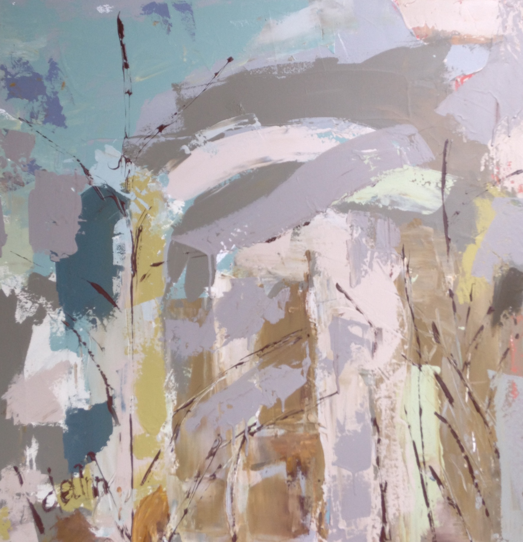
Transitions are always inspiring to me– the changing of seasons, the shift into a new life, the evolution and transformation. The transitional seasons of our lives always seem to bring about a renewed energy and purpose. In perusing the work of Toronto artist Kyle Stewart this morning, got me to thinking about how each experience builds upon the next as we move through this life.
In Stewart’s work, you see him working out, playing and stretching through each canvas. Scrolling through his paintings, you get a visual sense of each transition as he moves from tighter, more constrained abstracts into looser, quieter work, trying out narrative details along the way. How amazingly does the life cycle of art mimic our own? We too, move in and out of seasons, changing and transitioning, sometimes ever so slightly, sometimes in big, big ways.
If you’d like to see more of Kyle Stewart‘s work ( and I highly recommend you do! Every piece is stunning! ), please visit his website and follow along on his artistic journey through his Tumblr, Facebook & Instagram feeds.
Happy October! No more of that foolin’ around, Indian summer stuff. We are now well into Fall and I couldn’t be more thrilled. I’m equally excited to share with you the work of our October Featured Artist, Jennifer JL Jones! One of the things I love most about Fall is the cozy atmosphere that permeates each day and night and exploring Jennifer’s work, with its warm, ethereal light is the perfect way to kick off the season!
Here in the Northwest, we can go for days, even weeks without seeing the sun, but the light still manages to pierce the veil, even through falling leaves and raindrops. It is this same aura of light breaking through and of fluttering movement that draws me again and again to Jennifer’s work. In her most recent series, Sojourn, the work increasingly free and joy filled.. the atmosphere is ablaze.
If you’d like to see more of Jennifer JL Jones’ work, please visit her website and Facebook page. A trip over to the Artsy Forager Facebook page will also give you a glimpse into an album of some of my own favorites of the artist’s work. Florida Artsies can see Jennifer’s work, along with three other talented artists in Synergy, opening October 18th at Stellers Gallery in Ponte Vedra Beach. Don’t miss it! Not in Florida? Check out her website for a list of representing galleries around the country.
I’ve written before about the impervious nature of technology in our lives. You’re probably tired of reading about it, especially as I’m contributing to it by writing a blog.. umm.. dang. But it’s such an intriguing subject to me and such a careful balancing act we play with it, that I can’t help but see the references in artists’ work from time to time. In these paintings by Portland, Maine artist Meghan Howland, I see the artist conveying many of the conflicting emotions we encounter in this technology we interact with daily.
Pale figures, starkly lit glow eerily as they are surrounded by beauty– birds, flowers– some soft, some seeming savage. Do you see the connection? Maybe I’m reaching. What springs to mind for me is the way we use social media to show the best of ourselves, to unintentionally inspire envy in others when all we show is the most fabulous version of our lives. When we don’t mention our struggles, the piles of laundry, the failures, alongside the beautiful moments, we create an unreal, imaginary life. We gain followers who voyeuristically join our journey, yet heap praise on what isn’t our real selves, but a persona of our own making.
I admit, I find myself censoring and editing what I share. Mainly because, at my core, I’m a deeply private person, a bit uncomfortable with so much sharing. But also because so much of the time, life is just what it is. Day by day, it is beautiful in and of itself, but not necessarily Instagram photo worthy. But why not? Are we so scared of tarnishing our “brand” that we don’t allow ourselves to be authentic anymore? I hope not. What do you think, Artsies? Do you censor what you put out there for the world to see? Or are you all in, dirty dishes and all?
If you’d like to see more of Meghan Howland‘s work, please visit her website. If you’re in New York ( lucky! I love New York in the Fall! ), her work can be seen in person at TNC Gallery.
Sometimes, it isn’t a matter of what you see, but how you see it. Perception can be a funny thing. Often, Mr. F & I will watch the same movie but get something totally different from it. Or we’ll look at a scene and I’ll zero in on one thing, while his eye notices another. The simplicity of these paintings by Isabel Bigelow remind me that what each eye focuses on is as unique as the person they belong to.
Bigelow zeros in on simple shapes, isolating them against monochromatic backgrounds, leaving us to wonder– am I seeing what I think I’m seeing? Or am I seeing something else entirely? The shapes become even more ambiguous when we turn the paintings on their sides or upside down.
But maybe that’s a good thing, this act of seeing differently. We can focus too closely on our own perceptions, forgetting that there are other angles of viewing. Not wrong, just different.
Finally, finally FINALLY.. It’s Fall ya’ll!! I think I may have mentioned once or a hundred times how very much I love this season. The crisp, cool air, the brilliant changing of the leaves, the warm yellow light, it is by far my very favorite time of year. Tennessee artist Deann Hebert & I have that in common. She, too is a fall fanatic and wants to share her love of the season with you and what better way to do that than to GIVE YOU SOME ART!!
Here is the stunner of a painting you could win– Caramel Crisp by Deann Hebert, acrylic on gallery wrapped canvas, 30×30. Gorgeous right?!
Here’s how you can enter to win this painting for your very own–
1 | Create an Autumn-inspired Pinterest pinboard, it can be inspired by the painting or just the season itself! You can see a few of my own pins below and check out more of my Artsy Welcomes Autumn board on Pinterest!
3 | Comment on this post with a link to your pinboard. Easy as pumpkin pie!
Sorry, Artsies, this contest is now closed. A random giveaway winner will be announced here on the blog on Wednesday, October 2nd! Contest is open to U.S. residents only.
Good luck! Now grab a Pumpkin Spice Latte and get to pinnin’!
We all have our product loyalties. Mr. F is fiercely loyal to King Arthur Flour, for instance. Sometimes, as in Mr. F’s case, it’s about how the product performs, in others, it’s because we are enchanted by not just the product, but the packaging. New York based illustrator Spiros Halaris has created a charming series of illustrations celebrating the Aesop brand of beauty care products.
Halaris’ illustrations show crumbled, well used and presumably well loved tubes of Aesop balms and lotions against a drawn illustration of berry branches. In looking at these pieces, I’m reminded of the connection between nature, beauty products, and paint. All can be used to beautify in different ways and there is a natural bridge between found beauty in nature, enhanced beauty with cosmetics, and created beauty in paint.
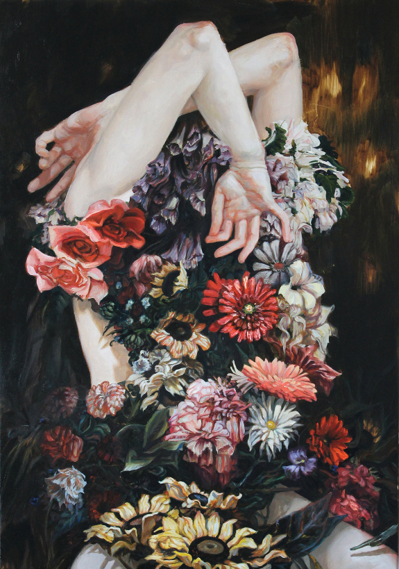
Birds must have magically wonderful lives, don’t you think? I’m always envious of their freedom and grace, their ability to walk on land, swim through the water ( well, some birds ), and fly to far off places. As delicate as they may seem, birds are strong, hearty creatures. In her series of avian paintings, London artist Amy Judd beautifully explores the relationship between woman and bird that has been the subject of many a myth and tale.
In Judd’s work, the feathers serve as armor, a sign of strength and dignity. Their delicacy belies the protection they offer, just as in their avian counterparts. Classically lit figures glow ethereally as if somehow transformed by their gossamer shields.
Do you ever find yourself fascinated by the way certain substances act and react? I’m always intrigued by how different types of liquid interact.. the way oil floats on water, how you can make those pretty drinks by layering the heavier liquid at the bottom of the glass. New York artist Julie Evans takes advantage of liquid reactions in her abstract creations of water-based media on mylar.
These Rorshach-like works seem to take on different forms depending on your perspective.. appearing at once botanical, sea creature-ish, even like organs in our own bodies. What I’m most intrigued by is the various consistencies that the media seem to take on throughout each composition, lovely transparently thin layers melt into deep pools of pigment.