Category: Paintings

  • Artsy Diggs: In the Studio with Deann Hebert

    Artsy Diggs: In the Studio with Deann Hebert

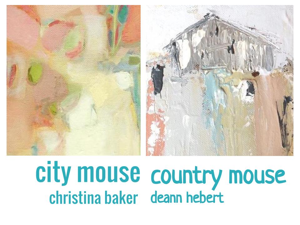
    One of my favorite activities in the world is visiting artists in their studios or even getting a little peek inside through photographs! Whether an artist is working from a light filled loft or a small corner in the kitchen, the way an artist approaches their workspace says so much about their creative process. I suspicion you enjoy studio visits, too.. And so dear Artsies, I thought I would treat us to a little jaunt to the studio of Deann Hebert website You may recognize Deann’s work from the City Mouse | Country Mouse show currently online at Found Gallery here at Artsy Forager.

    Everyone, say hello to Deann!

    Deann and I decided this trip to her studio would give us the perfect opportunity for you to get acquainted a bit better. So she indulged me by answering a few questions inquiring Artsies might like to know..

    Artsy | You have such a unique style of applying paint to canvas! Can you tell us a bit more about your process?

    Deann | My process has definitely evolved over the years. I have always been attracted to texture, and palette knife painting. I wanted to create a style that married these two together. A key factor in this was the opportunity I had to study abroad while receiving my formal training. It exposed me to different cultures, ways of thinking and creating art. It was really just a trial and error type of thing. It’s a process of applying layers on top of layers. With each layer reacting with another. Once I got into my “groove” of painting, it just felt right. I literally had an “ah-ha” moment, of “this is who I am!”

    20130306-152710.jpg

    AF | How have you seen yourself grow as an artist over the years?

    DH | Oh I have changed so much over the years. I think it’s only a natural progression that a fine artist changes and grows. I hope I am always changing and evolving, not being static. I think this is where true creativity comes from. Over the years my work has gone from bright, bold colors and still lifes, to more muted tones of blues, creams, greys, and landscapes. Who knows what the future will bring!

    20130306-153337.jpg

    AF | What is the most exciting part of painting for you?

    DH | The most exciting part of creating for me, is watching the painting literally become something right before my eyes as it is on the paint table. But, the créme de la créme, is evoking an emotional reaction from the viewer, for whatever reason.

    20130306-153904.jpg

    AF | What is it about the country that captures and holds your imagination?

    DH | Well, this little country mouse grew up in a small town and my family always owned horses and cows. So growing up “in the country” was our way of life, and I absolutely loved it. The texture of an old barn or fence, or grass growing in the fields remind me of my childhood days. Unfortunately, many of these old structures are falling victim to time and neglect, but still are a direct link to the past, and the present. These barns tell a story, too, if we could only listen to them, to me, they are the heart and soul of the South. Even my studio walls are made from reclaimed wood from a historic barn that was torn down, so my inspiration, is quite literally, everywhere. Now, I am lucky enough to call Tennessee home, and the rolling hills and landscape are truly inspiring to me and beautiful. In my own little way, I want to pay homage to that.
    Margaret Britton Vaughn, Poet Laureate of Tennessee, says it best in her poem:

    BARNS OF MY YOUTH

    I miss the barns of my youth,
    The ones that read, “See Rock City.”
    Hungry Caterpillars ate them alive,
    Spitting out nails
    To become thorns in the side
    Of crawling asphalt,
    Erasing small towns
    To link big cities
    They die hard, these old barns,
    Leaning on the everlasting
    Shoulders of Time
    That cushion the fall of rotting boards.
    Light seeps through decaying skeletons,
    Causing shadows to tiptoe
    Like ballerinas dancing the waltz of the wind.
    In our hurry to get there
    We destroyed the landscape:
    Masterpieces of America.

    20130306-154257.jpg

    AF | You are very involved in children’s art activities, like Art Camp. What do you see as the most important creative lesson a child can learn?

    DH | Since I have two children myself (2 and 6), exposing children to the arts is very near and dear to my heart, and I think the most important creative lesson a child can learn is that art can be used to express yourself in ways that nothing else can. That you can actually say something with your art.

    20130306-154545.jpg

    AF | Obligatory question. If you weren’t an artist, what would your dream job be?

    DH | It’s so hard to answer that question because I am living my dream job…. but let’s see, since I love to travel, I always thought Samantha Brown had the coolest job ever to tour the world and work for the Travel Channel show, “Great Hotels”. How cool would that be?!

    That would be a pretty sweet gig, but I have a feeling most folks would trade with you in a heartbeat! Thanks so much for opening up your studio to us, Deann!

    To see more of Deann’s work, please visit her Deann Hebert website and the City Mouse | Country Mouse online show and sale in Found Gallery here at Artsy Forager. Big thanks to Ray Sanduski of With an Eye Photography for the gorgeous shots of Deann’s creative space and process. Be sure to check out Ray’s website!

  • Eternal Spring: Temre Stanchfield

    Eternal Spring: Temre Stanchfield

    It’s March. This time last year, we were in Northern Idaho and I’m pretty sure we were still wearing heavy sweaters and boots. But spring has officially sprung here in the desert! Although the emerging season definitely looks different here. The paintings of Temre Stanchfield remind me that somewhere there is a spring filled with soft petals, not cactus blooms.

    Starlight by Temre Stanchfield
    Starlight, oil on canvas, 36×36
    Truffle by Temre Stanchfield
    Truffle, oil on canvas, 30×36

    The artist’s floral groupings have a delicate strength, much like the plants themselves. Only slightly reminiscent of traditional floral still lifes, these bouquets seem much more fresh and alive.

    Chortle by Temre Stanchfield
    Chortle, oil on canvas, 24×24
    Twinkle by Temre Stanchfield
    Twinkle, oil on canvas, 36×36

    As seeds float away from petals, we are reminded that the blooms we cherish so much are just one part of the life cycle of the plant. That the more quiet, dormant periods of a life are essential to the blossoming.

    Merry Dew by Temre Stanchfield
    Merry Dew, oil on canvas, 36×36

    To see more of Temre Stanchfield’s work, please visit her Temre Stanchfield website.

    All images are via the artist’s Temre Stanchfield website.

  • Art to Inspiration: Laura E. Pritchett

    Art to Inspiration: Laura E. Pritchett

    Art to Inspiration is back!  The time for this collaborative blogging project is here once again and this month’s inspiration is being provided by artist Laura E. Pritchett.  I have always loved the possibility inherent in the disappearing path.. One of the artists showing in our City Mouse | Country Mouse exhibition in found galleryDeann Hebert, also has a love for roads that lie before us.  So for my Art to Inspiration, I’ve put together a little gallery of Deann’s own paths taken.

    The inspiration–

    Out of the Woods by Pritchett
    Out of the Woods by Laura E. Pritchett

    The gallery– 

    The Path by Deann Hebert
    The Path**
    Country Road by Deann Hebert
    Country Road**
    Gracefully Growing by Deann Hebert
    Gracefully Growing**
    The Good Life by Deann Hebert
    The Good Life
    The Path I've Chosen by Deann Hebert
    The Path I’ve Chosen

    Asteriked work can be found ( heh, get it? ) in the City Mouse | Country Mouse exhibtion.  The other work by Deann can be found on her website.  What paths are you contemplating these days?

    You can find more information on Art to Inspiration here and if you would like to participate in the next Art to Inspiration, just fill out this form! Follow me and all the other Art to Inspiration bloggers on Twitter by subscribing here.  Let the inspiring begin! 

    Out of the Woods image via Laura E. Pritchett.  Other images via Deann Hebert.

  • The Abstract and The Absurd: Simon DeGroot

    The Abstract and The Absurd: Simon DeGroot

    Confession: there are times when I am bored by art.  Not often, but Mr. Forager will testify that it’s pretty obvious when I’m not crazy about the work I’m looking at.. my eyes just kinda glaze over or even worse still, I take one glance, shrug my shoulders and walk on in hopes of finding something more interesting.  But the work of today’s artist?  Nu uh.  I couldn’t stop looking and agonized over which work to include for you.  Yep, Brisbane artist Simon DeGroot knows how to capture my attention.

    Maintain Pleasure Personally by Simon DeGroot
    Maintain Pleasure Personally, screenprint, acrylic and oil on board, 600x800mm
    Copia Avis with Purple by Simon DeGroot
    Copia Avis with Purple, screenprint, acrylic and oil on board, 800x800mm

    First, there are these wonderfully absurd collages, filled with seemingly incongruous imagery like traditional Dutch still lifes, toy trucks, shelter magazine shots and of course.. Big Bird.  How do they all fit together?  Is it really necessary that they do?  DeGroot makes the compositions work using color, form and line, keeping our eye moving.  Keeping us guessing.

    But Is It Fragile by Simon DeGroot
    But Is It Fragile, 600x600mm
    Garnish by Simon DeGroot
    Garnish, 105x150mm
    Small Overload by Simon DeGroot
    Small Overload, 300x325mm

    Then there are the more purely abstract works– studies in vivid, expressive color against the pale or the black of an abyss.  Simple lines and shapes put together in that wonderfully it-seems-random-but-it-works-so-well-it-can’t-possibly-be.  Splashes of color and looping lines.  Perhaps more free than their collaged counterparts, but the compositions remain as grounded and sure as any classical still life.

    In Real Time by Simon DeGroot
    In Real Time, 600x600mm

    There is much more abstraction and absurdity on Simon DeGroot’s website.  Pixelated floral still lifes?  Wrapping paper collages?  He’s got ’em.  Be sure to check them out.

    All images are via the artist’s website.

  • March Featured Artist: Peri Schwartz

    March Featured Artist: Peri Schwartz

    I may have mentioned Mr. Forager has taken up beer making. Lately he has been obsessed with finding out the best methods and practices for brewing the perfect beer. He recently told me about a fellow brewer he found online that worked for over twenty years to perfect one particular brew recipe. Talk about practicing and perfecting your craft! This month’s Featured Artist, Peri Schwartz is equally tenacious in striving to capture every nuanced surface, angle and corner in her own studio.

    Studio IX, color monotype, 30×34.5
    Studio XXX by Peri Schwartz
    Studio XXX, oil on canvas, 38×48

    By narrowing her scope of work and field of vision, Schwartz frees herself to carefully explore her space, the forms inhabited therein, and the light that enters and retreats each day. Although her overall style and palette remains consistent, we can see her exploring how the space and objects are represented.. sometimes they are mere planes of color, other times their shapes are more concrete.

    Studio 12 by Peri Schwartz
    Studio 12, ink and charcoal on mylar, 12.34×27
    Studio 13 by Peri Schwartz
    Studio #13, ink and charcoal on mylar, 13.30x28x25

    In other instances, as in her black and white drawings above, she is carefully studying the effect of light on the familiar surfaces, carefully watching and interpreting the reflective play between light and shadow.

    Bottles and Jars XII by Peri Schwartz
    Bottles and Jars XII, oil on canvas, 30×20

    To see more of Per Schwartz’s work, please visit her website. You can also see an album of Peri’s work on the Artsy Forager Facebook page. Peri will be a busy bee soon with three openings– at Davis & Cline Gallery in April, Garvey/Simon Art Access in May, and Gerald Peters Gallery in July. Whew! Hope you’ll be able to catch one!

    All images are via the artist’s website.

  • Welcome our March Featured Artist!

    March is here! Where in the world did February go? Sneaky little short month catches me off guard every time. But I’m excited to welcome a new month because it means welcoming a new Featured Artist to Artsy Forager! Please help give a warm artsy welcome to New York artist Peri Schwartz!

    Studio XXXII by Peri Schwartz
    Studio XXXII by Peri Schwartz

    Be sure to head on over to the Artsy Forager Facebook page where Peri’s work will be gracing the cover for the month of March! And don’t forget to check out her Facebook album, where you’ll see a combination of her latest work and a few of my personal favorites. Happy month of March!

    Image via the artist’s website.

  • Amplified Spaces: Jeffrey Palladini

    Amplified Spaces: Jeffrey Palladini

    Hotels are usually advertised as a luxurious means of escape. A place where you don’t have to make your bed and clean, neatly folded towels appear while you are out as if by magic. But they can also be places of desolation and despair. Where a cast-out husband goes to sort out his life, where the traveling salesman spends countless hours missing his family. In his Hotel series, San Francisco artist Jeffrey Palladini explores the intimacies of this microcosm of life.

    Pool #10 by Jeffrey Palladini
    Pool #10, oil and charcoal on wood, 55×37

    When I first spotted Palladini’s work at the Palm Springs Fine Art Fair, I was immediately drawn to his quiet expanses of solid color. The simplicity of his palette adds to the somber, isolated feeling in some of the work.

    A Late Morning by Jeffrey Palladini
    A Late Morning, oil and charcoal on wood, 13×9
    Missing Our Reservations by Jeffrey Palladini
    Missing Our Reservations, oil and charcoal on wood, 13×9
    The Highlights by Jeffrey Palladini
    The Highlights, oil and charcoal on wood, 13×9

    Then there’s the flip side of hotel visits– when all is fun and irresponsibility. Staying up late, sleeping in, lounging around the pool doing nothing at all. The anticipation of what might happen and memories you might make. In showing us glimpses of his subjects from behind, we voyeuristically gaze, wondering which kind of hotel scene we’ve stumbled upon.

    Pool #8 by Jeffrey Palladini
    Pool #8, oil and charcoal on wood, 37×25

    If you’d like to see more of Jeffrey Palladini’s work, please visit his website.  I hope you love this work as much as I do.  Seriously it was like a scene from a hotel bar.. I spotted it across a crowded room.. 😉

    All images are via the artist’s website.


  • Intimate Weavings: Michelle Forsyth

    Intimate Weavings: Michelle Forsyth

    Sometimes there is nothing more inviting than curling up in one of Mr. Forager’s shirts.  He has his favorites and most of the time, the others hang in the closet, just calling out for me to put them on!  They’re so roomy and comfy and wearing them physically connects us.  Pullman, Washington artist Michelle Forsyth has created an entire series centered around the plaid patterns her own husband’s shirts, lovingly titled Letters for Kevin.

    Kevin's Shirt: Seven Diamonds by Michelle Forsyth
    Kevin’s Shirt: Seven Diamonds, gouache on paper, 10×10

    The series consists of paintings of the initial plaid patterns, the weaving of the actual material in her Pullman studio, and often the eventual painting of the finished textile crumpled against a stark background.  I’ve often made mention of the importance and influence of the materials we clothe ourselves in.  And, as evidenced in Forsyth’s series, the tale being woven by our choices isn’t one just for our own ears, but a story we are telling to others, as well.

    Kevin's Shirt: Vintage by Michelle Forsyth
    Kevin’s Shirt: Vintage, gouache on paper, 10×10
    Michelle Forsyth Studio
    Studio in Pullman, WA
    Kevin's Shirt Vintage ( woven ) by Michelle Forsyth
    Kevin’s Shirt: Vintage ( woven ), wool, alpaca and cotton, 18x 40

    These plaid patterns, with their beginnings in Scottish highlands, were also once the domain of preppy yuppies in the 80s and grunge fashion in the 90s.  So with such a diverse background, what can we infer from these plaids?  Perhaps, due to the grid-like repeating pattern that the person who wears them is stable and the rock for all who know him.  Or maybe the intersecting lines tell us he enjoys connecting with others and for others.  The artist, in the variety of patterns, may be telling us how many very different sides she sees to the person with whom she has chosen to spend her life.

    Small Plaids by Michelle Forsyth
    Small Plaids, all watercolor on paper, 5×5 each

    All of my inferences may be true or they may just be what I’m construing on my own.  But this series is obviously a labor of love.  Take it from another wife of a plaid-wearing husband.  To see more of Michelle Forsyth’s work, please visit her website.

    All images are via the artist’s website.  Artist found via Two Coats of Paint.


  • Suspended Effervescence: Kim Squaglia

    Suspended Effervescence: Kim Squaglia

    Ever throw a party, then wake up the next morning to a completely disheveled house, yet revel in the knowledge that you know a good time was had?  The work of California artist Kim Squaglia, with its effusive confetti-like dots and streamer-like lines against soft, solid backgrounds reminds me of the quiet morning after a rockin’ party.

    Lolly by Kim Squaglia
    Lolly, oil, acrylic and resin on panel, 24×24
    Lolly ( detail ) by Kim Squaglia
    Lolly ( detail )

    As you can see in Lolly ( detail ) above, Squaglia’s technique of layering acrylics, oil and resin results in incredible depth, almost cut-paper like in nature, adding to the confetti and streamer effect I can’t seem to get out of my head.

    Scend by Kim Squaglia
    Scend, oil, acrylic and resin on panel

    Then there are works like Scend ( above ) and Cirque I ( below ), which are a bit more reminiscent of cosmic configurations and tangled vines.  There is also an interesting cell-like structure to many of her compositions, which may seem like a microscopic peek inside the human body or other organism.

    Cirque I by Kim Squaglia
    Cirque I, oil, acrylic and resin on panel, 48×72

    So many possibilities to be discovered!  What do you see in Kim Squaglia’s work?  To view more of the artist’s work, please visit her website.

    All images are via the artist’s website.

  • Now Showing in Found Gallery: City Mouse | Country Mouse!

    Now Showing in Found Gallery: City Mouse | Country Mouse!

    The artsy mice have officially invaded Artsy Forager!  Our very first online exhibition and sale, City Mouse | Country Mouse is now on view in the found gallery !  I’m so excited to present the work of two talented Nashville artists, Christina Baker and Deann Hebert.

    If you’ve been reading the blog for awhile, hopefully you’ll recognize the work of these painters.  Each painting is an original and available for purchase through the artists, with a portion of the proceeds benefitting the Nashville Zoo.  Now I’m not sure they have any mice at the zoo, but I’m sure there are lots of other wonderful little furry foragers!

    City Mouse | Country Mouse will be showing in the found gallery through March 28th, so you’ll have until then to snatch up one of these beautiful little paintings all for your very own!  Throughout the month we’ll get to know the artists a little better, too!

    So what are you waiting for?!  Grab a handful of cheese and click here to see for yourself!