Once, in a job interview, I was asked what my favorite fashion brand was. I told the interviewer, I would love to be a Free People girl. But I think I’m more Anthropologie. And I think it’s the same with painting. I’ve gone through this questioning before, a few years ago, and thought I’d come to a happy conclusion.
But voices come in from all directions and we give them heed, perhaps we should but more than likely we shouldn’t.
Am I making work that makes my heart sing, that challenges me or am I making work that focuses on the way other people respond to it?
give me your forever, 2016, acrylic on cradled wood panel, 12×12
I’m a quiet person. I’m not loud or brash or even sparkly. I’m introspective. Some might say mysterious, since I usually keep my cards close to the vest. Why would I try to make work that doesn’t reflect who I truly am?
As I was beginning the VENTERS series, I experimented a bit with slightly bolder movement and texture and while successful, the more quiet and soft paintings that have come lately feel more “me”. I just finished up four more small coastal inspired pieces and am starting on larger canvases this week. They are turning out beautifully and sharing them will feel like sharing my heart. As art should be. I can’t wait for you to see, stay tuned!
I’ve never been good at keeping a sketchbook, or even painting daily unless I can block off a few studio hours to really paint. So the idea of creating something every day for 100 days was intimidating, but the idea of pushing myself in that way really excited me.
With a bit of trepidation, on Tuesday, April 19th, I began #the100dayproject, committing to creating every day for 100 days and sharing the results on Instagram.
Working within certain parameters would, I knew, make this process easier to document and control, so I decided to create 100 small artworks on 6×6 vellum ( I’m addicted to these little guys for quick sketches ). I started with acrylics for the first few pieces, whipping out quick little paintings while I worked on bigger canvases in the studio.
But I soon switched to watercolor, as it just so happened that the beginning of the project coincided with our prep to move from OR to WA, so the watercolors were much easier to whip out while my acrylics were packed away.
And I do believe a love affair with watercolor has begun! A large part of what artists who have participated in #the100dayproject have experienced has been a creative breakthrough or the discovery of a new technique or new palette or approach. I don’t plan to give up acrylics, but I do think I’ll be exploring watercolor on a larger scale very soon!
You can follow my #the100dayproject progress by following me on Instagram or searching the hashtag #100littleartworks. There is also now a #100littleartworks page on my artist site that I’ll be updating periodically.
I’m enjoying this new journey! Have you ever participated in a daily creative challenge? What did it do for you?
As I was finishing up the work for my LATITUDE show, my mind was already overflowing with ideas for my next body of work. But I was having a hard time narrowing my scope. Then my hubby and I took a weekend trip to the Oregon Coast. And my new series, VENTERS, was born.
A dozen new paintings in my VENTERS series are now available at Art & Light Gallery in Greenville, SC! You can also see all of the work on my website. More on the inspiration behind this new series, coming soon! I can’t wait to see how our new spot near Puget Sound influences what is to come.
You guys, there are some artist’s work that I just adore. And I just can’t help but share with you when such an artist has a new body of work to share or a solo show that you must see! Artist David Pirrie has a solo show, Mapping the Rockies, at Ian Tan Gallery in Vancouver, BC until April 30th.
In the artist’s own words, “I use the dots and grids to represent coordinate plotting, metaphorically pointing to the impermanence of their man-made structures that attempt to prescribe location at the intersection of human and geological time. I also paint evidence of erosion, hoping to remind us of the temporal nature of the mountains which, seemingly anchored in time, force us to acknowledge our transient existence on this earth.”
If you are in the Vancouver area, get to Ian Tan Gallery & see this show before it closes! See the show paintings here and more of David’s work on his website.
When I look at a painting, I always wonder how the artist arrived at its eventual conclusion. How did they begin? How did the painting evolve and what choices did the artist make along the way?
So I thought you guys might be interested in seeing the journey that one of my LATITUDE paintings took. I always begin with covering the canvas in a medium-toned ground. My favorite way to begin is with a creamy salmon pink tone in which I will often work out the basic composition by adding lights and darks.
Then I’ll start mapping in the bigger spaces in the painting.. In this painting, the sky was the first thing I started working. I knew the sky would end up being very light and foggy feeling but I always start with fairly saturated color and just keep pushing it back by painting on light layer after light layer.
I actually posted a photo at the stage above on Instagram & Facebook and lots of folks assumed it was a finished painting! I guess it could have been, there was definitely something about this stage that I really liked.
The next stages involve refining and shaping. The original flatness of the land shape wasn’t working for me, so I extended it up the side of the canvas to create more depth and draw the eye farther up the canvas. More depth and texture was added to the landforms so that they felt less like a marsh and more like the Pacific cliffs I’d intended.
In addition to adding depth in the form of darks and lines, the next stages involved adding light color and expressive marks to the landform shapes while continuing to lighten up and push back the sky.
Looking back, I am really drawn to those expressive marks in the right photo above. Some of that expression was retained, but I do wonder what would have been if I’d been able to retain that feeling but it wasn’t to be this time..
This ^ was the point in which I was really wrestling with this one. I was happy with where that sky section was and I loved the feeling of depth I was getting in the upper section, but the lower 2/3 was a whole other story. Somewhere along the way, I’d lost the expressiveness and definition and while I love misty-softness, it was feeling way too blah. Plus that wandering water shape coming down the middle was losing it’s jagged edges so it looked less like a tributary and more like a sock. Womp womp!!
I kept plugging away and got to this point before needing to leave the studio for dinner with Mr. F.
I try to get as much done as possible in the studio during the day so that we can have our evenings together. But there are nights that I just can’t call it a day, I feel so driven to come to a stopping point I’m happy with for the day, whether that is a finished painting or not. So I went back over to the studio after our dinner. Sometimes those evenings at the easel are just what I need– I crank the music ( something I can’t do during the day in my shared Ashland studio ) and just work until I get to that happy point. Luckily for this painting, the happy point for the night was a finished painting.
tenderness & time (48.53.53 N), acrylic on canvas, 36×36; ScanSource collection
While the music wafted through the studio, I upped the contrast, added more color and texture through transparent washes in rich greens, turquoises and purples. I took back the jagged shape of the water coming through the cliffs and what resulted was a painting that was one of my favorites in the LATITUDE show.
See the step by step progress in the .gif below! Hey ya’ll, I created a gif! I’m so proud.
The process of this painting is pretty typical for me. I wrestled a bit more than usual with this one, but there is always a bit of tussling involved to get to the vision in my head. One day perhaps the process will move a bit more swiftly and easily, but I’m not sure I would get the same amount of satisfaction if it were too easy to accomplish. If it were easy everyone would do it, right?
When I began to put to think about the direction for the LATITUDE paintings, I knew they would be heavily influenced by my past four years in the Northwest. While their style would create a common thread, I wanted them to be cohesive in other ways as well. So I began looking through photos of the moments I wanted to capture, looking for palette commonalities.
To capture the look and feel of the Northwest, I knew I wanted to include–
Cool blues and lavenders, echoing the water and overcast skies
Deep greens, for well, the evergreens so prevalent in the Northwest
Pops of pink and orange, to capture the warmth that sneaks in
Creamy whites and creams inspired by the fog and waterfalls
So I began the way I always do when honing in on a project.. with a Pinterest board, of course! It was these images that I hung up on my studio wall, along with the moments that the paintings were to be inspired by. And they informed my color choices each step of the way.
This exercise was invaluable to me as it kept my color choices in check and consistent with the vision I had for the completed series. I’ve begun a new series ( more on that soon! ) and have started this process all over again.
What about you? How do you approach color when working in series?
Endless inspiration. That’s how I feel about Yellowstone’s prismatic pools. I could paint them forever.
These deep steaming springs draw millions of people to Yellowstone each year and with good reason. Their boiling temperatures create magical steam, rising above chalky rock and water colored unlike any other.
They each feel like a world unto themselves. An entire landscape within the vastness of Yellowstone.
I would seriously move just to be near these wonders.
For the LATITUDE show, I created a mini-series within the show, Prismatics, my abstract interpretations of the pools in paint.
Prismatics 1-16, acrylic on cradled wood panel, 6×6 each
See larger images of Prismatics 1-16 on my website and see them up close and personal at Art & Light Gallery in Greenville, SC through the end of March.
The world wide web can be a strange place. We “meet” folks with whom we share interests and affinities. Friendships are made with people we’ve never laid eyes on in real life. Seattle artist Melanie Biehle and I share a love for the Northwest, Gilmore Girls, art, and travel.
Her most recent painting series, Nomads, “is inspired by wanderlust, how it feels to be a traveler, and what I imagine it would be like to accept a new place as home for a while.” No wonder I love it so much, it perfectly describes my life!
I love the graphic quality of Melanie’s work– can’t you just see the wanderings across each of these pieces? See more from the Nomads collection and read about the inspiration behind each piece on Melanie’s website. And be sure to follow her artistic journey on Twitter, Pinterest, and Instagram!
Ya’ll it has been a whirlwind few months. Followed by a whirlwind five days in Greenville, SC for the opening of my LATITUDE show at Art & Light Gallery! Greenville welcomed me with warmth and sunshine and made this Northwestern girl feel right at home.
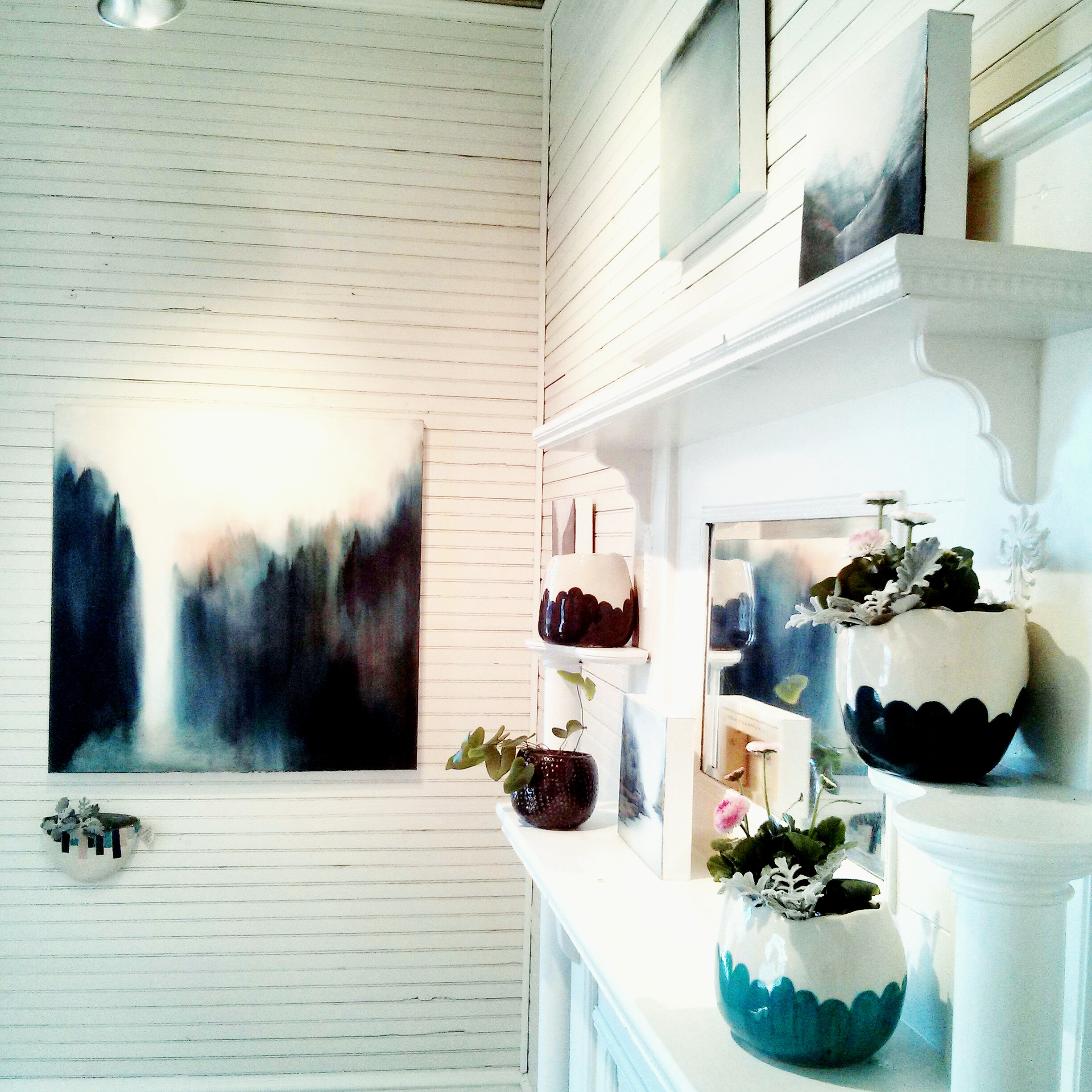
Teresa Roche, the owner and curator of Art & Light has created such a beautiful space! From the moment you step on the front porch and open the screen door ( so Southern, ya’ll! ), the space feels like stepping into sunshine. The house turned gallery/ art studios exudes old Southern charm, yet its clean white walls and sparse rustic furnishings feel completely modern. The mix of contemporary and organic is perfect for my work! Want to take a peek inside? Come on in!
This slideshow requires JavaScript.
Because A&L is housed in an old Greenville home, the galleries are small rooms perfect for wandering. Candidly, I was a bit worried that my work was too Northwestern in feel to fit in with Greenville’s historic, Old South vibe.
I was so surprised not only with how beautifully it fit, but with how many Gville folks either had NW connections or found their own LATITUDE moments in mine.
This slideshow requires JavaScript.
Ceramic artist Dee Sullivan created custom pottery pieces to go with the LATITUDE paintings, such a treat and they were just perfect! If I had a home to put them in I would have gladly purchased several, one wall pocket especially caught my eye ( and everyone else’s I might add! ).
My family came in from Florida and North Carolina to be with me and see the show but I also have a new Greenville family! Thank you to Teresa, Kiah, Everett and all the Greenville folks who have made this show such a success! There’s still time to see LATITUDE, the work will be up at Art & Light through the end of March. And if you’re not in Greenville, you can peruse all the paintings on my website.
Most images by me. Family group photo and panoramic gallery photo by my sister-in-law. Greenville family photo by Everett Waldrep.
Exclusive just for Artsy Forager readers! I’ve updated my website with all the works in my solo show, LATITUDE, opening tomorrow and I’m only sharing the news here on Artsy Forager.
Tenderness & Time (48.53.53 N), 2015, acrylic on canvas, 36×36
So if you’re not in Greenville but would like to see what’s in the show, just follow this link to the show page on my website. I’m on my way to Greenville as I type! Will be posting updates on Instagram and be back here next week for a recap of how it went!