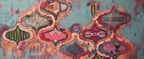
Spring has finally taken hold and color is exploding everywhere! And speaking of bursting color, make sure you go over to Escape Into Life today to see the work of German artist Markus Linnenbrink. He is masterful in his use of bright and brilliant hues!
Sammy Davis jr, Kee Joo and Peter Lawford by Markus Linnenbrink, c-print, epoxy resin and wood, 31×24
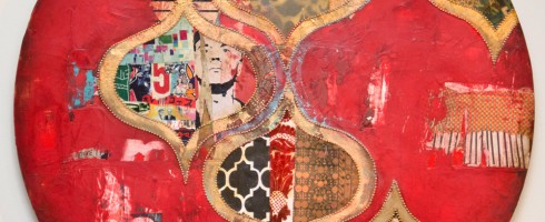
The first time I saw the work of Jill Ricci, I was completely smitten. Her palette, use of texture, pattern and materials lend such a glamourous edge to her work. Wonderfully feminine and sophisticated yet rustic-ly urban. I’m giddy to have her as the Facebook Featured Artist for May! So much so that I find myself going to the Artsy Forager Facebook page just to gaze at her cover image. Is that weird?
Breathing Room, mixed media on canvas, 48×24
Her work reminds me of the things I love so much about New York– the glamour and elegance of the city, its history and architecture, how it teems with life and colorful characters.
Decadent, mixed media on canvas, 48×36
But even as we idealize the city, it hits us with its grittiness, its realness. As the song goes, “If you can make it there, you can make it anywhere.” Ricci’s work shares that same energy, stubbornness and passion.
Star-Crossed, mixed media on canvas, 14×14
Like apartment windows in the city, each portal in Ricci’s work is a glimpse into a different world– graphic niches to discover and explore.
Thoughtful, mixed media on canvas, 48×30Happening, mixed media on canvas, 30×40
If you haven’t done so already, head over to the Artsy Forager Facebook page to see an album of more of my Jill Ricci faves– tell me which is your favorite! And of course, check out her website for even more gorgeousness!
Featured image is Bullseye, mixed media on canvas, 48×24. All images are via the artist’s website.
Note: The title of this post is a reference to the original Dead or Alive song, not more recent versions featuring people who are possibly young enough to be my children. Children of the 80s unite!
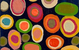
I love art of all shapes and sizes. Large scale, small, square, rectangle, ROUND. Artists who take on the circular composition get extra kudos. Check out some examples I’m loving this week!
Andy Says by Jill Ricci, mixed media on wood, 24″ diameterNational Soil Destruction Leading to Self Implosion by Steve Williams, mixed media, 48″ diameterEmily by Ben Hughes, oil on canvas, 22″ diameterNo. 555 by Nicholas Bodde, oil and acrylic on aluminum, 80cm diameter
Any other orb-obsessed artists I should know about? Tell me about ’em in the comments!
Featured image is Andy Says by Jill Ricci. Be sure to head over to the Artsy Forager Facebook page where Jill Ricci is this month’s featured artist! All images are via the artists’ websites, linked above. Special thanks to The Jealous Curator for introducing me to Ben Hughes’ work!
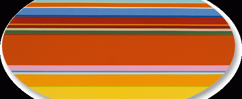
The way colors play off one another has always attracted me. There are certain designs I find myself staring at over and over again simply for the juxtaposition of hues and how they relate together. The work on Nicholas Bodde strikes my chroma-loving heart to the core.
No. 741, acrylic on aluminum, 80 cm diam
Bodde’s work is beautiful in its simplicity and in its joyful exploration of color. Parallel, horizontal stripes race across the canvas in a controlled riot, almost like we’re looking out a car window while whizzing by a carnival or planted fields of flowers.
O.T., acrylic on aluminum, 100 x 56 cm
Especially in the works featuring wide bands of blue or orange at the top of the canvas, these seem like distilled landscapes. Complex scenes broken down to simple bands of color.
O.T., oil and acrylic on aluminum
In this way, the placement of colors on the canvas and beside each other takes these away from being just painted stripes of color and into sophisticatedly designed patterns and compositions. And they simply make me happy.
No. 749, oil and acrylic on aluminum, 80 cm diamO.T., oil and acrylic on aluminum, 100×55 cm
To see more of Nicholas Bodde’s work, please visit his website. How are you embracing color these days?
Featured image is O.T., acrylic on aluminum, 100×56 cm. All images are via the artist’s website.
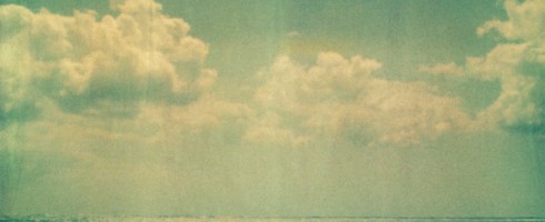
.. and not a drop to swim in. Well, without a wetsuit, at least here in Northern Idaho. What is it about the water that calls to us, calms our senses, rejeuvenates? These photographers might have a clue, as they’ve answered water’s siren song..
Philippe ChengMertxe AlarconTulum by Neil KrugWave Study I by Thomas Hager
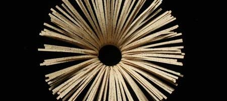
Wow. Has another month really gone by already? It’s Art to Inspiration time again! This month’s inspiration, Echoes of Fragrant Voices by Jo Howe inspires me on so many levels. Her sculptures, created from book pages ( love level one- check! ) are full of beautiful shapes ( two- check! ), soft color ( three- check! ), rhythm ( four- check! ) and gorgeous texture ( that makes five- check! ). Just as with Pakayla Biehn’s work last month, Jo’s work inspired me to create a gallery of varied complementary works, each of which shares characteristics reminiscent of Jo’s work.
The inspiration:
Echoes of Fragrant Voices by Jo Howe
The gallery:
Pendant by Erik Gonzales, mixed media on panel, 60×60Half Hickory by Virginia PettyCore III by Joe Segal, wood and paint, 54×9Trophy by Brenda Mallory, cloth, wax, welded steel, 20x20x13Mercury by Karen Margolis, watercolor, gouache, graphie, thread on Abaca paper, 11×14Expansion by Haley Farthing, pastel on wood, 48×24Relic by Jay Heryet, box elder, 200mm diameter
Visit the artists’ websites, linked above, for more inspiration!
You can find more information on Art to Inspiration here and if you would like to participate in the next Art to Inspiration, just fill out this form! Follow me and all the other Art to Inspiration bloggers on Twitter by subscribing here. Let the inspiring begin!
All images are via the artists’ websites unless otherwise noted.
Anyone who knows me knows that I’m far from a wild child. I tend to be calm, controlled, even-tempered. Maybe that’s why I’m drawn to abstract expressionist work like a moth to a flame. And the work of Delray Beach artist Brenda Hope Zappitell is a fire this little moth can’t resist!
In Search of Sunrise II, acrylic with cold wax on panel, 42×42
In her work, Zappitell “surrenders control to the paint, the brush and a visceral process of creative discovery” [sic]. She works spontaneously and rapidly, following the paint as it dances across the canvas.
In Search of Sunrise I, acrylic with cold wax on panel, 42×42
Taking her inspiration from the energy of nature, her palette builds from light, delicate tints to saturated rapid-fire strokes of bold color.
A Matter of Perception, acrylic with cold wax on panel, 48×48
Squiggles and strokes that could almost be graffiti-like still retain their softness, like a flourishing garden in the middle of an urban metropolis.
Embracing Uncertainty II, acrylic with cold wax on panel, 30×36Reverie I, acrylic with cold wax on panel, 48×48
To see more of Brenda Hope Zappitell’s work, please visit her website. You can see her work in person at several galleries across the US– be sure to check her website to see if there is one near you!
Featured image is Translation, acrylic with cold wax on panel, 60×30. All images are via the artist’s website.
Sometimes the simplest work can be the most powerful. I’m really drawn to these graphic, color-blocked paintings by Dwayne Butcher that I’ve posted over on Escape Into Life today. Go check ’em out!
I Got No Use for Trouble, acrylic on canvas, 18×16
Pretty sure I read in the latest InStyle Magazine ( we all have our guilty pleasures! ) that polka dots are big for spring. Maybe it’s the influence of Damien Hirst’s spot paintings. Here are some more artists marking the spot!
Small Spots by Georgia Gray, acrylic on canvas, 10x20cmPatterns With Purpose O by Paul Ecke, mixed media on panel, 48×60Cut 11-034 by Michelle Y. Williams, metal/plexiglas, 15×15#562 by Tory Cowles, mixed media, 48×48
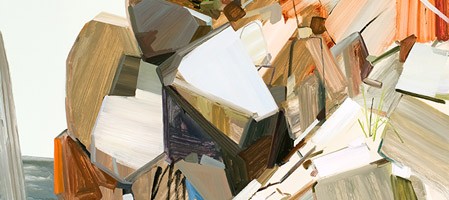
There is a quiet power that abides in certain landscapes that compels us to humilty. No cell phone reception, no internet, no traffic whizzing by. Nothing to make us believe we are the center of the universe. Just earth and rock and water and light. It is in these places that the earth is welcoming, yet can be strong and unyielding. The work of New York artist, Claire Sherman captures the essence of the quiet, raw power of our natural world.
Boulders, oil on canvas, 86×78
Sherman’s overall cool palette, tinged occasionally with warm tones conveys the earth’s reticent beauty. It wants us to explore and appreciate its wildness, but fears the mark our hand often leaves.
Butte, oil on canvas, 72×84Ravine II, oil on canvas, 84×96
This is still a dangerous place. We often forget, wrapped safely in suburban cocoons, thinking we are master of all that we survey. Yet still in many places, one wrong step and we may become prey to the earth’s power. The artist’s linear, often jagged brushwork reminds us to tread carefully. She is beautiful, yes, but we must never forget her untamed nature. Try as we might to use her up, certain parts of the earth will always remain wild and inhospitable to man.
Holes, oil on canvas, 72×60Trees III, oil on canvas, 78×84
These places are for her renewing and for moments ours, but they belong to her. That we will do well to remember. To see more of Claire Sherman’s work, please visit her website. Her work can be seen in person at the Kavi Gupta Gallery in Chicago.
Featured image is Pile of Rocks, oil on canvas, 72×78. All images are via the artist’s website.