Tag: abstract art

  • My Husband GETS Abstract Art.. finally

    My Husband GETS Abstract Art.. finally

    My hubby is a very intelligent and creative person in his own way– the stories he concocts and “sketches” he comes up with are Saturday Night Live-worthy and he reads books like A People’s History of the United States for fun.  But when we started dating, he was definitely an art-world novice.  Questions like, “But what exactly is wrong with Thomas Kinkade?” made my head want to explode.  But maybe the biggest struggle was trying to explain what I loved so much about abstract painting and why no, honey, a 3rd grader could NOT have done that.

    George checking out Rauschenberg

    Part of what I love about George is how much he appreciates my creative side and artsiness.  Makes me more interesting than the average-gal, I suppose.  And, like all lovey-dovey types, I wanted to be able to share that part of myself with him.  We went to art festivals, galleries and openings, all in pursuit of awakening his mind to a world of art he may have never experienced before.  He became a fan of Christina Foard, following the opening of her Williams-Cornelius show, admiring her use of color and texture.

    Moonlight Solitude by Christina Foard

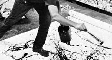
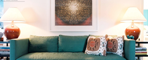
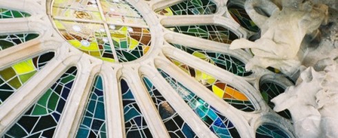
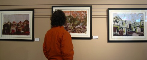
    We also discovered that he doesn’t always care for abstract expressionist-type work, i.e., seemingly random slashes of paint across a canvas, which will more than likely elicit a shoulder-shrug and a “eh” from him.  He does, however, appreciate light and texture, as he surprised me by totally digging these pieces we saw recently in a gallery in Hood River, Oregon.

    Artist: Barry Mack
    Artist: Barry Mack

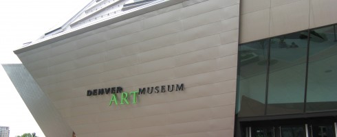
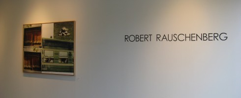
    Surprisingly, his tastes have emerged as running a bit more deep & avant-garde than mine.. where I get drawn in by beautiful color, texture and form, what may draw him to a particular work is the narrative of the story it is telling.  For instance, he was very interested in investigating the details of the Rauschenberg prints we saw in Tulsa.  He also tends to lean more toward multi-media work, such as this kind of creepy haunted-house-like part sculpture-part installation at the Denver Art Museum held his interest far longer than it held mine.

    Installation at the Denver Art Museum

    But what really keeps me on my toes is how inquisitive he is about what he is seeing– the process, the motivation, background story, etc.  He asks questions that I don’t always have the answers to, which results in us making discoveries together.  ( Who could ask for better? )  It is that inquisitive & curious nature that I think finally led him to the realization of just what it is about abstract art that makes it so interesting and provocative.

    Admiring the work of Hilary Williams

    As we were leaving the art gallery at The Pines in Hood River, George said to me, “I think I understand why you like abstract art so much.  When you see another realistic painting of a tree or landscape, it’s usually just another painting of a tree.  But abstract art draws you in, makes you think.”  YES!  Here’s to more discoveries with you, my love.

  • Museum Hopping

    Museum Hopping

    Though our time in the cities we visited on our cross-country tour was short, we managed to hit a couple of wonderful, yet very different museums along the way.  In Tulsa, we spent a few hours exploring the Philbrook Museum of Art.

    Front facade of the Philbrook Museum of Art

    My Jacksonville readers will be familiar with the Cummer Museum of Art in Jax.  The Philbrook is, to me, like the Cummer on steroids.  Like the Cummer, the Philbrook was once a private residence, which was donated to the city of Tulsa by its owners, oilman Waite Phillips and his wife Genevieve.  Once we entered the museum doors, we found ourselves in a gorgeous, domed center hall, light streaming through the oculus in the center of the dome.

    Center hall at the Philbrook
    Philbrook oculus

    Just walking the halls of this Renaissance style villa, built in 1927 and designed by architect Edward Buehler Delk for the Phillips as “a place where there two children could entertain friends” ( Imagine the sleepovers you could have! ), is a pleasure in itself.

    Corridor at the Philbrook

    The museum houses a varied and extensive permanent collection of art, ranging from African & Asian collections, Native American art to Italian Renaissance and a surprising and delightful modern collection.

    Bougereau at the Philbrook, a favorite artist of the Frenz’s
    Lovely little Picasso at the Philbrook
    Fabulous modern design collection at the Philbrook

    While the museum collections are enjoyable, it is the museum grounds that really steal the show.  Though we visited on a gray and rainy day, it didn’t stop us from exploring the extensive gardens behind the museum.  The original formal gardens extend from the rear colonnade of the museum down to the tempietto.  Let’s take a little walking tour..

    Rear collonade at the Philbrook
    View from the colonnade down to the tempietto
    Wonderful stepped fountain
    Beautiful, naturalistic water feature
    No formal garden is complete without a koi pond!
    View from the tempietto back toward the museum
    Yours truly in the tempietto ( wouldn’t this be a romantic spot to pop the question? )
    Contemporary sculpture walk beyond the formal gardens

    Let’s switch gears now, fast-forward through another 12 hour day on the road and pay a little visit to Denver.  While in the mile-high city, we spent some time downtown including a tour through the Denver Art Museum.  While the Philbrook is classically ornate, the DAM’s Hamilton Building, where we spent our time, is splendidly contemporary.  Designed by Daniel Lubeskind, the structure represents the Rocky Mountain peaks surrounding Denver.

    Denver Art Museum

    We started at the top and worked our way down, discovering lots of fun & interesting contemporary work along the way.

    Noguchi sculpture and Motherwell painting **Sidenote: Motherwell was born in Aberdeen, WA, the town where we are living for the summer.
    Ceramics at DAM

    Did you notice in the pictures above how the walls are slanted?  The angled walls created a very interesting visual space, especially in the 4th floor gallery where they were prominent.   They were a bit disconcerting when walking down the main stairs, though!

    Artist: Mark Tansey

    We were all fascinated by the piece above, by Mark Tansey.   Another highlight was the Fox Games installation by Sandy Skoglund.  I first saw Skoglund’s work in Jacksonville and am always fascinated by the environments she creates.

    Fox Games by Sandy Skoglund

    And there was just something about “Minotaur with Brushstrokes” that appealed to us.  What can I say, we like work that makes us smile.

    Minotaur With Brushstrokes by Richard Patterson

    Speaking of making us smile, George & I also loved the piece below, although I’m sad to report that I don’t recall the name of the artist.  But it reminded me of spring in the Northwest.

    Kicking myself for not writing down the title & artist for this piece! Anyone have any clues?

    The museum also boasts an impressive Western American Art Collection, as well as African, American Indian, Oceanic, Pre-Columbian and Spanish Colonial Collections.  We toured through the current special exhibition, Cities of Splendor: A Journey Through Renaissance Italy, but alas, no photography allowed in the exhibit, so you’ll have to check out the DAM website for a taste.  As you can see, our art experiences on this trip were widely varied and we are looking forward to more such experiences here in the Northwest.

  • Masterworks Monday:  Rauschenberg in Tulsa

    Masterworks Monday: Rauschenberg in Tulsa

    Hello Artsies!!!  After being out of the blogosphere for the past three weeks or so, I am finally back behind the computer, as it were and it feels great.  I have so much to share that I hardly know where to begin..  As many of you know, my hubby George and I recently moved from Florida to Washington.  We were incredibly blessed to be able to make a vacation out of our cross-country trek, with stops to see friends, new places and old favorites along the way.

    Our first stop ( OK, first fun stop.. we spent the first night in a motel outside Little Rock, AR, not super exciting ) was Tulsa, Oklahoma.  George lived in Tulsa for several years and we hadn’t been back since we got married, so decided to take a couple of days to introduce me around to Tulsa friends and places.  It just so happened that the friends we were staying with in Tulsa had a friend who owned a gallery, Exhibit by Abersons at Center 1 Tulsa.  Said friend of friends happened to be having an opening the night of our arrival in Tulsa, so even though there was a whole gang of people expected for dinner, we popped over to the gallery to have a peeksy.

     The exhibit, which opened on May 19th was curated by Master Printer Bill Goldston of Universal Limited Art Editions and follows the progression of Rauschenberg’s print work through the years.  Like any good Art History Major, I recognized Rauschenberg’s work and his importance as a painter & print maker, but beyond that, I admit I didn’t know much.  Rauschenberg came to the forefront toward the end of the Abstract Expressionist movement and toward the beginning of the Pop Art movement.  The prints included in the exhibition lean more toward the Pop end of the spectrum, showing examples of his collaging of photographic images through silk-screen processing showcasing pop culture imagery of the 1950s and 60s, such as Guardian ( 1968 ).

    Guardian is compromised of transfer images from Life Magazine, the transfers being done by brushing the images with solvent, placing them on the lithograph stone, then passing the stone through the printing press.  These are works that demand a closer look, there is so much going on, even little details are significant.  George enjoyed scrutinizing the work ( see photo below! ), which are so accessible that they seem just as relevant today as they must have 50 years ago.

    The work George is pondering is Bazaar, an intagilio print and lithograph on paper created in 1984.  Other highlights for me included, Aquafix ( below ), a haunting image created by Rauschenberg in 1981.  As the years progressed, his work evolved into cleaner, more simplified compositions as exemplified in Aquafix and Lotus VII, both favorites of mine from the exhibit.

    Lotus VII ( above ) is part of Rauschenberg’s final series of prints, completed only a month prior to his death.  The Lotus images were created for an exhibition of Rauschenberg’s work in Beijing and are compilations of photographs taken by the artist on two trips to China.  The photographs were transferred to panels, then an intagilio process, photogravure, was used to tie the images together visually.   The results are stunning images, which surely pleased Rauschenberg as his final legacy.

    If you are in the Tulsa area, be sure to check out the show at Exhibit by Abersons.  If you can’t get to Tulsa, Rauschenberg’s work can be found in many major museum collections with images, biography and other info available online, check out the websites of MOMA, The Tate, the Guggenheim and many more.

  • Masterworks Monday:  Jack the Dripper

    Masterworks Monday: Jack the Dripper

    A polarizing persona in the art world, Jackson Pollock, called “Jack the Dripper” by some, figured largely in the Abstract Expressionist movement in America.  His work  is such of the “love it” or “hate it” variety and it can often strike a chord with those who least expect it.

    Untitled, No. 3 by Jackson Pollock

    I remember taking a basic Art Appreciation class early on in college, with a good friend from high school.  Said friend was very conservative in most aspects and usually preferred the more realistic artwork we studied– but she loved Pollock’s work.  There was just something about it that she responded to.

    Untitled, No. 8 by Jackson Pollock

    Pollock’s process, referred to as “action painting”, involved several aspects that were innovative at the time– Pollock laid his canvases unstretched out on the floor, instead of stretched on an easel, utilizing household paints instead of more traditional oils and instead of brushing the paint on, dipped whatever was on hand into the paint and then slashed  & dripped it onto the canvas.

    Green Silver by Jackson Pollock

    I remember being intrigued by Pollock and his work, but it wasn’t until I saw one of his pieces up close & personal, in an Abstract Expressionist exhibition at the Cummer Museum in Jacksonville, that I truly became a fan.  Seeing the monumental scale of the work, the depth of the paint and being able to recognize that yes, there truly was a method to his madness in all those drips and splatters, sealed the deal for me.

  • Hang ‘Em High..Not TOO High

    Hang ‘Em High..Not TOO High

    CONFESSION TIME:  One of my biggest pet peeves is artwork hung incorrectly.  And by this I mean too high, too low, staggered when there is no reason for staggering ( i.e., up a staircase wall ), etc.   While there are no set rules when it comes to hanging artwork, there are guidelines.  Knowledge is power, ya’ll, and you’ll thank me for it when my eyes aren’t twitching uncontrollably when I come over and see how your artwork is hung.  I’m too polite to say anything, though.. I am a Southern girl, after all.

    Guideline #1:  Normal height for  hanging artwork is to center it at eye level. 

    But whose eye level?  You may be 4’11” but your husband is 6’4″– how do you decide?  Law of averages, my friends.   I’m 5’5″ ( ok, 5’4 1/2″ ), so my eye level is actually spot on.  The safest height at which to hang artwork is 60″ from the center of the artwork to the floor.

    I couldn’t resist adding in this image from Traditional Home ( via House of Turquoise ).  Recognize the work of our very own Pick of the Crop artist, Christina Baker?!  Girl’s got skilz.

    Guideline #2:  Use picture hooks and D-rings for hanging whenever possible

    picture-hooks-ready-for-d-ring-hangers

    Plain ol’ nails might be super cheap, but picture hooks are the best way to go to get your artwork to hang levelly and securely.  The weight of a piece of artwork will drag down a nail, but the picture hooks are designed to set the nail at an angle so that the laws of physics hold the picture up, instead of putting all the weight on the nail.  There are different size hooks available according to the weight of what you’re hanging, so if you’re in doubt about the weight, go with the heaviest weight hook so you’ll be sure your artwork won’t fall on someone’s head.. or toes.

    D-ring hanger

    D-rings are God-sends for hanging artwork and should be used instead of wire, if possible.   Simply install two d-rings at the same horizontal level on the back of the picture frame.  It’s true, you’ll need to put two holes in the wall instead of one, but your artwork will be more secure and won’t have that annoying habit of going crooked anytime it get’s bumped a little or someone closes a door a bit too hard.

    Guideline #3:  When hanging multiple pieces together, be aware of the space between them and how they relate to each other

    If you’re hanging a pair or series of artwork above a piece of furniture, measure and treat the pieces as if you were hanging one solid piece– taking into account a bit of space between them and center the overall size horizontally above the furniture and center each piece vertically at 60″.

    Guideline #4:  Some rules were made to be broken

    Not Guideline #2, the picture hook thing is always important, not just for aesthetics, but for safety.  The other two, however, might be flexible depending on the situation.

    • Broken rule #1– It is OK to hang artwork lower ( or higher, I guess, though this is less common ) than eye level if it helps the work relate to its surroundings

    • Broken rule #2– Sometimes extending a grouping of work outside of the borders of a piece of furniture or other furnishing helps the artwork to make more sense within the room, as in the case of the room below.  In this instance, more is more, yes?

    • Broken rule #3– The rules are, there are no rules.. Sometimes the positioning of artwork doesn’t really need to relate to the surroundings at all.. randomness & asymmetry can be beautiful!  If done well, of course.

    If you ever find yourself unsure of how to hang your latest acquisition, I hope these guidelines are helpful.  If you’re really stuck, drop me a line– I’m happy to help!  Happy hanging!

  • Hands-On vs Hands-Off Artistry

    Hands-On vs Hands-Off Artistry

    In my daily reading of Artinfo.com this morning I came across two articles, seemingly unrelated, until the Facebook comments regarding one of the articles tied them together for me.  The first article, found here, poses the question, “Should Gaudi’s Sagrada Familia Remain Unfinished?”  The Barcelona basilica, begun in 1882 by renown artist-architect Antonio Gaudi is still under construction eighty-five years following the architect’s death.

    Sagrada Familia under construction in Barcelona, Spain

     Though Gaudi left plaster models and drawings, many of his notes were destroyed during the Spanish Civil War, leaving his vision open to interpretation by current sculptors, architects and designers.  While some critics feel the current direction doesn’t jive with Gaudi’s original vision, even during his lifetime, there were many sculptors working on the basilica.  Like any monumental undertaking, “it takes a village” to bring Gaudi’s creation to life.

    Close-up of one of La Sagrada Familia's spires. Barcelona, Catalonia, Spain.

    Should Gaudi’s original design be so open to interpretation?  He gave artistic license to those working under him while alive, would he so object to modern interpretations now being imposed?  Unlike other types of sculpture, cathedrals are often the product of centuries worth of work by multiple architects, artists and craftsman.

    The star-studded ceiling of the east wing of La Sagrada Familia under construction. Barcelona, Catalonia, Spain.

    As Gaudi was aware he would not be alive to see it to completion, wouldn’t he have known his original design would be open to interpretation by those who came after him?  Does the fact that Gaudi is not here to personally oversee the work negate the additions?

    Artists using apprentices and assistants is nothing new.  The art world of the Renaissance era, which produced such celebrated masters as Michelangelo and DaVinci was built upon the concept of apprenticeship.  But what about now?  The second article I read this morning was regarding the approval of a Dale Chihuly museum at the site of a former amusement park in downtown Seattle ( now the Seattle Center ).


    The museum in itself is the subject of controversy, but that isn’t what I’d like to address here.  Instead, I’d like direct attention to another Chihuly controversy– his use of others to craft his designs.  One Facebook poster thought it necessary to point out that since losing the use of his left eye due to a car accident, he is no longer the person actually blowing the art glass he is so famous for.  ( In reality, Chihuly continued to blow glass for three years following the accident, until a body surfing incident dislocated his shoulder, so he was no longer able to manually manipulate the glass ).   The poster’s statement that “His employees make everything.  Just sayin’.” seems to somehow fault Chihuly for continuing to create in the only way he physically could, by having others help him.  The artist himself has said that his role, more of a director, allows him better perspective on the work.

    As stated above regarding Gaudi, the practice of using assistants and apprentices to create monumental works of art has been done for centuries ( and yes, many of Chihuly’s creations are monumental in scope ).  So as long as the artist himself continues to design the creations with his name on them, what’s the big deal?

    And what about so-called “production originals”?  You might be thinking of the ones advertised as “hand painted original works of art”, usually being sold out of a hotel ballroom.  But what I’m talking about are the production art studios– where perhaps one “lead artist” is creating original works of art, which are then being recreated & reproduced by the hand of “assistant artists”.  There are more of these studios around than people realize and the work can be found in galleries, corporate and private collections all over the world.  While the savvy gallerist, art consultant, designer and art afficionado knows production art when they see it, what about the collector who thinks they are buying a true original work of art, only to spot an almost exact replica when in their hotel while on vacation in Hawaii?  Do we lump Chihuly in with these?

    These are three examples of artwork being completed and accomplished without the direct hand of the creator.  What are your thoughts?  Is it ever OK to put your name on something you didn’t actually physically create?  This is definitely a gray area.. would love to hear your thoughts!

  • Masterworks Monday: Georgia On My Mind

    Masterworks Monday: Georgia On My Mind

    OK, I know it’s something of a cliche to be a woman who loves the work of Georgia O’Keeffe.   But I don’t care.  I have unabashedly loved her work for what seems like forever.  And I’m proud to say that my ten year-old niece, Samantha is a fan, as well and with no initial prodding from her aunt. ( Though I do admit to unabashedly encouraging her whenever I can! )

    I was drawn to her work on first sight, but it wasn’t until I began taking studio courses in drawing and painting that my love truly blossomed.  Maybe it was that her palette seemed to be similar to the colors I was repeating in my own work.

    Or maybe it was how shocking some of her abstract work, thought to recall certain parts of a woman’s body, were in her day.  Perhaps that sense of rebellion against the “boys club” appealed to the feminist in me.

    It could have been how she was celebrating quiet and peace of the natural world, while technology was being ushered in at a rapid pace.

    Maybe it is the softness of her brushwork– seriously, can you even see any brushstrokes?   Or how delicate her lines were drawn.

    Perhaps it is a combination of all these things.  Whatever it is, I find her work magical.

    All images via the Georgia O’Keeffe Museum online.

  • Friday Forager Faves:  Birthday Wish List

    Friday Forager Faves: Birthday Wish List

    Today is my birthday, ya’ll.   I will be happily spending the day with the one who birthed me, touring the Downtown Jacksonville studio of Christina Foard and researching downtown galleries for an article I’m writing for EU Magazine ( my first published print article! ).   In the spirit of Steve Martin’s SNL “Christmas Wish” sketch, I’m indulging in my own Birthday Wish list.

    These are works of art that, “If I could have but one birthday wish this birthday”… to own any one of these would be my birthday wish.  These are the pieces I covet, the pieces that I know I would love forever and ever and give them a kind and loving home.

    Sleep Deprived and the Dog Can Wait by Casey Matthews

    The title alone makes me smile.  I love how the palette is both warm and cool AND neutral all at the same time.  And I have a thing for circles.  I’ve seen this in person and it is stunning.

    Lucy in the Sky by Maribel Angel

    I love the Beatles.  I love the idea of a flying bunny chasing carrots.  I love Maribel’s work.  I would never tire of seeing this.

    Speak No Evil by Pam Moxley

    This reminds me of what it was like to be a kid, without a care in the world.  Summer days, carefree ways.  Before life was complicated.

    Hotel, Calgary by Theresa Maxwell

    This sweet little painting makes me think of honeymooning.. living out of a suitcase.. letting someone else make the bed.. bliss!

    Lifetime Partners by Christina Foard 

    I fell in love with this the first time I saw it on Christina’s Facebook page.  It reminds me of the devotion and complete commitment it takes to make a life with someone, to be a united front through thick and thin, to be sure of each other no matter what may lie ahead.  Maybe I’m just a starry-eyed newlywed.

    I could go on and on adding more and more to this list– believe me, there are MANY more!  But I was raised to not be greedy, so I’m limiting myself to these five.  Even if I don’t have the real thing, they will always be here for me to gaze upon lovingly.  Happy birthday to me!

  • Introducing Julia Hensley

    Introducing Julia Hensley

    As many of you know, my hubby George and I have been planning to move to the Pacific Northwest, pretty much since we started dating a little over a year ago.  But first we had to #1, get engaged, #2, sell his house in Tulsa, #3 plan a wedding, #4 get married and #5 sell my house in Jacksonville.  We have finally accomplished that last objective ( well, almost, our closing is May 18th ) and are planning the next stage of our life together.

    I have an ongoing list of artists I’d like to feature on Artsy Forager, but sometimes fate steps in and pushes a certain artist ahead of the rest.  I happened to be checking out a design blog I follow and spotted a painting the blogger had purchased from Seattle artist, Julia Hensley.  I surfed on over to her website and was impressed by what I found.   I discovered via Facebook, that today is Julia’s birthday! 

    So, in honor of Julia’s birthday, our upcoming move to the Northwest and just because her stuff is just genuinely awesome, I’m sharing her work with you.

    Chinatown, oil on masonite, 13 1/2″ x 11″

    65th and Roosevelt, gouache collage on bristol board, 9″ x 12″

    Hot Day Bremerton, gouache on bristol board, 7 1/2″ x 4 3/4″ 

    ( this might be my favorite )


     Flat Iron, acrylic on bristol board, 8″ x 12″

    Sunday Downtown, acrylic on paper, 19″ x 24″ 

    Hope you enjoyed meeting Julia, be sure to wish her a happy birthday!

    You can see more of Julia Hensley’s work here.

    Or check out the blog that led me to her, From The Right Bank.

  • Behind the Museum Walls: Thoughts From a Curator

    Good morning, all!

    Do you ever wonder how pieces are chosen for museum exhibits?  Why one work makes the cut but another doesn’t?  I just read this interesting little article written by Katharine Stout, curator of the new exhibit, “Watercolour” at the Tate in London.  A fascinating look behind the choices of work and use of watercolors today.   Although traditional watercolor landscapes have a long history in Britain, Stout chose to focus on contemporary work, making the exhibit more relevant for today.

    Hope you enjoy this little peek behind the museum walls!

    Tate curator Katharine Stout on the contemporary works in ‘Watercolour’ | Tate Blog.