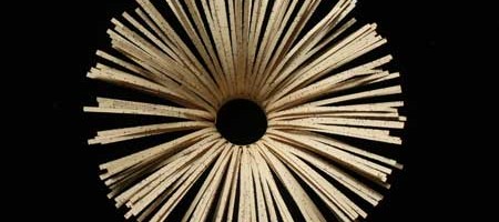
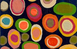
Wow. Has another month really gone by already? It’s Art to Inspiration time again! This month’s inspiration, Echoes of Fragrant Voices by Jo Howe inspires me on so many levels. Her sculptures, created from book pages ( love level one- check! ) are full of beautiful shapes ( two- check! ), soft color ( three- check! ), rhythm ( four- check! ) and gorgeous texture ( that makes five- check! ). Just as with Pakayla Biehn’s work last month, Jo’s work inspired me to create a gallery of varied complementary works, each of which shares characteristics reminiscent of Jo’s work.
The inspiration:
Echoes of Fragrant Voices by Jo Howe
The gallery:
Pendant by Erik Gonzales, mixed media on panel, 60×60Half Hickory by Virginia PettyCore III by Joe Segal, wood and paint, 54×9Trophy by Brenda Mallory, cloth, wax, welded steel, 20x20x13Mercury by Karen Margolis, watercolor, gouache, graphie, thread on Abaca paper, 11×14Expansion by Haley Farthing, pastel on wood, 48×24Relic by Jay Heryet, box elder, 200mm diameter
Visit the artists’ websites, linked above, for more inspiration!
You can find more information on Art to Inspiration here and if you would like to participate in the next Art to Inspiration, just fill out this form! Follow me and all the other Art to Inspiration bloggers on Twitter by subscribing here. Let the inspiring begin!
All images are via the artists’ websites unless otherwise noted.
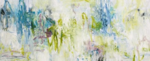
Anyone who knows me knows that I’m far from a wild child. I tend to be calm, controlled, even-tempered. Maybe that’s why I’m drawn to abstract expressionist work like a moth to a flame. And the work of Delray Beach artist Brenda Hope Zappitell is a fire this little moth can’t resist!
In Search of Sunrise II, acrylic with cold wax on panel, 42×42
In her work, Zappitell “surrenders control to the paint, the brush and a visceral process of creative discovery” [sic]. She works spontaneously and rapidly, following the paint as it dances across the canvas.
In Search of Sunrise I, acrylic with cold wax on panel, 42×42
Taking her inspiration from the energy of nature, her palette builds from light, delicate tints to saturated rapid-fire strokes of bold color.
A Matter of Perception, acrylic with cold wax on panel, 48×48
Squiggles and strokes that could almost be graffiti-like still retain their softness, like a flourishing garden in the middle of an urban metropolis.
Embracing Uncertainty II, acrylic with cold wax on panel, 30×36Reverie I, acrylic with cold wax on panel, 48×48
To see more of Brenda Hope Zappitell’s work, please visit her website. You can see her work in person at several galleries across the US– be sure to check her website to see if there is one near you!
Featured image is Translation, acrylic with cold wax on panel, 60×30. All images are via the artist’s website.
Sometimes the simplest work can be the most powerful. I’m really drawn to these graphic, color-blocked paintings by Dwayne Butcher that I’ve posted over on Escape Into Life today. Go check ’em out!
I Got No Use for Trouble, acrylic on canvas, 18×16
So often, when we see gems & minerals, it is rarely in their natural state. After they’ve been cut and polished and set, they seem to lose some of their inherent beauty and mystery. Toronto artist Carly Waito pays homage to these multi-faceted marvels in her small, exquisitely detailed paintings.
Dioptase, oil on masonite, 10×9
Waito uses macrophotography to record the color and intricacies of each cluster, which she then translates into oil.
Flourite 2, oil on masonite, 10×12
Through a process of layering, she captures in paint the amazing depth and prismatic qualities that give gems their luster and appeal. By isolating the minerals in their natural state, Waito celebrates their innate beauty.
Amethyst 6, oil on masonite, 8×9
The visual textures in these small works are simply stunning. And by keeping the works small, Waito invites us in to look closer and really examine the tiny details that make each gem so precious.
Pyrite 2, oil on panel, 10×10Smoky Quartz 5, oil on masonite, 12×11
To see more of Carly Waito’s work, please visit her website.
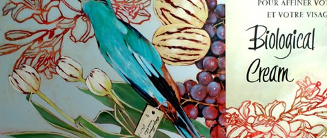
As soon as we are born, we begin to die. That may be a gloomy thought, but we begin the circle of life at birth and it seems, now more than ever, we fight as hard as we can against the inevitability of age and the ravages of time. Helskinki artist Vincent Bakkuum’s paintings confront us with the transitory nature of our very being.
Teen Joy
Using images of vintage-y shoes, skulls and dead birds juxtaposed with beautifully blooming flowers, Bakkum reminds us that what once was young and vibrant eventually will be no more.
Black Shoes and Pink Flowers
Just as the bird that falls from the sky, so will we also cease to fly. Our vanity compels us to continue to adorn what is already beautiful, our very bodies that give us life.
Dead Parakeets
Bakkum’s work reminds us of the inherent beauty to be found in flora and fruit, their beauty and bounty inspires and nourishes us. They are created as we are created and will return to the dust just as we will.
Sheep SkullPink Shoes
To see more of Vincent Bakkum’s work, please visit his website.
Featured image is Biological Cream by Vincent Bakkum. All images are via the artist’s website.
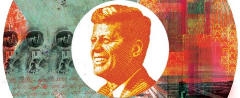
I hope you guys have wandered over to the Artsy Forager Facebook page to check out this month’s Featured Artist, Steve Williams! It’s been so much fun sharing Steve’s work with you over the month of April. With the Month of Steve is coming to a close, I wanted to share with you a few new pieces from the irrepressible Mr. Williams.
Cap Tossing Over the Wall of Space
These latest works were created for the Sustainotopiaconference, which happened in Miami this week. Sustainotopia is “an impact conference that encourages people to really consider how social relationships between investing, finances, and environmental sustainability can become more collaborative, creating a global community that benefits economically from doing what is, essentially, the right thing.”
A Slender Acquaintance With the WorldNational Soil Destruction Leading to Self Implosion
You can read more about Sustainotopia on their website ( and make plans to attend next year! ) and read about Steve’s thoughts on living an impactful life on his blog, Making Cheddar. And if you’re new here or haven’t already done it, be sure to check out Steve’s website!
Pretty sure I read in the latest InStyle Magazine ( we all have our guilty pleasures! ) that polka dots are big for spring. Maybe it’s the influence of Damien Hirst’s spot paintings. Here are some more artists marking the spot!
Small Spots by Georgia Gray, acrylic on canvas, 10x20cmPatterns With Purpose O by Paul Ecke, mixed media on panel, 48×60Cut 11-034 by Michelle Y. Williams, metal/plexiglas, 15×15#562 by Tory Cowles, mixed media, 48×48
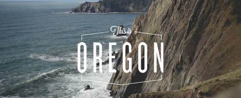
My husband and I love Oregon. George lived for a while on the Northern Coast of Oregon and last year, we lived in Southern Oregon while he worked in Grants Pass. The beauty and natural diversity there is just absolutely incredible. So when Joe Stevens of Shwood Eyewear emailed me about This is Oregon, a photo project “to inspire others to get up, go out and start exploring”, I told him I was more than happy to share it with you!
This Is Oregon, photo by Julian Bialowas
Shwoood Eyewear teamed up with photographer Julian Bialowas to photograph 10 magificient locations, all within a 90 minute drive from downtown Portland, Oregon. The project’s aim is to “showcase the awe-inspiring landscapes waiting to be explored.”
Columbia River Gorge by Julian Bialowas
There will be a This Is Oregon photo show and party at The Ace Hotel in Portland on May 3rd, admission is free and so is the beer! ( If only we were closer, we would be there for sure! ) Super cool prints of Julian’s This Is Oregon work can be purchased here. I can’t decide which one I love best. Each one is more beautiful than the next, just like the landscape in Oregon. ( I’m leaning toward the Columbia River Gorge piece above– it’s one of our favorite OR places! )
I hope you’ll check out the This Is Oregon website and see for yourself. If you haven’t been to Oregon– plan a trip. NOW. You’ll never regret it.
And make sure you watch this video. It’s almost like being there. But you need to see it for yourself!
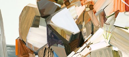
There is a quiet power that abides in certain landscapes that compels us to humilty. No cell phone reception, no internet, no traffic whizzing by. Nothing to make us believe we are the center of the universe. Just earth and rock and water and light. It is in these places that the earth is welcoming, yet can be strong and unyielding. The work of New York artist, Claire Sherman captures the essence of the quiet, raw power of our natural world.
Boulders, oil on canvas, 86×78
Sherman’s overall cool palette, tinged occasionally with warm tones conveys the earth’s reticent beauty. It wants us to explore and appreciate its wildness, but fears the mark our hand often leaves.
Butte, oil on canvas, 72×84Ravine II, oil on canvas, 84×96
This is still a dangerous place. We often forget, wrapped safely in suburban cocoons, thinking we are master of all that we survey. Yet still in many places, one wrong step and we may become prey to the earth’s power. The artist’s linear, often jagged brushwork reminds us to tread carefully. She is beautiful, yes, but we must never forget her untamed nature. Try as we might to use her up, certain parts of the earth will always remain wild and inhospitable to man.
Holes, oil on canvas, 72×60Trees III, oil on canvas, 78×84
These places are for her renewing and for moments ours, but they belong to her. That we will do well to remember. To see more of Claire Sherman’s work, please visit her website. Her work can be seen in person at the Kavi Gupta Gallery in Chicago.
Featured image is Pile of Rocks, oil on canvas, 72×78. All images are via the artist’s website.