Tag: figurative art

  • 2G2B4G: Shawn Huckins

    2G2B4G: Shawn Huckins

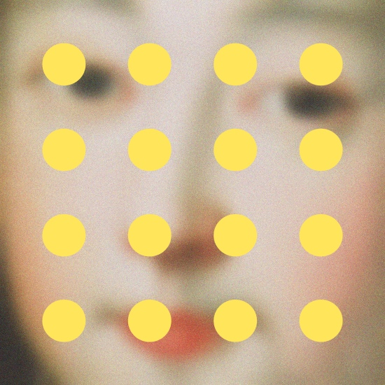
    Just in case you don’t speak text short-hand, 2G2B4G = too good to be forgotten.  Which very aptly describes the work of today’s artist, Denver’s Shawn Huckins.  The artist’s current series, An American Revolution Revolution combines 18th Century American portraiture with 21st Century lexicons such as tweet and text acronyms, creating diverting and provocative images.

    Vanderlyn's Secret Obsession, Talk Dirty to Me by Shawn Huckins
    Vanderlyn’s Secret Obsession, Talk Dirty to Me, acrylic and pencil on canvas, 30×36
    Dorothy Quincy: Don't U Realize Dat I Only Txt U Wen Im Drunk by Shawn Huckins
    Dorothy Quincy: Don’t U Realize Dat I Only Txt U Wen Im Drunk, acrylic on canvas, 34×44

    Like the historical portraits he uses in his work, the text slang has become a part of our own period in history.  Will we still be using this jargon to communicate in a hundred years?  Or will future generations look back and see us as stodgy, stuffy, and hopelessly formal?  Hard to believe that we could denigrate any further than we have, but perhaps our ancestors thought they were just as hip and happening as we believe ourselves to be.

    The Transient State of Mr. Rice, acrylic and pencil on canvas, 22×28

    My first thought when looking at this series was similarities between traditional portraiture, often created as a remembrance of a certain person for a special occasion, and our modern obsession with texting and tweeting, and the impressions and memories of ourselves we are creating.

    Young Girl with Dog and Bird- Sorry to Tell You, But Your Girlfriend Looks Like a Farm Animal by Shawn Huckins
    Young Girl with Dog and Bird- Sorry to Tell You, But Your Girlfriend Looks Like a Farm Animal, acrylic on canvas, 32×40
    Verplank's Post on American Moralism: Like Duh, Obviously, It's a Complete Waste of Time by Shawn Huckins
    Verplank’s Post on American Moralism: Like Duh, Obviously, It’s a Complete Waste of Time, acrylic on canvas, 40×53

    I’m not sure I would want to be remembered for my texts.  Would you?  To see more of Shawn Huckins’ work, please visit his website.

    All images are via the artist’s website.

  • Artsy on Escape Into Life: Andy Price

    Artsy on Escape Into Life: Andy Price

    The juxtapositions of uber-traditional garb and the ultra modern in these paintings by Andy Price really caught my eye.  See more from this artist in my Artist Watch over on Escape Into Life today!

    See No Evil by Andy Price
    See No Evil by Andy Price

    Andy Price on Escape Into Life

    Image via View Art Gallery.

  • Patterns of Domesticity: Jane Richlovsky

    Patterns of Domesticity: Jane Richlovsky

    Have you ever thought about how certain fabric patterns remind you of someone?  Crazy mod-retro prints make me think of my sister-in-law, who loves all things vintage, while subdued plaids in soft blues and greens make me think of nature-loving Mr. Forager.  Seattle artist Jane Richlovsky uses patterned textiles in her work, incorporating them in such a way that the personality of the era shines through.

    Cake Mix #7 by Jane Richlovsky
    Cake Mix #7, oil on found textile, 4.5×6

    The artist depicts domestic scenes from the mid-twentieth century, actually painting on found vintagey patterned textiles.  The result is a interesting visual style– one in which some details of the scene show depth of space, while others, usually the shapes on which the patterns come through, are flattened as the patterns appear more as cut-outs of the forms rather than strictly conforming to the shape it is covering.

    A Wonderful World of Your Own by Jane Richlovsky
    A Wonderful World of Your Own, oil on found textiles, 31.5×32
    Designed for Living as You Want It by Jane Richlovsky
    Designed for Living as You Want It, oil on found textile, 10x5x15

    Richlovsky’s work reminds us that not all was as it seemed in the “good ol’ days”.. the flatness of the patterns meet the Norman Rockwellish technicolor scenes of life we remember from movies, yet there is a cynical and almost sinister undercurrent to some of the paintings.

    Easy as Peeling a Banana by Jane Richlovsky
    Easy as Peeling a Banana, oil on found textile & canvas, 31×36

    To see more of the work of Jane Richlovsky, please visit her website.

  • Art Possessed: Chad Wys

    Art Possessed: Chad Wys

    Our currently semi-vagabond lifestyle dictates that Mr. Forager and I travel light.  Any purchase of a new object is always weighed against whether it’s truly necessary, how much room it will take up when in transit, or if it is too beautiful/wonderful/amazing to live without.  In his work, Illinois artist Chad Wys takes on our obsession with possession, questioning whether we can truly possess a piece of artwork, what our possessions say about us, and how we objectify the world around us.

    Arrangement in Skintones by Chad Wys
    Arrangement in Skintones, c-print ( edition of 10 ), 30×30
    Nocturne 111 by Chad Wys
    Nocturne 111, c-print, 24×30

    When we purchase a piece of artwork, what is our motive?  I believe the majority of art is acquired for aesthetic reasons– something about the work, whether it be the subject, the colors or the composition, appeals to us.  But what about artwork that doesn’t appeal, isn’t pretty?  Is it any less valuable?

    Golden Tea Party by Chad Wys
    Golden Tea Party, paint on found porcelain, 8.5x7x5.5
    Opus 1 by Chad Wys
    Opus 1, c-print

    And what do the objects we possess say about who we are?  And what makes the things we own or the things our ancestors owned so special?  Or are they not really special at all?

    To see more of Chad Wys’s work, please visit his website.

    Thank you to artsocial for reminding about this artist!  All images are via the artist’s website.


  • Dangerous Beauty: Jane Maxwell

    Dangerous Beauty: Jane Maxwell

    While visiting with friends in San Diego recently, somehow the topic of self-worth came up.  My friend Veronica mentioned that the Dalai Lama didn’t understand the Western issue of low self-esteem– we are not born thinking negatively about ourselves, yet something sinister creeps in.  The work of Boston area artist Jane Maxwell uses vintage fashion, advertising, and pop-culture ephemera to deconstruct the messages being sent to women and young girls by the fashion and entertainment industries.

    Runway Girls and Circles by Jane Maxwell
    Runway Girls and Circles, mixed media and resin on panel

    Our body image issues don’t always begin with someone actually telling us we’re too fat, too skinny, too pale.. we are inundated daily, especially as women and young girls, with images of stick thin fashion models and actresses, being held up as the current standard of ideal beauty.  Maxwell chooses to use silhouetted versions of these iconic figures, deconstructing them so that they become an anonymous “every woman”, which could help us to see the somber truth that these women have indeed become pawns in this game of idealized beauty.

    Blue Circle Girls by Jane Maxwell
    Blue Circle Girls, mixed media with resin on panel, 48×48
    Circle of Thought by Jane Maxwell
    Circle of Thought, mixed media with resin on panel, 48×48
    Blue by Jane Maxwell
    Blue, collage, wax & resin on panel, 36×36

    This standard of beauty seems to fluctuate with each generation, remember the days of Reuben and his voluptuous figures?  Or the curvaceousness of the iconic beauties of the 1950s?  When will we reach a point where women of every size, shape, and color are held up as quintessentially beautiful?  Maxwell’s work recognizes that struggle within us of that longing to be lauded for our unique  beauty yet we continue to strive to attain the ideal.

    Walking Girls and Bullseyes by Jane Maxwell
    Walking Girls and Bullseyes, collage, wax, and resin on panel, 70×40

    What are your thoughts on Jane Maxwell’s work or on self-image in general?  Where do you see the struggle?

    To see more of the work of Jane Maxwell, please visit her website and Facebook page.  Her work can be seen in galleries throughout the US, you can find a list of her representing galleries on her website.

    Artist found via Lanoue Fine Art.  Images via the artist’s website and Lanoue Fine Art.

  • Artsy About Town: Ruud van Empel’s Strange Beauty

    Artsy About Town: Ruud van Empel’s Strange Beauty

    I have had the work of Dutch artist Ruud van Empel pinned to my Pinterest board for months now.  Imagine my excitement when we arrived in San Diego back in October and I saw who was coming to the Museum of Photographic Arts at Balboa Park!  Since then, I’ve had the postcard for his show, Strange Beauty, hanging on our fridge, just waiting to see this compelling work up close.

    *I snapped this pic before I saw the sign for no photography.  Shhh.. don’t tell on me!

    The artist’s first solo show in an American museum, Strange Beauty showcases over 40 of van Empel’s digitally created works.  I hate to call them digitally enhanced photographs because they are so very much more than that.  Ruud van Empel carefully constructs each piece, meticulously layering staged photographs, digital imagery, and collage.

    World #7 by Ruud Van Empel
    World #7, cibachrome, 41.43×59.06

    The results are stunningly haunting, complex imagery.  With a background in theater arts and graphic graphic design, van Empel sets a beautifully enticing stage, one in we aren’t sure whether his characters should feel right at home or terribly out of place.

    World #20 by Rudd van Empel
    World #20, cibachrome, 23.5×33
    The Office #41 by Ruud van Empel
    The Office #41, digital print on paper, 12.01×13.78
    Untitled #1 by Ruud van Empel
    Untitled #1, cibachrome, 33.11×46.81

    As you look closely at each image, you aren’t sure where the actual photograph and the manipulation or collage begins.. in many we would be surprised to know which elements were not present all along.

    Generation #2 by Ruud van Empel
    Generation #2, cibachrome, 130×49

    Strange Beauty runs through February 3, 2013 at the Museum of Photographic Arts in San Diego.  If you’re anywhere near the area, I highly recommend a visit!  You can also see more of Ruud van Empel’s work on his website.

    Top image by Artsy Forager.  All other images are via the artist’s website.

  • Divided Unity: Sherri Belassen

    Divided Unity: Sherri Belassen

    You know that old saying “Good fences make good neighbors”?  There is much truth to be gleaned from that quote.  Freedom and space is important, but boundaries and divided spaces can help create a sense of protection and privacy.  In a painting, divided spaces can create a sense of balance and compositional interest, as in the work of Arizona artist Sherri Belassen.

    Hammock by Sherri Belassen
    Hammock, oil on canvas, 66×40

    In her paintings, Belassen utilizes line and color blocking to create shadow, shape, and texture within the layout of each canvas.  Figures are connected to each other and their surroundings, creating a sense of visual depth and the suggestion of surrounding spaces.

    What If by Sherri Belassen
    What If, oil on canvas, 36×48
    Love is in the Air by Sherri Belassen
    Love is in the Air, oil on canvas, 48×48

    Her figures take on almost a monumental, landscape-ish quality, as if these are giant canvases we are glimpsing from high above.

    Divine by Sherri Belassen
    Divine, oil on canvas, 30×40

    To see more of Sherri Belassen’s work, please visit her website.  Her work may be seen in person at a number of galleries around the US– see the list here!

    Hammock and Divine are via the artist’s website.  What If is via representing gallery Jules Place and Love is in the Air is via representing gallery Elizabeth Gordon Gallery.

  • Narrative Patterns: John Westmark

    Narrative Patterns: John Westmark

    One memory I have of my grandmother is of she and I in her dining room, sewing patterns spread out over fabric, pinking shears in hand, as she cut out the pieces to yet another new dress for me.  The crunch of that brown tissue paper is now always associated with those times together.  Austin artist John Westmark  incorporates paper sewing patterns into his work, reinterpreting them as he explores feminist narratives, mythical figures, and the segregation of stereotypes.

    Matrimony by John Westmark
    Matrimony, paper sewing patterns and acrylic on canvas, 36×36

    Not only does the artist incorporate the patterns into his work as a means of literal and visual texture, the patterns and their associations are the catalyst behind the explorations of themes in each series.  For instance, in his Folklore series ( including Corona below ), Westmark references the traditions of story telling, incorporating the instructional verbiage of the patterns themselves.  While in his Double Bind series ( including She-Crab below ), he reinterprets these instruments of traditionally feminine work into images of female mythical heroes and warriors.  Adding an additional level of interest, he adds to the patterns custom text from contemporary feminist writings– creating work not just to be seen but to be experienced.

    Corona by John Westmark
    Corona, paper sewing patters and acrylic on canvas, 48×48
    She-Crab by John Westmark
    She-Crab, paper sewing patterns and acrylic on canvas, 36×48

    For his Flight series, Westmark continues the visual conversation between the feminine and masculine by creating a bridge between the typically female sewing patterns and the mechanical drawings of aircraft, usually a more masculine endeavor.  Each patterns upon which to build and construct, looking very similar upon first glance– it is only when we examine more closely and determine their origin that we assign a stereotype to each.

    Mercury by John Westmark
    Mercury, paper sewing patterns and acrylic on canvas, 100×72

    To see more of the phenomenal work of John Westermark, please visit his website.  His work can be seen at Stark + Kent, a contemporary art gallery in Palm Springs, where I first spotted these extraordinary works, or at Gilman Contermporary in Sun Valley, ID, where his solo exhibition, Into the Fold, is showing until January 20, 2013.

    Artist found via Stark + Kent.  All images are via the artist’s website.

  • Forest Creatures: KOLLABS

    Forest Creatures: KOLLABS

    Mr. Forager and I are forest & woods people, with a bit of the ocean on the side.  Which is a big part of why we love the Pacific Northwest so much and can’t wait to get back there ( only 3 1/2 more months! ).  The quiet, the depth and darkness of the woods is a salve to our souls.  Artists Anke Schofield and Luis Garcia-Nerey aka KOLLABS, are two artists who work collaboratively, exploring the role of humans within the forest and the environment as a whole.

    Conversations by KOLLABS
    Conversations, mixed media on canvas/panel, 66×48

    In their work, KOLLABS often shows human and animal interaction, but taken out of the literal context of the woods.  As in Conversations ( above ), it may seem that the bear, shrunken in size, perhaps to belie its power, is there to entertain the wealthy woman.  Or perhaps she has invited the bear in, to try to get to know him and his ways so that she might better serve him.

    Angie's Run by KOLLABS
    Angie’s Run, mixed media on panel, 36×36
    Peapod by KOLLABS
    Peapod, mixed media with resin on panel, 36×36
    Parker by KOLLABS
    Parker, mixed media with resin on panel, 36×36

    As so many of us live far removed from the woods, usually only glimpsing wild animal at the zoo, photographs, or other media, it’s easy to forget that these creatures once ruled.  That they, along with their forest homes, were treated with reverence and respect.

    Chloe by KOLLABS
    Chloe, mixed media on panel, 48×60

    After all, they were there first.  To see more of KOLLABS’ work, please visit their website.  You can see their work in person in several galleries across the US, including Diehl Gallery in Jackson Hole, WY, Gilman Contemporary in Sun Valley, ID and Lanoue Fine Art in Boston, as well as Whistler Village Art in Whistler, British Columbia.

    Artist found via Diehl Gallery.  Images via Diehl Gallery and Gilman Contemporary websites.

  • The Art of Celebrity: Emma Gale

    The Art of Celebrity: Emma Gale

    For eons it seems that with a certain level of success in the art world, comes a level of celebrity most artists will never know.  Especially today, artists are selling themselves as a brand almost as much as they are selling their work.  Australian artist Emma Gale turns the tables to feature celebrated artists as the subjects of her work.

    Tribal Chic by Emma Gale
    Tribal Chic

    The artist takes these immediately recognizable artists and reinvents them in her own style, yet each one retains the essence of the personality we’ve come to associate with them and their celebrity.

    All My Lovin by Emma Gale
    All My Lovin, mixed media on paper, 56×76 cm
    Jimi by Emma Gale
    Jimi, collage and pencil on paper, 56×76 cm

    Yet, we’re left to wonder.. how much of our perception of the celebrated among us is based on spin and branding?  If we were to meet the famous in person, would they be just as we imagine them or would we be surprised to find how different they are from their image?

    Soho Glam by Emma Gale
    Soho Glam, mixed media on paper, 56×76 cm

    To see more of Emma Gale’s work, please visit her website.

    All images are via the artist’s representing gallery, Anthea Polson Art.