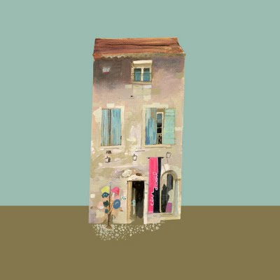
I used to be a lover of big department stores, you know, the ones full of racks upon racks of things to choose from– a little something for everyone. But that was the Suburban Florida girl in me. Since our move to the Northwest, I find myself more and more drawn to the small shops that make up most of the little towns we find ourselves living in and exploring. The shops themselves are often architectural gems, with brick walls, old hardwood floors and coffered ceilings, every time I see an empty storefront, I dream of the what a pretty little gallery or shop it might make. So I couldn’t help but be enchanted by this series by UK artist Johnny Bull, as he turns his brush to the lovely little shops to be found in the land of Degas and Monet.
Of course it goes without saying that French buildings and boutiques would be full of charm and joie de vivre, but the style of Bull’s work makes them even more delightful. In isolating the buildings against a muted pastel background, we are allowed to gaze upon them one by one, each with a personality and charm of its own.
Bull’s palette reminds me of what it might be like to see each shop in different lights of day– the blue grey of early morning, the warm glow of sunset. So lovely I can’t stand it. I immediately want to go into each shop and smell the cafe au lait and meet the quirky artists and writers sure to live above stairs.
To see more of Johnny Bull’s work, please visit his blog. Now I must go and plan a trip to France. Oh, it’s gonna happen.
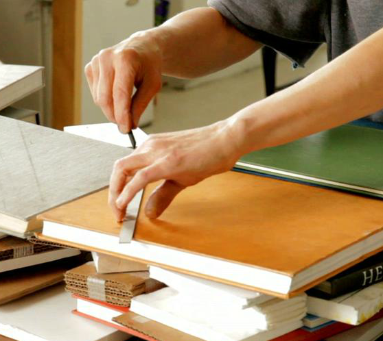
You are some lucky Artsies this week! Not only were you treated to a peek inside the studio of this month’s Featured Artist, Peri Schwartz, today you get to see inside the studio of one of our City Mouse|Country Mouse artists, Christina Baker! Christina was kind enough to give us a little glimpse inside her home studio, which just happens to be conveniently located in the kitchen– where the coffee is!– and takes the time to chat a bit about her work.
Give a warm Artsy welcome to Christina Baker!
Artsy | Hi, C! Thanks so much for opening up your studio to us and taking a few minutes to chat. I’ll dive right in.. Every artist has such a different way of working. Can you tell us about your painting process?
Christina | Well, for starters I am used to working in an open studio outside of my house. I’ve been working in that environment for almost 10 years now. Last fall I began working at home. Our kitchen is my favorite room in the house. I love to cook and I love to paint so we decided to turn the kitchen into a working studio from 8am till about 4pm each day. It’s actually really worked for me. There is plenty of light and the best part about it is that I am accessible to my family at any time. I’m also self taught and though I feel it has helped me maintain some originality, it has definitely kept me back a lot. I’ve always had a natural eye for color and composition but what I am still to this day learning is technique– trying to get the paint to do what I want it to do! This has by far been my biggest challenge. I paint in acrylics, although at times use both an oil as well as a watercolor format. My grandmother was a watercolor artist, so watercolor was the first medium, aside from Crayola, that I ever tried. I also like to keep my brushes and paint wet. It not only helps me with movement, but slowly builds a transition for additional, thicker paint with less use of water. I tend to use my fingernails in most every painting I do. It is an impulse as well as habit. Some people have called it a signature of sorts.. I’ll scratch free flowing lines or shapes through some of the thicker painted area. It sort of loosens up the area as well as adds depth and texture. The bad side of this is, it doesn’t always work.
[ pup Java likes to “help” ]
AF | You paint some landscapes in addition to your very successful abstract series. How is your process different when painting abstracts versus landscapes?
CB | Oh boy….This question opens a big can of worms! Just ask my husband. Landscapes, florals, as well as most anything with a subject matter, is so much easier for me to paint. I can usually do a landscape in a day or two. Though my heart is mostly in abstract painting, it carries with it a great deal of discipline and focus. The best way I can describe it is like writing a song. The first few sections are actually rather easy, but the more elements added, the harder it is to glue it all together. Sometimes you start off with one idea, you add your next idea, shape color, composition or contrast and it changes the entire dynamic of the piece. The next thing you know, you have something completely different than what you even remotely thought you would end up with! Another way to describe it is like putting together a jigsaw puzzle. Well, maybe putting together a puzzle is a lot easier. Anyway, the reason I love doing abstracts so much is that when I am in the groove I truly do get lost in the painting. It’s that certain “zone” where you’re not really thinking anymore, you’re just painting, where all the magic happens. If I am singing out loud ( aka annoying the family ), I am in the zone. This is when I do my very best work.
AF | Where do you find your inspiration?
CB | It’s absolutely everywhere! Aside from friends and family, which are always such an inspiration, I would say that color in general is something that has always sparked that feeling of “I can not wait to try this!” sort of thing. I remember back in the 90’s when films were using this sort of orange and green tint and I just loved it. The basic simple composition of every day visuals is also very inspiring to me. It could be something as simple as a bottle cap laying on the sidewalk but just shy of the grass line, a photograph, the way the street lights sort of trickle down our beveled window at night. Sometimes it is a current event which could be personal or universal. Other obvious forms of inspiration for me come from the work of other artists which include, photographers, writers as well as painters.
AF | Do you have a finished composition in mind when you begin or do you just feel your way through?
CB | I wish I were able to plan out my work but I can’t. Usually the only thing I can control is the colors I have chosen to use for a specific piece. Even that can and will change as I go! There are countless times when I am “seeing” the outcome in advance but usually the finished piece never matches that vision.
AF | How has your work changed since moving from Florida to Tennessee?
CB | I haven’t seen much change inspired from my move to another state but what I have seen and felt is change inspired by my life here in Tennessee. I have finally met my soul mate, another long but very beautiful story! He has brought so much joy and happiness to my family and my life that it has definitely shown up in my work.
My husband collects comic books, bear with me as I’m going somewhere with this, and though it may seem unrelated to painting I feel it is relevant to the direction my art has taken. Learning more about the culture behind comics, and it goes so much deeper than Spider-Man, I have learned how wonderful it is to become open minded to so many areas in life some may have never thought to explore. Simon Pegg could not have said it better with this quote:
Being a geek is all about being honest about what you enjoy and not being afraid to demonstrate that affection. It means never having to play it cool about how much you like something. It’s basically a license to proudly emote on a somewhat childish level rather than behave like a supposed adult. Being a geek is extremely liberating.
How does this fit into me being an artist? It’s becuase I am living my life and expressing myself via my work with the most liberating mindset that I have ever had. I am trying so many new things and have so much yet to discover that there is just not enough time in the day to do it all!
AF | I asked Deann this question, so I just have to ask you, too. If you weren’t an artist, what would your dream job be?
CB | An interior designer! I love interior design and Pinterest has totally been heaven for me in this department. Though my taste leans more contemporary, I have always had great appreciation for antiques. My mom owned an antique shop when I was a child, so for obvious reasons my love for antiques will always stay with me. As I grew older, I realized my eye was more drawn to simple clean lines, the less is more sort of thing, but over all, I honestly just appreciate all interior design. Especially when the two words, old and new are combined. In other words, eclectic.
AF | Thanks so much for chatting, Christina and a special thanks to your hubby, Jeremy Baker for taking such lovely photographs!
CB | Thank you for this really fun interview, Lesley!
If you’d like to see results of Christina’s studio work, please check out her work in the City Mouse | Country Mouse show and sale currently up in Found Gallery, as well as on her website.
When we get a glimpse inside the studio of this month’s Featured Artist, Peri Schwartz, we not only see into gain insight into where she works, but in this video, we are also given the privilege of seeing how she works. I promise you will never look at one of her paintings the same way again.
What better way is there to officially kick off Spring than a chance to win some art?! I assert that there is none! That’s right, Artsies, Art Association is back and this one is going to be crazy good, I can feel it! After February’s contest Erin, my partner in AA crime over at artsocial, and I persuaded this month’s artist, Karen Schnepf to participate and we think you’ll love her work just as much as we do. Seriously, it is gorgeous!
If you’re new to Art Association, here’s the what’s what — You create a Pinterest board around one work of art ( which we provide ), filled with anything and everything that pops into your mind while gazing at the catalyst piece.
Are you ready to get started? Of course, you are! The sun is shining, the birds are chirping and you’re ready to pin your little hearts out. Our catalyst piece for this month is.. Wedding Day by Karen Schnepf!
Step 2 | You create a Pinterest board titled Art Association, like mine here, where you pin any and all images you associate with the featured artwork ( like word associations, only visual )– here’s a sneak peek at some of my associations
Step 3 | Leave a link to your Art Association pinboard in the Comments section of this post
Colors Layered 26 by Karen Schnepf, collaged painting with high gloss finish, 12×12
Erin & I will choose the best board entry, who will be the lucky new owner of Colors Layered 26 by Karen Schnepf ( below )! Colors Layered is a series of work in which paper is painted, cut, then layered onto panel and coated with a smooth, high gloss finish. ( The work has to be photographed before the finish s applied or else it is impossible to capture without glare ). Isn’t it stunning? I’m incredibly jealous of whoever wins this lovely.
The pinner with the best Art Association board ( as judged by me and Erin ) will be chosen on Wednesday, March 27th at 5pm (mountain standard time). I can’t wait to gaze upon all the beautifully colored boards I just know you guys are going to come up with! This currently desert-dwelling-gal needs some color!
OK, now go forth and pin!
**So sorry but the contest is open to US residents only. Stupid laws.
Cornish Window Sill, mixed media on panel, 80×60 cm
Often dividing her surfaces into planes of color, Pamphilon treats us to glimpses of moments that, though simple as they may be, draw us in with their sweetness and humor.
Blackbird Eyeing Up Sleeping Lily Wondering If He Can Borrow Crumbs From Phillip’s Plate, mixed media on canvas, 50×40 cmStudying India, mixed media on panel, 30×30 cmIndian Seed Pods and Chai, mixed media on panel, 30×30 cm
There is such a sense of collected spontaneity about her work, as if each finished piece is just a quick little sketch in her journal, a remembrance of the day, sights, sounds, and findings.
At the Old Rising Sun, mixed media on panel, 40×30 cm
Sigh. Her work makes me wish I was a better journal keeper. Guess I’ll have to settle for Instagram. To see more of Elaine Pamphilon’s work, please visit her website.
Do you ever have days when you just feel abundantly blessed? I hope you do!! These days I’m feeling amazingly thankful for so much. Mr. Forager, the life we lead, the life we’re building, what I do here and everyone who shares in it. When I was gazing at these abstract paintings by Conneticut artist Sandy Welch, one word came to mind: abundance.
Springtime in the Park #2
These paintings are filled to overflowing with vibrant color and energetic rhythm. Fairly frenetic with joy, they are brimming with life, just as the world explodes in color each spring.
All That Jazz, acrylic, 30×40Spring II
The paint is almost dancing off the canvas, isn’t it?! Each one is just brimming with hopefulness and frivolity. I think we need to remind ourselves sometimes that it’s OK to be happy. Life isn’t perfect, no, but overall it is pretty darn good.
I will never forget how intimidated I was during my first figure drawing class. And how incredibly awful I was. My professor was very encouraging, telling me to push through until it clicked. And then one day it did and I loved it. All that time spent agonizing over drawing the perfect figure gave me the freedom to let loose once I got it. Charleston artist Kate Long Stevenson seems to get it, too. Her elegantly sketched figures are perfectly imperfect.
Femme Nue, oil, latex, charcoal and chalk pastel on canvas, 22×28Pastoral, oil and charcoal on canvas, 30×40
With a minimum amount of line, Stevenson shows us the essence of each figure, a hint of a toe reveals a foot, shapes and angles slightly exaggerated so that our eye finishes the sentence they’ve begun.
Reclining, 28×20
Bold patches and slashes of paint cause the eye to follow the colors around the canvas, landing and concentrating on just the right spots.
AKT, oil, acrylic, gouache, and charcoal on canvas, 18×24Woman, oil, gouache, charcoal and chalk pastel on canvas, 42×48
Did you know that today, 3.14, is Pi Day? The happiest of all days? Get it? Pi/pie? I have a deep and abiding love for pie. Ask Mr. Forager. I’ll take pie ( fruit filled, please, preferably berry ) over cake any day of the week! And as you know, being artsy is a way of life as much as it is a type of person. And this artsy loves her pie. Especially this one from BHG made with fresh strawberries AND chocolate. If you love Christina Baker’s sweet painted confection, I bet you’ll love this pie, too. A little rich chocolate, fresh strawberries and a flaky crust perfectly mime Christina’s February painting filled with berry-hued pinks, creamy whites and fresh brights. I can almost taste them both..
Gotta go, I need some strawberries STAT.
art | February by Christina Baker, available at Found Gallery on Artsy Forager
You can check out February and more of Christina Baker’s candy-colored artwork in the City Mouse | Country Mouse show up in Found Gallery until March 28th. You can even buy that little sweet for yourself, which let’s face it will be much better on the waistline than confections of the pie variety. Aaaah, I’m always craving art, but now I’m craving pie, too! Happy Pi Day, Artsies!
Christina Baker image via the artist, pie image via Better Homes & Gardens website.
The limited palette and tight scope of the work of this month’s Featured Artist, Peri Schwartz is what continues to keep me enthralled with her paintings. An artist whose work shares these same characteristics is Lily Stockman, whose work I’ve featuredtwice here on the blog.
Lily and her sister, Hopie, have teamed up to create Block Shop, a textiles company creating hand block printed, naturally dyed scarves crafted in India by the Chhipa family of master printers ( more about the process here ). Doesn’t it seem fitting that if you love Peri’s focus on her place of inspiration, creation, and process that you would wear an artist designed, hand crafted and created scarf? Of course it does!
Because they are hand crafted, only a limited number of Block Shop textiles are created at one time. The entire inventory sold out in less than a week when Block Shop launched back in December! So Lily & Hopie have restocked and are taking pre-orders for April 1st shipping. And if you love these as much as I do, you’d better get your order in now before they’re gone!
See more from Peri Schwartz and Block Shop on their websites, linked here and here.
As we travel and move from rental to rental, Mr. Forager and I talk a lot about our future permanent home. We think about our ideal life, which, aside from a smallish house in the Northwest, can be a pretty fluid concept for us. We see so many people striving for that “perfect” life, the one we are told we should have, a big house in suburbia, perfectly manicured lawn and all. The work of Joseph Phillips website embodies this obsession in succinctly drawn works depicting dissections of perceived perfection.
Double-Wide Bunker with Paradise Package, gouache, graphite and ink on paper, 41×30Duplex Bunker, gouache, graphite and ink on paper, 17×14
Scenes of neatly trimmed grass and crystal clear pools are isolated against a white background and we see from the outside looking in that these are manufactured replicas of an idealized life.
String Theory ( diptych ), gouache, graphite and ink on paper, 24×18 each
The utopian ideals take on a slightly sinister, Stepford-like aura, where perfect grass is revealed to be carpet, where pine and palms live together, where a perfect house comes with a bunker, acknowledging that life isn’t anywhere near perfect.
Vertically Integrated Model for Multi-Climate Living, gouache, graphite and ink on paper, 30×39Auxilliary Lot with Site Plan, gouache, graphite and ink on paper, 41×30