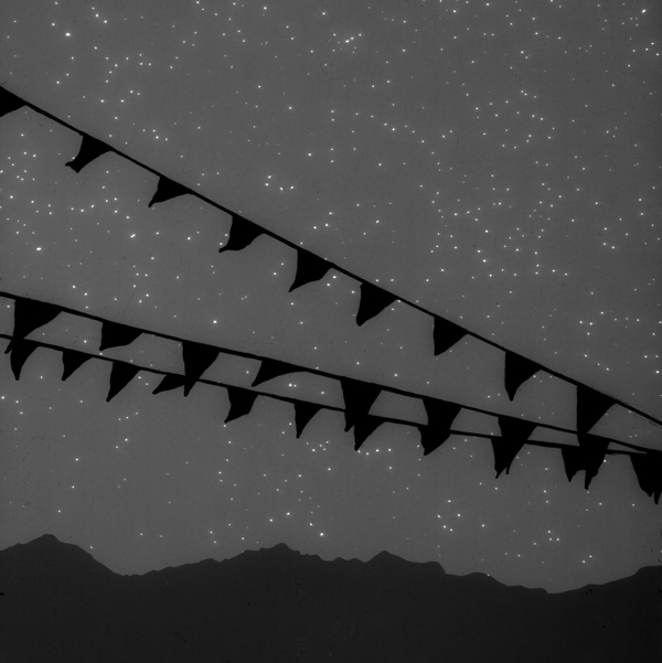
Mr. Forager and I have been camping our way down the West Coast this week. While camping isn’t always the most comfortable way to bed down, there is something about sleeping under the stars, hearing the wind, the crickets and such that can put us more in touch with the world above and around. In her photogram based work, Oakland artist Vanessa Marsh crafts images that remind us of the wonder starlight provides.
In shades of grey, Marsh creates scenes filled with shadows and silhouettes, the simple way we see at night, breaking objects down to their most fundamental forms. Though the shapes may feel a bit dark and haunting, skies filled with stars beckon a welcoming hello. In focusing on the skies above, we’re able to shift away from the darkness surrounding us and turn our faces toward the lights twinkling down. How is it possible to look up into a star-filled night sky and not feel a twinge of hope and possibility? It never fails to fill me with both.
To see more of the work of Vanessa Marsh, please visit her website and Facebook page.
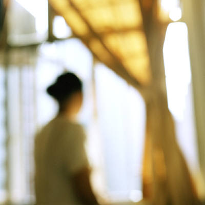
Moments of quiet reflection seem too frequent and far between these days. Today, I’m packing up the last of our belongings as we prepare to leave Western Washington tomorrow morning. Stillness in the physical and especially mental sense has been eluding me for weeks. So when I spotted photographer Virginia Mak’s work, the sense of peace she captures completely spoke to my own harried mind.
In these painterly photographs, we see figures moving toward or looking forward to something or somewhere. There is a sense of peace and hopefulness that what we are looking for may be just around that bend or approach our doorstep any moment. Figures are keeping watch, looking ahead, ready to move. So am I.
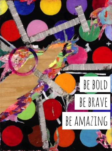
I’m a firm believer that art is not just about what the artist makes, but what you take from it. Living the Artsy isn’t just about living with art, but living out art each day in our lives. One of the things I love most about the work of this month’s Featured Artist M.A. Tateishi is how bright and downright audacious it is. This artist is not afraid to use color, to deconstruct and then resurrect her surfaces, all resulting in work that inspires me to be move forward as bravely as she does.
I thought perhaps you could use a bit of artsy inspiration, too, so in the words of Simon de Pury..
I’ve been finding things in life to be a bit daunting lately, but just looking at M.A.’s work and putting together this post, thinking about these women that I look up to, who are so much braver than me, I feel empowered and encouraged. I hope you do, too.
Creating and choosing art for healthcare environments is about much more than just beautifying a space. People in those environments are often worried, stressed, sad, and in need of healing. Experts have found that through evidence-based design, these places can become much more warm and welcoming and certain design choices can actually aid the healing process. Carefully chosen artwork in these settings not only has a positive impact on the patients, visitors, and staff, but also on the perception of care given by the facility.
I’ve had several artists, designers, and publishers ask about placing artwork in healthcare environments. They want to be a part of creating a healing environment, but aren’t sure how to go about it. So considering evidence-based design and my own experiences in curating art for healthcare, I’ve put together a few guiding principles when creating or choosing art for healthcare environments–
1 | happy, engaging imagery
Nine times out of ten, unless you’re there for the entrance of a new baby into the world, being in a hospital or other type of healthcare environment is not a happy or joyful occasion. And with all the weird smells, strange noises, and necessary sterility of these settings, no wonder they can be seen as such cold, intimidating places! Creating and curating art for healthcare environments that fosters a more warm, welcoming atmosphere goes a long way toward making patients and visitors feel more at ease in their surroundings. Work that makes us smile, reminds us of family and love, and calls to mind memories of happy times all can work together to ease the mind and spirit.
Often when you ask a hospital patient how they’re doing, you may get an answer that begins with “I’d rather be…”. Patients and visitors often wish they were anywhere but where they are. Artwork that creates a sense of voyeuristic escape can lessen anxiety by giving the viewer a means of liberation from their current situation. They’re able to think less about their pain or circumstances as their mind wanders and wonders what might be over that hill or around that bend.
3 | create a sense of calm, peacefulness and positivity
By using natural, organic imagery as symbols of peace, restoration, and comfort, the artwork in healthcare environments can become instruments of healing. Studies have shown that patients shown nurturing scenes of nature required lower strength pain medication. These kinds of images also foster a sense of the world outside the walls of the facility and the goal to get back to where the skies are blue and the waters peaceful.
Hospitals can be lonely, scary places. Choosing artwork that may garner conversation goes a long way toward creating connections among patients and visitors, as well as providing a much needed mental escape. Sculpture and interactive digital artwork do well to give patients and visitors a purposeful sense of exploration and the unexpected and abstract can create a path to solving a puzzle and thereby, a means of distraction.
5 | create reflections of community
Each hospital or healthcare facility has an important role to play as a part of a community. Honoring the history, landmarks, and atmosphere of that community can create a sense of familiarity and connection in places where we often feel helpless and alone.
Creating and curating art for healthcare environments is about so much more than simply manufacturing a pleasing looking space. Instead of merely being places of clinical procedures and processes, through art and design hospitals and other medical facilities are becoming places of nurturing and healing. Artists, designers, and consultants are looking more and more not at what the artwork speaks to them, but how it promotes positivity and restoration to the visitor and patient.
You can read more on evidence based design in this Guide to Evidence Based Art by Kathy Hathorn, MA, and Upali Nanda, Ph.D.
With each place Mr. Forager & I travel to, we always come away with corresponding memories and associations. Maybe with the weather, maybe with the food of the region, maybe with the experiences we had. The work of Los Angeles artist Matthew Brandt takes the idea of associations of place and actually physically informs his work.
[ taste tests in color, laffy taffy 3, blue raspberry, banana and grape laffy taffy multi-layered silkscreen on paper, 30×40 ]
[ dexter lake, or 3, c-print soaked in dexter lake water, 40×30 ]
[ 120821716891, bubbilicious blueberry gum on paper, 40×30 ]
[ ketchup and mustard, ketchup and mustard multi-layered silkscreen on paper, 40×30 ]
[ marys lake, mt 2, c-print soaked in marys lake water, 105×72 ]
In his photographs of iconic American landscapes and places, the artist pays homage to the locale’s meaning sometimes by soaking his prints in the water of the scene in question, or by using unusual yet culturally meaningful printing mediums. For instance, in his Houses series, photographs of typical American homes are printed with flavored gum, perhaps a nod to the children who grew up there and the memories the buildings carry. For the Taste Test series, the artist printed quintessentially American landscape scenes with typical American condiments like mustard and ketchup or processed sweets like Laffy Taffy and Jello.
The resulting prints become not just images of idealized places, but those places have somehow become a part of the artwork itself. Just as each place becomes a part of those who have visited it.
If you’d like to see more of Matthew Brandt‘s work, please visit his website. Seriously, so much more amazing work to see there!
Once upon a time, there was a rule that we all followed diligently– that art had to be centered on something. Whether it was centered above a piece of furniture or centered based on the wall on which it was hung, centering was very important. But I’m noticing a trend towards more casual, more interesting placement. Deliberately hanging artwork off-center. Justified waaaay to the right or way to the left.
Bold statement pieces often need another dramatic something to balance them out or your room may feel a bit lopsided. That scene stealing coffee table or pendant needs something to create a bit of harmonious tension, otherwise, he’s like that dinner party guest that just won’t shut up. We liked hearing his stories at first, but someone else, please say something!
Our eyes like triangles. Triangular compositions help our eyes travel and take in all that we see instead of zeroing in on one element. By hanging artwork off center, you can deliberately create your own triangular composition. So even if that painting is hanging in a place that at first seems off, once your eye takes in all the other elements in the room, it seems just right.
3 | Work your other angles
Angles aren’t just found in the architecture and furnishings surrounding a piece of art, but also in the artwork itself. Don’t forget about the compositional lines and angles in your artwork when thinking about how to hang it. The work should carry on a pleasing conversation with the furnishings around it. Like a first date that’s going really really well.
Hanging artwork off center doesn’t necessarily have to mean that the artwork isn’t centered on anything. Just maybe think about centering on an unexpected or secondary element in the room, like a chandelier or rug instead of the desk or dining table.
Rules tend to be created to make things easy and orderly. But art is neither of those things, so why should we live with it that way? Don’t be afraid to be a bit off center. Your art is crying out for it!
See more off centered artsiness in my Artsy Dwelling Pinterest board! Need some help finding just the right artwork for your space? I can help with that! More info here.
If you’ve been following Artsy Forager for a while, you may have noticed a few recurring themes in some of the work I write about– man’s relationship with nature, fashion industry and its psychology of influence, and art historical themes being a few. When I first wrote about the work Toronto based artist Amanda Clyne , she was drawing reference from and making connections between historical portraiture and high fashion photography. In her latest series, she continues the fasciation and the lines become even more blurred ( pun intended ).
In this work, she begins with a photograph of a painting. The photograph is then printed onto paper to which it doesn’t stick, creating a wet, workable surface. She then “paints” the photograph, then once the residue dries, the surface is scanned and the painting then once again becomes a photograph of a painting.
The resulting image is ghostly, with an x-ray-ish quality. A nod to the illusory nature of the original portrait? An attempt to find the real person beneath the layers of fashion and facade? In style and palette, these are much softer than Clyne’s previous series. Yet they are still asking the same questions and it seems we, as a society tend to continue to give the same answers.
We often think of walls in a negative light, something to put up to keep danger out. But they can also bring a sense of safety and comfort, creating for us a haven from the weather and the world outside. In this series of photographs, Austrian artist Rosa Rendl gives an intimate look at the walls and the views they create in a Paris building.
The perspective from which she composes her photographs creates flattened planes of view, so that the photographs lose a bit of their perspective and take on characteristics of abstract collages. I’ve always found those spots where one surface meets another to be very interesting and quite telling regarding the way a space feels. Rendl definitely has an eye for composition as she invites us into this Parisian world with just a peek at what may be.
Yesterday, I shared with you Lucky Jackson‘s work and wrote about the masks we wear. Well, it seems like I’m on a bit of an identity-crisis train this week, so hop aboard! I was really struck by this series of photographs by Austin artist Denise Prince, in which we find women dressed in finery, yet seeming very out of place.
These women, decked out in evening wear, seem frozen in time, not just physically, but perhaps spiritually as well. They could be the homecoming queens whose lives began with such hopes for greatness, only to find themselves living a much more ordinary, less glamorous life than they ever expected. Sometimes, we put such expectations on our future, don’t we? Of course it’s perfectly normal to have dreams. Haven’t we all, especially when we were young, dreamt of accepting an Oscar or Grammy in our evening gown or tux? Maybe we expected our lives to turn out differently. But no matter what turns life has taken, we can always still be the star of our own story, just perhaps less formally attired.
Remember when I mentioned the need to stretch some creative muscles? While not exactly the painting project I had in mind, this Instagram project, initiated by Sandra of Raincoast Creative Salon and Christie of Bedside Design, came along at just the right time! #Foliophoto is the name of the game and the objective is to take an Instagram each day of October based on a word prompt [ see list below ], then use hashtag #foliophoto to mark your Instagram and follow what everyone else is doing.
The project is about bettering our visual storytelling, improving our photography, and building creative community. A definite assortment of goals I knew I could benefit from and have some artsy fun at the same time! Want to join in? It’s not too late! Just find the word prompt below corresponding with today’s date [ i.e., for today, Oct. 8th, the word is pattern ]. Then take an Instagram inspired by that word. Get creative!
I hope you’ll play along with us! I love going through the #foliophoto entries at night and seeing what everyone else has come up with. So much creativity, you guys! You’ll be more creative and you’ll be inspired by what other folks are doing. Come and play! #foliophoto


, Erased Fragment by Amanda Clyne")
, Erased by Amanda Clyne")
, Erased by Amanda Clyne")


