Happy April, Artsies! I’m excited to welcome in the month of April for many reasons, A | we finally leave the desert this month!, B | I get to celebrate one of my favorite days of the year, the day Mr. Forager was born ( never mind that my own b-day is in there, too, ugh ) and C | the celebration of a fabulous new Featured Artist! You may remember New York artist Hooper Turner from my post featuring work from his Catalog and Fashion series n which he meticulously depicts the imagery found in luxury catalogs and fashion magazines.
#129, oil on catalog page, 12 3/4×9 7/8#85, oil on catalog page, 10 5/8×14 3/4
In his latest body of work, Typeforms, Turner continues his fascination with fashion and found imagery, this time extending his reach into the commodified art world. In choosing to paint letters and numbers directly onto found art auction catalog pages, the artist is perhaps speaking to the struggle of contemporary artists to find their own voice in among the masses.
#130, oil on catalog page, 12×19 1/4#166, oil on catalog page, 10 5/8×8 1/4
Although I’ve chosen to focus on his auction catalog pages, Turner also gives found imagery of celebrities and models the same treatment. Perhaps in doing so, he is reflecting upon the artist as celebrity and what that elevated status means for the art marketplace.
#99, oil on catalog page, 11 3/4×8 3/8
Bold and striking, whatever their message, these pieces are saying it loudly and proudly. To see more of Hooper Turner’s work, please visit his website and be sure to stop by the Artsy Forager Facebook page to see his cover image and an album of a few of my favorite Turner pieces ( in addition to these, of course! ).
Just in case you don’t speak text short-hand, 2G2B4G = too good to be forgotten. Which very aptly describes the work of today’s artist, Denver’s Shawn Huckins. The artist’s current series, An American Revolution Revolution combines 18th Century American portraiture with 21st Century lexicons such as tweet and text acronyms, creating diverting and provocative images.
Vanderlyn’s Secret Obsession, Talk Dirty to Me, acrylic and pencil on canvas, 30×36Dorothy Quincy: Don’t U Realize Dat I Only Txt U Wen Im Drunk, acrylic on canvas, 34×44
Like the historical portraits he uses in his work, the text slang has become a part of our own period in history. Will we still be using this jargon to communicate in a hundred years? Or will future generations look back and see us as stodgy, stuffy, and hopelessly formal? Hard to believe that we could denigrate any further than we have, but perhaps our ancestors thought they were just as hip and happening as we believe ourselves to be.
The Transient State of Mr. Rice, acrylic and pencil on canvas, 22×28
My first thought when looking at this series was similarities between traditional portraiture, often created as a remembrance of a certain person for a special occasion, and our modern obsession with texting and tweeting, and the impressions and memories of ourselves we are creating.
Young Girl with Dog and Bird- Sorry to Tell You, But Your Girlfriend Looks Like a Farm Animal, acrylic on canvas, 32×40Verplank’s Post on American Moralism: Like Duh, Obviously, It’s a Complete Waste of Time, acrylic on canvas, 40×53
I’m not sure I would want to be remembered for my texts. Would you? To see more of Shawn Huckins’ work, please visit his website.
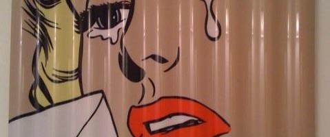
Advertising imagery has become such an integral part of our cultural landscape that products are often instantly recognizable simply by their logos. Like his Pop Art predecessors before him, Jacksonville, FL artist Mark George takes inspiration from the inescapable world of advertising, putting his own spin on the Mad Men era.
Of course, there are obvious parallels between George’s work and that of Pop Art icon, Roy Lichtenstein. Yes, the imagery also takes its cues from advertising imagery and comic books. But where as Lichtenstein enlarged his imagery to the point of replicating in paint the Ben-Day dots that comprised printed materials of the day, George chooses to flatten out the imagery even further.
The lack of visible brushstrokes and use of smooth, reflective surfaces emphasizes the slick nature of the mid-centuray imagery. While the severely cropped faces and “torn” edges of his panel suggest that these are relics abandoned to a different kind of future.
But what interest me most is the emotionality to be found in the faces of George’s subjects. There is a sad, melancholia about the imagery, bordering on the disturbing. In this respect, his work could be seen as our past looking back upon itself with current eyes, shocked and saddened by what is seen in hindsight.
What do you make of the faces of Mark George’s subjects? Please visit his website to see more of his work. If you’re in South Florida, he will be participating in a show, Jet Set Glamourat Harold Golen Gallery in Miami, opening tonight!
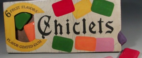
Isn’t it funny how seeing an object from our past will immediately take us back to a certain time and place? It seems that we have an innate sense of nostalgia within us, whether we relate our memories to a place, an object, a film, a piece of music. Ceramic artist Karen Shapiro, after working for years as a pastry chef, now creates raku concoctions of iconic products from long ago and what will soon be past.
Animal Crackers, raku, 14.5×8.5
Just looking through the images of her work, memories come flooding back. As a young girl, I used to love to buy Barnum’s Animal Cracker boxes. It was like a little purse with cookies inside?! What could be better?
Noxzema, raku, 10×10
As with any Pop Art, Shapiro puts her own spin on her recreated icons. These effigies are literally larger than life, as you can see in the Starbucks image ( below ), just as the cultural staples often come to symbolize not just a product, but an era. Her use of raku, an ancient process whose temperature change causes characteristic crazing or cracking, gives a nod to the temporal nature of the more contemporary icons.
Starbucks Coffee, raku, 10×14Prozac, raku, 15×4.5
I’m quickly coming to an age where the pop culture and products that populated my past are reaching iconographic status. It does make me wonder how future generations will look back on us and all that we have consumed. Will it be with disdain or idyllic fascination?
Campbell’s Soup, raku, 8.5×15
To see more of Karen Shapiro’s work, please visit her website.
This artist found via Daily Dolan Geiman.
PS– I still occasionally treat myself to a box of animal crackers!
Featured image is Chiclets ( wall piece ), raku, 25x11x1.75. All images are via the artist’s website.
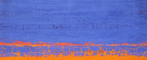
While digging through my Pinterest inspiration boards, planning my features for next week, I noticed a color trend in a few of my pins. It’s funny how our minds gravitate toward certain palettes some days, isn’t it? Apparently, my eyes are loving the combination of orange and indigo these days! I thought you might enjoy a few examples from my boards..
Christina Otero ( via My Modern Metropolis )Michael RiceNeil Wax ( via Skidmore Contemporary )Frances SewardHenry DomkeChristopher St. Leger
Any color combos you’re enamored with these days? Guess this native Florida girl can’t escape the Orange & Blue!
Featured image by Stephanie Paige. Sources can be found by clicking on each image.
Hello Artsies!!! After being out of the blogosphere for the past three weeks or so, I am finally back behind the computer, as it were and it feels great. I have so much to share that I hardly know where to begin.. As many of you know, my hubby George and I recently moved from Florida to Washington. We were incredibly blessed to be able to make a vacation out of our cross-country trek, with stops to see friends, new places and old favorites along the way.
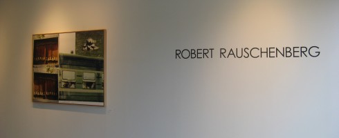
Our first stop ( OK, first fun stop.. we spent the first night in a motel outside Little Rock, AR, not super exciting ) was Tulsa, Oklahoma. George lived in Tulsa for several years and we hadn’t been back since we got married, so decided to take a couple of days to introduce me around to Tulsa friends and places. It just so happened that the friends we were staying with in Tulsa had a friend who owned a gallery, Exhibit by Abersons at Center 1 Tulsa. Said friend of friends happened to be having an opening the night of our arrival in Tulsa, so even though there was a whole gang of people expected for dinner, we popped over to the gallery to have a peeksy.
The exhibit, which opened on May 19th was curated by Master Printer Bill Goldston of Universal Limited Art Editions and follows the progression of Rauschenberg’s print work through the years. Like any good Art History Major, I recognized Rauschenberg’s work and his importance as a painter & print maker, but beyond that, I admit I didn’t know much. Rauschenberg came to the forefront toward the end of the Abstract Expressionist movement and toward the beginning of the Pop Art movement. The prints included in the exhibition lean more toward the Pop end of the spectrum, showing examples of his collaging of photographic images through silk-screen processing showcasing pop culture imagery of the 1950s and 60s, such as Guardian ( 1968 ).
Guardian is compromised of transfer images from Life Magazine, the transfers being done by brushing the images with solvent, placing them on the lithograph stone, then passing the stone through the printing press. These are works that demand a closer look, there is so much going on, even little details are significant. George enjoyed scrutinizing the work ( see photo below! ), which are so accessible that they seem just as relevant today as they must have 50 years ago.
The work George is pondering is Bazaar, an intagilio print and lithograph on paper created in 1984. Other highlights for me included, Aquafix ( below ), a haunting image created by Rauschenberg in 1981. As the years progressed, his work evolved into cleaner, more simplified compositions as exemplified in Aquafix and Lotus VII, both favorites of mine from the exhibit.
Lotus VII ( above ) is part of Rauschenberg’s final series of prints, completed only a month prior to his death. The Lotus images were created for an exhibition of Rauschenberg’s work in Beijing and are compilations of photographs taken by the artist on two trips to China. The photographs were transferred to panels, then an intagilio process, photogravure, was used to tie the images together visually. The results are stunning images, which surely pleased Rauschenberg as his final legacy.
If you are in the Tulsa area, be sure to check out the show at Exhibit by Abersons. If you can’t get to Tulsa, Rauschenberg’s work can be found in many major museum collections with images, biography and other info available online, check out the websites of MOMA, The Tate, the Guggenheim and many more.