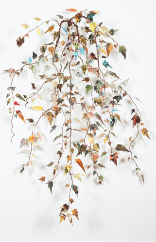
Hmm.. It would seem I’m having a thing for books and cowboys this week. Let’s just go with it, ‘kay? I had a different artist planned for today, but sometimes, I’m just not feeling it, so I go into my Pinterest archives to see what might strike my fancy a little, um, fancier. And these sewn sculptures by Lisa Kokin got me excited.
The artist has taken old pulp cowboy novels and transformed them into organic branches and beings. Cowboy culture has been such a prominent and accepted part of American history, pop culture elevating the cowboy as hero throughout the mid-twentieth century, it isn’t any wonder the gun totin’ good-guy mentality has permeated the minds of so many. Kokin is taking a stereotypically male culture and fusing it with a stereotypical female craft by taking apart these books and sewing them together. It is interesting to think of the young boys who once held these books and played the cowboy role. Have their lives transformed? Or are they still playing cowboy?
To see more of the work of Lisa Kokin, please visit her website. Lisa’s work can currently be seen in Women’s Work at Seager Gray Gallery in Mill Valley, CA through March 30th.
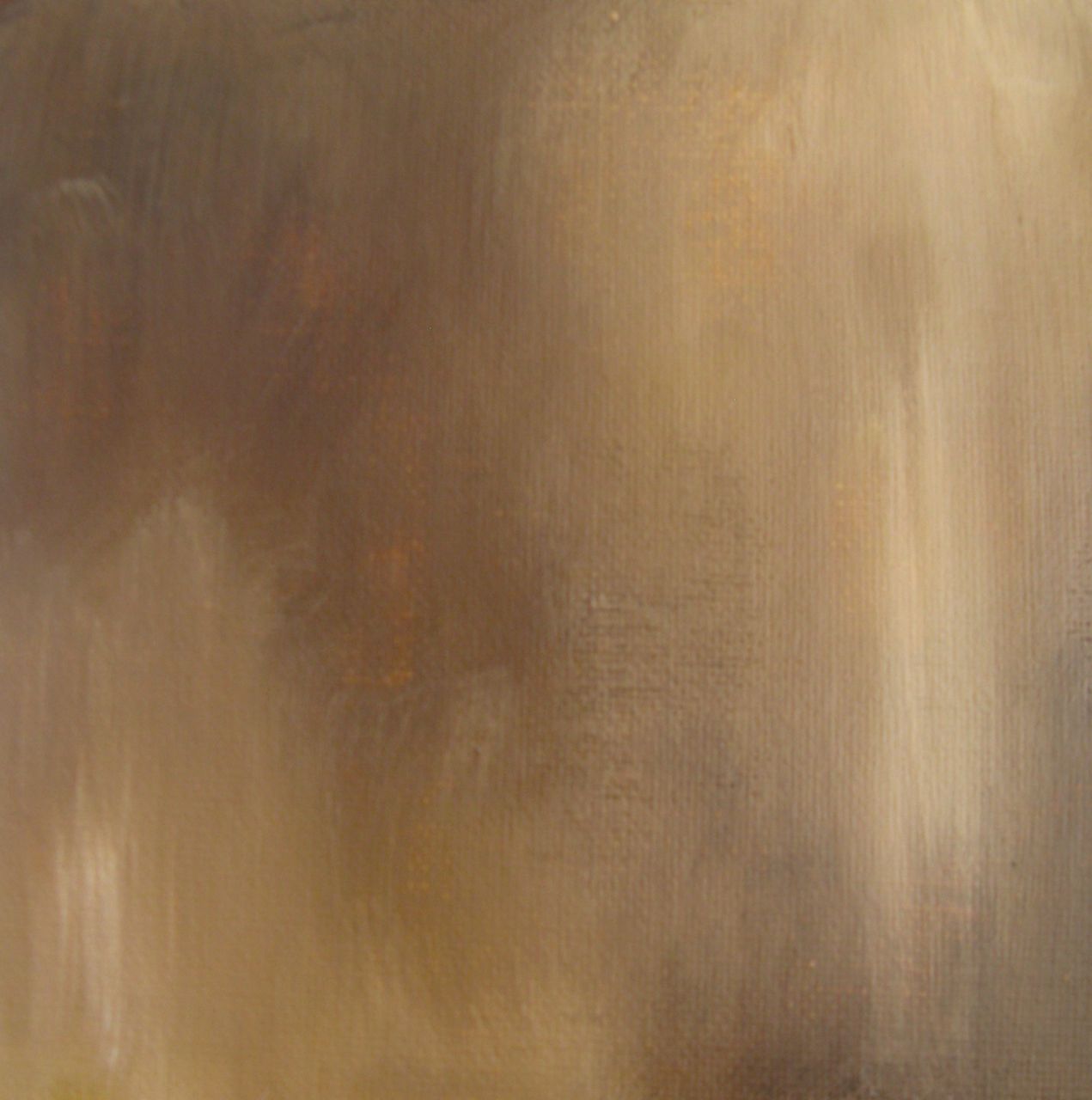
Here goes, ya’ll, I’m ready to share the second painting in my new series, Feminine Wiles( see the first one here ). This new series of paintings are abstract color studies based on the fashion of iconic female film roles. While Faye Dunaway as Bonnie Parker in Bonnie & Clyde may not have been the most glamorous of wardrobes, it definitely conveys a sense of the time and of the character.
Dunaway’s earthy neutral wardrobe palette fit well with her role as a woman taking on a life usually the domain of men. Yet Bonnie’s fashions still maintain a sense of femininity and aren’t entirely cold– a bit of warmth showing through the callous exterior.
Faye Dunaway as Bonnie Parker, acrylic on panel, 6×6
What do you think, Artsies? This series is making me so uber aware of the way color is used in film wardrobe design. And it is an excellent excuse to stream some classic films!
Source for Dunaway image linked above. Artwork by Lesley Frenz.
Being out here in the Northwest versus growing up in Florida, I’ve gotten more of a sense of what it would have been like to see this wild and glorious country for the first time. It is difficult in this day to comprehend the hardship and sluggishness of that world. How it could take weeks, even months to convey the simplest of communications. In his latest series of paintings, American _Tier, Denver artist Shawn Huckins explores the juxtaposition of the artwork of the 19th century in America versus our 21st century technology-driven vocabulary.
Judging from the names they gave some of the places out here, such as Cape Disappointment and Dismal Nitch, I can imagine Lewis & Clark would have been texting WTF all over the place during their expedition. Huckins’ series surely brings to mind the evolution of language between then and now, especially in our written communications. I find it interesting to think about how people are the same as they were then, in their feelings and emotions, what has changed is in mode and frequency in which those emotions are expressed.
If you’re following along on Instagram, you might have noticed a little sneak peek into something I’ve been working on lately. Since starting my #colorforaging2014 project at the beginning of the year, I’ve had more creative energy than ever. And I’ve begun taking full advantage of it. I’ve always worked in a series format ( thanks, Prof. Ladnier for creating that habit! ) and have already completed 5(!) paintings in one series while my mind is pondering, researching, contemplating the beginnings of seven more different series of work.
Early on, my above mentioned college painting prof labeled me a colorist. It’s true, I’ve always been drawn to color and color theory. I’m sure one of my first experiences with color was in admiring the fashion in my favorite curl-up-on-a-Sunday classic films. As a little girl, I imagined myself in those beautiful clothes, becoming those charismatic leading ladies. Then as a grown woman, I’ve found myself analyzing the use of color in the establishment of character– the reasoning why the film’s costume director chose that particular gown in that particular shade for that particular scene. There was a method to all that beautiful madness.
Each series of paintings I have in mind will deal with the psychology and effect of color in some way. For this first series, which I’ve tentatively titled Feminine Wiles, I’m focusing on the fashion of iconic female film characters, especially those used in scenes in which the character is capitalizing on her feminity in some way.
Each piece is a small abstract portrait of that character at the moment and how the character is defined by that particular costume choice. All that intellectual stuff plus I just love pretty dresses and pretty paint..
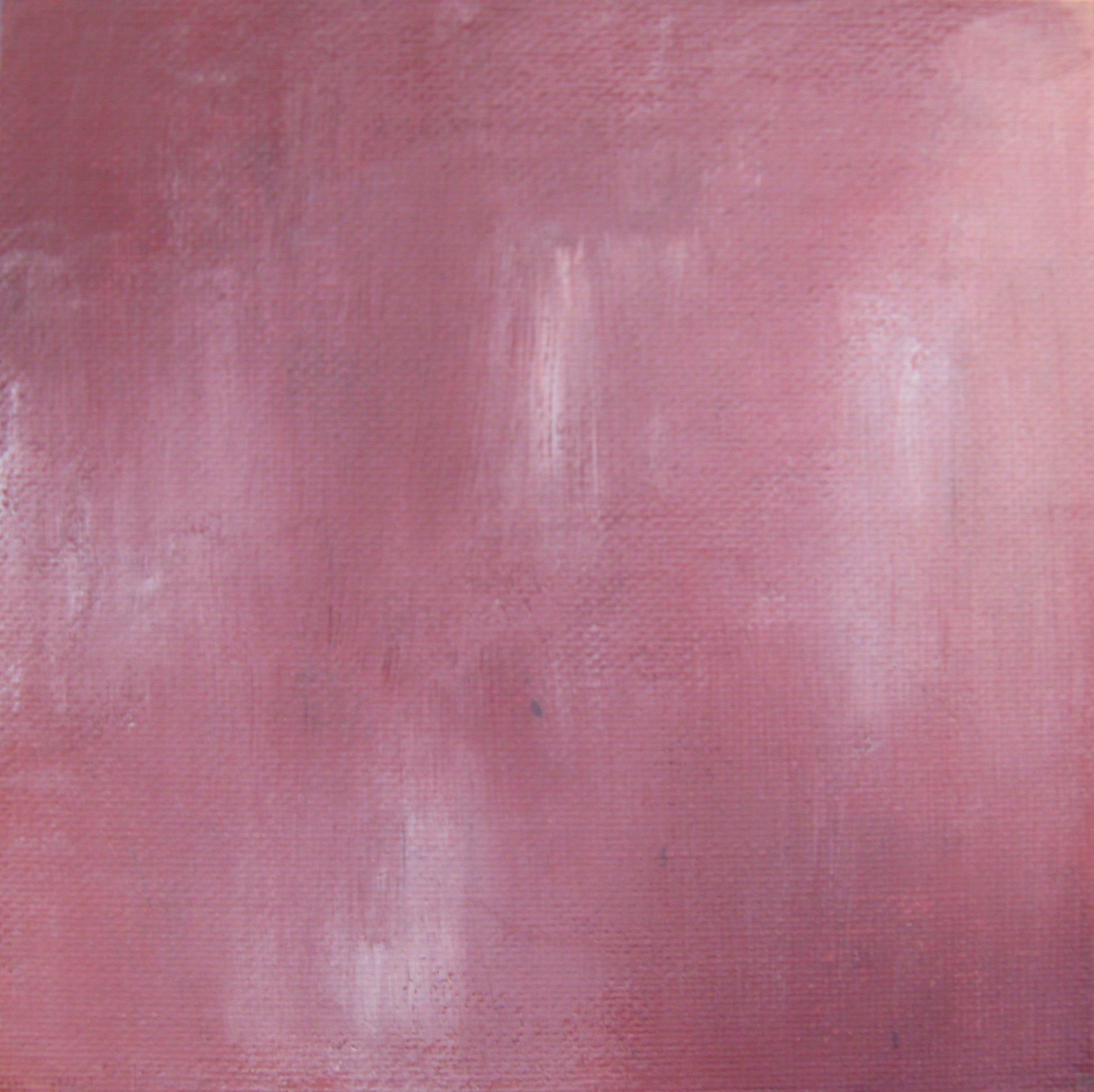
The first painting in the series is a study of Audrey Hepburn’s Holly Golightly from Breakfast at Tiffany’s. While the character’s series of elegant little black dresses is synonymous with the character, I’ve always been drawn to the pink Givenchy cocktail dress. The character wears this confection while in the midst of wooing her Brazilian millionaire would-be fiancé. She is no longer fashioned as cool and elegant, her style for Jose is warm and feminine and festive. It is such an interesting contrast to the devastation that happens later in the scene.
Through a sequence of layers in shades of grey, red, purple, pink and white in acrylic on a 6×6 inch canvas panel, I finally came to a point where I felt like I had a representation of my own interpretation of the character in that dress, in that scene.
Audrey Hepburn as Holly Golightly, The Pink Dress by Lesley Frenz
acrylic on canvas panel, 6×6
I’ve always worked on larger canvases in the past but our current vagabond lifestyle doesn’t include much room for storage of bulky canvases. I would love to translate these BIG, but for now, these little studies are proving satisfying. I can’t wait to share more of the Feminine Wiles series with you! Do you have any iconic female film characters to suggest? I have a list of possibilities, but am completely open to suggestion. I’ve been focusing on classic films, but may eventually move into contemporary characters, too. Can you tell I’m having a ball and completely obsessed with this? I hope so, because I totally am!
Art and logo by Lesley Frenz/Artsy Forager, other image sources linked above.
I’m a Southern girl. You may not know that about me, since we’ve been all over the Northwest during most of Artsy Forager’s existence. OK some may not include Florida as the Deep South, but North Florida is pretty dang close to South Georgia, which is pretty dang Southern. Mr. F is a Southern boy and while we definitely feel more at home in the Northwest, there are things about the South that are so incredibly identifiable and iconic, that only Southerners, whether by birth or transplant, truly understand. Artist Jon Davenport came to the US South by way of the UK where he grew up well versed in Southern iconography, but it wasn’t until he was fully immersed in its culture that he began his artistic exploration of distinctly Southern tastes.
Jon, who shares a similar style to his wife, this month’s Featured ArtistChristy Kinard, creates heavily textured, layered work filled with vintage advertising imagery much of which built up our ideas about life in the South, for better or for worse. Some of these icons can still be seen as faded paintings on the sides of buildings, especially in small Southern towns. In many ways, there is a fierce desire to hold onto the past in the South, where Sunday dinners at grandma’s and yes ma’am and no ma’am are still the norm.
Yet behind the fun and frivolity and charm, there was a darkness that would best be forgotten and which many Southern cities are still fighting to overcome. Many strive to overcome lingering stereotypes and “Ol’ Boys Networks”, while seeking to maintain the best of what it means to be a part of what has been a troubled region. Davenport’s work with its bright but slightly faded palette and layered drips and splotches of paint remind us that time marches on, ideals fade, but hopefully what is left is our favorite, most positive parts of ourselves.
To see more of Jon Davenport‘s work, please visit his website. His work can be seen in his solo show at Matre Gallery in Atlanta through February 8th. Stay tuned over the next few days for interviews with Jon & Christy in a special “He Said, She Said” feature on what it’s like to be half of a creative couple!
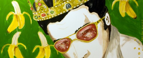
Ya’ll, I am a long time fan of The King. Not a crazy-I-have-an-Elvis-room-in-my-house-and-make-a-yearly-pilgrimage-to-Graceland fan, but I will sing along with him every time he comes up on the iPod. Yesterday marked the 35th anniversary of Elvis’s death and I’ve been seeing a lot of artists drawing inspiration from Mr. Presley lately, so thought I’d round up a few of my faves for you!
Sticker Elvis by Jim Blanchard( Elvis ) Beyond the Bend by Deborah ScottThe Dr. Martin Luther King of Rock & Roll by Troy GuaThank You, Thank You Very Much by Sarah Ashley Longshore
Be sure and check out all these artists’ websites, linked above. If you happen to be in the Seattle area, don’t miss Elvistravaganza!, a curated show featuring works inspired by The King during Bumbershoot, Sept 1st-3rd. All the cool kids will be showing, including Deborah Scott, Jim Blanchard and more!
All images are via the artists’ websites, linked above.
Special treat for your Monday! Due to Escape Into Life website maintenance, my EIL feature ran early yesterday. Head over and enjoy!
Love at first sight. That’s what I felt for Jill Ricci’s work. The colors! The texture! The graphics! I love it all and am sharing it over on Escape Into Life today. Click on the link below to fall in love!
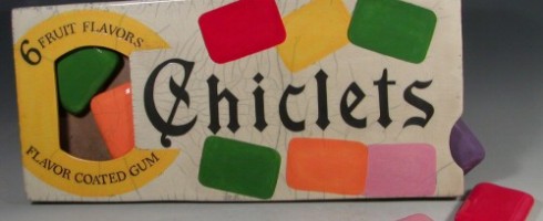
Isn’t it funny how seeing an object from our past will immediately take us back to a certain time and place? It seems that we have an innate sense of nostalgia within us, whether we relate our memories to a place, an object, a film, a piece of music. Ceramic artist Karen Shapiro, after working for years as a pastry chef, now creates raku concoctions of iconic products from long ago and what will soon be past.
Animal Crackers, raku, 14.5×8.5
Just looking through the images of her work, memories come flooding back. As a young girl, I used to love to buy Barnum’s Animal Cracker boxes. It was like a little purse with cookies inside?! What could be better?
Noxzema, raku, 10×10
As with any Pop Art, Shapiro puts her own spin on her recreated icons. These effigies are literally larger than life, as you can see in the Starbucks image ( below ), just as the cultural staples often come to symbolize not just a product, but an era. Her use of raku, an ancient process whose temperature change causes characteristic crazing or cracking, gives a nod to the temporal nature of the more contemporary icons.
Starbucks Coffee, raku, 10×14Prozac, raku, 15×4.5
I’m quickly coming to an age where the pop culture and products that populated my past are reaching iconographic status. It does make me wonder how future generations will look back on us and all that we have consumed. Will it be with disdain or idyllic fascination?
Campbell’s Soup, raku, 8.5×15
To see more of Karen Shapiro’s work, please visit her website.
This artist found via Daily Dolan Geiman.
PS– I still occasionally treat myself to a box of animal crackers!
Featured image is Chiclets ( wall piece ), raku, 25x11x1.75. All images are via the artist’s website.
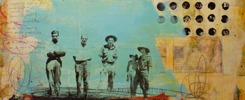
Vintage photos and ephemera, bright colors against faded backgrounds, pop culture iconography.. these are a few of my favorite things and they can all be found in the work of Melody Postma.
Absolute Beginners, mixed media on panel, 36×36 ( via Lanoue Fine Art )
This Clearwater, FL native and graduate of SCAD shares my own fascination with old photographs, utilizing their documentary/slice-of-life style and pop culture graphics of years gone by to create work that calls to us from the past. We see our parents and grandparents in these faces, recalling memories of favorite games, candy, the way of life as we like to remember it.
Languishing in the Calm, mixed media on panel, 36×36 ( via Lanoue Fine Art )
Looking at these images and icons leads me to wonder.. Will audiences in the future be impacted as emotionally when they look back on today’s culture? Will we see artists exploring the good ol’ days of the 00’s, the digital revolution, reality shows and social media? Will the cultural phenomena of today hold as much charm as other decades?
Might Cause Double Vision, mixed media on panel, 42×42 ( via Lanoue Fine Art )
Or is it just that we always look back with nostalgia at times that held precious memories or periods that we’ve idealized? Maybe it’s the 21st century cynic in me, but I’m just not sure we’ll look back on the current era quite as fondly. Or maybe it’s that most of us didn’t live through the eras we’re most nostalgic about. And perhaps that what Melody Postma is getting at.
A Memory Hard to Ignore, mixed media on panel, 36×36 ( via Lanoue Fine Art )There’s Treasure Children Always, mixed media on panel, 36×36 ( via Lanoue Fine Art )