Happy Friday, Artsies! Allow me to distract you for a bit this afternoon.. Artsy Forager will soon be moving from WordPress.com to its very own domain at ArtsyForager.com. I’ve been working on design options and think I have it narrowed down to three favorites. Since you, my readers, are the primary users of the site, I would love to find out which design you like best! ( Note: This isn’t a drastic redesign. That will happen when I can pay someone else to do it. 😉 ).
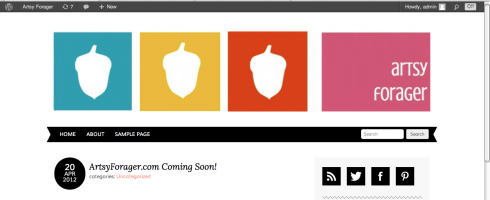
Option A:

Option B:

Option C:

Each option has its own set of positives and negatives, but I’d like your gut reactions to the visuals of each option. Your input is important to me & greatly appreciated!
PS– If there are any web designers out there who’d love to help with the design in exchange for major props/free advertising on the blog, give me a shout! 😉
Comments
24 responses to “Help Artsy Forager Decide on a New Site Design!”
Option A! Option A! :0)
Option A. It’s more streamlined, easy to navigate and the audience doesn’t have to look around to find all the menus.
I like Option B. 🙂
It’s B for me.
A
Option A!!
A!
OPtion A for me- it’s bold, bright, graphic, the black line sweeps across the page and you can find all media links.
Option B. I really like the font and how the acorns are in a square. Have fun with wordpress.org there are so any great features!
Option B – I like the discretion – the identity is there, but it’s background to the content.
I like option B
Everything that Richard said was exactly my thoughts. The branding is strong and font subtle and “artsy”
Option A!!
C is my choice! 🙂
I think B looks cleaner and more contemporary.
B!
A is bolder and a little more striking. B has a simpler, more feminine feel. C says “Artsy Forager” twice which kind of distracted me. I’d go with A.
Hi Lesley, I been following your blog for sometime and love it. In answer to which design I would chose it is Option A. It has a warm and easy feeling to it. I am not sure the image U wont project. . But for friendly A is best the others are to corporate. Hope this helps and look forward to seeing you final design. God bled U and guide your final decision.
Regards, Felicity.
I am a visual artist who lets the amazing fine art studio on line (www.faso.com) do my website design, art management and optimization etc. It is a simple solution to a complex world of art websites. They just introduced to us the Slate Orange template, which I chose for my update. Go to ww.faso.com to learn more about their wonderful biz of artist management or look at my website, http://www.karenweihs.com to gain further info on the modern/sleek “look.”
Option A is the modern approach to your needs, esp with facebook and twitter, but I like the b/w type of option C for your logo.
You can ask a hundred people …you’ll get that many opinions!…my mind changed after reading some of the other opinions LOL
A…for readability, and….I just liked it better.
Thanks, everyone, for your input!! It seems like you’re as torn as I am. 😉 I’m leaning in the direction Option A with a few changes.. you’ll see the results soon!
Option A – I love it when you ask us for our advice! 🙂
whatever you choose, they’re all nuts. So how can you go wrong?!
[…] Forager away from WordPress.com & over to its own domain, asking you to help me decide on a newly tweaked site design.** I’ve been working on getting all the backend functionality up & running and hope to […]