Pantone announced its Color of the Year for 2019 as Living Coral. I’ll admit, at first I was a bit disappointed, as I felt like the representation of the color I was seeing wasn’t really one I could relate to. It felt over saturated and a bit brash, which, if I’m being completely frank, most of the Pantone COTY seem to me (sorry, Pantone!).

image found here
But then, I began to look around– at my Pinterest inspiration boards and in my own paintings. And I realized that shades of Living Coral were everywhere!

my heart in tow, acrylic on canvas, 12×12, available at elliott fouts gallery

knockin’ on heaven’s door, acrylic on canvas, 40×30, available through seattle art source

further xiii, watercolor and cold wax on cradled wood panel, 10×8, available at art and light gallery

heart unfolding, acrylic on canvas, 6×6, unavailable
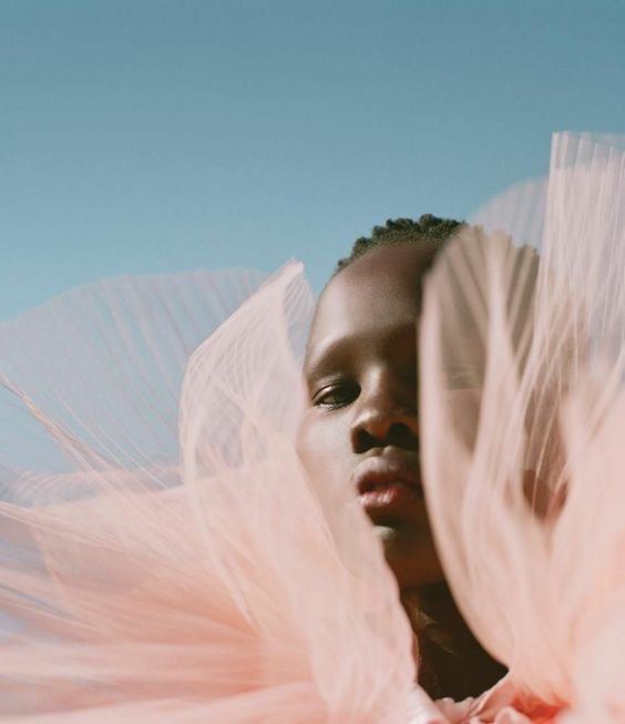
I love this color most it is desaturated and paired with deep jewel tones and neutrals!


images found here here here and here
How do you feel about Living Coral? It’s always interesting to see how much influence Pantone’s COTY has on the art world, whether directly or subconsciously. I won’t be purposefully adding it to my work, but you never know how things sneak in!
Image sources linked above.