Tag: color

  • Seeing. Living Coral.

    Seeing. Living Coral.

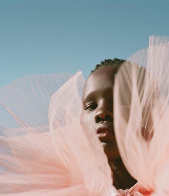
    Pantone announced its Color of the Year for 2019 as Living Coral. I’ll admit, at first I was a bit disappointed, as I felt like the representation of the color I was seeing wasn’t really one I could relate to. It felt over saturated and a bit brash, which, if I’m being completely frank, most of the Pantone COTY seem to me (sorry, Pantone!).

    image found here

    But then, I began to look around– at my Pinterest inspiration boards and in my own paintings. And I realized that shades of Living Coral were everywhere!

    my heart in tow, acrylic on canvas, 12×12, available at elliott fouts gallery 

    knockin’ on heaven’s door, acrylic on canvas, 40×30, available through seattle art source

    further xiii, watercolor and cold wax on cradled wood panel, 10×8, available at art and light gallery

    heart unfolding, acrylic on canvas, 6×6, unavailable

    I love this color most it is desaturated and paired with deep jewel tones and neutrals!

    images found here here here and here

    How do you feel about Living Coral? It’s always interesting to see how much influence Pantone’s COTY has on the art world, whether directly or subconsciously. I won’t be purposefully adding it to my work, but you never know how things sneak in!

    Image sources linked above.


  • Finding My Own Artsy: #colorforaging2014!!

    Finding My Own Artsy: #colorforaging2014!!

    Have you made a list of resolutions for the new year?  I’ve come to prefer the term goals instead, as something to shoot for, rather than promises to myself I’ll feel guilty about when I fail to keep them.  In looking back over 2013, especially the last 9 months or so, something was missing.  And that something was my creative passion!  Sure I’ve been blogging like mad ( and loving it! ) but creative time away from the computer screen just wasn’t there.  So I decided to force myself into a tiny little daily practice– enter #colorforaging2014!

    #colorforaging2014

    Each day in 2014, I’ll be playing with paint and discovering color.  Sometimes the color will be straight outta the tube, but more often I’ll be Ms. Mix-A-Lot, mixing paint combos and will share 365 days of my color finds on Instagram.

    #colorforaging2014

    I’ve always been drawn to color, fascinated by the way different shades interact, color theory and the psychology of color.  A painting a day was a bit too much for my slightly commitment-phobic soul and I felt the need to get back to basics.  So exploring color each day seemed like the perfect way to dip my toes back into the artsy water!

    #colorforaging2014

    #colorforaging2014

    My hope is that by starting on this simple exercise each day, once the paints & brushes are out, I won’t just stop with that daily mix.  Instead, I hope to feel the push to continue, to paint, to draw, to find color and inspiration all around me and to truly see it and grow not just in my artistic practice but in the way I see and approach the world around me.  Just this morning, I’ve already seen half a dozen examples of Naples Yellow ( color #1 )surrounding me without even leaving our apartment!

    #colorforaging2014

    I hope you’ll follow along with me, offer up your own thoughts on color, and most of all, keep me accountable!  I’ll post a new color daily on Instagram, ( follow #colorforaging2014 ) but will only occasionally pop in with a #colorforaging2014 update here on the blog.

    #colorforaging2014

    I’m so excited about this and what 2014 may hold, I can’t even tell you, Artsies.  I’m ready to give up what doesn’t really matter for what makes my heart sing.  I hope you’ll join me on my color-filled journey!  Follow along on Instagram, #colorforaging2014.

    All images by Artsy Forager.

  • Color Harvest: Radiant Orchid, 2014 Pantone Color of the Year

    Color Harvest: Radiant Orchid, 2014 Pantone Color of the Year

    Well, it’s that time of year again!  The folks at Pantone have made their pronouncement predicting the color that will be most on trend for the coming year.  The Color of the Year 2014 is.. drumroll.. Radiant Orchid!

    CH_Radiant Orchid

    I’ll admit, at first I was underwhelmed.  I haven’t been a huge fan of purples since  Christmas 1985 in which every single gift I received was of a lavender hue.  It was the favorite color of my 13 year old self, but I eventually tired of it and moved on, pretty much abandoning it forever.  But once this news got out, I decided to do a little foraging for color amongst the art on my Pinterest boards and what ho, I spy a bunch of this very shade!

    So maybe my inner 13 year old is subconsciously seeping through into my pins.  Or, more likely, these artists know what Pantone folks have discovered– this particular shade, dubbed Radiant Orchid, is much more versatile than it may seem upon first glance.

    It can be soft and feminine, as its floral moniker implies.  These artists know that pairing this color with creamy neutrals and fellow floral shades creates a feeling of delicate suppleness.

    Radiant orchid_soft_collage

     clockwise from top left casey matthews | riley lester | ada wang | bahman farad | laurence amelie | christina baker

    When paired with darker shades and jewel tones, Radiant Orchid takes on a rich, earthy quality.  Pairing such a feminine color with more heavy, masculine tones makes these abstract pieces perfectly balanced.

    Orchid_Rich and earthycollage

     clockwise from top left elizabeth condon | eva lundsager | scott cumberland | charline von heyl

    And of course, artists know when to capitalize on a color’s inherent pop factor.  In the work below, these artists have used Radiant Orchids bright and bold sensibility to bring vibrant fearlessness to their work.

    Orchid_bold pop_collage

    clockwise from top left julie cockburn | eva eun sil-han | shannon rankin  | francois nielly | andy gilmore

    Are you a fan of this lavender shade?  If you’re an artist, are you using it in your current work or have plans to try to incorporate it in 2014?  Designers & consultants, think your clients will be itching for artwork to incorporate this color into their interiors?  Artsy minds want to know!

    All image sources are linked above.  Some images are cropped details of the original.

  • Color Harvest: The Blush of Faded Blooms

    Color Harvest: The Blush of Faded Blooms

    As summer passes into fall, those vibrant brights we’ve embraced in the heat slowly begin to fade into pale grey and warm, rosy light.  I’ve always loved this in-between season, when the afternoon light begins to glow with the promise of cool evenings and coming snows.

    CH_fadedblooms

    With the change brings a turn back to delicate, cool tones echoing the coziness of the months ahead.  I want to bathe myself in these gentle hues!  Below you can see just a few of the dustings of blush I’ve been foraging over on Pinterest..

    Blush collage

     clockwise, from top left: Rue de Emily | Stephen Edwards | Andrea Gulickx | Susan Hall | Amanda Clynehiperboles

    I’m ready to embrace this new season in all its guises.  How about you?  I’m collecting more autumnal inspiration over on my new Pinterest board, Artsy Welcomes Autumn.  Come over and check it out!

    All image sources linked above.

  • Color Harvest: Orange & Indigo

    Color Harvest: Orange & Indigo

    While digging through my Pinterest inspiration boards, planning my features for next week, I noticed a color trend in a few of my pins.  It’s funny how our minds gravitate toward certain palettes some days, isn’t it?  Apparently, my eyes are loving the combination of orange and indigo these days!  I thought you might enjoy a few examples from my boards..

    Christina Otero ( via My Modern Metropolis )
    Michael Rice
    Neil Wax ( via Skidmore Contemporary )
    Frances Seward
    Henry Domke
    Christopher St. Leger

    Any color combos you’re enamored with these days?  Guess this native Florida girl can’t escape the Orange & Blue!

    Featured image by Stephanie Paige.  Sources can be found by clicking on each image.

  • Melodious Abandon:  Michelle Armas

    Melodious Abandon: Michelle Armas

    Pablo Picasso once asked ( rhetorically, of course ), “Why do two colors, one put next to the other, sing?” Good ol’ Pablo had no answer, nor do I.  But they do.  Color calls out to us, reaches out to something in our spirit and psyche, evoking emotion.  Not every artist gets color, how different hues complement and interact with each other.  Michelle Armas gets it.  She gets it and puts it on canvas for all the world to see and enjoy.

    Sophia by Michelle Armas
    Sophia

    Michelle began professional life, not as an artist, but in graphic design and corporate branding in New York.  Talk about baptism by fire!  To help cope with the stress of working in NYC, Michelle began painting.  After about a year, she decided to trade the corporate world for the art world and began painting full-time.

    Rosalia by Michelle Armas
    Rosalia

    Her canvases explode with color, joyous, juicy and fluid.  It’s as if she’s captured the hues of the warmth of a sunny day, of being a kid again, running and jumping with full abandon.

    Arelis by Michelle Armas
    Arelis

    Lovely, sketchy scribbles and seemingly-spontaneous pops of color remind us what it was like before we were “taught” to draw and color– that magical time when we, as young children, were only concerned with the feel of the crayon on paper, fascinated by the variety in our Crayola 64.  We weren’t trying to create anything.. we were just completely submerged in the process of creating.

    Spooky by Michelle Armas
    Spooky

    Filled with the colors of poppies and popsicles, sundaes and springtime, her work does sing.  Sappy, happy love songs, you know, the ones that we all know the words to.  Because we recognize this artist’s vocabulary– these are stories of pure color, that speak to the very basic of creative instincts that began deep within all of us.  They sing us a sparkling lullaby as we bask in their sunshine, dreaming of coloring in the clouds.

    To see more of Michelle Armas’ work, check out her website and be sure to stop by her blog.  Her writing style is as cheeky and colorful as her paintings.