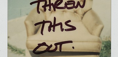
I recently saw a clip of Jim Gaffigan in which he does a riff on our modern propensity to take photos of everything and then post them on all of our various social media outlets. I’ll admit, I’m guilty of taking a photo of my dinner and posting it on Facebook for all of my friends to see. The Defaced series by Los Angeles photographer Jen Gotch, ( which I’m featuring in my Artist Watch over on Escape Into Life today– see it here! ) reminds us that even before Instagram, we were still a society obsessed with capturing memories and sharing them. Check out her work on EIL today AND if you love her style, Jen has teamed up with HGTV host and stylist extraordinaire Emily Henderson on a lovely little round-up of Jen’s work on Open Sky. Check that out here!
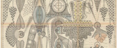
Although I’m a pretty detail-oriented person, my own drafting and drawing style is much more intuitive than precise. Architectural drafting was torture for me. So the exquisitely elaborate and deliberate compositions of Brooklyn artist Louise Despont leave me speechless.
Dancer, graphite and colored pencil on antique ledger book pages, 49.5×81Small Performers, graphite, watercolor, and colored pencil on antique ledger pages, 58.4×40.6 cm
Despont creates these intricately graphic drawings on the pages of antique ledger books, providing a natural grid upon which to weave her compositions. Reminiscent of Persian rugs and other ancient patterns, the artist is creating her own “abstract language of symbols”.
Couple With Clock Tower, graphite on antique ledger book pages, 50.5×55
These are works to take in as they were created.. slowly, deliberately, and with careful attention. You wouldn’t want to miss out on any of the delicious details.
The Bodhi Tree, graphite and colored pencil on antique ledger book pages, 170.2×174.6 cmJester Inversion, graphite and colored pencil on antique ledger book pages, 54×82.5
To see more of Louise Despont’s work, please check out her website, where you can see close-ups of these wonderfully complex drawings!
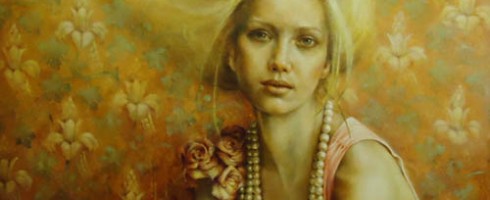
We are all guilty of over-sharing these days. Thanks to Facebook, Twitter, Instagram, Pinterest, Four Square, etc., the world has become privy to our innermost thoughts, what we ate for lunch, how many miles we ran that day. We scoff at reality shows detailing the daily lives of the Kardashanians, Snookis, and Honey B00-Boos of the world. We wonder, whatever happened to the allure of mystery? UK artist Pam Hawkes reaches back into the iconography of illuminated manuscripts and Renaissance portraiture to cleanse our palate of the modernly overexposed.
Unbound, oil on copper leaf on board, 61×104 cmTracing Mythologies II, oil on copperleaf on board, 62×122 cm
The stillness and serenity of Hawkes’ figures are at such odds with how we live today. The often classical poses reminiscent of religious iconography of the Virgin Mary and other figures may at first seem foreign to our contemporary eyes. Yet there is a softness and vulnerability in these women, as if the ancient had come alive and found itself somehow wandering about our modern world.
You Made Me II, oil, beeswax, and dutch metal on board, 30×41Fading, oil on copper leaf on board, 122×122 cm
There is a sense of bound freedom to Hawkes’ figures, as if they are only just discovering the door to their cage is open. We wonder why they sit so still, resisting the temptation to be free. Perhaps they, like us, have grown fond of their cages.
Birdsong, oil on copperleaf on board, 76×122 cm
To see more of Pam Hawkes’ work, please visit her website— a great many gorgeous works to see there!
Happy Friday, Artsies! Allow me to distract you for a bit this afternoon.. Artsy Forager will soon be moving from WordPress.com to its very own domain at ArtsyForager.com. I’ve been working on design options and think I have it narrowed down to three favorites. Since you, my readers, are the primary users of the site, I would love to find out which design you like best! ( Note: This isn’t a drastic redesign. That will happen when I can pay someone else to do it. 😉 ).
Option A:
Artsy Forager site design Option A
Option B:
Artsy Forager site design Option B
Option C:
Artsy Forager site design Option C
Each option has its own set of positives and negatives, but I’d like your gut reactions to the visuals of each option. Your input is important to me & greatly appreciated!
PS– If there are any web designers out there who’d love to help with the design in exchange for major props/free advertising on the blog, give me a shout! 😉
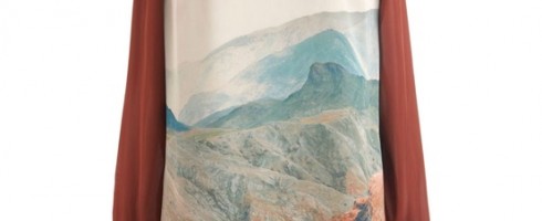
With the continuing improvements in digital printing, designers and artists are able to collaborate in amazing ways. I’ve been noticing a trend toward printed, wearable art incorporated into gorgeously designed fashion. Here are a few of my faves, spotted on Pinterest recently!
Glam Canyon Dress from ModclothFlashed Back Shift from AnthropologiePrinted Silk Dress from Mary KatrantzePennii Artist Palette Dress from Ted Baker London
What say you, Artsies? Which is your favorite? Any other fabulously artsy fashion I should know about? Find these and other artsy fashion finds on my Pinterest board, This Fashion is Artsy. Happy weekend!
I am super excited to announce that Artsy Forager is now a regular feature in print! Arbus, an arts and business magazine in my old ‘hood of Northeast Florida will regularly be running select Artsy Forager features beginning with their October/November 2012 issue ( see it here!! ).
October/ November 2012 issue of Arbus Magazine
Arbus features the best of what’s happening in art, culture and design in the Northeast Florida area. But publisher Cinda Sherman knows that there is a great big world of art out there, so each month’s Artsy Forager feature will showcase artists from around the world, introducing Arbus readers to a whole new set of artists to love.
As a blogger, it’s a special kind of thrill to see my words in print, but for me, it’s especially wonderful to see them in a publication I’ve read since my college days. I hope you’ll check out the issue online ( or pick it up in person, NEFL Arsties! ), lots of great features in this issue, including a spread on one of my Florida faves, sculptor Joe Segal!
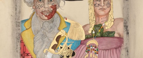
‘Tis election season in the US which for many ( including myself ) = the season for cynicism, frustration, and the eventual choosing between what we hope will be the less destructive of two not-so-great choices. Throughout history many a nation has had a habit of creatively reinterpreting their own backstory to slant history more to their favor. In his work, Los Angeles artist Frohawk Two Feathers calls out the ridiculousness of such reinvention, echoing the growing dissatisfaction with the political status quo.
He Dead. Amen! LaDonna, inventor of the hot comb and widow of Andre I of Hispaniola Maitresse of Mambo Erzulie Freda Dahomey, 30×44
Two Feathers’ ( born Umar Rashid ) works are a fictional retelling of periods in history, his latest series being a fictionalized version of the conquest of Haiti. The overall style of his work bases itself in traditional colonial portraiture yet the artist tweaks it to tell his own version of the story.
Let Me Upgrade You. A farewell embrace for Duke Tarik Ibn Rashid and the Duchess Josefina of Margarita and Tortuga. Tarik was called to Frengland to Tirain the artillery corps by Lord Protector Casimir Theroux of the Republic of Frengland. Josefina is running shit for real man, 30×44The Spanish Main 1794 (3BB) Blanca, the motherfucking Queen of Spain Jacinta, Queen of the Tairona (Deceased) Carlota, Queen of Santo Domingo (Deceased), 60.5×44.75
While the works are satirical in nature, I can’t help but think that they aren’t that far off from how our own histories have been subtly reshaped over time in order to gloss over certain ugly facts or to push a powerful group’s agenda.
Solid. Solid as a Rock Lord protector Casimir Theroux of Pomerania (Poland) and his wife Helen Sidney of London, 30×44
To see more of Frohawk Two Feathers’ work, please visit the website of his representing gallery, Taylor De Cordoba. I’m not sure how much time I’ll have to explore LA galleries while we’re in Joshua Tree, since I’ll be heading to Florida for a month in November, but seeing this work in person at Taylor De Cordoba is high on my list.
Who’s in for some artsy pinning fun with Artsy Forager and Erin Cassidy of art social? We’ve been gettin’ our pins on and are psyched to present a new Art Associations contest!
In case you missed the debut contest last month, here’s the gist– You create a Pinterest board around one work of art ( which we provide ), filled with anything and everything that pops into your mind while gazing at the inspiration piece.
For October, we’re associating with the piece below, Mailing ABQ 10-12 Lines by Kate Farrall.
Mailing, ABQ, 10-12 Lines by Kate Farrall
The prints from Kate Farrall’s Mailings to Myself series are made by sending un-exposed photo paper through the mail, allowing it to expose during its trip, and then developing it when it arrives. Such a serendipitous way of art making!
But now for the real fun, the CONTEST! Here’s how our little artsy mad scientist experiment will work–
Step 2 | You create a Pinterest board titled Art Association, like mine here, where you pin any and all images you associate with the featured artwork ( like word associations, only visual )– here’s a little sneak peek at my board to get your creative juices flowin’
Step 3 | Leave a link to your Art Associations pinboard in the Comments section of this post
Step 4 | Follow both art social and Artsy Forager on Pinterest ( if you already are, you’re ahead of the game and doubly awesome )
Here’s what you can win–
Once you’ve completed the steps above, you’ll be entered for a chance to win Mailing 10x8x8, a unique chromogenic print by Kate Farrall ( below ). Thanks to Kate for generously donating this work for our little contest!
Mailing Overlap 10x8x8 by Kate Farrall
The pinner with the best art associations ( as judged by me and Erin ) will be chosen on Wednesday, October 24th at 5pm (mountain standard time). Last month’s boards were incredibly creative, can’t wait to see what artsy associations you see in Kate’s work!
Ready.. set.. associate!!
Would you like your artwork to be featured as an Art Association subject? Shoot Erin an email at artsocialonline@gmail.com for more info.
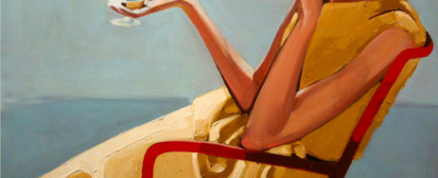
For me, gorgeously styled movies and fashion photos are a guilty pleasure and voyeuristic escape. For a brief moment, I can imagine myself a part of a super fabulous, amazingly glamorous life. The work of Tallahassee artist Anna Kincaide Horne offers a similar experience in her elegantly painted figures.
Blue Tights Girl, oil on canvas, 48×3Blue Gloves, oil on canvas, 30×40
In my gallery days, I relished the chance to dress up for an opening or special event. Something about wearing heels and a little cocktail dress makes even a work event just a bit more exciting. These days, I ( like many of us! ) live my days in jeans and flip flops. Events for elegant dress are few and far between.
Happy Hour, oil on canvasEveryone Wants to be Cary Grant, oil on canvas, 30×30
Yet, life still feels glamorous to me. Mr. Forager and are pretty fortunate, we live a life filled with travel and discovery. Even if we’re living it casual-style.
Artist found via Stellers Gallery in Ponte Vedra Beach, Florida. All images are via the artist’s website.
The work of California artist Lisa Beerntsen seems at once cosmic and microscopic.. organic forms float as if suspended in viscous fluid. Check out more of Beerntsen’s work my Artist Watch feature today over on Escape Into Life!