OK, I’ll admit, I’m not a big action-movie fan. In fact, the latest super-hero based film is usually the very last on my movie watching list ( although I end up watching them with Mr. Forager so that he’ll watch the latest costume drama/foreign film with me ). But I might be rethinking my prejudice due to the work featured today. The recent work of Brooklyn artist Jim Gaylord is based on action sequences in films– now there’s an action movie screening approach I could get into!
High Muck-a-Muck, oil on canvas, 24×20
In Gaylord’s work, some paintings, some collage/mixed media, we are met with a cacophony of shapes, colliding upon one another. The crashing of objects, the roar of engines.. it’s almost audible. Can you hear it?
Coat of Arms, gouache on cutout paper, 40×26Rat King, oil on paper, 43.75×30Victory Lap, gouache and soot on cutout paper, 26×36
Pops of white amid the chaos resemble clouds of smoke, distorting the full scene from our view, while smaller forms are catapulted out from the midst like shrapnel.
Soft Endorsement, oil on canvas, 22×17
I think I’ll be looking at action sequences a bit differently from now on, won’t you? To see more of Jim Gaylord’s work, please visit his website.
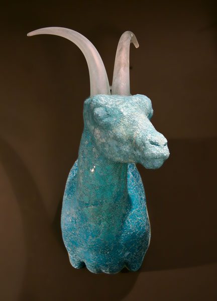
Did you have a favorite animal growing up? One that you loved, identified with, family members bought you t-shirts & stuffed animals in their likeness? Isn’t it interesting how we, as young children, identify with our fellow members of the animal kingdom, then as with most of the magic of childhood, we outgrow our connection to our spirit creatures. The work of Tuscon artist Katja Fritzsche reminds us that those connections we once felt are not gone forever, only buried for a time.
Blue Sky Ram, reverse painted mosaic and hand cast glass, 30x20x22
By casting her creatures in the glass with perceived rigidity and coldness, Fritzsche’s work serves to recall to us that though we overlook our fellow animals, destroying their habitats as we build our own glass and steel monuments, they are still among us. We catch glimpses of them in unexpected places, a lost deer wandering a suburban neighborhood, a hawk perched high atop a skyscraper.
Edge, blown glass and hand worked bronzeMigration, cast glass and hand forged bronze, 18x10x10Mapplethorpe, mosaic glass and hand worked glass, 30x21x10
As we amble clumsily through life, the animals live each day with instinct, grace, and purpose. Each born to his own calling and knowing it from birth. How have we strayed so far from our own guiding spirits?
Violet, blown glass, mosaic glass and pressed flowers, 24x15x22
To see more of Katja Fritzsche’s work, please visit her website. I went through a pretty serious manatee phase when I was young– such gentle, unassuming animals, while Mr. Forager has always had a fascination with wolves. What creature did/do you identify with? Has it changed over the years?
I am loving the mixed media work of Los Angeles artist Chyrum Lambert, featured today on my Artist Watch on Escape Into Life. They remind me of wonderful puzzles waiting to be solved! See more of Chyrum Lambert’s work on EIL here.
The Artist as a Portrait of His Material by Chyrum Lambert
You know that old saying “Good fences make good neighbors”? There is much truth to be gleaned from that quote. Freedom and space is important, but boundaries and divided spaces can help create a sense of protection and privacy. In a painting, divided spaces can create a sense of balance and compositional interest, as in the work of Arizona artist Sherri Belassen.
Hammock, oil on canvas, 66×40
In her paintings, Belassen utilizes line and color blocking to create shadow, shape, and texture within the layout of each canvas. Figures are connected to each other and their surroundings, creating a sense of visual depth and the suggestion of surrounding spaces.
What If, oil on canvas, 36×48Love is in the Air, oil on canvas, 48×48
Her figures take on almost a monumental, landscape-ish quality, as if these are giant canvases we are glimpsing from high above.
Divine, oil on canvas, 30×40
To see more of Sherri Belassen’s work, please visit her website. Her work may be seen in person at a number of galleries around the US– see the list here!
Hammock and Divine are via the artist’s website. What If is via representing gallery Jules Place and Love is in the Air is via representing gallery Elizabeth Gordon Gallery.
This month’s featured artist, Christina Baker, is a painter whose work I’ve followed since we were both living in Florida. Christina now resides in Tennessee, while at the moment you can find me in California.. While we are geographically distant, I’ve enjoyed watching her artistic career flourish from afar. It has been such an amazing journey to watch as Christina grow into her own style as her work has blossomed into sophisticated expressions of her own visual language.
Manhattan Memories, acrylic on canvasRunaway Deer, acrylic on canvas, 40×40
Christina’s work harnesses the power of color and emotion as she translates the feelings of a moment onto canvas. Her palette goes through phases and cycles, just as our psyches do. In many cases, you can truly see the joy she was feeling as warmth and light bounces around the canvases.
Mint Chocolate, acrylic on canvas, 20×20White Chocolate, acrylic on canvas, 20×20
Often in her work, there is a sense of fluidity and movement, possibly a byproduct of so much time spent near the ocean in Florida. Shapes float among the light like drops of ocean spray or falling leaves. Whatever the moment, wherever the place, it is a happy one.
Love Letters, acrylic on canvas, 40×30
To see more of Christina Baker’s work, please visit her website. You can see her work in person at her representing galleries, Gregg Irby Fine Art in Atlanta and Imagine Gallery of Fine Art in Franklin, Tennessee. Be sure to follow Artsy Forager all month long for more Christina Baker goodies!
PS– this post was published by mistake last Wednesday, my apologies to Christina and anyone who saw it and then went back to find it gone! Blog operator error. 😉
One memory I have of my grandmother is of she and I in her dining room, sewing patterns spread out over fabric, pinking shears in hand, as she cut out the pieces to yet another new dress for me. The crunch of that brown tissue paper is now always associated with those times together. Austin artist John Westmark incorporates paper sewing patterns into his work, reinterpreting them as he explores feminist narratives, mythical figures, and the segregation of stereotypes.
Matrimony, paper sewing patterns and acrylic on canvas, 36×36
Not only does the artist incorporate the patterns into his work as a means of literal and visual texture, the patterns and their associations are the catalyst behind the explorations of themes in each series. For instance, in his Folklore series ( including Corona below ), Westmark references the traditions of story telling, incorporating the instructional verbiage of the patterns themselves. While in his Double Bind series ( including She-Crab below ), he reinterprets these instruments of traditionally feminine work into images of female mythical heroes and warriors. Adding an additional level of interest, he adds to the patterns custom text from contemporary feminist writings– creating work not just to be seen but to be experienced.
Corona, paper sewing patters and acrylic on canvas, 48×48She-Crab, paper sewing patterns and acrylic on canvas, 36×48
For his Flight series, Westmark continues the visual conversation between the feminine and masculine by creating a bridge between the typically female sewing patterns and the mechanical drawings of aircraft, usually a more masculine endeavor. Each patterns upon which to build and construct, looking very similar upon first glance– it is only when we examine more closely and determine their origin that we assign a stereotype to each.
Mercury, paper sewing patterns and acrylic on canvas, 100×72
To see more of the phenomenal work of John Westermark, please visit his website. His work can be seen at Stark + Kent, a contemporary art gallery in Palm Springs, where I first spotted these extraordinary works, or at Gilman Contermporary in Sun Valley, ID, where his solo exhibition, Into the Fold, is showing until January 20, 2013.
The first time I saw high-definition tv, I thought to myself, “I can’t believe people are paying more money for this imagery.” The resolution was so ultra-high, it was too crisp, too clear, lacking the depth to be found in blur and shadow. The work of Brooklyn based artist Caroline Zucchero Hurley uses loosely arranged shapes that, like our old analog screens, give us hints at what is there, allowing our minds and eyes the freedom to connect the dots.
Trees of Eden, oil on linen, 48×48
Much of what I love most about Hurley’s work has to do with the sense of balance and control in what may seem at first to be unfettered patterns and brushstrokes.
Dirt Stains, oil on canvas, 60×60Thank You, Virgin America
For all their seeming randomness, there is a deliberate quality to their placement, letting us know that each composition is by no means accidental. Yet, the artist arranges these shapes and colors with a deft hand, revealing just enough to suggest at what might be there.
Brights, oil on canvas, 60×60
To see more of the work of Caroline Zucchero Hurley, please visit her website. In addition to works on canvas, the artist also translates her love of shapes and forms to jewelry and linen throws— be sure to check those out, as well!
Happy 2013, Artsies! I’m excited for a new year and even more than that, I’m thrilled to spend this first month of a new year featuring the work of Tennessee artist, Christina Baker! Look for lots more loveliness coming your way from this talented painter all throughout the month of January. Stay tuned to the blog, Facebook, and Twitter feeds ( click the buttons to the right to follow! ) all month long!
Isn’t it amazing to think of all the precious stones, metals, and other extraordinary objects growing in the hidden places of our world? The sculptural work of artist Brett Freund seeks to explore questions of value and preciousness, what makes one thing more prized than another?
Crystals series, porcelain
Do we place a higher value on something that takes a longer time to ferment and evolve into its ideal form? Or is a thing’s rarity more important? And what about objects that are always growing and changing?
Freund’s work, with its fractal shapes that seem to be metamorphosing right in front of our eyes, making us think of old things, covered in signs of age and transformation. They are no longer what they were, but have become what they were meant to be.
Vessel, porcelain
Which is more valuable, what is at the beginning or the end? To see more of Brett Freund’s work, please visit his website.
New Year’s Eve is a time for self-reflection, right? I mean, between the glasses of champagne, that is. Which makes the work of photographer Akihiko Miyoshi perfect for today’s Artist Watch on Escape Into Life. In his work, the photographer seems to be looking into his own lens, distorted by the forms standing between. I find them fascinating and hope you will, too! Check ’em out here!