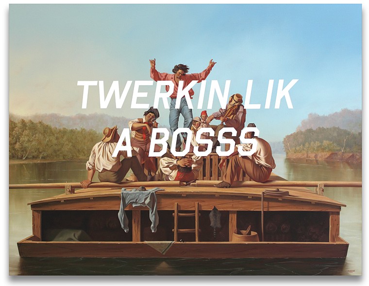
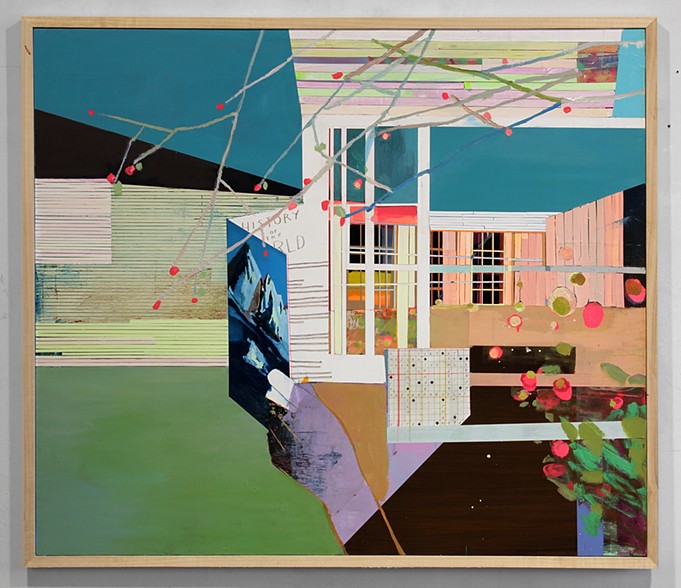
Being out here in the Northwest versus growing up in Florida, I’ve gotten more of a sense of what it would have been like to see this wild and glorious country for the first time. It is difficult in this day to comprehend the hardship and sluggishness of that world. How it could take weeks, even months to convey the simplest of communications. In his latest series of paintings, American _Tier, Denver artist Shawn Huckins explores the juxtaposition of the artwork of the 19th century in America versus our 21st century technology-driven vocabulary.
Judging from the names they gave some of the places out here, such as Cape Disappointment and Dismal Nitch, I can imagine Lewis & Clark would have been texting WTF all over the place during their expedition. Huckins’ series surely brings to mind the evolution of language between then and now, especially in our written communications. I find it interesting to think about how people are the same as they were then, in their feelings and emotions, what has changed is in mode and frequency in which those emotions are expressed.
Every place has its own personality, just like any person. Some places are a bit dark and brooding, while others are so sunny and bright they are almost annoying.. Victoria artist Stacey Rees captures the sensual and spiritual atmosphere of her surroundings in her paintings and illustrations.
I always find it interesting to compare the feel and palette of the different places we visit. Between some, there are only minor differences, but in other spots, it feels like being in an entirely different world. And in those places, often times our personalities may absorb some of that difference, too. As in Rees’ work, in which there is a wonderful sense of not just earthly but spiritual atmosphere, we can take on not just the physicality of a place but some places get into our souls– for better or worse.
Mr. Forager & I have visited a few soul-filling places. Do you have any place you’ve visited that had a profound effect on you?
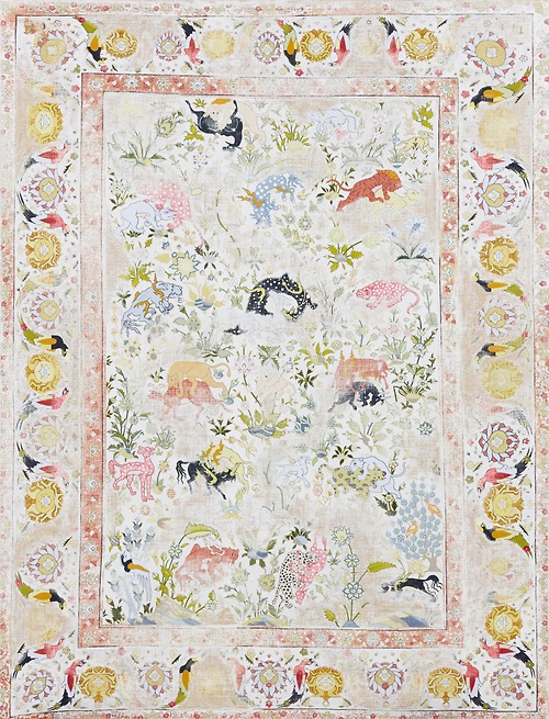
Things are just things, it’s true. Life is about our relationships and what we say and do, yet the objects that we live with become a part of who we are. Artist Kour Pour methodically recreates intricately patterned carpets similar to the ones he grew up with in his father’s England rug shop.
We may not take much notice of those objects that surround us each day, but they become a part of our associations and our memories. It’s why after the death of a loved one it’s so hard to go through their things, to touch those pieces of life that beloved fingers held each day, but will no more. Those objects become a part of our history, as carpets did for Pour, and when we least expect it, those associations may help bring about healing.
In love, as in life, things aren’t always neat and orderly. Emotions go awry, we find ourselves sliding down the rabbit hole of sensitivity, going from sadness to anger to regret to tenderness and back again. These large scale floral paintings by Florida artist Carmelo Blandino capture that undeniable exquisite mess that comes with loving another person.
Paint is applied thick and frenzy-like, just like the whirlwind of those first moments of falling in love, every touch, every minute together is dripping with excitement and overwhelming beauty. Then, as time goes on, we settle into a different kind of messy loveliness, the kind that knows what you look like first thing in the morning, but can’t wait to kiss you anyway. The kind that loves you through your moodiness and emotional outbursts. The kind that fights honestly and fairly and then loves you even more when it is over.
On this Valentine’s Day, I wish you the messiest sort of love, dear Artsies! If you’d like to see more gorgeous flowers by Carmelo Blandino, please visit his website.
If you’re following along on Instagram, you might have noticed a little sneak peek into something I’ve been working on lately. Since starting my #colorforaging2014 project at the beginning of the year, I’ve had more creative energy than ever. And I’ve begun taking full advantage of it. I’ve always worked in a series format ( thanks, Prof. Ladnier for creating that habit! ) and have already completed 5(!) paintings in one series while my mind is pondering, researching, contemplating the beginnings of seven more different series of work.
Early on, my above mentioned college painting prof labeled me a colorist. It’s true, I’ve always been drawn to color and color theory. I’m sure one of my first experiences with color was in admiring the fashion in my favorite curl-up-on-a-Sunday classic films. As a little girl, I imagined myself in those beautiful clothes, becoming those charismatic leading ladies. Then as a grown woman, I’ve found myself analyzing the use of color in the establishment of character– the reasoning why the film’s costume director chose that particular gown in that particular shade for that particular scene. There was a method to all that beautiful madness.
Each series of paintings I have in mind will deal with the psychology and effect of color in some way. For this first series, which I’ve tentatively titled Feminine Wiles, I’m focusing on the fashion of iconic female film characters, especially those used in scenes in which the character is capitalizing on her feminity in some way.
Each piece is a small abstract portrait of that character at the moment and how the character is defined by that particular costume choice. All that intellectual stuff plus I just love pretty dresses and pretty paint..
The first painting in the series is a study of Audrey Hepburn’s Holly Golightly from Breakfast at Tiffany’s. While the character’s series of elegant little black dresses is synonymous with the character, I’ve always been drawn to the pink Givenchy cocktail dress. The character wears this confection while in the midst of wooing her Brazilian millionaire would-be fiancé. She is no longer fashioned as cool and elegant, her style for Jose is warm and feminine and festive. It is such an interesting contrast to the devastation that happens later in the scene.
Through a sequence of layers in shades of grey, red, purple, pink and white in acrylic on a 6×6 inch canvas panel, I finally came to a point where I felt like I had a representation of my own interpretation of the character in that dress, in that scene.
Audrey Hepburn as Holly Golightly, The Pink Dress by Lesley Frenz
acrylic on canvas panel, 6×6
I’ve always worked on larger canvases in the past but our current vagabond lifestyle doesn’t include much room for storage of bulky canvases. I would love to translate these BIG, but for now, these little studies are proving satisfying. I can’t wait to share more of the Feminine Wiles series with you! Do you have any iconic female film characters to suggest? I have a list of possibilities, but am completely open to suggestion. I’ve been focusing on classic films, but may eventually move into contemporary characters, too. Can you tell I’m having a ball and completely obsessed with this? I hope so, because I totally am!
Art and logo by Lesley Frenz/Artsy Forager, other image sources linked above.
For some artists, the end product is the goal, but for others, the process of creating, pushing the limits of medium and where that journey takes them is more the target. In his work, Portland artist Justyn Hegreberg explores the reaction of paint against glitter, plastic against canvas.
Given their diminutive size, most being around 5×7 inches, there is a playfulness about these pieces that make them seem like small and lively test samples for a larger project. Which is a huge part of their charm. If they were to be enlarged, these pieces would lose some of their frivolity, gaining in return something labored. It’s that experimental aspect of each piece that is so pleasing– you can almost see him working out the juxtapositions.. so what if I extend the raw canvas here, how about some yellow there?
How about you, Artsies? Are you a final result type of artist or is the process where your joy is found? If you’d like to see more of Justyn Hegreberg‘s work, please check out his website.
Occasionally, Mr. F will wake up and unknowingly be mad at me for something I did in one of his dreams. It’s only after being awake for a bit that he realizes that what he is remembering never actually took place. Just last night, I had a similar dream about him and had to stop myself from carrying those feeling on into our day. Funny how much what happens while we’re sleeping can affect us, isn’t it? These paintings by Kristen Schiele remind me of what my subconscious must be like– not orderly and sensible, but filled with hints and tokens of seemingly unrelated moments.
These pieces are dream-like in their mash-up of elements, jumping from here to there just as our subconscious does in slumber. I often awake wondering– where did that come from?? Sometimes it seems like we’re trying to work out our waking life in our dreams, or perhaps the past comes back more vividly when we aren’t consciously trying to resurrect it.
To see more of Kristen Schiele‘s work, please visit her website. Have a fabulous weekend, Artsies! I’m looking forward to lots of dream-time!
A while back I wrote about the work of Wendy McWilliams and how to me, much of her work illustrates the glimpses of light and color that give us hope in the dark. We are now well into winter and if you happen to be living in the Northeast, you may be wondering if you will ever see blue skies, flowers and unfrozen ground. February has always seemed to be winter’s last cold blow, preparing us for March and the beginning of our transition into spring. But maybe you can’t wait for March and need to put a little spring into your dark winter days! This painting by McWilliams reminded me that even in the midst of the coldest, darkest winter, we can still embrace the spring in our souls.
I love how the Tapestry Necklace brings together the dark and light of McWilliams’ painting, the colors echoing the painting and the inspiration, as well as mimicking the beautiful messiness of the brushstrokes. Perfect for a shot of color and would keep your neck warm while it’s still freezing outside!
To see more of Wendy McWilliams’ work, please visit her website and to see more fiber art necklaces like these ( I want one! So many gorgeous choices! ) check out the You Made That shop on Etsy.
Not that long ago, women were valued for not just their beauty, but their “accomplishments”. That term didn’t refer to earning a promotion or college degree at the time, but showing a capacity for a certain “womanly” skill set– things such as singing, playing music, dancing and embroidery– all thought to be the types of talents needed to be a successful hostess and therefore, appropriate for marriage. In her Samplers series, New York artist Clare Grill deconstructs these antiquated notions by reinterpreting and deconstructing embroidery samplers in paint.
Painting would have also been listed under the merits of “accomplishment”, a coincidence not lost on me or I’m sure on the artist. Samplers were originally just that– quick samples of stitches a needlewoman saw and admired. Then, as time went on, they became examples of proficiency and skill at needlework, a talent valued across the classes, though certainly more necessary for the lower.
Grill’s paintings retain some of the original sampler designs– the decorative borders, the notation of name, date and age. Yet I find it interesting in the way that these painted samplers are done in a much more abstract and naive style. Perhaps a nod to the exclusion of these girls and women from achieving more meaningful and intellectual pursuits.
You know one thing I miss about working in an office? Cake days. Birthdays, new babies, going aways, work anniversaries– any excuse to have an afternoon cake break in the lunch room. I was always amazed by how having a little treat in the middle of the day made the work day seem just a bit special. I can almost taste these painted treats by Kentucky artist Lori Larusso.
It’s interesting how important food is, the preparing of it, the gathering, the sharing and consuming, to so many cultures, including our own. How baking cookies for someone is a warm and welcome way to say thank you and how we wouldn’t dream of having a celebration without food! Why do you think that is? Perhaps because our need to eat is so universal? Because we all need and crave food, it’s the perfect ice breaker and status leveler. Maybe that cupcake isn’t on our diet, but the child we share it with will remember the moment always.


 Cake by Lori Larusso")
 by Lori Larusso")

 by Lori Larusso")
