Category: Paintings

  • Walking the Line: Sabine Finkenauer

    Walking the Line: Sabine Finkenauer

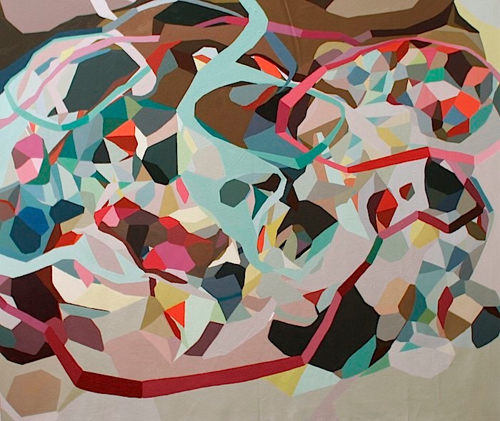
    While I have a great love of work with lush, chaotic patterns and texture, there is always something so lovely and intriguing in work that embraces visual economy.  Barcelona based, German born artist Sabine Finkenauer breaks down the world into simple lines and shapes, creating a signature visual language that is a little whimsical, a little retro and altogether lovely.

    Sabine Finkenauer | artsy forager #art #artists #painting #abstractart Sabine Finkenauer | artsy forager #art #artists #painting #abstractart Sabine Finkenauer | artsy forager #art #artists #collage #abstractart Sabine Finkenauer | artsy forager #art #artists #collage #abstractart Sabine Finkenauer | artsy forager #art #artists #painting #abstractart

    There is a childlike playfulness to her work, but her use of space and palette bring a sense of sophistication.  Light-hearted enough to seem like Sunday afternoon doodles, looking closer and at her body of work as a whole, you can see the thought and calculation as she works her way through her use of space, line and color in drawing, painting, collage and sculpture.

    Want to see more of Sabine Finkenauer‘s work?  Please visit her website.  Wouldn’t it be lovely to see the world in such a simple way?  I’m making that a goal this week– ignore the distractions and see what is simply before me.

    All images via the artist’s website.

  • Wafting Serenity: Laura E. Pritchett

    Wafting Serenity: Laura E. Pritchett

    It seems that spring in Eureka is a very windy season.  The sun is shining and from our cozy apartment, it looks deceptively warm.  But upon stepping outside we’re quickly reminded that we are in a transitional season– the air still has a chill and the warmth of stillness is welcome.   The breezes blow and scatter fallen leaves, branches and petals, but at the same time, they are carrying away the grey and damp of winter, ushering in the peace and warmth of the coming summer.  In her Room to Breathe series, artist Laura E. Pritchett explores the magical  influence of a breath of air.

    Laura E. Pritchett | artsy forager #art #painting #artists Laura E. Pritchett | artsy forager #art #painting #artists Laura E. Pritchett | artsy forager #art #painting #artists Laura E. Pritchett | artsy forager #art #painting #artists

    Pritchett has made a big splash in the Instagram world with her breathtakingly beautiful photography– studies of light, air, and seasons ( follow her IG feed here for regular doses of serene inspiration ).  While perhaps more well known for her photography, these paintings  translate the same quiet wistfulness found throughout her work.  You can almost feel the soft breeze as it wafts up, up, and away, taking with it cares and troubles.

    To see more of Laura E. Pritchett’s work, please visit her website and do yourself a favor and follow @bythebrush on Instagram!  ( And @artsyforager, too, if you aren’t already.. 😉 ).

    All images are via the artist’s website.

  • Finding My Own Artsy: Feminine Wiles, Painting Four

    Finding My Own Artsy: Feminine Wiles, Painting Four

    Another week, another painting in my Feminine Wiles series to share with you!  Feminine Wiles is a series of small abstract color studies based on iconic female film characters.  My introduction to many of these films and characters came through my mom, with whom I share a love of sappy love stories, witty characters, and gorgeous design.  One of her favorite character turns ( and mine!! ) is Barbara Streisand as Fanny Brice in Funny Girl.

    FMO_Funny Girl collage

    images found here here here and here

    I’ve always loved the palette of this film– filled with warm earthy browns and oranges, highlighted with delicate pinks and passionate reds– but when thinking about this project, I was struck by the reoccurring use of lavender hues on and around Fanny.  Of course, this could have something to do with how the cool hues so beautifully compliment Streisand’s creamy complexion!  But I like to think that costume designer Irene Sharaff and the production team were delicately clueing the audience in to the fact that the character of this young girl from Henry Street was destined for greatness.

    Frenz_Barbra Streisand as Fanny Bryce

     Barbra Streisand as Fanny Brice in Funny Girl by Lesley Frenz

    acrylic on canvas panel, 6×6

    Purples hues are often associated with royalty, riches and power.  So it isn’t surprising that Fanny would often assume a lavender glow.  She was a star, but unlike Jo Stockton, one of her own making.  She was confident in her talent and passionate in her pursuit of fame and stardom, even at personal loss.

    FMO_Funny Girl collage with painting

    Funny Girl still found here

    In the end, despite setbacks and heartache, Fanny perseveres and shows that the strong will always survive.  I’ve always thought there were great lessons to be learnt from Funny Girl— of tenacity, talent, love, humility and perseverance.  Oh and let’s not forget that unbelievably beautiful voice!

    To see more from the Feminine Wiles series, check out the archives here.  Next week, a polarizing character and one of the most iconic!  Hint: drapery.

    Film image sources linked above, art images by Lesley Frenz.

  • Lavish Simplicty: Miya Ando

    Lavish Simplicty: Miya Ando

    As many artists know, much of the time, art making is a matter of knowing when enough is enough.  Or even when enough is just a bit too much.  In her work, New York artist Miya Ando is creating pure moments of simply just enough.

    Miya Ando | artsy forager #art #paintings #sculpture #abstract Miya Ando | artsy forager #art #paintings #sculpture #abstract Miya Ando | artsy forager #art #paintings #sculpture #abstract Miya Ando | artsy forager #art #paintings #sculpture #abstract

    Miya Ando | artsy forager #art #paintings #sculpture #abstract

    By working in a process in which she hand-dyes metallic surfaces, Ando creates pieces with an incredible sense of stillness and light.  Translucent layers of color reflect not just the light without but the light within.  By keeping the compositions simple, the work is free from distraction, allowing the viewer to fall into its spell, to meditate on the purity of color and transformative power of light.

    To see more of Miya Ando‘s work, please visit her website and be sure to follow her on Facebook, Tumblr, and Instagram.

    Here the artist speak about her work in this video interview–

    Teaser – MIYA ANDO from Tricycle on Vimeo.

    All images are via the artist’s website.

  • Chasing the Light: Zaria Forman

    Do you ever think about what kind of legacy you will leave behind?  I’m not thinking of material wealth or possessions, but the impact that your life will have had on the people who’ve known you?  It’s a sobering thought, to be sure, to contemplate what your impact will have been.  Brooklyn artist Zaria Forman ‘s series Chasing the Light is the culmination of the impact of a mother’s dream on her daughter.

    Zaria Forman | artsy forager #art #artists #landscape #greenland Zaria Forman | artsy forager #art #artists #landscape #greenland Zaria Forman | artsy forager #art #artists #landscape #greenland Zaria Forman | artsy forager #art #artists #landscape #greenland Zaria Forman | artsy forager #art #artists #landscape #greenland

    The artist’s mother originally conceived the idea to lead an art expedition up the Northwest Coast of Greenland, the only other expedition here of this kind not done since 1869.  Illness overtook her mother and the daughter kept her promise to carry on with the expedition.

    The hyperreal pastel drawings of the disappearing glacial landscape remind us that we are continually impacting the world around us, whether we are aware of it or not.  These monumental mountains of ice are slowly melting away, perhaps forever.  We are losing a loved one, gradually, reluctantly.

    To see more of Zaria Forman‘s work, please visit her website.

    All images via the artist’s website.

  • Chaotic Abundance: Katherine Mann

    Chaotic Abundance: Katherine Mann

    We all seem to seek peace and quiet.  An escape from the chaos.  And yes, its true, we do need those times of rest and rejuvenation.  But sometimes it is in the chaos that we find our strengths, what we are really made of, that hone what we are all about.  The abstract works of Washington, DC artist Katherine Mann are incredible clashes of material run wild and moments of fastidious control.

    Mann_Cloud of Oil Mann_Maw2 Mann_Tick Mann_Embroideries Mann_Fallow


    Each piece begins with a spill of color, an organic beginning to work that shifts between careful discipline and perceived pandemonium.  They almost have a feeling of accidental abandonment, as if a pot of paint was spilled over a meticulously wrought drawing.  I say almost because you can see that each is a mastery of composition– every placement of line, color and shape providing just the right compliment and contrast.

    To see more of Katherine Mann‘s work, please visit her website.  PS– I posted larger images than I normally do for artist features because these are human-scaled works– check out that last installation image for scale!  Amazing.

    All images via the artist’s website.

  • Meaning & Myth: Louis St. Lewis

    Meaning & Myth: Louis St. Lewis

    It’s easy to look at the past through a utopian filter, usually fueled by too many historical novels and costume dramas.  We’re often shown worlds filled with richness, decadence and graceful living.  But under all the frills and frippery lie the other side of riches– the backs upon which the wealth is gained, those who serve, and ultimately, the problems caused by overabundance.  The work of artist Louis St. Lewis touches on the themes of decadence, privilege and the myth of history.

    Louis St. Lewis | artsy forager #art #figurativeart #mixedmedia Louis St. Lewis | artsy forager #art #figurativeart #mixedmedia Louis St. Lewis | artsy forager #art #figurativeart #mixedmedia Louis St. Lewis | artsy forager #art #figurativeart #mixedmedia Louis St. Lewis | artsy forager #art #figurativeart #mixedmedia

    I’ll admit, I’ve been guilty of watching one too many Jane Austen movies, finding myself wishing I could have been born into aristocratic 19th Century privilege rather than 20th Century middle class.  Oh to have the luxury of being a “lady”!  With a lady’s maid at my bidding and all the time in the world to read, paint, sew, dance and all the other proper skills a lady must possess.  But then there were always little hints to break the facade of carefree privilege– the pressure to marry “up”, to bear sons, the boredom of not being able to pursue what may truly be of interest.

    Mr. F and I just last night were talking about what being “rich” might mean.  For us, it would mean freedom– freedom to travel, to spend our lives doing exactly what we want to do when we want to do it.  But with that freedom must come an incredible burden and responsibility, too.  Perhaps it is best that we remain solidly middle class.  We live a life of privilege by the standards of most of the world’s population and we do have freedom– the freedom to chose to live our lives in the way we choose.  It is a mythological goal, but one that is definitely attainable with vision and sacrifice.

    To see more of the work of Louis St. Lewis, please visit his website.  You can see his work in New Orleans at one of my favorite galleries, Gallery Orange!

    All images via the artist’s website.  Artist found via Gallery Orange.

  • Finding My Own Artsy: Feminine Wiles, Painting Three

    Finding My Own Artsy: Feminine Wiles, Painting Three

    I admit, I’m a big fan of the candy color confections of the film variety that came out of the 1950s and 60s.  The costumes!  The dancing!  I love it all.  One of my favorites of these sweet treats is Funny Face, starring Fred Astaire and Audrey Hepburn.

    FF341

    image found here

    For the third painting in my Feminine Wiles series, I wanted to capture the glamour and struggle of Jo’s transformation in Funny Face.  Intellectual and bookish Jo finds herself thrown into the world of modeling and couture fashion, finding herself struggling with reconciling her newfound feminine allure and her high minded beliefs.  I love that the character doesn’t allow her physical transformation to change her ideals.

    FMOA_Funny Face collage

    hepburn image found here

    In the scenes in which she wears this blue satin cape, the character is distressed over what she sees as insurmountable differences of mind between herself and the man she’s falling for, photographer Dick Avery played by Astaire.  The color is such an intense, moody blue, with hints of grey and lavender, I’ve always felt like it captured the conflict inside her character beautifully.

    Frenz_FW_Audrey Hepburn_Funny Face

     Audrey Hepburn as Jo Stockton, Funny Face, The Blue Cape by Lesley Frenz

    acrylic on canvas panel, 6×6

    What do you think of this one, Artsies?  I wish my camera could do these little paintings justice.  Any sources/tips for photographing paintings using a point & shoot digital camera?  Would love a DSLR but don’t see it in the budget any time soon!  If you have tips to share, please let me know in the comments!

    You can find more of the Feminine Wiles series here.  I’ll have a new one for you next week, one of my favorite all time characters!

    Film images linked above.  Paintings by Lesley Frenz.

  • Circle Circle Dot Dot: Casey Vogt

    Circle Circle Dot Dot: Casey Vogt

    Now you’ve got your cooties shot.  But maybe that cooties shot will do you more harm than good.  It might help prevent you from contracting the dreaded cootie, but the side effects will have you begging for cootieville. In his work, Akron artist Casey Vogt explores this country’s relationship with drugs and big pharma.

    Casey Vogt | artsy forager #art #mixedmedia #paintings Casey Vogt | artsy forager #art #mixedmedia #paintings Casey Vogt | artsy forager #art #mixedmedia #paintings Casey Vogt | artsy forager #art #mixedmedia #paintings Casey Vogt | artsy forager #art #mixedmedia #paintings

    The background of each piece is composed of elaborate mandala-like patterns, massive layers of dots of house paint.  These layers create a trippy atmosphere recalling the disorientation of a drug induced state.  Cowboys in various situations find themselves among the meditative chaos.  Maybe the cowboys are ghosts– the vestiges of times before corporations took on the role of healer.  Or perhaps they are the new generation of American thinker, the one that rebels against the accepted norms and strikes out on their own, carving their own way and pioneering through unknown territory.

    To see more of Casey Vogt‘s work, please visit his website.

    All images are via the artist’s website.  Artist found via Diehl Gallery.

  • Live the Artsy: Erin McIntosh

    Live the Artsy: Erin McIntosh

    While we are getting settled into our new temporary Eureka home, what we want in our eventual forever home is heavy on our minds.  While Mr. F aka Mr. Practicality is thinking of square footage, alternative power sources and cost, I tend to focus more on how the space will feel and how we will live in it.  A home that is a peaceful retreat, yet full of life and creative energy.  The mix of warm neutrals, light pales and bright shots of color in Untitled by this month’s Featured Artist Erin McIntosh, feels like the best of artsy spaces– inviting, yummy colors and patterns and spots of cool serenity.

    LTA_McIntosh collage

     art | found here

    interior | found here

    Now to design a space how this painting feels– this interior featured on Apartment Therapy  feels like the perfect translation.  Though this series by Erin is based in geometric shapes, the  atmosphere remains organic and flowing, never hard and stagnant.  There is warmth to be found in the natural woods and nubby textures in the room and the pattern on the rug & other textiles calls out to the geometrics in Erin’s painting.  My favorite element, the light blue concrete floor, provides a stream of lightness and translucency, just as shots of the same blue  do in Untitled.  Oh how an Artsy could live here!

    To see more of Erin McIntosh‘s work, please visit her website!  Want to see more from the Live the Artsy series?  Check out the archives!