I stumbled across this necklace from Anthropologie on Pinterest today. If I were a Margaret Glew painting, I would wear this all the time.

necklace available here

I stumbled across this necklace from Anthropologie on Pinterest today. If I were a Margaret Glew painting, I would wear this all the time.
necklace available here
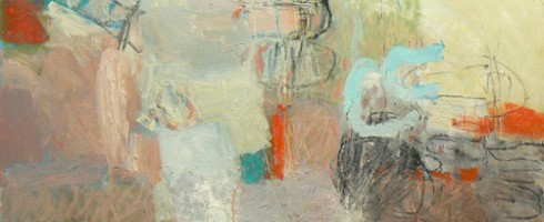
I have such a huge amount of respect and awe for artists who work in the abstract, especially gestural, expressive works like those of Toronto artist, Margaret Glew.

There is such an amazing amount of controlled chaos in each of Glew’s abstracts, they are fairly bursting with harnessed energy. The scribbly lines and forms give her work a childlike essence, yet if you’ve ever tried to accomplish excellence in abstract painting, you know ( as I learned in college! ) just how difficult it can be.

After all, Picasso himself once said “It took me four years to paint like Raphael, but a lifetime to paint like a child.”

What may seem to a novice eye like mere scribbles and marks are placed yes, perhaps intuitively but deliberately. For Glew, each shape and line is a kind of shorthand. She’s created her own visual language, telling her stories in texture, color and gestural expression.


And it is a story I could read over and over again! To see more of Margaret Glew’s work, please visit her website. Many thanks to Artsy Forager favorite artist Christina Foard for the introduction to Margaret’s work!
Featured image is Pitter Patter ( detail ). All images are via the artist’s website.
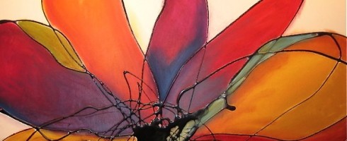
This blogging world is chock full of creative and inspiring people. I am so excited to participate in the collaborative blogging project, Art to Inspiration! Art to Inspiration is a monthly collaborative blogging project in which bloggers around the world post how the same piece of artwork has inspired them on the first Wednesday of every month. So let’s get started!
I was pumped when I saw the artwork inspiration for April, 2 Years, 264 Days and This Morning by Pakayla Biehn, an artist whose work I love and recently featured!

In my gallery days, one of my absolute favorite tasks was to help curate, design and plan how the work was hung in the gallery. Laying work out, figuring out how pieces relate and the best way for them to work together visually. So for my first Art to Inspiration, it felt natural to curate my own gallery of work inspired by Biehn’s piece.
 by Markus Linnenbrink")

 by Lauren Clay")


Markus Linnenbrink | Kristina Bailey | Lauren Clay | Wil Jansen | Lissy Laricchia | Michelle Armas
Visit the artists’ websites, linked above, for more inspiration!
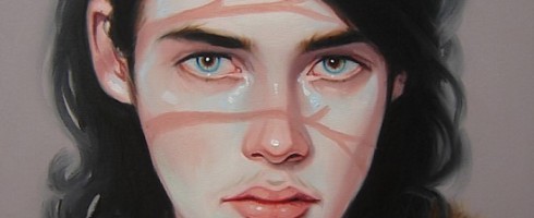
Sometimes, in a world filled with sarcasm and cynicism, we can easily forget the vulnerability of the human spirit. How one wounding word can hurt and haunt us. Toronto artist Kris Knight’s portraits remind us that the strength we so often feign is not impenetrable.

The pale pastel palette Knight employs translates to us the inherent frailty of our psyches. Though each subject takes a strong stance, often looking straight into the gaze of the viewer, their faces tell a different story. Beneath the facade, we see flushed cheeks, downturned mouths and eyes that seem to be bright with unshed tears.

Some wear netted masks, hiding in plain sight. While others at once stand defiant under our close attention, yet their eyes are pleading.


They are the faces of loved ones and strangers. People we think we acknowledge but who are longing to be known. To see more of Kris’s work, please visit his website.
Artist found via Escape Into Life.
Featured image is Run Deep, oil on canvas, 16×20. All images are via the artist’s website.
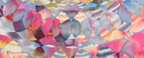
I am not a knitter. Nor do I crochet, weave or macrame. I tried crocheting in my middle school Home Economics class and, let’s just say, I didn’t get it. And all that knit 1, purl 2 stuff? Just sounds like math to me, which is to be avoided at all costs. But I love woven textiles. There is such an innate beauty in the patterns and texture create. Los Angeles artist Hadley Holliday’s exhibtion, Warp and Weft at Taylor De Cordoba Gallery is weaving together a caliedoscope of color and pattern.

She is exploring the worlds of space and depth and the illusions created by overlapping shapes and patterns. There is a fantastic sense of movement and prismatic expanse to her paintings.


They seem optically illusional in nature, yet there is also an organic quality to them, reminding me of the intersecting lines and orderly nature of a spider’s web.

To see more of Hadley Holliday’s work, please visit her website. If you happen to be in Southern California, you can see Warp and Weft at Taylor De Cordoba Gallery only until this Saturday, April 7th. So get moving and see it this week!
Featured image is Sun Vault ( detail ), acrylic on canvas, 63×63. All images are via the Taylor De Cordoba website.
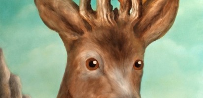
Hubby and I have been going through major winter cabin fever. Every weekend lately, it’s been either snowing or raining. We miss getting our hiking on and are ready to see some wildlife actually in the wild ( the diaorama at the local Cabellas doesn’t count ). There’s just something so magical about coming across creatures in the woods. Are you experiencing the itch to get outdoors and do some animal watching? Maybe these will help..


Duy Huynh | Susan Hall | Rachel Denny | Scott Belcastro | Deedee Cheriel
Happy weekend!
Featured image is by Corine Perier. All images are via the artists’ websites, linked above.
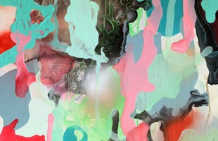
Being a hyper visual person, I remember imagery like nobody’s business. Names, however, often escape me. So I was very excited when on Pinterest last week, I spotted the Omaha artist Karen Schnepf. We’d carried a few of her paintings while I was working in a gallery, purchased through an art rep, so we’d never had any contact with her personally. I was so delighted to find her again so that I could share her striking, color saturated work with you!

Let me just say that none of these photos do Karen’s work justice. Her canvases are super high-gloss, making it nearly impossible to get accurate photos. But that deep shine is one of the things that I love about her work.

The glossy surface enhances the brilliance of her saturated color palette. Her use of such vibrant color tempered with black and lustrous surfaces call to mind modern stained glass on canvas. The color seems to virtually ooze across the canvas. I want to swim in it!


To see more of Karen Schnepf’s work, please visit her website.
Featured image is Painting-033. All images are via the artist’s website.
Every time I go back to the work of Portland artist Anna Magruder, I fall more in love with it. Come and see why over on Escape Into Life today!
 by Anna Magruder")
I am craving color. It seems like spring has sprung everywhere except where we are. Don’t get me wrong, I love winter, but after almost 4 months without flowers, I am ready for blooming! So it should be no surprise that this week I’m drawn to the work of Anne Harper.

Spring is full of contrasts– bright flowers glowing against skies wet with rain. Harpers work parallels for me the loveliness of an urban spring. Her liquid color reminds me of my first spring visit to Seattle, where the cherry blossoms littered wet sidewalks. It seemed magical. ( Probably didn’t hurt that I was newly in love, both with the city and my then soon-to-be hubby! )

Then, the rainy days of spring gradually dry, giving way to the glorious glow of summer. I am ready. Are you?


To see more of Anne Harper’s work, please visit her website. In addition to being a fantastic painter, she is also a talented musician! You can listen to her tunes here.
This artist found via Saatchi Online.
Featured image is a detail of Persuasion #4. All images are via the artist’s website.
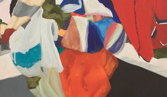
I can sort of relate to Linus van Pelt, of Peanuts fame. I have a favorite blanket, too. It was never a security blanket of the type that is carried around and a meltdown ensues when it is forgotten, lost or laundered. But rather, I have a blanket ( quilt, actually ) given to me by my grandmother that is a repository of memories and is one of my prized possessions. I imagine Los Angeles artist Erin Payne understands emotional connections to a cherished textile.

In her Piles series, Payne sets up still lifes constructed of heaps of blankets, sheets, tablecloths and other household fabrics set against landscaped dioramic backgrounds, forever memorializing these stacks on canvas. Just as I find comfort in the warmth of my grandmother’s quilt, both physically and emotionally, so do many once ordinary items become cherished vessels of remembrance.

But what happens when the person most connected to those memories is gone? The beloved item may be forgotten, thrown out or given away, becoming a hollow receptacle, now ready to be imprinted upon by a new owner.

Will their new keeper appreciate the past life of an object that may be a bit worn? Will they even give thought to whose history this article has been a part of?


I hope my grandmother’s blanket will be with me, reminding me of sniffles comforted and snuggles under a reading lamp. But even if it somehow finds its way out of my grasp, I hope the love that it carries radiates from its worn threads. To see more of Erin Payne’s work, please visit her website.
Featured image is Pile 4, acrylic on canvas, 24×24. All images are via the artist’s website.