Often when we think of spring, our thoughts turn to light, pale pastels but this season, I’ve noticed just how saturated everything around me seems. Maybe it’s just a shock to my eyes following the white and grey winter or perhaps this has just been an unusually sunny and bright season. In any case, I’m finding myself more drawn than usual to heavy doses of color and I’m blaming this saturated spring!
Here are just a few of the full color palettes inspiring me on Pinterest lately–
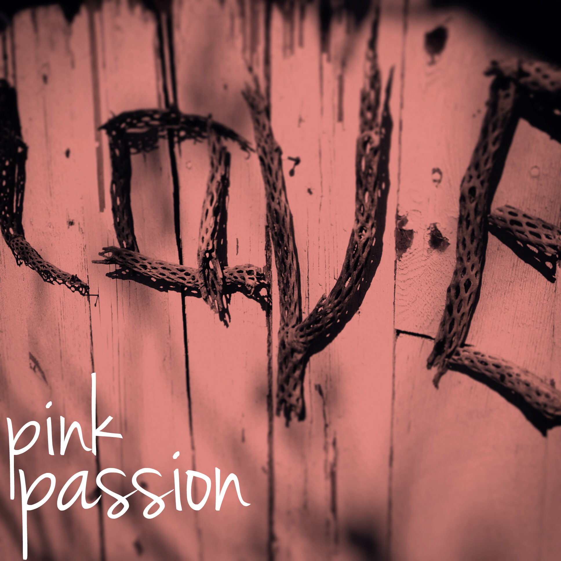
I don’t wear much pink, I’ve never decorated with it much, but it seems to have some strange kind of power over me ( see blog logo & graphics! ). I find the shade completely irresistible in artwork, and in, well, pretty much everything, about this time every year. I’m going to blame it on succumbing to mass advertising! Ha. You must admit, it is a lovely shade, this shade of love. The color of lips and roses and sunsets, it isn’t any wonder we find it so gosh darn romantic.
image by artsy forager
Here’s a little round up of a few rose-colored favorites from around my Pinterest boards lately..
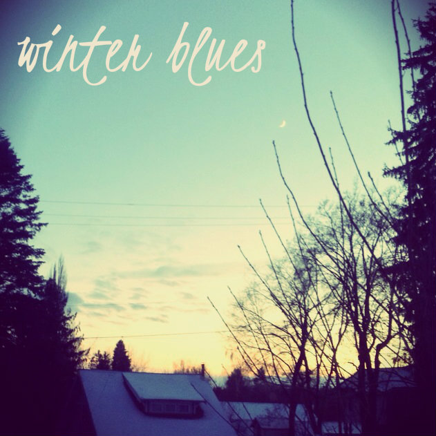
I’ve heard of this phenomena called the January Blues. A condition in which the post-holiday, short, usually cold and cloudy days get some folks down. I’m thankful not to suffer that affliction! If anything, I absolutely revel in the winter blues of January.
I love the fading light of late afternoon, the silhouette of bare tree limbs and the softness of the snow covered landscape. The world slows down, cools down, literally and figuratively, and our minds are given the chance to rest and renew. I’ve been pinning some of my favorite wintery images on my An Artsy WinterPinterest board and thought I’d share some of them with you!
I hope that maybe this post and peeking around the board will help you find the beauty in your winter blues! To see more selections, visit the An Artsy Winter board on Pinterest. If it doesn’t do the trick, turn on a heat lamp, pour yourself a cup of cocoa and count the days until spring! 😉
Well, it’s that time of year again! The folks at Pantone have made their pronouncement predicting the color that will be most on trend for the coming year. The Color of the Year 2014 is.. drumroll.. Radiant Orchid!
I’ll admit, at first I was underwhelmed. I haven’t been a huge fan of purples since Christmas 1985 in which every single gift I received was of a lavender hue. It was the favorite color of my 13 year old self, but I eventually tired of it and moved on, pretty much abandoning it forever. But once this news got out, I decided to do a little foraging for color amongst the art on my Pinterest boards and what ho, I spy a bunch of this very shade!
So maybe my inner 13 year old is subconsciously seeping through into my pins. Or, more likely, these artists know what Pantone folks have discovered– this particular shade, dubbed Radiant Orchid, is much more versatile than it may seem upon first glance.
It can be soft and feminine, as its floral moniker implies. These artists know that pairing this color with creamy neutrals and fellow floral shades creates a feeling of delicate suppleness.
When paired with darker shades and jewel tones, Radiant Orchid takes on a rich, earthy quality. Pairing such a feminine color with more heavy, masculine tones makes these abstract pieces perfectly balanced.
And of course, artists know when to capitalize on a color’s inherent pop factor. In the work below, these artists have used Radiant Orchids bright and bold sensibility to bring vibrant fearlessness to their work.
Are you a fan of this lavender shade? If you’re an artist, are you using it in your current work or have plans to try to incorporate it in 2014? Designers & consultants, think your clients will be itching for artwork to incorporate this color into their interiors? Artsy minds want to know!
All image sources are linked above. Some images are cropped details of the original.
As summer passes into fall, those vibrant brights we’ve embraced in the heat slowly begin to fade into pale grey and warm, rosy light. I’ve always loved this in-between season, when the afternoon light begins to glow with the promise of cool evenings and coming snows.
With the change brings a turn back to delicate, cool tones echoing the coziness of the months ahead. I want to bathe myself in these gentle hues! Below you can see just a few of the dustings of blush I’ve been foraging over on Pinterest..
I’m ready to embrace this new season in all its guises. How about you? I’m collecting more autumnal inspiration over on my new Pinterest board, Artsy Welcomes Autumn. Come over and check it out!
Maybe it’s finally living in a place surrounded by water after living in the desert last year, but I have been finding such inspiration in the various hues of blue to be found in the waters around Seattle! So many gorgeous shades from the deepest, darkest blue to green aquas, I just want to plunge right in and see what mysteries await!
It’s only natural that this blue obsession is trickling over into the artwork I’m foraging on my Pinterest boards.. here’s a little deep blue sea inspiration to get your own seas churning!
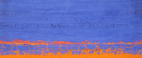
While digging through my Pinterest inspiration boards, planning my features for next week, I noticed a color trend in a few of my pins. It’s funny how our minds gravitate toward certain palettes some days, isn’t it? Apparently, my eyes are loving the combination of orange and indigo these days! I thought you might enjoy a few examples from my boards..
Christina Otero ( via My Modern Metropolis )Michael RiceNeil Wax ( via Skidmore Contemporary )Frances SewardHenry DomkeChristopher St. Leger
Any color combos you’re enamored with these days? Guess this native Florida girl can’t escape the Orange & Blue!
Featured image by Stephanie Paige. Sources can be found by clicking on each image.