Blog

  • Friday Design Finds: If These Walls Could Draw

    Friday Design Finds: If These Walls Could Draw

    Happy Friday, Artsies!!  You may have noticed that the Friday round-ups have been a bit more design oriented of late.  It wasn’t intentional on my part at first, but once I noticed it, I decided to just dive in completely!  Artsiness abounds in all kinds of places– fashion and interior design, architecture, consumer goods, you name it.  So beginning today, each Friday I’ll bring you a group of artsy design goodies that I find inspiring.  Hope you enjoy!

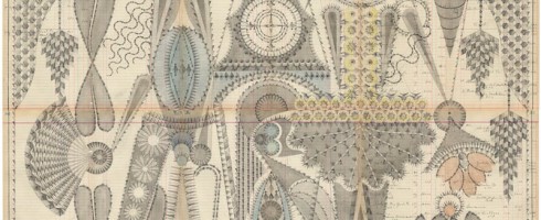
    Secret AF tidbit: The one and only time I was ever spanked as a child was for drawing on my bedroom walls with a permanent marker.  Now, there are wall coverings made especially for coloring or you can just draw/paint directly onto your wall ( if you’re an adult & own your walls ).  Instantly artsy vertical space.

    Paint by Numbers mural created by Katie Blair for her son Max’s little art studio

    source

    Wallpaper by Jonas Carlberg

    source

    Colour in Wallpaper by Jon Burgerman

    source

    Frames Wallpaper by Graham & Brown

    source

    Audrey Hepburn wall mural by Ben Slow

    source

    Don’t these make you just want to draw all over your walls?

    All images sources are linked above.

  • October Art Associations Contest Winner: Athena Roth!

    October Art Associations Contest Winner: Athena Roth!

    Athena’s board was dark & moody and we loved it!  Doesn’t she have a great eye?

    Athena Roth’s Winning Art Associations board

    I mean, those scarves, that ring and the Vivienne Westwood bag are gorgeous!  Not to mention the fantastic artwork she included.  It all worked together to beautifully compliment Kate Farrall’s work.  See the rest of Athena’s winning board here!

    I’ve already notified Athena of her win and she’s super excited.  Want to be inspired and maybe win free artsy stuff?  Art Associations back next month with new art and another giveaway!

    In the meantime, follow all the artsiness here on Artsy Forager and over on my Art Association partner Erin’s blog, artsocial.

  • Flashbacks & Snapshots : Diego Gravinese

    Flashbacks & Snapshots : Diego Gravinese

    There are some artists whose work I respond to on a visceral level, visually.  I see it.  I love it.  I don’t have to know what it’s about or the super secret story behind the meaning of each piece.  The paintings of Argentinian artist Diego Gravinese grabbed me when I spotted one on Pinterest last week.

    The Love of Renault and Burritoes Obsequious ( diptych ), acrylic and enamel on canvas, 79×51

    The artist’s earlier work ( such as The Love of Renault.. & In the Future.. ) are conglomerations of painted memories.. scenes from childhood and current memories mix with nostalgic elements to give us visual tales of how each experience builds on the ones that came before it.

    Milk Girl, oil on canvas, 40×27.5
    The Method, oil on canvas, 71×47.2
    Mimesis, oil on canvas, 71×47.2

    His more current work, ( Milk Girl, The Method & Mimesis, above ), leave behind the nostalgia, focusing instead on fleeting everyday moments.  Painted in a photorealistic style, the palette of each painting seems carefully selected and limited, so that not only do we get a sense of situation and place, but the resulting image is arrestingly graphic.

    In the Future, We Will Colonize the Exterior Planets, acrylic on canvas, 75×39.5 ( overall )

    To see more of Diego Gravinese’s work, please visit his website.

    All images are via the artist’s website.

  • Guest Foraging for UGallery: Curated Persona:  Zombie Attack Survivalist

    Guest Foraging for UGallery: Curated Persona: Zombie Attack Survivalist

    It’s that time of the month..  for a little guest foraging over on the UGallery blog for my Curated Persona series.  I’m not a fan of super scariness, but I love art that’s just a bit spooky.   Check it out my Curated Persona: Zombie Attack Survivalist post here!

    Girl by Ryan Pickart
  • Under an Urban Sky: Jennifer Seymour

    Under an Urban Sky: Jennifer Seymour

    I don’t know what it is about this time of year, but it makes me crave a big city.  A city with bustling sidewalks and tall buildings.  Mr. Forager and I are still trying to figure out if we’re urban or small town people.  The work of British Columbian artist Jennifer Seymour definitely has me leaning toward big city life.

    Oscillations, mixed media on panel, 48×24

    Seymour’s works begin as photographs she’s saved and collected over time and are then reworked with layers of charcoal, pastel and glaze resulting in pieces that glow.  It’s as if all those reflective surfaces and city lights are caught in one hurried moment after another.

    Jump Start, mixed media on panel, 24×24
    Distant Constellation, mixed media on panel, 48×24

    These mixed media works capture what I love most about urban centers– the energy, that glimpse of mountains or river just beyond the skyscrapers, the feeling of endless possibility and opportunity.

    Skywalk, mixed media on panel, 48×24

    To see more of Jennifer Seymour’s work, please visit her website.  I’ll be here in yet another small town, dreaming of a more metropolitan life. 😉

    Artist found via one of her representing galleries, Sopa Fine Arts.

    All images are via the artist’s website.

  • Artsy on Escape Into Life: Jen Gotch

    Artsy on Escape Into Life: Jen Gotch

    I recently saw a clip of Jim Gaffigan in which he does a riff on our modern propensity to take photos of everything and then post them on all of our various social media outlets.  I’ll admit, I’m guilty of taking a photo of my dinner and posting it on Facebook for all of my friends to see.  The Defaced series by Los Angeles photographer Jen Gotch, ( which I’m featuring in my Artist Watch over on Escape Into Life today– see it here! ) reminds us that even before Instagram, we were still a society obsessed with capturing memories and sharing them.  Check out her work on EIL today AND if you love her style, Jen has teamed up with HGTV host and stylist extraordinaire Emily Henderson on a lovely little round-up of Jen’s work on Open Sky.  Check that out here!

    Someone Threw This Out by Jen Gotch

    Jen Gotch on Escape Into Life

  • Psychedelic Precision: Louise Despont

    Psychedelic Precision: Louise Despont

    Although I’m a pretty detail-oriented person, my own drafting and drawing style is much more intuitive than precise.  Architectural drafting was torture for me.  So the exquisitely elaborate and deliberate compositions of Brooklyn artist Louise Despont leave me speechless.

    Dancer, graphite and colored pencil on antique ledger book pages, 49.5×81
    Small Performers, graphite, watercolor, and colored pencil on antique ledger pages, 58.4×40.6 cm

    Despont creates these intricately graphic drawings on the pages of antique ledger books, providing a natural grid upon which to weave her compositions.  Reminiscent of Persian rugs and other ancient patterns, the artist is creating her own “abstract language of symbols”.

    Couple With Clock Tower, graphite on antique ledger book pages, 50.5×55

    These are works to take in as they were created.. slowly, deliberately, and with careful attention.  You wouldn’t want to miss out on any of the delicious details.

    The Bodhi Tree, graphite and colored pencil on antique ledger book pages, 170.2×174.6 cm
    Jester Inversion, graphite and colored pencil on antique ledger book pages, 54×82.5

    To see more of Louise Despont’s work, please check out her website, where you can see close-ups of these wonderfully complex drawings!

    Artist found via the Honey Kennedy blog.

    All images are via the artist’s website.

  • The Feminine Mystique: Pam Hawkes

    The Feminine Mystique: Pam Hawkes

    We are all guilty of over-sharing these days.  Thanks to Facebook, Twitter, Instagram, Pinterest, Four Square, etc., the world has become privy to our innermost thoughts, what we ate for lunch, how many miles we ran that day.  We scoff at reality shows detailing the daily lives of the Kardashanians, Snookis, and Honey B00-Boos of the world.  We wonder, whatever happened to the allure of mystery?  UK artist Pam Hawkes reaches back into the iconography of illuminated manuscripts and Renaissance portraiture to cleanse our palate of the modernly overexposed.

    Unbound, oil on copper leaf on board, 61×104 cm
    Tracing Mythologies II, oil on copperleaf on board, 62×122 cm

    The stillness and serenity of Hawkes’ figures are at such odds with how we live today.  The often classical poses reminiscent of religious iconography of the Virgin Mary and other figures may at first seem foreign to our contemporary eyes.  Yet there is a softness and vulnerability in these women, as if the ancient had come alive and found itself somehow wandering about our modern world.

    You Made Me II, oil, beeswax, and dutch metal on board, 30×41
    Fading, oil on copper leaf on board, 122×122 cm

    There is a sense of bound freedom to Hawkes’ figures, as if they are only just discovering the door to their cage is open.  We wonder why they sit so still, resisting the temptation to be free.  Perhaps they, like us, have grown fond of their cages.

    Birdsong, oil on copperleaf on board, 76×122 cm

    To see more of Pam Hawkes’ work, please visit her website— a great many gorgeous works to see there!

    Artist found via artist Deborah Scott and POETSArtists Magazine.

    All images are via the artist’s website.

  • Help Artsy Forager Decide on a New Site Design!

    Help Artsy Forager Decide on a New Site Design!

    Happy Friday, Artsies!  Allow me to distract you for a bit this afternoon.. Artsy Forager will soon be moving from WordPress.com to its very own domain at ArtsyForager.com.  I’ve been working on design options and think I have it narrowed down to three favorites.  Since you, my readers, are the primary users of the site, I would love to find out which design you like best!  ( Note: This isn’t a drastic redesign.  That will happen when I can pay someone else to do it. 😉 ).

    Option A:  

    Artsy Forager site design Option A

    Option B:

    Artsy Forager site design Option B

    Option C:

    Artsy Forager site design Option C

    Each option has its own set of positives and negatives, but I’d like your gut reactions to the visuals of each option.  Your input is important to me & greatly appreciated!

    PS– If there are any web designers out there who’d love to help with the design in exchange for major props/free advertising on the blog, give me a shout! 😉

  • Friday Finds: Fashion Formerly Known as Prints

    Friday Finds: Fashion Formerly Known as Prints

    With the continuing improvements in digital printing, designers and artists are able to collaborate in amazing ways.  I’ve been noticing a trend toward printed, wearable art incorporated into gorgeously designed fashion.  Here are a few of my faves, spotted on Pinterest recently!

    Glam Canyon Dress from Modcloth
    Flashed Back Shift from Anthropologie
    Printed Silk Dress from Mary Katrantze
    Pennii Artist Palette Dress from Ted Baker London

    Glam Canyon Dress at Modcloth | Flashed Back Shift at Anthropolgie | Mary Katrantzou Dress at Net-A-Porter | Pennii Artist Palette Dress at Polyvore

    What say you, Artsies?  Which is your favorite?  Any other fabulously artsy fashion I should know about?  Find these and other artsy fashion finds on my Pinterest board, This Fashion is Artsy.  Happy weekend!

    All images from sources linked above.