Tag: abstract art

  • The Calm and The Frenzy: Krista Harris

    The Calm and The Frenzy: Krista Harris

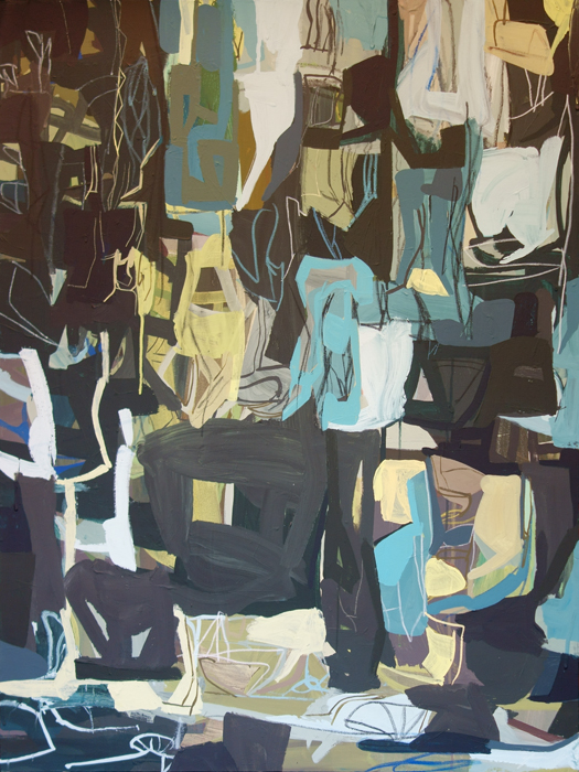
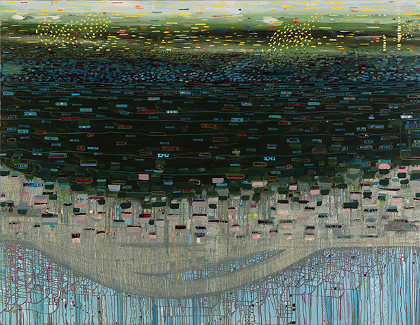
    Our life seems, as I’m sure many of yours do, like a stream of times of hurry and peace.  When we’re looking for our next spot– hurry.  Once we get there and settle in– peace.  Autumn and spring– hurry.  Winter and summer– peace.  In her abstract paintings, Colorado artist Krista Harris finds inspiration in that natural push and pull that the journey of life brings.

    Blushing by Krista Harris Keeping Bees by Krista Harris Sunflowers by Krista Harris

    East of Here by Krista Harris

    Holding Hands by Krista Harris

    Through her process of building up and tearing down, adding and subtracting paint intuitively, Harris ends up with compositions that are flooded with movement, yet we find moments of respite among the fury.  Warm colors are tempered with contrasting cool hues, a perfect parallel of our own seasons of peace among life’s fray.

    If you’d like to see more of the work of Krista Harris, please visit her website.

    All images via the artist’s website.

  • In Context: Rudolf Stingel at Palazzo Grassi

    In Context: Rudolf Stingel at Palazzo Grassi

    I’ve found that occasionally, where and how I see an artist’s work will influence how I feel about it.  If I see something while relaxing on vacation, I might think more highly of it than I would have if it had just been hanging in my local coffee shop.  A beautifully designed gallery or thoughtfully hung gallery can positively influence the way work is viewed.  Context is everything!  New York based artist Rudolf Stingel‘s installation of work at Palazzo Grassi in Venice turns the context of the gallery on end by blanketing expansive surfaces in an Ottoman-style carpet.

    Rudolf Stingel Rudolf Stingel Rudolf Stingel Stingel5 Rudolf Stingel

    The carpet, a nod to the palazzo’s history ( it used to be a trading spot for rugs from the Middle East ), creates a dramatic backdrop for Stingel’s monochromatic paintings.  The work ranges from small scale portraits of classical sculpture to large minimalist abstracts.  In a white wall gallery, they would still grab attention, but somehow the carpeted space seems to create a more intimate experience with the artwork.  And set against all that pattern– the work still calls out, perhaps the pattern serves to even enhance the work, drawing the viewer in and intensifying details that may have been overlooked.

    It’s an interesting thought, isn’t it?  The way in which the context of work might influence our opinions and feelings toward it.  Have you ever experienced something similar?  Seeing work in one context and feeling a certain way, then completely changing your mind when you see it differently?

    If you’d like to see more of Rudolf Stingel‘s work, please visit his representing gallery, Gagosian.

    All images are via Design Boom.

  • Transitory Nature: Kyle Stewart

    Transitory Nature: Kyle Stewart

    Transitions are always inspiring to me– the changing of seasons, the shift into a new life, the evolution and transformation.  The transitional seasons of our lives always seem to bring about a renewed energy and purpose.  In perusing the work of Toronto artist Kyle Stewart this morning, got me to thinking about how each experience builds upon the next as we move through this life.

    Hooded Girl #2 by Kyle Stewart Form #1 by Kyle Stewart Autumn's Return by Kyle Stewart Form #2 by Kyle Stewart The Conversation #2 by Kyle Stewart

    In Stewart’s work, you see him working out, playing and stretching through each canvas.  Scrolling through his paintings, you get a visual sense of each transition as he moves from tighter, more constrained abstracts into looser, quieter work, trying out narrative details along the way.  How amazingly does the life cycle of art mimic our own?  We too, move in and out of seasons, changing and transitioning, sometimes ever so slightly, sometimes in big, big ways.

    If you’d like to see more of Kyle Stewart‘s work ( and I highly recommend you do!  Every piece is stunning! ), please visit his website and follow along on his artistic journey through his Tumblr, Facebook & Instagram feeds.

    Images via the artist’s website.

  • October Featured Artist: Jennifer JL Jones

    October Featured Artist: Jennifer JL Jones

    Happy October!  No more of that foolin’ around, Indian summer stuff.  We are now well into Fall and I couldn’t be more thrilled.  I’m equally excited to share with you the work of our October Featured Artist, Jennifer JL Jones!  One of the things I love most about Fall is the cozy atmosphere that permeates each day and night and exploring Jennifer’s work, with its warm, ethereal light is the perfect way to kick off the season!

    She Hath Wings by Jennifer JL Jones Mala by Jennifer JL Jones Okika by Jennifer JL Jones

    Le Petit Jardin 11 by Jennifer JL Jones

    Le Petit Jardin 2 by Jennifer JL Jones

     Here in the Northwest, we can go for days, even weeks without seeing the sun, but the light still manages to pierce the veil, even through falling leaves and raindrops.  It is this same aura of light breaking through and of fluttering movement that draws me again and again to Jennifer’s work.  In her most recent series, Sojourn, the work increasingly free and joy filled.. the atmosphere is ablaze.

    If you’d like to see more of Jennifer JL Jones’ work, please visit her website and Facebook page.  A trip over to the Artsy Forager Facebook page will also give you a glimpse into an album of some of my own favorites of the artist’s work.  Florida Artsies can see Jennifer’s work, along with three other talented artists in Synergy, opening October 18th at Stellers Gallery in Ponte Vedra Beach.  Don’t miss it!  Not in Florida?  Check out her website for a list of representing galleries around the country.

    All images are via the artist’s website.

  • Abstract World: Isabel Bigelow

    Abstract World: Isabel Bigelow

    Sometimes, it isn’t a matter of what you see, but how you see it.  Perception can be a funny thing.  Often, Mr. F & I will watch the same movie but get something totally different from it. Or we’ll look at a scene and I’ll zero in on one thing, while his eye notices another.  The simplicity of these paintings by Isabel Bigelow remind me that what each eye focuses on is as unique as the person they belong to.

    Partial Arch by Isabel Bigelow Isabel Bigelow collage

    Bigelow zeros in on simple shapes, isolating them against monochromatic backgrounds, leaving us to wonder– am I seeing what I think I’m seeing? Or am I seeing something else entirely?  The shapes become even more ambiguous when we turn the paintings on their sides or upside down.

    Yellow Mushroom by Isabel Bigelow

    Bigelow_Wings Turquoise

    Fluke by Isabel Bigelow

    But maybe that’s a good thing, this act of seeing differently.  We can focus too closely on our own perceptions, forgetting that there are other angles of viewing.  Not wrong, just different.

    If you’d like to see more of Isabel Bigelow‘s work, please check out her work on the Sears Peyton Gallery website.

    All images via the Sears Peyton Gallery website.

  • Organic Liquidity: Julie Evans

    Organic Liquidity: Julie Evans

    Do you ever find yourself fascinated by the way certain substances act and react?  I’m always intrigued by how different types of liquid interact.. the way oil floats on water, how you can make those pretty drinks by layering the heavier liquid at the bottom of the glass.  New York artist Julie Evans takes advantage of liquid reactions in her abstract creations of water-based media on mylar.

    Swishbone #3 by Julie Eveans Swishbone #6 by Julie Evans Twolip by Julie Evans Carnivore by Julie Evans Swishbone #2 by Evans

    These Rorshach-like works seem to take on different forms depending on your perspective.. appearing at once botanical, sea creature-ish, even like organs in our own bodies.  What I’m most intrigued by is the various consistencies that the media seem to take on throughout each composition, lovely transparently thin layers melt into deep pools of pigment.

    You can see more of Julie Evans‘ work on her website.

    All images are via the artist’s website.  Artist found via Sears Peyton Gallery.

  • Distorted Perceptions: Stephen Thorpe

    Distorted Perceptions: Stephen Thorpe

    Have you ever gone back to places you visited as a kid and found that they were nothing like what you’d been remembering all this time?  Perception can be muddled by age, memory, and association.  The work of UK artist Stephen Thorpe speaks to our distorted perceptions of place and reality.

    Void by Stephen Thorpe
    Void, oil on canvas, 59.8×71.7
    Lepton by Stephen Thorpe
    Lepton, oil on canvas, 17.7×23.6

    We might associate a place with a certain feeling, due to the memories created there, sometimes good, sometimes bad. In our travels, I’ve definitely found that distance and time softens my memories of some places.  The town I couldn’t wait to leave, I can now look back on fondly.  Well, sort of.

    Boson by Stephen Thorpe
    Boson, oil on canvas, 17.7×23.6

    Sometimes, we might remember a place altogether differently than the reality of that spot.  Thorpe’s paintings jumble reality with transparent planes and skewed perspectives.  What looks vaguely familiar seems just a bit abstracted and absurd.

    Deviant Boson by Stephen Thorpe
    Deviant Boson, oil on canvas, 23.6×29.9
    Event Horizon by Stephen Thorpe
    Event Horizon, oil on canvas, 35.8×29.5

    If you’d like to see more work by Stephen Thorpe, please visit his website.  Love his work enough to make it your own?  Selected works are available at Saatchi Online, including some works as prints.  Accessible, affordable art.  It’s a good thing.

    All images via the artist’s website.  Artist found via Saatchi Online.

  • Vintage Visions: Jay Zerbe

    Vintage Visions: Jay Zerbe

    Mr. Forager tends to roll his eyes and snicker when I settle in to watch an old Doris Day or Cary Grant flick.  Yes, I’ll admit, sometimes the story lines are implausible and the acting a bit affected, but something about entering those make-believe worlds touches the part of me that longs for beauty and elegance and grace.  The paintings of artist Jay Zerbe seem cloaked in the palette of those longed for days.

    Shadows and Signs by Jay Zerbe
    Shadows and Signs, acrylic and crayon on canvas, 36×48

    There is something in his chalky palettes that remind me of the energy of the mid-twentieth century.  The colors seem to be telling the story of young love, white gloves and big Cadillac tail fins.

    Celery Soup by Jay Zerbe
    Celery Soup, acrylic and crayon on canvas, 36×36
    Ascension by Jay Zerbe
    Ascension, acrylic and crayon on canvas, 36×36

    But there is something underlying the nostalgic palettes.  A subtle darkness and shadow, reminding us not everything bright and shiny is without its demons.

    57 Bonneville by Jay Zerbe
    57 Bonneville, acrylic and crayon on canvas, 24×24
    Paper Lantern by Jaz Zerbe
    Paper Lantern, acrylic and crayon on canvas, 30×48

    If you would like to check out more of Jay Zerbe‘s work, please visit his website.

    All images are via the artist’s website.

  • Take to the Waters: Anne Neely

    Take to the Waters: Anne Neely

    Water is one of those resources we tend to take for granted until we find ourselves without it.  During the six months we spent in the California desert, Mr. F and I discovered just how essential its presence was to our psyches and overall happiness.  Not only does it nourish us physically, but something about this liquid nurtures our souls.  Boston artist Anne Neely explores the importance of waters seen and unseen in her Mopang series.

    Turlach-Turlough by Anne Neely
    Turlach-Turlough, oil on linen, 72×60
    Pond Park by Anne Neely
    Pond Park, oil on linen, 36×44

    The series is named after the Mopang Aquifer in Maine which was saved after an attempt to establish an ash dump near it.  The artist plunges depths, showing off water’s sparkles and light in her use of color, shape and line.

    Riverside by Anne Neely
    Riverside, oil on linen, 32×24

    We are lucky enough to have a beautiful little man-made stream and waterfall running through the backyard of our current rental.  Just a few minutes gazing into the clear waters and listening to the splashing instantly calms me.  The mere presence of water reminds us of our most basic needs and we relax in its cool calming being.

    Off Island by Anne Neely
    Off Island, oil on linen, 32×24
    Waterlines by Anne Neely
    Waterlines, oil on linen, 14×11

    If you would like to see more of Anne Neely‘s work, please visit her website.

    All images are via the artist’s website.

  • Artsy Dwelling: Watercolored Walls

    Artsy Dwelling: Watercolored Walls

    A Different Take on the Art Wall

    Gallery walls have been all the rage for a couple of years now.  They are a fantastic way to showcase your art collection and so easy to change up!  But sometimes, you want your art wall to make a bolder statement– why not make the wall itself the artsy focal point?  Whether you paint your masterpiece directly on the wall’s surface, apply an artsy wallpaper, or a mural sized decal, there will be no shortage of artsiness on those walls!  Here are just a few of my own faves from around the web–

    AD_pink palms

    via 

    AD_blue watercolor

    via

    AD_multiwatercolor

    via

    AD_pink geom

    via

    Think I love the simplicity of the pink geometric design and the blue watercolor best.  What do you think?  Have you ever treated your walls as a truly blank canvas?

    PS– Need help finding art for your walls?  Check out the new services I’m offering!  Click on Forager For Hire in the tool bar for more info!

    All image sources linked below the photos.