Tag: abstract art

  • November Featured Artist: M.A. Tateishi

    November Featured Artist: M.A. Tateishi

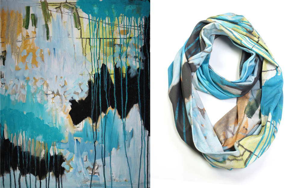
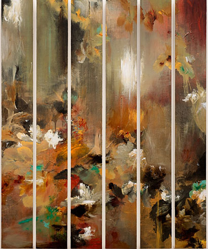
    It’s the end of the week, but the beginning of a brand new month!  Oh, October, did you have to go so soon?  I’ll forgive you, though, because November means a new Featured Artist and she is one of my long-time faves!  The work of Vancouver, BC artist M.A. Tateishi explodes with color and movement, so its fitting that the artist would find recent inspiration in the undersea realm.

    M.A. Tateishi M.A. Tateishi M.A. Tateishi M.A. Tateishi M.A. Tateishi

    Following a trip to the Vancouver Aquarium, the artist has been cranking out these jellyfish inspired works. ( if you’re up Vancouver-way, there’s a special jellyfish exhibit but it’s only on exhibit until November 14th! )  The graceful, flowing creatures are a perfect vehicle for Tateishi’s bold, fluid style.  The jellyfish are part of a new Pure series, in which the artist combines drawing and pure, transparent colored resin.  Stunning, right??

    All this month, I’ll be featuring M.A.’s work here on the blog and the Artsy Forager social media pages.  Be sure to head over to Facebook where her work will be gracing the cover of our page and I’ve put together an album of my personal Tateishi faves.

    Another note for you Vancouverites ( Vancouverians? ), M.A. Tateishi will be participating in the Eastside Culture Crawl with 400 fellow artists November 15-17th.  Don’t miss out on the chance to see these beauties in person!  Want to see more?  Make sure you visit M.A.’s website and Facebook page.

    All images via the artist.

  • Insert the Artsy: One Painting, Three Rooms

    Insert the Artsy: One Painting, Three Rooms

    A phenomenal piece of artwork can find its home in any sort of space.  Especially when its as beautiful as this one, Darzita by this months’ Featured Artist, Jennifer JL Jones.

    1380996_495705810528702_41315867_n

    Darzita means “to reveal” and I love how this abstract mixed media work informs the personality of each of these spaces in such a chameleon-like way!

    It goes soft and serene in a monochromatic bedroom retreat..

    ITA_jones_dreamy

    room found here

    Or adds dynamic movement to dramatic charcoal walls in this copper-accented dining room–

    ITA_Jones_drama

    room found here

    Modern texture and little pops of bright color echo this loft’s downtown feel–

    ITA_jones_urban

    room found here

    Which is your favorite? Personally, I think it would look stunning in a little modern cabin in the mountains.. preferably one with my name on the welcome mat. 😉

    If you’re in the Tulsa area, be sure to check out Jennifer’s latest exhibition opening on November 14th at Aberson Exhibits!  Don’t miss out seeing her work in person!

    Interior images linked above, art image via the artist.

  • In Essentials: Daniele De Batte

    In Essentials: Daniele De Batte

    You have to walk before you can run.  But you see things more clearly when you’re walking, you know?  So it goes with black & white vs. color.  In art school, we were all taught to begin with a black and white sketch.  Master that, then move on to color.  But what if just those two hues– the absence of color and the sum of all colors was enough?  For Italian artist Daniele De Batte, it wasn’t color that fascinated, but composition and juxtaposition of space.

    D_012_Y_2011 by Daniele De Batte Noise 1 by Daniele De Batte Linoleum 4 by Daniele De Batte Noise 4 by Daniele De Batte Squares by Daniele De Batte

    In breaking these down to the most essential elements of line, shape, and space, the artist is able to focus our attention on the strength of composition and the way each element contributes to the overall scheme.  The absence of color and even shading ( ok, there is some shading in other work ), keep our eyes from being distracted.  The graphic forms advance and recede, changing our perception of each composition with every new glance.

    To see more of Daniele De Batte’s work, please visit the artist’s website.

    All images are via the artist’s website.

  • Painted Skies: Scott Naismith

    Painted Skies: Scott Naismith

    There is something so magical about the way the skies color with the beginning and end of each day.  It’s almost like a painted message– there is new joy and hope in a new day or take heart, this day is done, a new one comes in the morning.  In his work, Scottish painter Scott Naismith explores the brilliance of those colored skies and the effects of light and color in the atmosphere.

    Consonance and Disonance by Scott Naismith Dissonant Skye by Scott Naismith Diminuendo Shore by Scott Naismith Staccato Loch Study 1 by Scott Naismith Diminuendo Sky Study 2 by Scott Naismith

    Through the refraction and reflection of light, we are treated to skies filled with glorious color.  What happens within the atmosphere and how our eyes perceive it is completely explicable, scientifically, but what about our emotional reaction to such a sight?  How do we explain the warm glow within that light and those colors bring?  Maybe we don’t have to.  Let’s just enjoy the gift.

    If you’d like to see more of Scott Naismith‘s work, please visit his website.  The artist also has some really interesting thoughts on color theory, which you can see in this video on his YouTube channel.

    All images are via the artist’s website.

  • Wear the Artsy: Megan Auman Scarves + A Special Deal Just For You!

    Wear the Artsy: Megan Auman Scarves + A Special Deal Just For You!

    I am forever in awe of how interconnected we have become through the glory of the inter webs!  Case in point– I receive an email from artist & designer Megan Auman, telling me about her new line of gorgeous scarves based on her paintings.  I think to myself, Artsy, these are awesome!  But those paintings look so familiar.. Sure enough, a quick check of my Pinterest boards reveals that I’d recently pinned one of Megan’s paintings for a future Artsy Forager feature.  Turns out I’d seen her work through Jaime Derringer’s Instagram feed and well, the rest is internet history!

    I’ve made no secret of my scarf obsession.. my friends and family know it well!  And scarves that begin life as abstract paintings, thereby combining two of my absolute favorite things?  Winner, winner, warm & artsy neck!

    Megan Auman Scarves

    Auman’s richly colored abstract paintings provide the starting point for these lovelies.  The work is then digitally printed onto soft organic cotton ( bonus! ) and hand sewn in her Pennsylvania studio.  Each scarf is made in small batches and available in limited quantities.  Truly works of wearable art!

    SONY DSC

    WTA_Auman_trio

    SONY DSC

    Auman collage

    Megan Auman scarves are available for purchase in her online shop here.  And Megan is generously offering a special FREE SHIPPING offer to Artsy Forager readers!  Just enter the code ARTSY at checkout, but make it fast because this offer ends at midnight (EST) on Sunday 10/27.  Be sure to check out Megan’s other artsy wares– gorgeous art pillows, jewelry, and especially these ingenious cozy/cuffs!

    All images are via Megan Auman.

  • Exuberant Lines: Jessica Simorte

    Exuberant Lines: Jessica Simorte

    You guys.  I get so excited when I come across a new artist!  In fact, I’m pretty sure when I clicked through from Instagram and saw this artist’s work, I might have let out a little squeal.    Jessica Simorte is creating these perfect little abstracts that practically sing with their exuberance of color, line, and composition.

    Jessica Simorte Jessica Simorte Jessica Simorte Jessica Simorte

    Jessica Simorte

    These diminutive works ( I think the largest I saw was 12×12 ) pack a big punch.  I love how she is translating what could easily be large compositions onto a small surface.  And the little “imperfections” in each are really what get me.  The fearlessness it takes to let the world see sketchy lines and that little yellow streak coming down at the bottom of the last piece?  Possibly my favorite moment among them.  This is definitely an artist I will be keeping my eye on!

    Check out more of Jessica Simorte‘s work on her website.  I wish I could remember on whose Instagram I saw Simorte’s name/work.  Whoever you were, thank you for introducing me to a new favorite!

    All images are via the artist’s website.

  • Artsy Spot: Stellers Gallery

    Artsy Spot: Stellers Gallery

    Some galleries, the most successful and long lived, find their sweet spot and flourish.  Stellers Gallery in Ponte Vedra Beach, Florida, quietly and consistently shows and sells the work of emerging and established artists in their space just steps away from the Atlantic Ocean.

    But this isn’t your typical “beachside” gallery.  Since 1999, owner Hillary Tuttle, has cultivated a selection of sophisticated work that compliments, not caricatures, the local landscape and culture from local, regional, and national artists, including this month’s Featured Artist here on Artsy Forager, Jennifer JL Jones.  The wide range of styles and consistence of excellence among the work in the gallery lends it appeal across the generations, creating a diverse range of collectors.

    photo

    [ the work of Jennifer JL Jones at Stellers Gallery at Ponte Vedra Beach ]

    Tonight, Stellers celebrates its original four artists with an artists’ reception to open Synergy, an exhibition dedicated to the work of these very different artists, abstract painter Jennifer JL Jones, realist landscape painter Henry Von Genk, figurative and still life artist Laura Lacambra Shubert, and whimsical figurative painter Enrique Mora.  Beginning with these four seemingly incongruous artists might have seemed like a gamble, but it shows just how well Tuttle knew who her collectors would be, appealing to a wide and varied assortment of artistic tastes.

    Jones _ Shubert collage

    [ work by Laura Lacambra Shubert & Jennifer JL Jones ]

    Stellers Von Genk _ Mora collage

    [ work by Henry Von Genk, Laura Lacambra Shubert & Enrique Mora ]

    Each artist’s work, though very different in style and approach, represents the magic of beach life– the wonder of the light, the calming peace of the landscape, the quiet lifestyle, and of course, the wind in your hair fun of it!

    AS_Stellers_Synergy


    If you are in the North Florida area, can you think of a better evening out than taking a drive out to the beach to see some beautiful work and meet these amazing artists?  And while you’re there, congratulate Hillary & the Stellers team for an incredible journey.  You can see more from these artists and all the artists Stellers represents on their website.

    All images via Stellers Gallery.

  • His Father’s Colors: Morgan Fisher

    His Father’s Colors: Morgan Fisher

    We all get sentimental about some of our possessions.  Especially things that remind us of the ones we love.  I have paintings by my grandmother that I’ll never part with.  Santa Monica artist Morgan Fisher honors one of his own prized pieces of family history by recreating a part of his father’s work in paint in his series Interior Color Beauty.  In the 1930s, Fisher’s father owned a pre-fabricated housing company and a booklet of paint color schemes his company produced inspired this series of minimalist paintings.

    C5 by Morgan Fisher B5 by Morgan Fisher C4 by Morgan Fisher B3 by Morgan Fisher L2 by Morgan Fisher

    His father’s legacy becomes larger than life as Fisher enlarges the paint chips on wooden panels.  Staying true to the original inspiration, the works are painted with acrylic house paint.

    We feel the influence of so many people throughout our lives, but our family’s impact usually leaves the strongest impression.  I love seeing this artist honor his father’s work in such a way!

    Interior Color Beauty is on display at Bortolami Gallery in New York until October 19th, if you’d like to check it out.  You can see more of Morgan Fisher‘s work on their website.

    Artist found via Design Milk.  Images via Design Milk and Bortolami Gallery.

  • Scratching the Surface: Jeane Meyers

    Scratching the Surface: Jeane Meyers

    It’s so easy to get caught up in the superficiality of life, isn’t it?  But what happens when we look beyond the surface glitter and get real?  Are we afraid of letting people see beyond the facade to the layers of disfunction and mistakes? There are artists who do just that.  Like self taught Port Townsend, WA painter Jeane Meyers, who builds up and covers up in order to go back and reveal what’s underneath.

    Meyers_Right Turning Meyers_Her Minor Idea Meyers_Her Basic Instinct Meyers_Sinking Into the White Sky


    Yes, maybe revealing the ugly might not be so fun or flattering, but it adds texture and depth and a certain sense of vulnerability, not only in Meyers’ work, but in our lives, as well. By submitting to the process and taking what is found underneath, we letting go of our compulsion for perfection.  And in return, the work ( and we ), become more interesting and more complex.

    To see more of Jeane Meyers’ work, please visit her website.  Her work is currently showing alongside Portland sculptor Lisa Kaser in Wax On, Wax Off at Simon Mace Gallery in Port Townsend.

    All images are via the artist’s website.

  • Wear the Artsy: Jennifer JL Jones

    Wear the Artsy: Jennifer JL Jones

    I don’t know what it is about the work of this month’s Featured Artist, Jennifer JL Jones that reminds me so much of the Pacific Northwest.  Maybe it’s the watery, downward strokes that make me think of the softly falling rain or perhaps it’s the subtle glowing light, so different from the blaring bright this Florida girl had been used to!

    This piece in particular, Sukha [Totems]is just the perfect representation of a Pacific Northwest Fall and I’m pretty sure that wasn’t anywhere near her mind when she painted it!  Autumn here in the NW is such an interesting mix of brilliantly changing leaves, grey skies and rain soaked earth.  Days that are made for cozy sweaters, boots and definitely don’t forget your raincoat!

    Wear the Artsy collage

    art | Sukha [Totems] by Jennifer JL Jones

    ring | Patina Pleat Ring

    sweater | Boucle Cowlneck

    bag | Dylan Tote

    jeans | AG Stevie Ankle Cords

    boots | Dahlia Punched Boots

    coat | Classic Snap Up Trench

    My perfect Northwest Autumn day would be spent wrapped up in these cozies, grabbing coffee and heading to the art museum, followed by an evening at home by the fire gazing up at Jennifer Jones’ painting. 😉  One day, I will have one!  One day.

    Image sources linked above.