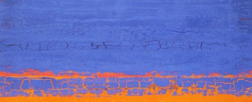
While digging through my Pinterest inspiration boards, planning my features for next week, I noticed a color trend in a few of my pins. It’s funny how our minds gravitate toward certain palettes some days, isn’t it? Apparently, my eyes are loving the combination of orange and indigo these days! I thought you might enjoy a few examples from my boards..
Christina Otero ( via My Modern Metropolis )Michael RiceNeil Wax ( via Skidmore Contemporary )Frances SewardHenry DomkeChristopher St. Leger
Any color combos you’re enamored with these days? Guess this native Florida girl can’t escape the Orange & Blue!
Featured image by Stephanie Paige. Sources can be found by clicking on each image.
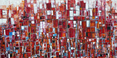
When I was taking studio classes in college, I had a thing for geometric shapes. Collage project involving painted pieces of paper? Mine were scenes made out of painted paper squares. Once I mastered drawing the figure realistically, I had a complete blast simplifying my figures into geometric shapes and planes. It seems that Los Angeles artist Kymm Swank has the same fondness for bright color and simple shapes, putting them together in a way that is downright intoxicating.
Structure2, oil on canvas, 36×36
I am in love with the way Swank is using common linear shapes to create complex compositions full of light and movement.
City Structure VI, oil on canvas, 72×60
There are any number of scenes these works may represent.. a cityscape at sunset, sunspots reflecting off a waterfall, looking down on busy city traffic, boats crowded together in a busy port, waves crashing upon a shore..
Juke VIII, oil & resin on canvas, 18×18
How about we change things up a little? Instead of me telling you what I see, I’d love to hear what you see!
City Structure VII, oil on canvas, 72×60
Be sure to head over to Kymm Swank’s website to check out the rest of her portfolio. Share your thoughts on what you see in her work in the comments below. No Rorschach-like psycho analyzing of your vision, I promise! 😉
Featured image is Structure 14, oil on canvas, 72×36. All images are via the artist’s website.
I’ve always been interested in the interplay between color and pattern, how each effects the other and the visual impact both can have, even in small doses. Australian artist Kirra Jamison’s works are a beautiful, modern mastery of both.
Love Me Two Times IV, gouache, ink, pen and vinyl on paper 76×56 cm
Her warm and pure palette allow her compositions to pop against neutral backgrounds. Saturated, cut-out like shapes call to mind the collages of Henri Matisse, though Jamison’s compositions tend to be a bit more complex and detailed. But anyone whose work reminds me of Matisse is an automatic fave!
Willow Weep, gouache and vinyl on paper, 160×114 cm
Some of her pieces, such as Willow Weep ( above ) are a delightfully dizzying kaleidoscope of color and detail. I am drawn in by the playful patterns of color, then enchanted by the surprises that await.
Belong to me (after Deluany,) acrylic, gouache, pen on canvas 220×183 cm
Patterned backgrounds in works like Belong To Me ( above ) appear, upon first glance to be a symmetrical repeat, but each element is revealed to be unique. It is amazing how our eyes fool us into thinking that all are the same.. there is something poetic in that, isn’t there?
Love Me Two Times V, gouache, ink, pen and vinyl on paper 76×56 cmCherry Blossom, acrylic, gouache, pen and vinyl on canvas 152.5×132 cm
To see more of Kirra Jamison’s work, please visit her website. Thank you to Tamara Lynn Photography for introducing Artsy Forager to this artist!
Featured image is Cut Out V, vinyl on paper, 57×38 cm. All images are via the artist’s website.
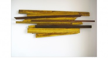
I grew up in a household where old things were relished and appreciated. My dad and brother refurbished antique cars. My mom had a knack for painting and reusing old furniture. Family vacations were taken to historic sites instead of Disney World. So it isn’t any wonder that I have a fondness for the sculptural work of Seattle artist Michael Todd Harrison.
13, assemblage
Architectural fragments and wood are stacked together as building blocks of these humble monuments to the past. Some of Harrison’s pieces, like the one above have a charming, vintagey-homey feel, as if they were plucked directly from the wreckage of a derelict Queen Anne home. Others, such as Burst, are more abstract in feel and organic in shape, carefully hap-hazard. In the artist’s hands, what could have simply been a pile of scrap wood becomes an explosion of line and shape.
BurstSpiral
Harrison’s latest series, Skyscrapers, takes inspiration from walks through the city, with it’s tall monuments built long ago by men who have since been all but forgotten. There is a poetic loveliness in these folksy, wooden sculptures paying homage to albatrosses of glass and steel. A reminder, perhaps of architecture’s humble beginnings, as well as our own.
SkyscrapersSmall Church
To see more of Michael Todd Harrison’s work, please visit his website. He is currently the Artist-In-Residence for the James W. Washington Foundation in Seattle during the month of February. You can keep up with his residency work here!
Featured image is Horizon by Michael Todd Harrison. All images are via the artist’s website.
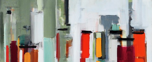
Life just gets so complicated, doesn’t it? We are constantly bombarded with imagery and information, it’s a wonder our brains can keep up! What I love most about the work of New York artist, Peri Schwartz is her way of seeming to keep things simple in such a complicated world.
Studio XXVIII, 2010, 38×52
Using simple swathes of bold color, she distills objects and spaces into their purest planes and forms. We are no longer caught up in minute, mind-numbing detail, but instead, can enjoy her worlds for the lively, colorful spaces they are.
Studio XXXI, 2011, 38×50
She uses perspective to great advantage, as it is directs us and gives our too often over-saturated brains a bit of a rest.. sort of just gently pulling us along so that we know just what we are seeing before we even realize we are seeing it. 😉
Bottles and Jars XVI, 2011, 36×22
The peek-a-boo quality of the lines and grids give a hint that there is much more going on beneath the surface than our eyes may notice upon first glance.
Studio XXIX, 2010, 38×52
Doesn’t that always seem to be the case, though? We make simplistic conclusions about complicated processes. Each of these works are a complex juxtaposition of color, light and space, fooling our eye into seeing form and shape in a primitively intricate way.
Studio XXXII, 2011, 40×44
To see more of Peri Schwartz’s work, please visit her website.
There are certain artists whose work resonates with me, to whom I return again and again for inspiration. Vancouver, BC artist M.A. Tateishi is definitely an artist whose work fits into that category! I’m so happy to feature her over at Escape Into Life today. Please click on over and take a look at this extraordinary artist’s work!
I used to hate Valentine’s Day. Back when I was single, my friends and I often enjoyed Anti-Valentine celebrations. But now that I’m an old married lady ( it’s been an entire year of marital bliss! ), I revel in it. So today in honor of the upcoming V-Day, dear Artsies, I’m sharing my obnoxious lovey-doveyness with you! Here are some of my mushy-love-stuff faves..
Cleaning Is Addictive by Kelly ReemtsenSweetheart by Robert TownsendVentricle by Eva Milinkovic, Tsunami GlassworksLove by Jill Joy
May your weekend be filled with love! If you’re not on the receiving end, try giving some away!
Fire is fascinating. At once necessary and dangerous. Delicately beautiful and vigorously potent. It lives and breathes. It is no wonder that artist’s embrace its beauty and harness its power. Take a look at these artists who are using their firepower for good.
Fire by Daryl BunnDeai Series by Etsuko IchikawaFlower Imprint by Steven SpazukTowards Another Theory #6CP by Geoffrey ShortRaining Fire by Steve Shubert ( via My Modern Met )
I absolutely love watching the evolution of an artist’s work. And the latest round of paintings from abstract painter, Casey Matthews blew me away. They are unmistakably hers, but she continues to grow in her use of color, elegance of form and sophistication. So it thrills me to feature her today on Escape Into Life!
Thank Goodness You Said It First, mixed media on canvas
Henry David Thoreau said, “This world is but a canvas to our imagination.” Street artists take that idea quite literally, by taking art out of the isolating artistic environments of galleries and museums, bringing the art to a public that might not otherwise be exposed to it. Check out these examples of art full of street cred!
Alice PasquiniNeSpoonBen WilsonJuliana Santacruz HerreraSnyder
Keep your eyes peeled for street art while you’re out and about this weekend! Would love to see some examples from your community!
Featured image by Alice Pasquini. Click on each image to view the source.


 by Jamison")