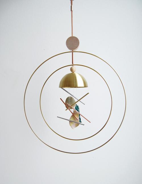
I have a great love for wind chimes. My paternal grandfather used to fashion his own from aluminum pipes and every time I hear breezy chimes, I’m transported back to summer days in the cool grass of my grandparents’ backyard. So when I spotted these Aura Chimes by Seattle based design house Ladies & Gentlemen Studio ( in collaboration with artist Nicholas Nyland ) on The Jealous Curator, I just had to share them with you!
Handmade in small edition, each chime is unique, made of metal, wood, and leather components complimenting Nicholas Nyland ceramic pieces. Such a lovely modern take on an ancient ornament!
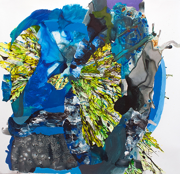
We all seem to seek peace and quiet. An escape from the chaos. And yes, its true, we do need those times of rest and rejuvenation. But sometimes it is in the chaos that we find our strengths, what we are really made of, that hone what we are all about. The abstract works of Washington, DC artist Katherine Mann are incredible clashes of material run wild and moments of fastidious control.
Each piece begins with a spill of color, an organic beginning to work that shifts between careful discipline and perceived pandemonium. They almost have a feeling of accidental abandonment, as if a pot of paint was spilled over a meticulously wrought drawing. I say almost because you can see that each is a mastery of composition– every placement of line, color and shape providing just the right compliment and contrast.
To see more of Katherine Mann‘s work, please visit her website. PS– I posted larger images than I normally do for artist features because these are human-scaled works– check out that last installation image for scale! Amazing.
It’s easy to look at the past through a utopian filter, usually fueled by too many historical novels and costume dramas. We’re often shown worlds filled with richness, decadence and graceful living. But under all the frills and frippery lie the other side of riches– the backs upon which the wealth is gained, those who serve, and ultimately, the problems caused by overabundance. The work of artist Louis St. Lewis touches on the themes of decadence, privilege and the myth of history.
I’ll admit, I’ve been guilty of watching one too many Jane Austen movies, finding myself wishing I could have been born into aristocratic 19th Century privilege rather than 20th Century middle class. Oh to have the luxury of being a “lady”! With a lady’s maid at my bidding and all the time in the world to read, paint, sew, dance and all the other proper skills a lady must possess. But then there were always little hints to break the facade of carefree privilege– the pressure to marry “up”, to bear sons, the boredom of not being able to pursue what may truly be of interest.
Mr. F and I just last night were talking about what being “rich” might mean. For us, it would mean freedom– freedom to travel, to spend our lives doing exactly what we want to do when we want to do it. But with that freedom must come an incredible burden and responsibility, too. Perhaps it is best that we remain solidly middle class. We live a life of privilege by the standards of most of the world’s population and we do have freedom– the freedom to chose to live our lives in the way we choose. It is a mythological goal, but one that is definitely attainable with vision and sacrifice.
To see more of the work of Louis St. Lewis, please visit his website. You can see his work in New Orleans at one of my favorite galleries, Gallery Orange!
Remember the old days, when all your photographs were on paper and were precious and fragile? If you’ve ever had a photo destroyed by heat or liquid, you know what I’m talking about. The once familiar image becomes distorted, a face we knew now obliterated. The work of Venezuelan photographer Angelica Garcia reminds us that though our photographs can now be “backed up” and last forever, their subjects are still fragile and fading.
The photographer manipulates each photograph, not with digital software, but hand manipulates each one post printing. Purposefully distorting and abstracting each figure, we are left with ghostly apparitions of what was once. The plainclothes style of each figure makes them universal and relatable, someone we might have known.
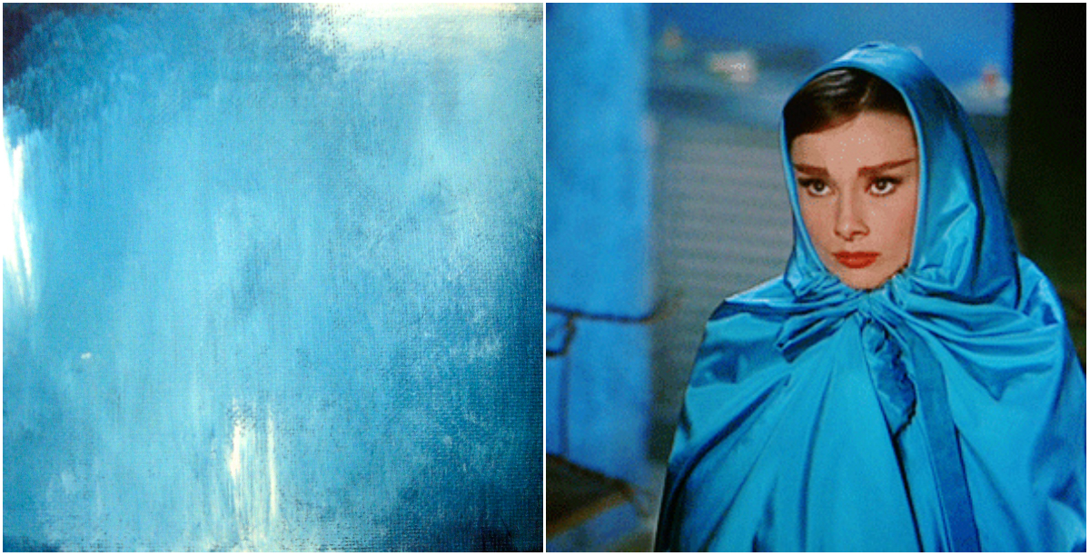
I admit, I’m a big fan of the candy color confections of the film variety that came out of the 1950s and 60s. The costumes! The dancing! I love it all. One of my favorites of these sweet treats is Funny Face, starring Fred Astaire and Audrey Hepburn.
For the third painting in my Feminine Wilesseries, I wanted to capture the glamour and struggle of Jo’s transformation in Funny Face. Intellectual and bookish Jo finds herself thrown into the world of modeling and couture fashion, finding herself struggling with reconciling her newfound feminine allure and her high minded beliefs. I love that the character doesn’t allow her physical transformation to change her ideals.
In the scenes in which she wears this blue satin cape, the character is distressed over what she sees as insurmountable differences of mind between herself and the man she’s falling for, photographer Dick Avery played by Astaire. The color is such an intense, moody blue, with hints of grey and lavender, I’ve always felt like it captured the conflict inside her character beautifully.
Audrey Hepburn as Jo Stockton, Funny Face, The Blue Cape by Lesley Frenz
acrylic on canvas panel, 6×6
What do you think of this one, Artsies? I wish my camera could do these little paintings justice. Any sources/tips for photographing paintings using a point & shoot digital camera? Would love a DSLR but don’t see it in the budget any time soon! If you have tips to share, please let me know in the comments!
You can find more of the Feminine Wiles series here. I’ll have a new one for you next week, one of my favorite all time characters!
Film images linked above. Paintings by Lesley Frenz.
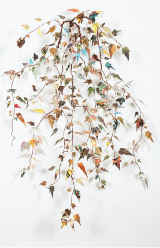
Hmm.. It would seem I’m having a thing for books and cowboys this week. Let’s just go with it, ‘kay? I had a different artist planned for today, but sometimes, I’m just not feeling it, so I go into my Pinterest archives to see what might strike my fancy a little, um, fancier. And these sewn sculptures by Lisa Kokin got me excited.
The artist has taken old pulp cowboy novels and transformed them into organic branches and beings. Cowboy culture has been such a prominent and accepted part of American history, pop culture elevating the cowboy as hero throughout the mid-twentieth century, it isn’t any wonder the gun totin’ good-guy mentality has permeated the minds of so many. Kokin is taking a stereotypically male culture and fusing it with a stereotypical female craft by taking apart these books and sewing them together. It is interesting to think of the young boys who once held these books and played the cowboy role. Have their lives transformed? Or are they still playing cowboy?
To see more of the work of Lisa Kokin, please visit her website. Lisa’s work can currently be seen in Women’s Work at Seager Gray Gallery in Mill Valley, CA through March 30th.
There’s this thought that’s been dominating the art and interiors world for a while now– the white cube phenomenon– the thought that art is shown at its best on a clean white wall. And perhaps sometimes that’s true, but when you live with art, it becomes a part of your surroundings in a much more subtle and incorporated way. Layering your art on patterned walls can create a complex visual even more intriguing to the eye!
Here’s four ways to display art on patterned walls–
1 | soft texture So maybe you’re more into super subtle patterns, letting a softly textured pattern play a secondary role in a solid, rich color, allowing monochromatic artwork takes center stage. Just an understated wash of color and visual texture plays up the nuances in the artwork.
2 | playful repeats Play up an element in your artwork by subtly repeating it in your wall covering. The nautilus shell-like pattern below is a quiet nod to the lollipop swirl in the painting. It’s not in-your-face-repetition, but once you start looking, you’ll see repeating patterns everywhere!
3 | modern botanics This isn’t your grandma’s family portrait on floral wallpaper. The monochromatic scheme of the paper keeps it feeling fresh and modern and subtly picks up on the greens in these contemporary portraits without being matchy-matchy. Plus it’s like being in a sunny garden! Bonus.
4 | graphic goodness Big bold, graphic artwork is too much for all this pattern, right? Wrong! The symmetrical and relatively small pattern repeat on the wall covering is the perfect foil for the freeform overlapping squares in this piece. Keep the scale of pattern in your artwork complementary and you’ll be sure to please the eye.
Now you’ve got your cooties shot. But maybe that cooties shot will do you more harm than good. It might help prevent you from contracting the dreaded cootie, but the side effects will have you begging for cootieville. In his work, Akron artist Casey Vogt explores this country’s relationship with drugs and big pharma.
The background of each piece is composed of elaborate mandala-like patterns, massive layers of dots of house paint. These layers create a trippy atmosphere recalling the disorientation of a drug induced state. Cowboys in various situations find themselves among the meditative chaos. Maybe the cowboys are ghosts– the vestiges of times before corporations took on the role of healer. Or perhaps they are the new generation of American thinker, the one that rebels against the accepted norms and strikes out on their own, carving their own way and pioneering through unknown territory.
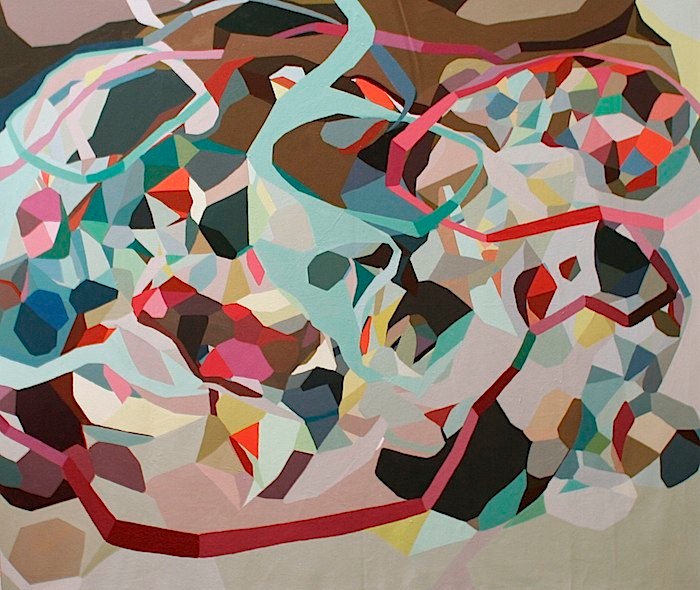
While we are getting settled into our new temporary Eureka home, what we want in our eventual forever home is heavy on our minds. While Mr. F aka Mr. Practicality is thinking of square footage, alternative power sources and cost, I tend to focus more on how the space will feel and how we will live in it. A home that is a peaceful retreat, yet full of life and creative energy. The mix of warm neutrals, light pales and bright shots of color in Untitled by this month’s Featured ArtistErin McIntosh, feels like the best of artsy spaces– inviting, yummy colors and patterns and spots of cool serenity.
Now to design a space how this painting feels– this interior featured on Apartment Therapy feels like the perfect translation. Though this series by Erin is based in geometric shapes, the atmosphere remains organic and flowing, never hard and stagnant. There is warmth to be found in the natural woods and nubby textures in the room and the pattern on the rug & other textiles calls out to the geometrics in Erin’s painting. My favorite element, the light blue concrete floor, provides a stream of lightness and translucency, just as shots of the same blue do in Untitled. Oh how an Artsy could live here!
To see more of Erin McIntosh‘s work, please visit her website! Want to see more from the Live the Artsy series? Check out the archives!
I’m a touchy feely person. As in I love running my hands over interesting textures. I’m that shopper who touches everything, I run my hands over tree bark and moss when we’re hiking and I have to force myself to refrain from touching artwork anytime I’m in a gallery or museum. So it kind of goes without saying that I love paintings with lots of yummy texture. The work of British artist Jessica Zoob is fairly oozing with lovely scrapes and swishes and piles of paint, celebrating the abstract beauty found all around.
From her vibrant palette to the multitude of visual and physical textures in each piece, Zoob creates incredible abstract impressionistic compositions that transport us to dreamy places. It’s easy to imagine yourself looking up through the clouds into a blinding and beautiful sun or looking down on sandy beaches and coral reefs. But these aren’t merely abstracted scenes, they carry within them their own story, their own idea of beauty, their own path of feeling.