It’s been a while since I shared a new Feminine Wiles piece with you! I’ve been so distracted by the gorgeous weather, hikes with Mr. F, and my new series on paper, that I let the FW pieces slip a bit. But then Sunday came and along with it a warm and sunny afternoon, so I spent some time painting out on our little deck. When I was ruminating on starting this series, iconic feminine film icons were popping into my noggin’ and Rita Hayworth‘s Gilda was among the first to come to mind.
In the 1946 black & white film noir, Rita Hayworth plays title character Gilda, the passionate and beautiful songstress wife of an illegal casino owner. The film plays out a dark love triangle between Gilda, casino owner husband Mundson, and Gilda’s former love, and indebted confidante to Mundson, Johnny Farrell.
The 40s film is teeming with tension– crime, secrets, anger, revenge. It’s not wonder costume designer Jean Louis outfitted the femme fatale character is slinky black, reminiscent of Sargent’s Madame X.
Rita Hayworth as Gilda Mundson Farrell in Gilda, acrylic on canvas panel, 6×6
My darkest FW piece yet, it also has a slightly looser feel– something that I thought fit the characterization of Gilda so well– full of turmoil and contradiction.
To see more from the Feminine Wiles series, check out the series portfolio page. Up next? I’m thinking a little Monroe. 😉
Film image source linked above, painting by Lesley Frenz.
Perhaps this is sacriledgious type talk, but I’ve never been a fan of the Wizard of Oz. I just never really connected with it. But I do love me some Judy Garland. Meet Me in St. Louis? Easter Parade? I’ll take those over flying monkeys any day! When it came time to think about an iconic Garland role to do a color study of for the Feminine Wiles series, A Star is Born‘s Vicki Lester seemed the quintessential choice.
In Lester’s rise to fame and the effects of her success on her marriage, we see a story of drive, devotion, self-sacrifice, and desolation. A sweeping melodrama filled with mountainous highs and the deepest of lows, it made sense for costume designers Jean Louis and Mary Ann Nyberg to dress Garland’s Vicki in moody lavenders, blues, and greys.
Judy Garland as Vicki Lester in A Star is Born, acrylic on canvas panel, 6×6
If you’d like to see more in the Feminine Wiles series, check out the archives! Gathering up inspiration for some more to come! Do you have a favorite you’d like to see me tackle? Let me know in the comments below!
All film image sources linked above. Art by Lesley Frenz aka Artsy Forager.
You know what made for a perfect Sunday afternoon for a young Artsy Forager? A few lazy, rainy hours and Pillow Talk on my parents’ bedroom TV. If I was ever tempted to trade my brunette locks for blonde, Doris Day could make me do it. As an awkward preteen growing up in the 80s, I was always drawn to Day’s down to earth flirtiness. So when I began the Feminine Wiles series, I knew without a doubt that Doris Day would make my list of inspirations.
The first of three movie pairings of the quintessential romantic comedy duo of Doris Day and Rock Hudson, Pillow Talk not only launched their iconic partnership, it also drew box office and critical acclaim. In the movie, Day plays Jan Morrow, an independent Manhattan interior decorator who finds herself sharing a party line with Hudson’s composer playboy Brad Allen.
Like many films of the era, Pillow Talk is painted in the pastel frosted palette of the late 1950s. Perhaps owing to Day’s trademark blonde locks, noted designer Jean Louis and the film’s costume designer Bill Thomas often dress Day’s Morrow in buttery yellows and creamy ivories.
Even in the set design, she is often surrounded by lemony hues. Maybe a nod to the innocence of this unattainable “golden girl” or the hidden warmth buried beneath the icy ( at least to Hudson’s Allen ) exterior.
Doris Day as Jan Morrow in Pillow Talk, acrylic on canvas panel, 6×6
Day’s natural sunniness and the joie de vivre of this classic romantic comedy made a creamy yellow color study a natural choice for this piece. Although Pillow Talk doesn’t necessarily hold up well in terms of gender equity, its brightness outshines its dated conventions.
Want to see more in my Feminine Wiles series? Check the archives! I’m beginning to brainstorm how to display and where to show these pieces. Think I have some fun ideas! If you’re a boutique or gallery owner or know someone who might be interested in partnering, give me a shout!
Film image sources linked above, painting by Lesley Frenz aka Artsy Forager.
Or maybe it would have been more appropriate for this to be Painting 8. This seventh painting in my series of small color studies,Feminine Wiles, is based on Elizabeth Taylor in Butterfield 8. Elizabeth Taylor plays Gloria Wandrous, a promiscuous party-girl model with a propensity for attracting wealthy suitors.
Although Taylor has been said to have disliked the film, her performance garnered the actress her first Oscar. Gloria is a character filled with passion and sexuality, but flawed in her own humanity. I thought it was so fitting that the palette of the film should be so full of fleshy pinks and peaches.
Elizabeth Taylor as Gloria Wandrous in Butterfield 8, acrylic on canvas panel, 6×6
To see more of my Feminine Wiles series, check out the archives here. Oh and Feminine Wiles has received its first bit of press! The Woven Tale Press included a spread on FW in their latest issue! So exciting!
Butterfield 8 image source linked above, art by Lesley Frenz aka Artsy Forager.
Like many women of my generation, I somehow missed An Affair to Remember until Meg Ryan brought it to my attention. It was beautiful, witty, romantic and sappy, just like a great chick flick is supposed to be. And Deborah Kerr’s Terry McKay was completely captivating and one of the first iconic female characters I thought of when beginning the Feminine Wiles series.
With her warm auburn locks and creamy complexion, the film’s wardrobe designer Charles Le Maire wisely capitalized on her natural palette by using autumnal peaches and oranges in her costumes peppered throughout the movie.
Deborah Kerr as Terry McKay in An Affair to Remember, acrylic on canvas panel, 6×6
The character is smart and sassy, beautiful but down to earth and practical. Characteristics perfectly portrayed with a warm, simmering palette.
I have no idea how many of these I’ll do, but am thinking of broadening soon into more contemporary film characters– maybe even by decade? Um, hello, Molly Ringwald anyone? To see more paintings in the Feminine Wiles series, check the archives here.
Film image linked above, art by Lesley Frenz aka Artsy Forager.
OK, Artsies, please don’t judge me, remember I was a young, impressionable girl growing up in the South.. but I was obsessed with Gone With the Wind as a youngster. Don’t recall how old I was when I first saw the movie, but I’ve already confessed my early love for glamour and gorgeous design. Then as a pre-teen, I read the novel, my first “adult” book, and the full-blown obsession began. The movie always drew me back in and as an adult, I grew more critical and analytical of the characters and design. The fifth painting in my Feminine Wiles series, is a color study of Vivien Leigh as Scarlett O’Hara, prominently featuring her signature color.
The character’s costumes, designed by Walter Plunkett feature a heavy dose of emerald and jade hues. The green is an obvious nod to Scarlett’s Irish heritage and her notable green eyes. But perhaps the color was used to make a few more subtle clues into Scarlett’s personality..
Earthy yet regal, in green, we see Scarlett as the renown beauty and notorious flirt, but also the pillar of strength and a cut-throat businesswoman. She uses whatever and whoever may be at her disposal to get what she needs. A character that’s often difficult to love.
Vivien Leigh as Scarlett O’Hara in Gone With the Wind by Lesley Frenz
acrylic on canvas panel, 6×6
Did you have any movies or characters you were obsessed with when young? I still can’t resist watching a bit of GWTW whenever I catch it on. Want to see more of the work in my Feminine Wiles series? Check out the archives here. This is the last piece I currently have finished.. guess someone needs to do some painting this weekend!
Film image sources listed above, paintings by Lesley Frenz aka Artsy Forager.
Another week, another painting in my Feminine Wiles series to share with you! Feminine Wiles is a series of small abstract color studies based on iconic female film characters. My introduction to many of these films and characters came through my mom, with whom I share a love of sappy love stories, witty characters, and gorgeous design. One of her favorite character turns ( and mine!! ) is Barbara Streisand as Fanny Brice in Funny Girl.
I’ve always loved the palette of this film– filled with warm earthy browns and oranges, highlighted with delicate pinks and passionate reds– but when thinking about this project, I was struck by the reoccurring use of lavender hues on and around Fanny. Of course, this could have something to do with how the cool hues so beautifully compliment Streisand’s creamy complexion! But I like to think that costume designer Irene Sharaff and the production team were delicately clueing the audience in to the fact that the character of this young girl from Henry Street was destined for greatness.
Barbra Streisand as Fanny Brice in Funny Girl by Lesley Frenz
acrylic on canvas panel, 6×6
Purples hues are often associated with royalty, riches and power. So it isn’t surprising that Fanny would often assume a lavender glow. She was a star, but unlike Jo Stockton, one of her own making. She was confident in her talent and passionate in her pursuit of fame and stardom, even at personal loss.
In the end, despite setbacks and heartache, Fanny perseveres and shows that the strong will always survive. I’ve always thought there were great lessons to be learnt from Funny Girl— of tenacity, talent, love, humility and perseverance. Oh and let’s not forget that unbelievably beautiful voice!
To see more from the Feminine Wiles series, check out the archives here. Next week, a polarizing character and one of the most iconic! Hint: drapery.
Film image sources linked above, art images by Lesley Frenz.
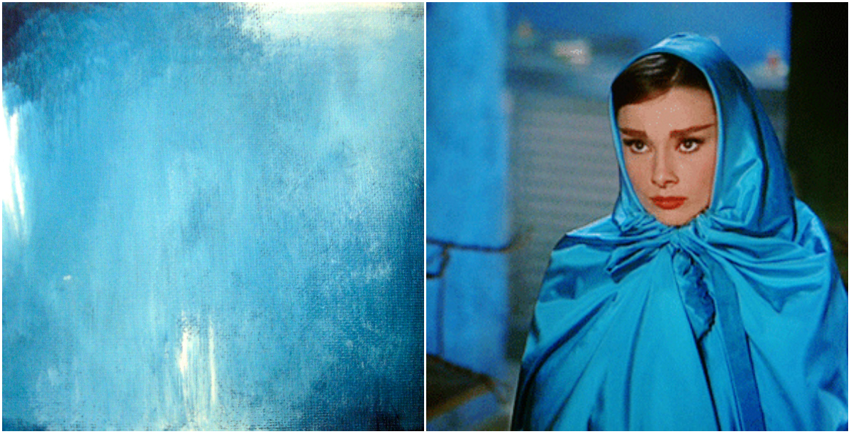
I admit, I’m a big fan of the candy color confections of the film variety that came out of the 1950s and 60s. The costumes! The dancing! I love it all. One of my favorites of these sweet treats is Funny Face, starring Fred Astaire and Audrey Hepburn.
For the third painting in my Feminine Wilesseries, I wanted to capture the glamour and struggle of Jo’s transformation in Funny Face. Intellectual and bookish Jo finds herself thrown into the world of modeling and couture fashion, finding herself struggling with reconciling her newfound feminine allure and her high minded beliefs. I love that the character doesn’t allow her physical transformation to change her ideals.
In the scenes in which she wears this blue satin cape, the character is distressed over what she sees as insurmountable differences of mind between herself and the man she’s falling for, photographer Dick Avery played by Astaire. The color is such an intense, moody blue, with hints of grey and lavender, I’ve always felt like it captured the conflict inside her character beautifully.
Audrey Hepburn as Jo Stockton, Funny Face, The Blue Cape by Lesley Frenz
acrylic on canvas panel, 6×6
What do you think of this one, Artsies? I wish my camera could do these little paintings justice. Any sources/tips for photographing paintings using a point & shoot digital camera? Would love a DSLR but don’t see it in the budget any time soon! If you have tips to share, please let me know in the comments!
You can find more of the Feminine Wiles series here. I’ll have a new one for you next week, one of my favorite all time characters!
Film images linked above. Paintings by Lesley Frenz.
Here goes, ya’ll, I’m ready to share the second painting in my new series, Feminine Wiles( see the first one here ). This new series of paintings are abstract color studies based on the fashion of iconic female film roles. While Faye Dunaway as Bonnie Parker in Bonnie & Clyde may not have been the most glamorous of wardrobes, it definitely conveys a sense of the time and of the character.
Dunaway’s earthy neutral wardrobe palette fit well with her role as a woman taking on a life usually the domain of men. Yet Bonnie’s fashions still maintain a sense of femininity and aren’t entirely cold– a bit of warmth showing through the callous exterior.
Faye Dunaway as Bonnie Parker, acrylic on panel, 6×6
What do you think, Artsies? This series is making me so uber aware of the way color is used in film wardrobe design. And it is an excellent excuse to stream some classic films!
Source for Dunaway image linked above. Artwork by Lesley Frenz.
If you’re following along on Instagram, you might have noticed a little sneak peek into something I’ve been working on lately. Since starting my #colorforaging2014 project at the beginning of the year, I’ve had more creative energy than ever. And I’ve begun taking full advantage of it. I’ve always worked in a series format ( thanks, Prof. Ladnier for creating that habit! ) and have already completed 5(!) paintings in one series while my mind is pondering, researching, contemplating the beginnings of seven more different series of work.
Early on, my above mentioned college painting prof labeled me a colorist. It’s true, I’ve always been drawn to color and color theory. I’m sure one of my first experiences with color was in admiring the fashion in my favorite curl-up-on-a-Sunday classic films. As a little girl, I imagined myself in those beautiful clothes, becoming those charismatic leading ladies. Then as a grown woman, I’ve found myself analyzing the use of color in the establishment of character– the reasoning why the film’s costume director chose that particular gown in that particular shade for that particular scene. There was a method to all that beautiful madness.
Each series of paintings I have in mind will deal with the psychology and effect of color in some way. For this first series, which I’ve tentatively titled Feminine Wiles, I’m focusing on the fashion of iconic female film characters, especially those used in scenes in which the character is capitalizing on her feminity in some way.
Each piece is a small abstract portrait of that character at the moment and how the character is defined by that particular costume choice. All that intellectual stuff plus I just love pretty dresses and pretty paint..
The first painting in the series is a study of Audrey Hepburn’s Holly Golightly from Breakfast at Tiffany’s. While the character’s series of elegant little black dresses is synonymous with the character, I’ve always been drawn to the pink Givenchy cocktail dress. The character wears this confection while in the midst of wooing her Brazilian millionaire would-be fiancé. She is no longer fashioned as cool and elegant, her style for Jose is warm and feminine and festive. It is such an interesting contrast to the devastation that happens later in the scene.
Through a sequence of layers in shades of grey, red, purple, pink and white in acrylic on a 6×6 inch canvas panel, I finally came to a point where I felt like I had a representation of my own interpretation of the character in that dress, in that scene.
Audrey Hepburn as Holly Golightly, The Pink Dress by Lesley Frenz
acrylic on canvas panel, 6×6
I’ve always worked on larger canvases in the past but our current vagabond lifestyle doesn’t include much room for storage of bulky canvases. I would love to translate these BIG, but for now, these little studies are proving satisfying. I can’t wait to share more of the Feminine Wiles series with you! Do you have any iconic female film characters to suggest? I have a list of possibilities, but am completely open to suggestion. I’ve been focusing on classic films, but may eventually move into contemporary characters, too. Can you tell I’m having a ball and completely obsessed with this? I hope so, because I totally am!
Art and logo by Lesley Frenz/Artsy Forager, other image sources linked above.