I’m always fascinated by artists who find inspiration in nature. What excites me even more is coming across an artist who interprets organic forms into work that is decidedly modern. Brooklyn artist Pamela Sunday creates contemporary ceramic sculptures that nod to the biological forms found all around and inside us.
Out of clay, the artist sculpts these magnificently strong yet delicate forms, so much like the environmental elements from which they take their inspiration. Our bodies and the nature around us can withstand so much, but we still have to keep reminding ourselves that each body, each habitat has its own tipping point. Life really is such a precarious balance, isn’t it?
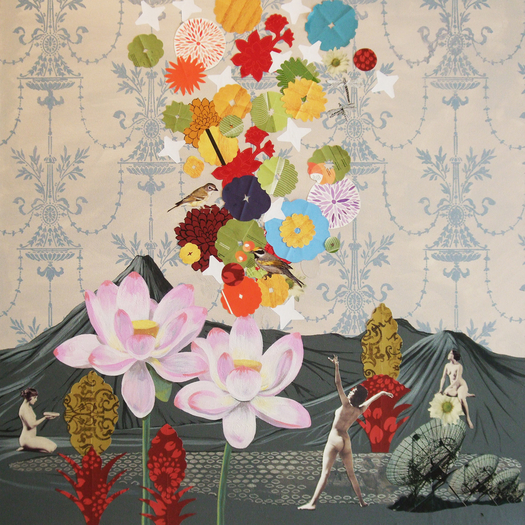
Being nature loving outdoorsy types, Mr. Forager and I sometimes discuss what it would have been like for Adam & Eve– to dwell peacefully with wild animals. Mr. F hopes that being able to interact safely with wild creatures will be one of the perks of heaven. He really really wants to hug a grizzly bear. In her mixed media work, New York based artist Lauren Matsumoto uses unexpected elements to focus on nature and how we relate to it.
The artist uses female figures from vintage erotica among playful and whimsical flora. But there is an element of the looming industrial age, as planes, satellites, and automobiles threaten to intrude and destroy our love affair with nature. How often do we completely unplug? No wifi, no cell phones, no cable t.v. It’s definitely easier said than done, but maybe if we try it, we can recapture some of that peaceable kingdom that once was.
It’s the end of the week, but the beginning of a brand new month! Oh, October, did you have to go so soon? I’ll forgive you, though, because November means a new Featured Artist and she is one of my long-time faves! The work of Vancouver, BC artist M.A. Tateishi explodes with color and movement, so its fitting that the artist would find recent inspiration in the undersea realm.
Following a trip to the Vancouver Aquarium, the artist has been cranking out these jellyfish inspired works. ( if you’re up Vancouver-way, there’s a special jellyfish exhibit but it’s only on exhibit until November 14th! ) The graceful, flowing creatures are a perfect vehicle for Tateishi’s bold, fluid style. The jellyfish are part of a new Pure series, in which the artist combines drawing and pure, transparent colored resin. Stunning, right??
All this month, I’ll be featuring M.A.’s work here on the blog and the Artsy Forager social media pages. Be sure to head over to Facebook where her work will be gracing the cover of our page and I’ve put together an album of my personal Tateishi faves.
Another note for you Vancouverites ( Vancouverians? ), M.A. Tateishi will be participating in the Eastside Culture Crawl with 400 fellow artists November 15-17th. Don’t miss out on the chance to see these beauties in person! Want to see more? Make sure you visit M.A.’s website and Facebook page.
With each place Mr. Forager & I travel to, we always come away with corresponding memories and associations. Maybe with the weather, maybe with the food of the region, maybe with the experiences we had. The work of Los Angeles artist Matthew Brandt takes the idea of associations of place and actually physically informs his work.
[ taste tests in color, laffy taffy 3, blue raspberry, banana and grape laffy taffy multi-layered silkscreen on paper, 30×40 ]
[ dexter lake, or 3, c-print soaked in dexter lake water, 40×30 ]
[ 120821716891, bubbilicious blueberry gum on paper, 40×30 ]
[ ketchup and mustard, ketchup and mustard multi-layered silkscreen on paper, 40×30 ]
[ marys lake, mt 2, c-print soaked in marys lake water, 105×72 ]
In his photographs of iconic American landscapes and places, the artist pays homage to the locale’s meaning sometimes by soaking his prints in the water of the scene in question, or by using unusual yet culturally meaningful printing mediums. For instance, in his Houses series, photographs of typical American homes are printed with flavored gum, perhaps a nod to the children who grew up there and the memories the buildings carry. For the Taste Test series, the artist printed quintessentially American landscape scenes with typical American condiments like mustard and ketchup or processed sweets like Laffy Taffy and Jello.
The resulting prints become not just images of idealized places, but those places have somehow become a part of the artwork itself. Just as each place becomes a part of those who have visited it.
If you’d like to see more of Matthew Brandt‘s work, please visit his website. Seriously, so much more amazing work to see there!
A phenomenal piece of artwork can find its home in any sort of space. Especially when its as beautiful as this one, Darzita by this months’ Featured Artist, Jennifer JL Jones.
Darzita means “to reveal” and I love how this abstract mixed media work informs the personality of each of these spaces in such a chameleon-like way!
It goes soft and serene in a monochromatic bedroom retreat..
Which is your favorite? Personally, I think it would look stunning in a little modern cabin in the mountains.. preferably one with my name on the welcome mat. 😉
If you’re in the Tulsa area, be sure to check out Jennifer’s latest exhibition opening on November 14th at Aberson Exhibits! Don’t miss out seeing her work in person!
Interior images linked above, art image via the artist.
You have to walk before you can run. But you see things more clearly when you’re walking, you know? So it goes with black & white vs. color. In art school, we were all taught to begin with a black and white sketch. Master that, then move on to color. But what if just those two hues– the absence of color and the sum of all colors was enough? For Italian artist Daniele De Batte, it wasn’t color that fascinated, but composition and juxtaposition of space.
In breaking these down to the most essential elements of line, shape, and space, the artist is able to focus our attention on the strength of composition and the way each element contributes to the overall scheme. The absence of color and even shading ( ok, there is some shading in other work ), keep our eyes from being distracted. The graphic forms advance and recede, changing our perception of each composition with every new glance.
Once upon a time, there was a rule that we all followed diligently– that art had to be centered on something. Whether it was centered above a piece of furniture or centered based on the wall on which it was hung, centering was very important. But I’m noticing a trend towards more casual, more interesting placement. Deliberately hanging artwork off-center. Justified waaaay to the right or way to the left.
Bold statement pieces often need another dramatic something to balance them out or your room may feel a bit lopsided. That scene stealing coffee table or pendant needs something to create a bit of harmonious tension, otherwise, he’s like that dinner party guest that just won’t shut up. We liked hearing his stories at first, but someone else, please say something!
Our eyes like triangles. Triangular compositions help our eyes travel and take in all that we see instead of zeroing in on one element. By hanging artwork off center, you can deliberately create your own triangular composition. So even if that painting is hanging in a place that at first seems off, once your eye takes in all the other elements in the room, it seems just right.
3 | Work your other angles
Angles aren’t just found in the architecture and furnishings surrounding a piece of art, but also in the artwork itself. Don’t forget about the compositional lines and angles in your artwork when thinking about how to hang it. The work should carry on a pleasing conversation with the furnishings around it. Like a first date that’s going really really well.
Hanging artwork off center doesn’t necessarily have to mean that the artwork isn’t centered on anything. Just maybe think about centering on an unexpected or secondary element in the room, like a chandelier or rug instead of the desk or dining table.
Rules tend to be created to make things easy and orderly. But art is neither of those things, so why should we live with it that way? Don’t be afraid to be a bit off center. Your art is crying out for it!
See more off centered artsiness in my Artsy Dwelling Pinterest board! Need some help finding just the right artwork for your space? I can help with that! More info here.
There is something so magical about the way the skies color with the beginning and end of each day. It’s almost like a painted message– there is new joy and hope in a new day or take heart, this day is done, a new one comes in the morning. In his work, Scottish painter Scott Naismith explores the brilliance of those colored skies and the effects of light and color in the atmosphere.
Through the refraction and reflection of light, we are treated to skies filled with glorious color. What happens within the atmosphere and how our eyes perceive it is completely explicable, scientifically, but what about our emotional reaction to such a sight? How do we explain the warm glow within that light and those colors bring? Maybe we don’t have to. Let’s just enjoy the gift.
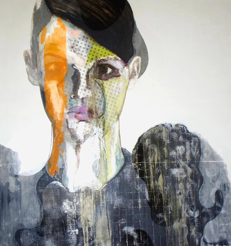
When you look in the mirror, what face do you see? Not a trick question! Do you see your own visage as it actually is or do you tend to see the face of ten, twenty years earlier? We often think of faces as unchanging, until a glance from just the right angle shows us the mortality of time marching across our faces. In his work, Mexican artist Rogelio Manzo deals with the fragility of life and notion of beauty by deconstructing and distorting the faces of his subjects.
As a society, we’ve become so obsessed with the idea of youth and perfection as beauty– that the end result seems to be that we are ending up with a homogenized standard of attractiveness. The unique face, the one with a bent nose or not-quite-perfect teeth is reconstructed through surgery and orthodontia to fit the idealized “normal”. We all begin to look the same, losing our sense of what makes us each rare and uncommon.
We love our adventuring, we truly do. But there’s somehow something even more special in those ordinary moments we spend together each day. Comfort and joy in our routine, the way we “assume our positions” at the sink following dinner, he rinses, I fill the dishwasher. How I know that I’ll get a kiss each night before I close my eyes. It makes me think that these moments, not the big ones, are the ones we miss most. New York artist Giordanne Salley captures the warmth and life in her paintings that I think so many of us forget is there in the every day.
I love her use of texture and pattern– real life is layered with complexities and real homes don’t always look perfectly trendy and spotless. But if we’re lucky, we are graced with a roof over our head and every day life is filled with people we love. The next time you find yourself ready to complain about those ugly kitchen cabinets or wishing you could just redecorate that living room, remember, it isn’t the place you live that matters, it’s who lives there.