If you’ve been following Artsy Forager for a while, you may have noticed a few recurring themes in some of the work I write about– man’s relationship with nature, fashion industry and its psychology of influence, and art historical themes being a few. When I first wrote about the work Toronto based artist Amanda Clyne , she was drawing reference from and making connections between historical portraiture and high fashion photography. In her latest series, she continues the fasciation and the lines become even more blurred ( pun intended ).
In this work, she begins with a photograph of a painting. The photograph is then printed onto paper to which it doesn’t stick, creating a wet, workable surface. She then “paints” the photograph, then once the residue dries, the surface is scanned and the painting then once again becomes a photograph of a painting.
The resulting image is ghostly, with an x-ray-ish quality. A nod to the illusory nature of the original portrait? An attempt to find the real person beneath the layers of fashion and facade? In style and palette, these are much softer than Clyne’s previous series. Yet they are still asking the same questions and it seems we, as a society tend to continue to give the same answers.
We often think of walls in a negative light, something to put up to keep danger out. But they can also bring a sense of safety and comfort, creating for us a haven from the weather and the world outside. In this series of photographs, Austrian artist Rosa Rendl gives an intimate look at the walls and the views they create in a Paris building.
The perspective from which she composes her photographs creates flattened planes of view, so that the photographs lose a bit of their perspective and take on characteristics of abstract collages. I’ve always found those spots where one surface meets another to be very interesting and quite telling regarding the way a space feels. Rendl definitely has an eye for composition as she invites us into this Parisian world with just a peek at what may be.
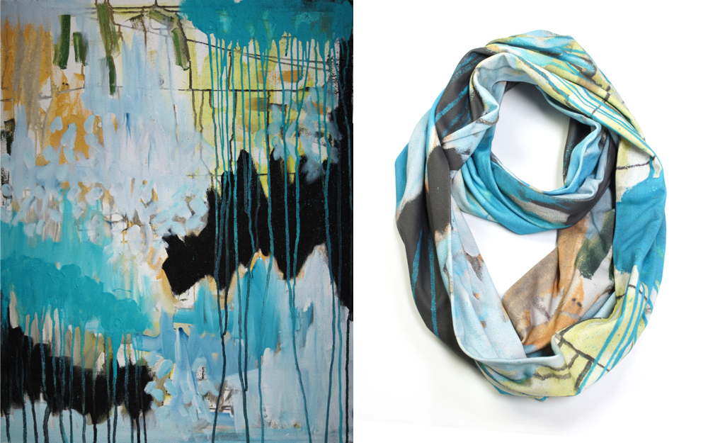
I am forever in awe of how interconnected we have become through the glory of the inter webs! Case in point– I receive an email from artist & designer Megan Auman, telling me about her new line of gorgeous scarves based on her paintings. I think to myself, Artsy, these are awesome! But those paintings look so familiar.. Sure enough, a quick check of my Pinterest boards reveals that I’d recently pinned one of Megan’s paintings for a future Artsy Forager feature. Turns out I’d seen her work through Jaime Derringer’sInstagram feed and well, the rest is internet history!
I’ve made no secret of my scarf obsession.. my friends and family know it well! And scarves that begin life as abstract paintings, thereby combining two of my absolute favorite things? Winner, winner, warm & artsy neck!
Auman’s richly colored abstract paintings provide the starting point for these lovelies. The work is then digitally printed onto soft organic cotton ( bonus! ) and hand sewn in her Pennsylvania studio. Each scarf is made in small batches and available in limited quantities. Truly works of wearable art!
Megan Auman scarves are available for purchase in her online shop here. And Megan is generously offering a special FREE SHIPPING offer to Artsy Forager readers! Just enter the code ARTSY at checkout, but make it fast because this offer ends at midnight (EST) on Sunday 10/27. Be sure to check out Megan’s other artsy wares– gorgeous art pillows, jewelry, and especially these ingenious cozy/cuffs!
You guys. I get so excited when I come across a new artist! In fact, I’m pretty sure when I clicked through from Instagram and saw this artist’s work, I might have let out a little squeal. Jessica Simorte is creating these perfect little abstracts that practically sing with their exuberance of color, line, and composition.
These diminutive works ( I think the largest I saw was 12×12 ) pack a big punch. I love how she is translating what could easily be large compositions onto a small surface. And the little “imperfections” in each are really what get me. The fearlessness it takes to let the world see sketchy lines and that little yellow streak coming down at the bottom of the last piece? Possibly my favorite moment among them. This is definitely an artist I will be keeping my eye on!
Check out more of Jessica Simorte‘s work on her website. I wish I could remember on whose Instagram I saw Simorte’s name/work. Whoever you were, thank you for introducing me to a new favorite!
One of my favorite things to do in Portland is a little gallery-hopping. There is such a rich creative atmosphere there and this past weekend, I was seriously craving some thought provoking art. And boy, did I get it! Portland’s Pearl District is one of the best spots for art viewing, window shopping, and well, just the perfect place to spend a PDX day.
As we wandered from gallery to gallery, I noticed a definite trend among the current exhibitions– a leaning toward the exploration of the scientific– whether cancer research, technology or psychology, there seemed to be a common thread of art interwined with science running through almost all the gallery shows we saw.
I found the current exhibition at Augen Gallery, Art for Oncologists by Jim Riswold to be incredibly poignant in its honesty and simplicity. The artist has been battling a 13 year fight against leukemia and prostate cancer, but this body of work isn’t just about his own battle. It’s a show of recognition, of thanks, to the crusaders and tireless discoverers of new and better ways to combat this unrelenting enemy. A larger than life candy dish takes center stage, filled with heart shaped sculptures inscribed with the names of chemotherapy drugs. Cancer-fighting is not for the weak of heart or spirit. It takes dogged determination, not to mention learning the names, functions, and side-effects of numerous unpronounceable medications. At some point in each of their lives, cancer touched every one of my grandparents. I know the kind of strength it takes to fight.
Speaking of poignant, we discovered a new gallery on this trip, J. Pepin Art Gallery, a space dedicated to the work of “contemporary artists who are reframing the perception of mental illness.” As I went through the gallery, reading the words of each artist, the story of their struggles and triumphs, it struck me how very powerful art as therapy can be. How we are able to express emotions and situations through visualization in ways that words can never capture.
We “lightened up” a bit when we hit Froelick Gallery and Michael Schultheis’ Universal Couplings of Archimedes.Can I just say how much I love Portland? Where else might you see an exhibition dedicated to an ancient Greek mathematician? PDX doesn’t just celebrate its geekiness, it downright revels in it and I love the city for that.
Our final stop was Butters Gallery, which come to think of it was our final gallery stop the last time we explored The Pearl District, not sure how that keeps happening, but it is always a lovely way to end the afternoon.
The current exhibition at Butters, Proclivities, features the mystical work of Marlana Stoddard-Hayes. In this new series of paintings, the artist moves through the grieving process following the death of her mother by working through the physicality of the creation, application and transference of elements onto the canvas, Stoddard-Hayes was able to liberate herself from the bonds of bereavement. Though created during a time of grief, the paintings retain a sense of wonder and hopefulness. A fitting tribute to a mother’s life.
These galleries, each so different in their approach, offered up stimulating and passionate work, one of the most satisfying afternoons of art-gawking I’ve enjoyed in a long while. The next time you’re in Portland, do yourself a favor and schedule an afternoon in The Pearl District. You won’t be sorry!
Peterson, Schultheis, and Stoddard-Hayes images are via their galleries’ websites, linked above. All other images are by Artsy Forager.
When we go out hiking, Mr. Forager is, with the exception of gorging on huckleberries and the like, strictly a leave-it-as-you-found-it hiker. I am too, for the most part, although I sometimes find myself so very tempted by that perfectly shaped leaf or beautiful wildflower. A stone does occasionally find its way into my pocket, but with our traveling, my hoarding of rocks is limited. Last week, I came across the work of Marilla Palmer, whose delicate constructions examine the intricacies of the forest and man’s hand upon it.
The artist tenderly renders wispy branches, then adds in embroidery, sequins, glitter, and such. The resulting compositions have the feeling of modern botanical renderings, a celebration ( or perhaps condemnation? ) of the coming together of man and nature.
If you’d like to see more of Marilla Palmer‘s work ( be sure to check out some of her sculptural pieces! ), please visit her website.
I seem to have a thing for pale, sad faces right now ( Exhibit A ). But just take a look at these wood sculptures by Italian artist Bruno Walpoth and tell me how I could not share them with you? Modern, young faces full of poignant longing, these pieces are the anti-selfie. Representations of true emotions felt by real people, rather than a facade put up to show the world how cool and hip we think we are.
There is such a vulnerability about these gentle wood portraits. That seems to be an emotion we could all stand to use a bit more of in our interactions. To be honest enough, with ourselves and others– to truly be real in the way we communicate with our fellow humans, might go a long way in creating the connectedness that so many of us long for.
Our current little bungalow backs up to a beautifully landscaped yard, verdant and green, even in the midst of Fall. As I sit working here every day, it’s easy to forget that the leaves are changing all around, I get so caught up in my own little world here. Austin artist Joseph Norderer chooses to celebrate those little corners of the world in which we dwell.
Lush and lively, his compositions crop in tightly on a small crop of land, beckoning us beyond the bushes to find who might be living inside. We get so caught up in our view from within that I think we sometimes forget that just a few feet or yards away, another life is being lived, perhaps very different or quite similar. But more and more we chose to hide behind our own walls. Choosing to dwell only in that same familiar corner.
If you’d like to see more of Joseph Noderer‘s work, please visit his website. You can also see his show at Tiny Park art space in Austin until October 19th.
Some galleries, the most successful and long lived, find their sweet spot and flourish. Stellers Gallery in Ponte Vedra Beach, Florida, quietly and consistently shows and sells the work of emerging and established artists in their space just steps away from the Atlantic Ocean.
But this isn’t your typical “beachside” gallery. Since 1999, owner Hillary Tuttle, has cultivated a selection of sophisticated work that compliments, not caricatures, the local landscape and culture from local, regional, and national artists, including this month’s Featured Artist here on Artsy Forager, Jennifer JL Jones. The wide range of styles and consistence of excellence among the work in the gallery lends it appeal across the generations, creating a diverse range of collectors.
[ the work of Jennifer JL Jones at Stellers Gallery at Ponte Vedra Beach ]
Tonight, Stellers celebrates its original four artists with an artists’ reception to open Synergy, an exhibition dedicated to the work of these very different artists, abstract painter Jennifer JL Jones, realist landscape painter Henry Von Genk, figurative and still life artist Laura Lacambra Shubert, and whimsical figurative painter Enrique Mora. Beginning with these four seemingly incongruous artists might have seemed like a gamble, but it shows just how well Tuttle knew who her collectors would be, appealing to a wide and varied assortment of artistic tastes.
[ work by Laura Lacambra Shubert & Jennifer JL Jones ]
[ work by Henry Von Genk, Laura Lacambra Shubert & Enrique Mora ]
Each artist’s work, though very different in style and approach, represents the magic of beach life– the wonder of the light, the calming peace of the landscape, the quiet lifestyle, and of course, the wind in your hair fun of it!
If you are in the North Florida area, can you think of a better evening out than taking a drive out to the beach to see some beautiful work and meet these amazing artists? And while you’re there, congratulate Hillary & the Stellers team for an incredible journey. You can see more from these artists and all the artists Stellers represents on their website.
We all get sentimental about some of our possessions. Especially things that remind us of the ones we love. I have paintings by my grandmother that I’ll never part with. Santa Monica artist Morgan Fisher honors one of his own prized pieces of family history by recreating a part of his father’s work in paint in his series Interior Color Beauty. In the 1930s, Fisher’s father owned a pre-fabricated housing company and a booklet of paint color schemes his company produced inspired this series of minimalist paintings.
His father’s legacy becomes larger than life as Fisher enlarges the paint chips on wooden panels. Staying true to the original inspiration, the works are painted with acrylic house paint.
We feel the influence of so many people throughout our lives, but our family’s impact usually leaves the strongest impression. I love seeing this artist honor his father’s work in such a way!
Interior Color Beauty is on display at Bortolami Gallery in New York until October 19th, if you’d like to check it out. You can see more of Morgan Fisher‘s work on their website.


, Erased Fragment by Amanda Clyne")
, Erased by Amanda Clyne")
, Erased by Amanda Clyne")