Tag: Artists

  • Emotional Pop: Mark George

    Emotional Pop: Mark George

    Advertising imagery has become such an integral part of our cultural landscape that products are often instantly recognizable simply by their logos.  Like his Pop Art predecessors before him, Jacksonville, FL artist Mark George takes inspiration from the inescapable world of advertising, putting his own spin on the Mad Men era.

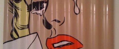
    Of course, there are obvious parallels between George’s work and that of Pop Art icon, Roy Lichtenstein.  Yes, the imagery also takes its cues from advertising imagery and comic books.  But where as Lichtenstein enlarged his imagery to the point of replicating in paint the Ben-Day dots that comprised printed materials of the day,  George chooses to flatten out the imagery even further.

    The lack of visible brushstrokes and use of smooth, reflective surfaces emphasizes the slick nature of the mid-centuray imagery.  While the severely cropped faces and “torn” edges of his panel suggest that these are relics abandoned to a different kind of future.

    But what interest me most is the emotionality to be found in the faces of George’s subjects.  There is a sad, melancholia about the imagery, bordering on the disturbing.  In this respect, his work could be seen as our past looking back upon itself with current eyes, shocked and saddened by what is seen in hindsight.

    What do you make of the faces of Mark George’s subjects?  Please visit his website to see more of his work.  If you’re in South Florida, he will be participating in a show, Jet Set Glamour at Harold Golen Gallery in Miami, opening tonight!

    All images are via the artist’s website.

  • Artsy on Escape Into Life: Geoff Mitchell

    I absolutely adore work that is marries striking visual elements and imagination stirring imagery.  Come and take a magical ride through Geoff Mitchell’s work with me over on Escape Into Life today!

    Zipper, mixed media on panel, 20×20

    Geoff Mitchell on Escape Into Life

  • Color Embraced: Nicholas Bodde

    Color Embraced: Nicholas Bodde

    The way colors play off one another has always attracted me.  There are certain designs I find myself staring at over and over again simply for the juxtaposition of hues and how they relate together.  The work on Nicholas Bodde strikes my chroma-loving heart to the core.

    No. 741, acrylic on aluminum, 80 cm diam

    Bodde’s work is beautiful in its simplicity and in its joyful exploration of color.  Parallel, horizontal stripes race across the canvas in a controlled riot, almost like we’re looking out a car window while whizzing by a carnival or planted fields of flowers.

    O.T., acrylic on aluminum, 100 x 56 cm

    Especially in the works featuring wide bands of blue or orange at the top of the canvas, these seem like distilled landscapes.  Complex scenes broken down to simple bands of color.

    O.T., oil and acrylic on aluminum

    In this way, the placement of colors on the canvas and beside each other takes these away from being just painted stripes of color and into sophisticatedly designed patterns and compositions.  And they simply make me happy.

    No. 749, oil and acrylic on aluminum, 80 cm diam
    O.T., oil and acrylic on aluminum, 100×55 cm

    To see more of Nicholas Bodde’s work, please visit his website.  How are you embracing color these days?

    Featured image is O.T., acrylic on aluminum, 100×56 cm.  All images are via the artist’s website.

  • Conscious Collective: Casey McGlynn

    Conscious Collective: Casey McGlynn

    Things we experience in childhood have such a powerful impact on the people we become.  They are the memories, good and bad, which come back to us again and again.  Ontario artist Casey McGlynn’s work recalls recurring symbols from his childhood and life, symbols that many of our own lives share.

    How 2 Do Snake Graffiti on Water Tower, mixed media on canvas, 36×36 ( via Foster/White Gallery )

    I first saw Casey’s work at Foster/ White in Seattle, where he was exhibiting alongside Rachel Denny.  His work is striking from afar, but the elements in each work are what really drew me in and caused me to closely examine each one.

    We Thought We Were Going to Space, mixed media on canvas, 42×48 ( via Bau-Xi Gallery, Vancouver )

    His canvases are filled with symbols of formative memories and experiences throughout his life.  You’ll see repeating pictographs recalling influences and events– like the Space Shuttle Challenger explosion and blues musician Robert Johnson, along with even more personal memories like the artist’s pregnant wife.

    20 Lucky Horses, mixed media on canvas, 60×48 ( via Bau-Xi Gallery )

    The work is autobiographical, but remains accessible and universally appealing.  I found myself pouring over the canvases and thinking– “Yes!  I remember where I was when the shuttle went down.. yes! I know what it’s like to gather coins for the laundromat.

    Bird Found, mixed media on canvas, 48×48 ( via Foster/White Gallery )
    Coin Laundry, mixed media on canvas, 48×40 ( via Bau-Xi Gallery )

    His primitive drawing style adds to the power of these visual memories, works created by the child within the man acknowledging where he’s been and how he arrived at where he is.  To see more of Casey McGlynn’s work, please visit his Facebook page and his representing galleries, Foster/ White in Seattle, Bau-Xi Gallery in Vancouver, BC and Artistic Spirit Gallery in Charleston, SC.

    Featured image is Coin Laundry, mixed media on canvas, 48×40.  All images are via the artist’s representing galleries, linked above.

  • Friday Faves: Water, Water Everywhere

    Friday Faves: Water, Water Everywhere

    .. and not a drop to swim in.  Well, without a wetsuit, at least here in Northern Idaho.  What is it about the water that calls to us, calms our senses, rejeuvenates?  These photographers might have a clue, as they’ve answered water’s siren song..

    Philippe Cheng
    Mertxe Alarcon
    Tulum by Neil Krug
    Wave Study I by Thomas Hager

    Philippe Cheng | Mertxe Alarcon | Neil Krug | Thomas Hager 

    To see more work from these artists, please visit their websites linked above.  Happy weekend, Artsies!

    All images are via the artists websites.

  • Translucent Revelations: Christina Bothwell

    Translucent Revelations: Christina Bothwell

    With the increasing sophistication of technology, we have become more and more aware of the realities of what was once mysterious.  We know what the inside of our bodies look like, it’s even possible to see an unborn baby in 3-dimensional form.  We can know what our children will look like before they ever take their first breath.  Yet, what remains to be revealed is their personality.  How they will evolve spiritually and emotionally remains a mystery.  Sculptor Christina Bothwell‘s figures illustrate for us the metamorphosis of our beings, our deliverance into who we are become.

    Deer Girl, cast glass, raku, clay, antlers, and oil paints, 28x27x11

    In her cast glass sculptures, Bothwell incorporates figures within figures.  We see smaller figures nestled into the glass, most often in the shape of a newborn.

    Octopus, cast glass, raku clay and oil paint, 48x23x23

    From the artist: “I think of these pieces as souls, each being pregnant with their own potential, giving birth to new, improved versions of themselves.”

    Hair, cast glass, raku clay and oil paints, 10x31x8

    As long as we are breathing, we are constantly evolving, hopefully into a better version of ourselves.  Wouldn’t it be fantastic to know that at the end of your life, you had become your most strong, your most loving, your most compassionate, the very best version of you?

    Centaur, cast glass, raku clay, oil and found objects, 21x21x11
    Phoenix, cast glass, raku fired clay, oil paints and wood, 33x60x21

    Bothwell’s work shows us, not the end result, but the transformation.  We see the adaptation and evolution of the spirit as translated into the material.  To see more of Christina Bothwell’s work, please visit her website.

    Featured image is Dawn, cast glass, ceramic, wood and oil paint, 38x10x7.  All images are via the artist’s website.

  • Art to Inspiration: Jo Howe

    Art to Inspiration: Jo Howe

    Wow.  Has another month really gone by already?  It’s Art to Inspiration time again!  This month’s inspiration, Echoes of Fragrant Voices by Jo Howe inspires me on so many levels.  Her sculptures, created from book pages ( love level one- check! ) are full of beautiful shapes ( two- check! ), soft color ( three- check! ), rhythm ( four- check! ) and gorgeous texture ( that makes five- check! ).  Just as with Pakayla Biehn’s work last month, Jo’s work inspired me to create a gallery of varied complementary works, each of which shares characteristics reminiscent of Jo’s work.

    The inspiration:

    Echoes of Fragrant Voices by Jo Howe

    The gallery:

    Pendant by Erik Gonzales, mixed media on panel, 60×60
    Half Hickory by Virginia Petty
    Core III by Joe Segal, wood and paint, 54×9
    Trophy by Brenda Mallory, cloth, wax, welded steel, 20x20x13
    Mercury by Karen Margolis, watercolor, gouache, graphie, thread on Abaca paper, 11×14
    Expansion by Haley Farthing, pastel on wood, 48×24
    Relic by Jay Heryet, box elder, 200mm diameter

    Jo Howe

    Erik Gonzales | Virginia Petty | Joe Segal | Brenda Mallory | Karen Margolis | Haley Farthing | Jay Heryet 

    Visit the artists’ websites, linked above, for more inspiration!

    You can find more information on Art to Inspiration here and if you would like to participate in the next Art to Inspiration, just fill out this form! Follow me and all the other Art to Inspiration bloggers on Twitter by subscribing here.  Let the inspiring begin! 
    All images are via the artists’ websites unless otherwise noted.
  • Primal Expression: Brenda Hope Zappitell

    Primal Expression: Brenda Hope Zappitell

    Anyone who knows me knows that I’m far from a wild child.  I tend to be calm, controlled, even-tempered.  Maybe that’s why I’m drawn to abstract expressionist work like a moth to a flame.  And the work of Delray Beach artist Brenda Hope Zappitell is a fire this little moth can’t resist!

    In Search of Sunrise II, acrylic with cold wax on panel, 42×42

    In her work, Zappitell “surrenders control to the paint, the brush and a visceral process of creative discovery” [sic].  She works spontaneously and rapidly, following the paint as it dances across the canvas.

    In Search of Sunrise I, acrylic with cold wax on panel, 42×42

    Taking her inspiration from the energy of nature, her palette builds from light, delicate tints to saturated rapid-fire strokes of bold color.

    A Matter of Perception, acrylic with cold wax on panel, 48×48

    Squiggles and strokes that could almost be graffiti-like still retain their softness, like a flourishing garden in the middle of an urban metropolis.

    Embracing Uncertainty II, acrylic with cold wax on panel, 30×36
    Reverie I, acrylic with cold wax on panel, 48×48

    To see more of Brenda Hope Zappitell’s work, please visit her website.  You can see her work in person at several galleries across the US– be sure to check her website to see if there is one near you!

    Featured image is Translation, acrylic with cold wax on panel, 60×30.  All images are via the artist’s website.

  • Artsy on Escape Into Life: Dwayne Butcher

    Sometimes the simplest work can be the most powerful.  I’m really drawn to these graphic, color-blocked paintings by Dwayne Butcher that I’ve posted over on Escape Into Life today.  Go check ’em out!

    I Got No Use for Trouble, acrylic on canvas, 18×16

    Dwayne Butcher on Escape Into Life

  • Precious Specimens: Carly Waito

    Precious Specimens: Carly Waito

    So often, when we see gems & minerals, it is rarely in their natural state.  After they’ve been cut and polished and set, they seem to lose some of their inherent beauty and mystery.  Toronto artist Carly Waito pays homage to these multi-faceted marvels in her small, exquisitely detailed paintings.

    Dioptase, oil on masonite, 10×9

    Waito uses macrophotography to record the color and intricacies of each cluster, which she then translates into oil.

    Flourite 2, oil on masonite, 10×12

    Through a process of layering, she captures in paint the amazing depth and prismatic qualities that give gems their luster and appeal.  By isolating the minerals in their natural state, Waito celebrates their innate beauty.

    Amethyst 6, oil on masonite, 8×9

    The visual textures in these small works are simply stunning.  And by keeping the works small, Waito invites us in to look closer and really examine the tiny details that make each gem so precious.

    Pyrite 2, oil on panel, 10×10
    Smoky Quartz 5, oil on masonite, 12×11

    To see more of Carly Waito’s work, please visit her website.

    Artist found via The Art Stormer.

    Featured image is Flourite 2, oil on masonite, 10×12.  All images are via the artist’s website.