Coco Chanel once said, “I consider lace to be one of the prettiest imitations ever made of the fantasy of nature; lace always evokes for me those incomparable designs which the branches and leaves of trees embroider across the sky..”
Shoreline, oil on panel, 48×43
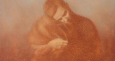
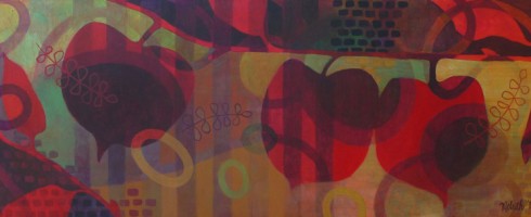
I came upon Susan Hall’s paintings as we ascended the stairs up to Butters Gallery in Portland, our last gallery stop of a long day spent in that art mecca. Through the glass doors, I spied beautiful tone-on-tone figures, peaceful in their exquisite solitude.
Vision, oil on panel, 60×48
As they drew me in, I realized that I was viewing these figures through a veil, not one over my own eyes but through the intricate patterns in which Chicago artist Susan Hall ensconces each of her subjects.
Companion, oil on panel, 35×40
Veils may have both negative and positive connotations– The view through the veil of a bride is lovely and full of hope, while the view through the veil of a burqa may be considered by some as the prospect of a prisoner, someone not allowed to view the world through naked eyes.
Reverie, oil on panel. 27×27
Hall’s work also has a bit of a voyeuristic quality, as if we were gazing through lace covered windows, intruding upon a private moment or catching a glimpse of a ghostly deer’s visit before he disappears into the dark night.
Arrival, oil on panel, 43×48Clearing, oil on panel, 48×43
We see him but does he see us through our gossamer covering? Or perhaps he is merely an apparition of our imagination? Either way, I am enthralled.
Please visit Susan Hall’s website to see more of her breathtaking work. If you are in the Northwest, a visit to Butters Gallery to see her work in person will be a delight for your eyes, pinky promise.
Candace Fasano is a painter and a poet. Where the paintings end and the poetry begins is not always distinctive. According to Wikipedia, “poetry primarily is governed by idiosyncratic forms and conventions to suggest differential interpretation to words, or to evoke emotive responses.” Substitute words for images and you’ve hit just the beginning of what makes Fasano’s work so interesting.
Topographical Remembering, mixed media on canvas, 48×48
Like poetry, Fasano’s paintings abound with symbolism and rhythm, their ambiguous nature often leaving them open to interpretation. Though they may have been created with a certain narrative in mind, the visual elements expressed are more suggestive than overt.
OMGGMO, oil on canvas, 96×72 diptych
Just as Candace the poet plays with words, Candace the painter plays with paint. Building up texture, leaving whispy washes of color and sketchy lines contrast with typographical verbiage.
Balancing Act, oil on canvas, 30×36
Layers of imagery create layers of meaning. Objects within the works are often rendered realistically, but are not necessarily resting in their reality. They may become transparent, weaving in and out of the composition like the ghostly marks left behind after an pencil eraser has done its work.
Warmth, oil on canvas, 66×56
imaginary landscapes attract
pictures from our collective mythologies.
text or fragments take hold like scaffolding
constructing and deconstructing
realities into temporary truths
revealing fragile limitations
of growth and decay –
viewed through a cardboard kaleidoscope
–c.fasano
To see more of Candace Fasano’s work and to read more of her poetry, visit her website and blog. If you like her work as much as I do, please fan her Facebook page to keep up with all her latest news. If you’re in the North Florida area, be sure to visit the Cummer Museum‘s “The Neighborhood As Art” show, which features one of Candance’s pieces.
Happy 4th of July weekend, Artsies! As soon as the hubby gets off work today, we’re heading out for a little camping in the Port Townsend area ( For all my East Coast readers, that’s North of where we are in Aberdeen, PT is on the Northeastern tip of the Olympic Penisula ). I’ve never been further North than Seattle, so I am super excited. Anyone else doing a little holiday camping this weekend? To get me ( and you! ) in the mood, here’s some of my favorite campy art..
Bear Mountain by Rachel Ann AustinCaravel by Leah GibersonChaise de Camping by Ronald BowenAirstream Alice by Carrie Goller
Have a wonderful weekend, everyone! Mix in something artsy along with all your outdoor celebrating!
PDX is slang for Portland, apparently. I kept seeing it everywhere in Portland this weekend and being from Florida, of course had no idea what it meant. Was it some sort of secret code? Some inside joke only super-hip Portlandians knew about? Nope, just Portland’s airport code, which has become short for Portland, just like JAX is short for my hometown of Jacksonville. I must admit, I was a bit disappointed that there wasn’t some sort of subversive meaning to PDX, at least not one I could find on Google.
After a month in the Northwest, George & I finally made the 2 1/2 hour drive from Aberdeen, WA to Portland last Saturday. We’ve already hit a couple of smaller artsy destinations nearby ( Olympia, WA & Astoria, OR ), but finally worked our way up to the mac-daddy of them all, Portland. The home of hip. We were only in Portland for the day, so decided it would be best to limit ourselves to one section of the city. So we chose The Pearl District, for its galleries for me and its proximity to Powell’s Books, Stumptown Coffee & Rogue Brewery for George. I try to make sure that when I drag him gallery-hopping, there is always the promise of beer. This makes for a much happier husband.
Work by David Slader at Gallery 903
Gallery 903 was filled with contemporary painting, sculpture and mixed-media work. I can usually tell the minute I walk into a gallery whether or not I’m going to enjoy my visit and find artists to blog about. As soon as I saw wonderfully textured abstracts and thoughtfully placed sculpture, I knew Gallery 903 was a good stop. The work of the artist above, David Slader, got George’s attention before than mine. Slader is a former high-powered attorney turned artist and after reading his tongue-in-cheek artist statement, I had a better appreciation for him. His work has deep texture , a powerful palette and expression. Here’s an even better shot of “You Want to Dance”, that gallerist Herschel was nice enough to email me..
You Want to Dance, Oil on canvas, 24×24
This was just the first of the delights to be found at 903. While George continued to admire the Sladers, I rounded the corner and happily came across a little niche and what was to be found there? Some thrilling little Salvador Dali prints!
Salvador Dali prints at Gallery 903
Complimenting the Dalis in the same little space were two epoxy-resing pieces by Alan Fulle. One of my favorite things about working in a gallery was designing & creating tableaus of artwork that coordinate together in unexpected ways. Virtual congrats to whomever hung the work in this gallery.
I absolutely loved this bronze geese sculpture! George wasn’t quite as enamored. What’s not to love about lovey-dovey, fat bronze geese? I mean, really, how could you not love them?! Oh well, moving on..
Augen Gallery had two interesting exhibitions showing, the first, work by Wendy Franklund Miller– I am a sucker for encaustics. There is just something about that waxy texture that I adore.
Artist: Wendy Franklund Miller, Augen Gallery
The kind-of cosmic feel to Franklund Miller’s work was a great complement to their other exhibition, Light Drawings by James Minden.
Artist: James Minden, Augen Gallery
These “light drawings” are scratched/etched PETG ( plastic ) reflecting light. They are totally trippy in the best sense. We had so much fun looking at these from all different angles. Check out this slide show to see better photos than I could have taken: James Minden on Vimeo.
Continuing the equestrian kick I seem to be on lately, Froelick Gallery happened to be showing Equine, a juried group exhibition showcasing the horse. A diverse showing of work centered around our four-legged friends, it was fun to see the variety of interpretations, including a plate from the famous MuybridgeAnimal Locomotion series. George was drawn to the work of Miles Cleveland Goodwin, which while beautifully rendered, was a bit on the dark side for my tastes. I love how the differences in our tastes spark lively discussion!
Artist: Miles Cleveland Goodwin, Froelick Gallery
I, on the other hand, fell in love with the giant below. White Shadow by Rick Barstow is pastel on paper, 74″ long and it is fabulous. I’m not sure what I love more, the lovely layering of the pastel, the unfinished, sketchy-quality or the scribbled “HORSES” at the bottom. It’s all workin’ for me. Or maybe it is that the straight-on gaze of the horse reminds me of an illustration of a story my grandmother used to read me as a little girl, The Goose Girl.
Artist: Rick Barstow, Froelick Gallery
Our next stop, Bullseye Gallery has a kick-a$$ space. Two levels, full of exposed brick and metal work, rustic wood and these amazing little installation rooms. I got so caught up in admiring my surroundings that I failed to take many pictures. I know, bad little blogger. The gallery is part of Bullseye Glass Company, maker of colored glass for art & architecture. Oh, that explains why there was so much incredible art glass!
Our final destination was Butters Gallery. Are ya’ll tired yet? Because I sure was by this point in the day. ( We’d also hit the Saturday Market, Stumptown Coffee, Powell’s Books and Rogue, in addition to all the galleries. ) Butters reminded me of some of the Chelsea galleries in NYC, as it was kind of hidden away, on the 2nd floor of a walk-up building.
Artist: Susan Hall, Butters Gallery
Butters had some really interesting work on display, I hope to bring you more on those artists very soon, especially the one whose work is pictured above, Susan Hall. I fell head over heads for her work– my crappy picture doesn’t even begin to do it justice. I’ll feature her more in depth in a separate post in the next few weeks.
So ends our little jaunt through Portland’s Pearl District galleries. I can’t wait to go back to PDX and explore the other art districts. This weekend we’re headed North!
“Rich colors draw me in, patterns guide me through, and flat, poetic shapes allow me to rest.” — Susan Melrath
It is just these rich colors and flat, poetic shapes that drew me in to Susan Melrath’s work. Susan takes complex forms like flowers, architecture and figures and condenses them to their most basic shapes.
Crimson Kiss, acrylic on canvas, 36×36
By doing so, the viewer becomes more drawn in by the emotionality brought to the surface through her use of vibrant color applied to the forms, rather than by the subjects themselves.
Cafe, acrylic on paper, 11×19 framed
Though I love ALL of Susan’s work, it is her Garden series that speaks something to my soul. Perhaps it is how I am amazed by the flora to be found here in the Northwest. ( Wildflowers!! )
Out of the Blue, acrylic on paper, 22×22 framed
She takes what could be a mundane subject and with the use of pattern and color creates something extraordinary. It’s a little bit Pop-Art, a little bit Fauvist, kind of Cubist without the hard edges ( Cone-ist? ).The flowers seem to be underwater, floating in a happy haze of pattern. Or maybe it’s drizzly rain? We ARE in the Northwest..Sometimes it seems that we are seeing the flower’s shadow, rather than the plant itself, looking through the shadow to the play of patterns and light beyond. Which makes the work groovily mysterious.
Moonflower, acrylic on canvas, 24×24
Susan created a floral series called “Bloom” for a recent Art & Sustainability show at the Sightline Institute in Seattle, integrating technology and traditional painting, posting a mobile tag by each painting providing more insight and information about each work of art. You can see the progress of one of these works and hear Susan speaking about the work here. And because I always personally find these things to be so much darn fun, here’s a time-lapse video of Susan completing a painting. What’s up next for Susan after her technology driven show? Unplugged, artwork created during a one-week period in which artists went without TV, internet, social media and texting. Because great art is always about finding balance.
Be sure to check out Susan Melrath’s website to see more of her work and learn more about the artist.
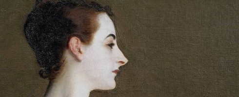
She has been a source of fascination, scandal and intrigue for over a century.
Madame X, 1884
John Singer Sargent’s masterpiece, Madame X, while initially a source of pain and frustration to the artist, proved to be his most recognizable and memorable work. The portrait’s subject, Virginie Amelie Avegno Gautreau, was a Paris socialite renown for her beauty and though it is a remarkably beautiful work to contemporary audiences, at the time of its Paris salon debut, the portrait was greatly criticized by critics, the public and Gautreau’s family ( her mother was outraged ).
The characteristics that appeal to our modern eyes are some of the same characteristics by which it was condemned upon its debut. The elegant lines of her simple black dress create a decidedly contemporary feel to Madame Gautreau’s ensemble, but this would be years before Coco Chanel’s “little black dress” would become ubiquitous with timeless fashion. The expanse of almost translucent white skin may not seem provocative to our 21st century eyes, to show such a sweep of bare skin, especially the beautifully turned neck and decolletage would have been quite provocative in 1884. Though artists had long been painting nudes of mythical and fictional figures, showcasing the body of a real person in such a seductive way would have been scandalous. ( Even if said person was infamous for her infidelities.. ).
Madame X, detail
The most scandalous component of all though may be her dress strap. The strap as pictured above laying rightfully upon her shoulder is not how Sargent originally painted it. In looking at his sketches for the portrait, it would seem that her strap had a tendency to slip off her shoulder..
Sketches for Madame X
So, painting the truth in beauty, Sargent originally depicted the strap as having fallen casually from Gautreau’s shoulder.
Madame X, recreated as may have originally been painted
This detail caused such a backlash, that when Sargent picked the painting up after the Salon showing, he took it back to the studio and repainted the strap well stationed upon her shoulder. Despite the outrage the painting incited when it was first shown, Sargent would eventually come to realize the importance of the portrait, describing it in a letter to the director of the Metropolitan Museum of Art as “..the best thing I have ever done”. He would sell it to the museum in 1916 and it is there that I saw it in person in 2007 during the “Americans in Paris” exhibition. Photographs online do not do this painting justice in any way. In person, it is commanding in scale, mesmerizing in presence and breathtaking in beauty.
Artists have long held a fascination for horses. Some of the earliest cave drawings were filled with equine imagery. Modern artists are no different. Today’s faves feature artists with a penchant for ponies. Enjoy!
In the interest of full disclosure, I think there is something you should know. I love Audrey Hepburn. Adore her. Want to be her when I grow up. Her style, her intelligence, her philosophy of living and her legendary kindness all inspire me. So it will come as no surprise to you that I actually gasped with glee when I saw stumbled upon these paintings by Sarah Ashley Longshore.
For attractive lips, speak words of kindness
War and Peace AudreyAudrey with Monarch Butterflies
For lovely eyes, seek out the good in people
Audrey with a Cherry on the Top
For a slim figure, share your food with the hungry
A Moment Between Moments
For beautiful hair, let a child run their fingers through it once a day
For poise, walk with the knowledge that you never walk alone
As you grow older, you will understand you have two hands
One for helping yourself
And the other for helping others
Audrey Underwater with Lilies
— Audrey Hepburn
Visit Sarah Ashley Longshore’s website to see more of her work and learn more about the artist. Her work is carried by New Orleans gallery, Gallery Orange, they have fabulous taste in artists, check them out!
The Matisse post yesterday got me in the mood for color. AND it’s the first day of summer, perfect for sharing work that is bright, colorful and full of whimsical goodness. George & I took a day trip to Olympia, WA this past Saturday to scope it out a bit. In Childhood’s End Gallery, we both fell in love with the imagery of Lisa Telling Kattenbraker.
U-Turn
Lisa works in batik, an ancient process of wax-resist dyeing. Her work juxtaposes traditional Batik patterning with simple, stylized childlike imagery.
Language Convergence
Most of her figures are faceless, so that the viewer can apply their own experience and emotions to the scene, which reminds me of another favorite artist, Yvonne Lozano.
Dress Rehearsal
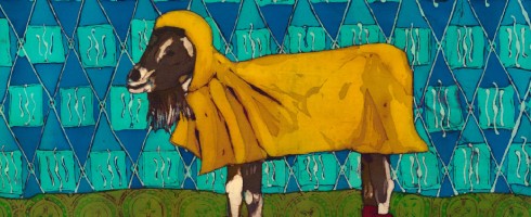
These just make you smile, don’t they? Wouldn’t you love to see this gal every day? Doesn’t every good goat need a yellow rain slicker and wellies?
Lorelei the Pacific Northwest Goat from the New Moon Goat Rescue and Sanctuary
I would love to begin a tradition of collecting one piece of artwork from each of our travel assignments. Thinking a Lisa Kattenbaker might just be The One for this summer.
Find out more about Lisa and her work, including originals and ( very affordable! ) limited editions on her website, here.
Do you have a certain outfit you wear when you need a pick-me-up? Or maybe there is a particular piece of music that always gets your blood pumpin’ and instantly uplifts your mood? The work of Henri Matisse does the same for me.
Sorrows of the King
From his beginnings as a Fauvist, Matisse was never afraid of exploring expression through color.
Open Window
And like his friend and rival, Pablo Picasso, Matisse loved painting figures and still lifes, but it is the way he paints interiors that get me. Maybe it is my love of interior design or the fact that I too, went through a “let’s paint pictures of fun & pretty rooms” phase. Whatever the cause, Matisse gets the joy of painting rooms full of life and color and I dig it in a big way.
Dance(I) by Matisse, 1909
It is that brilliance of color and exuberance of design that draws me to his work. As the artist himself said, “With color, one obtains an energy that seems to stem from witchcraft”.
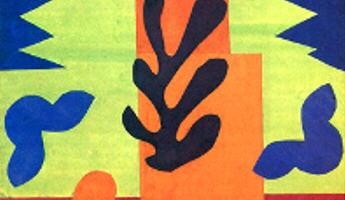
Les Codomas for Jazz, 1944
If that be the case, I am under the spell of Matisse’s color and hope to never be awakened.
Check out more of Matisse’s work at the MOMA website.


 by Matisse")
