Tag: Artists

  • Unfettered Sensibility: Corey Mason

    Unfettered Sensibility: Corey Mason

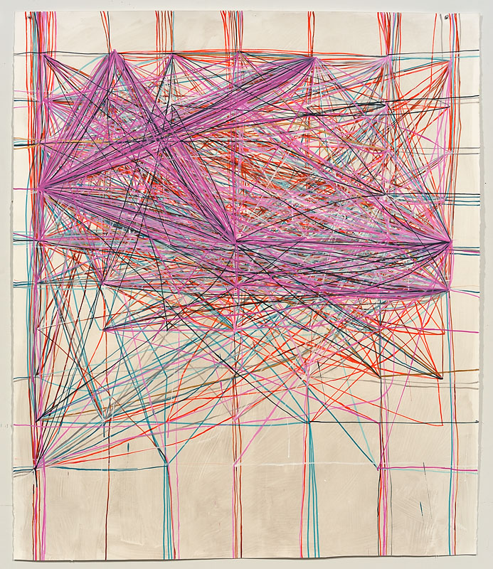
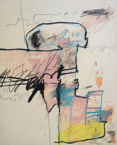
    I have a firm belief that if you are a creative person, your artistic sensibility needs multiple outlets, it fairly oozes out of you not only in the form of art, but maybe in the way you prepare a meal, decorate a home, write a letter or design a garden.  Landscape designer and artist Corey Mason of Clyde Oak extends the creativity he lavishes on his outdoor designs into his wonderfully unaffected mixed media abstract work.

    Salem II by Corey Mason Voyager Queen by Corey Mason Caballos by Corey Mason Old Man Holds Tight to the Pole by Corey Mason Untitled by Corey Mason

    Mason’s work has that kind of loose, scribbly feel that I personally struggle so hard to let into my own work.  Each piece is so perfectly imperfect.  From the smudges on the page to the backwards text so reminiscent of a child’s handwriting.  And did you spot the chicken?!  We are becoming acquainted with our landlords’ chickens.  I’m learning to delight in them so much!

    Back to Mason’s artwork– truly in looking at these I see that unfettered, naive sensibility that I think so many artists are striving for but that perhaps has been educated out of us.  I don’t know whether Corey is a trained or self taught artist, but either way, he is drawing with the carefree spirit of a child, an aim even Picasso strove to reach.

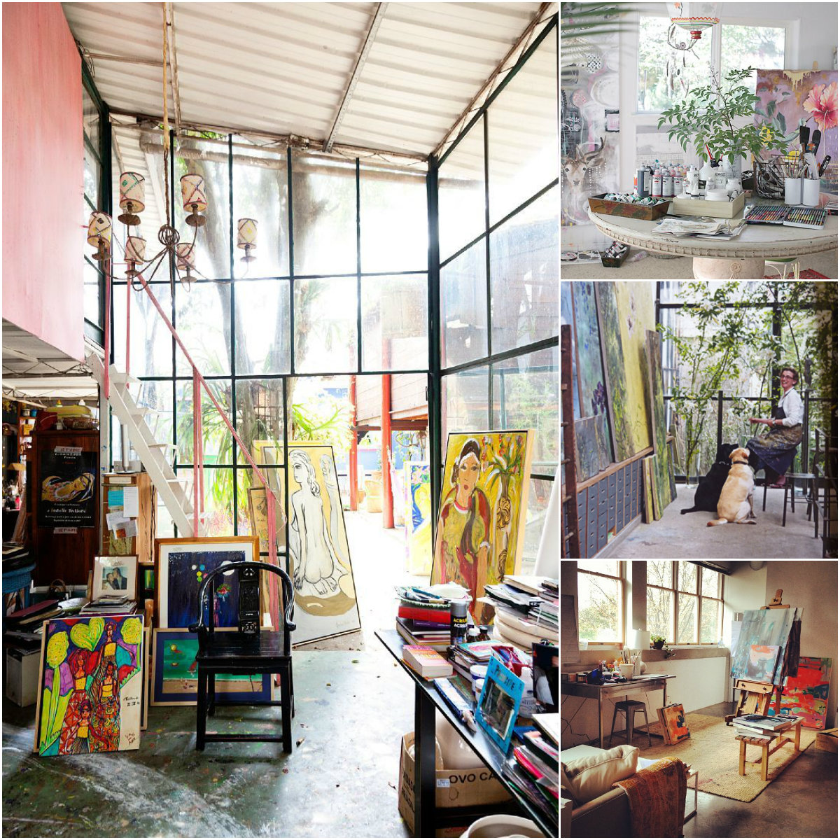
    To see more of Corey Mason‘s work, please visit his art page on the Clyde Oak website.

    All images via the Clyde Oak website.  Artist found via The Fresh Exchange.

  • Artsy Dwelling: Your Art Studio Style

    Artsy Dwelling: Your Art Studio Style

    As different as each artist’s work can be, so too is the way they work and the environment in which they find the most creativity.  Some artists are lucky enough to be able to design their studio space to fit the way they work just perfectly, others take advantage of whatever available space may be at hand.  And some, like me, out of necessity keep their supplies to a minimum so they can set up studio wherever they land!  But oh how I long for the day when I can have a dedicated work space.  Are you dreaming of your own studio space, too?  What’s your current art studio style?  What are you dreaming it could be?

    Art Studio Style inspiration Willem de Kooning

    found here

    Do you like your space open & airy?  Maybe like Willem de Kooning, you create best in bright white spaces with soaring ceilings and gorgeous light.

    Art studio style open and airy

    clockwise from top studios of kirra jamison | emily ferretti | lisa congdon | brenda hope zappitell

    Don’t have a big open space?  Paint every surface of your small studio white and remove any window treatments.  You’ll be amazed at how much light bounces around the room!

    Some artists work best in smaller, creative & cozy spaces.  Filled with warmth and life, Monet-like spaces make you want to settle in with a cup of tea and paint your heart out.

    Art studio style inspiration Claude Monet

    found here 

    Art studio style creative and cozy

    clockwise from left studios of isabelle tuchband | anahata katkin | claire basler | michelle armas

    Paned windows, chandeliers and plants make a studio space feel like a creative home.  And having a sweet pup around to love on helps with the creative frustration!

    AD_Studio_O'Keeffe-2

    found here

    No doubt working in a neatly organized space helped O’Keeffe achieve her soft, elegantly clean lined paintings.  A tidily laid out space with supplies within arm’s reach allow an artist to concentrate on creating instead of looking everywhere for that one tube of paint..

    Art studio style artsy organization

    clockwise from top left studios of scott waterman | jenny saville | mari andrews

    Timothy Atwood said, Creative mess equals creative thought. And for many artists, I think this holds true.  Most creatives are, by nature collectors.  We need to be surrounded by a beautiful mess, so that inspiration may spark at any time.  And let’s admit, sometimes, we’re just too busy creating to pick up. 😉

    AD_Studio_Picasso

    found here

    beautiful mess collage

    clockwise from left studios of thomas campbell | cornelius volker | flora bowleg

    What is your own studio style, Artsies?  One of the above or a mix of all?  Is a studio overhaul on your 2014 to-do list?

    See more art studio style inspiration on my Pinterest board, Where the Artsy Folk Work.  Have a dynamic studio to share?  Leave a link in the comments!

    All image sources linked above.

  • Splendorous Adornments: Takaya Hanayushi

    Splendorous Adornments: Takaya Hanayushi

    We’re so casual these days.  Heck, all my high heels are in storage, I probably won’t see them again until around 2018!  But there are days when I miss getting dressed up.  Remember that careful giving I was going on about yesterday?  These sculptural floral arrangements by Takaya Hanayushi remind me of our need to present ourselves artfully.

    Takaya Hanayushi Takaya Hanayushi Takaya Hanayushi Takaya Hanayushi Takaya Hanayushi

     The idea of adorning oneself in a certain way, whether to mark one’s place in society or simply as personal expression is a human trait that seems to have been with us a long time.  And although in our dressed down society, such lavish adornments as were once practiced are rare, we still find ways to incorporate these rituals.  We pierce and tattoo, we find just the right pair of shoes, we refuse to wear animal fur or skins.  Though it may be in more subtle, 21st century ways, we are still each day painting our own portrait of who we are and presenting it to the world.

    To see more of these stunning arrangements by Takaya Hanayushi, please visit his website.  You can also follow Hanayushi on his Facebook page.

    All images are via the artist’s website and Facebook page.

  • Handle With Care: Yrjo Edelmann

    Handle With Care: Yrjo Edelmann

    I have yet to wrap a single Christmas gift.  But the online orders are due to arrive any day and I am supplied and ready to dive in.  I love this part!!  Every year, I would wrap my gifts just so, often thinking of what type of wrapping the giver might enjoy as much as making it look artful and pretty.  Some may think, “what’s the point”?  It’s what’s inside that matters, right?  Well, not entirely.  You see, to me, the gift is the entire process– spending the time choosing something the recipient will enjoy, carefully and lovingly wrapping the gift, and seeing their surprise and delight when opening it.  In these paintings ( yes, paintings! ), Swedish artist Yrjo Edelmann presents us with meticulously painted images of hastily and carelessly wrapped packages.  Are these treasures or leftovers from “the gift closet“?

    Magnetic Field Energy by Yrjo Edelmann An Important Property of Green by Yrjo Edelmann Critical Solution and Close Packing of Two by Yrjo Edelmann Packaged and Stringed Grey Powder Fields by Yrjo Edelmann A Packed View Over Harmonic Blue Fields by Yrjo Edelmann

    Now, just because a gift isn’t perfectly wrapped doesn’t mean that the giver didn’t put a lot of thought and effort into it.  Maybe wrapping just isn’t their thing.  Maybe they’re being ironic in a isn’t it more artsy this way kind of way.  But don’t we give more care to the things we find important?  Would you wrap a Picasso all willy-nilly?

    Sometimes I think we are so materially blessed in this country that we are rarely truly grateful for even the smallest of things.  I remember my grandmother telling me the Laura Ingalls-ish tale of being delighted in receiving an orange every Christmas as a little girl.  An orange! Not an orange iPhone, not an orange Lexus.  A piece of fruit.  And she looked forward to it every year.  This season, its my hope and challenge to give and receive freely and thoughtfully and with a gracious heart.  Every gift will be as precious to me as an orange.

    To see more of Yrjo Edelmann’s work, please visit the website of his representing gallery, Galleri GKM.

    All images via the Galleri GKM website.

  • Life, Lived Larger: Andrew Salgado

    Life, Lived Larger: Andrew Salgado

    For many, our life may seem filled with adventure.  And at times, it is.  But most days, its a normal sort of existence, the kind that consists of work, laundry, dirty dishes and too much tv.  These large scale paintings by Canadian artist Andrew Salgado have made me stop and think about how to live a bigger life.

    Now and Forever by Andrew Salgado Modern Painters by Andrew Salgado Subject by Andrew Salgado Stare by Andrew Salgado Year of the Silencer by Andrew Salgado

    I’ve always been a small person.  Always a little slip of a thing ( until getting married that is, Mr. Forager put curves on me! ), one of my long time best friends who towers over me has always called me “Little One”.  Because next to her, I was always the little one!  But this littleness isn’t just physical.  I have a naturally shy, retiring nature, the complete opposite of a “larger than life” type of personality.  I don’t hate the spotlight, but I don’t go out of my way to seek it out, preferring to be the one behind the scenes, these days behind the computer.

    These large scale portraits by Salgado are full of texture and vulnerability and delicious messiness.  Sometimes, I think we let our quest for control and order get in the way of a bigger life.  It’s so in my nature to stay safely in my shell, coming out only when coaxed, like a little hermit crab.  But where is the adventure in that?  How many of us will be able to look back on a life lived largely and to its fullest?  I’m striving against my own temperament in my quest but its a fight I’m willing and eager to take on.

    To see more work by Andrew Salgado, please visit his website.  Salgado has solo exhibitions coming up in 2014 in South Africa, New York and London.  You can also follow the artist on his Facebook page.

    All images are via the artist’s website.

  • Design Foraging: Sarah Ashley Longshore at Anthropologie

    Design Foraging: Sarah Ashley Longshore at Anthropologie

    I love everything that Sarah Ashley Longshore does.  You can see all the evidence right here on the blog.  And when she teams up with one of my favorite retailers, well, I just can’t resist sharing the artsy goodness with you!  The artist’s latest collaboration with Anthropologie features her iconic Audrey Hepburn paintings on a tres chic line of travel bags and weekenders.

    Sarah Ashley Longshore Weekender, City of Lights Sarah Ashley Longshore Weekender, Big Apple Sarah Ashley Longshore, Jetsetter Hatbox, London Sarah Ashley Longshore, Jetsetter Hatbox, London ( detail ) Sarah Ashley Longshore, Jetsetter Traincase, Tasseled Traveler

    These remind me so much of “the golden age of travel”, when taking a plane ride meant getting dressed to the nines and a matching set of luggage was the ultimate luxury.  Inside each of the larger bags is a wonderful little “handwritten” note from the artist.  A perfect gift for that artsy girly girl!

    See more of the Jetsetter line at the Anthropologie website.  You can see original work by Sarah Ashley Longshore on her website.  And follow her own jet setting adventures on Instagram!

    All images via the Anthropologie website.

  • Spoiled Earth: Brooks Salzwedel

    Spoiled Earth: Brooks Salzwedel

    In our travels, Mr. Forager and I have been very fortunate to have seen some amazingly beautiful places.  Unfortunately, for many, the opportunity to see unspoiled beauty is rare.  Our landscapes are filled with strip malls and fast food joints, rather than untamed forests.  In his resin cast work, Los Angeles artist Brooks Kalzwedel examines this dichotomy of urban development versus wilderness.

    Untitled #1 by Brooks Salzwedel Reclaimed Tipping Tower by Brooks Salzwedel Tendril by Brooks Salzwedel Tangled and Half Nature, Half Power by Brooks Salzwedel The Dinosaur and the Statuette by Brooks Salzwedel

    In these heavily layered pieces, Salzwedel’s landscapes are disrupted by electrical towers and sprawl, almost seeming to be choked by encroaching development.  The mechanical elements look to be nearly parasitical, especially in Tendrils ( 3rd down ), they seem to have incorporated themselves as a part of the root.

    Such beauty, yet so filled with sadness for what is lost.  If you’d like to see more of Brooks Salzwedel‘s work, please visit his website.  If you’re in the San Fran/Oakland area, you can see his work being shown with Mayumi Hamanaka in the two person exhibition, Temporal Void at Johansson Projects in Oakland until January 16, 2014.

    PS–Thanks to The Jealous Curator for reminding me of Brooks’ work!

    All images are via the artist’s website.

  • Artsy Lately: Christina Foard

    Artsy Lately: Christina Foard

    I know I should be unbiased and objective.  But art is subjective ya’ll and I have my faves.  And this artist, dear Artsies, is one of them.  If you’ve been reading the blog for awhile, you’ve seen her work before.  If you’re new, well then I’m happy to introduce you!  Jacksonville, FL ( soon to be Athens, GA ) artist Christina Foard continues to amaze me each time she puts brush to canvas.

    Foard_That Sweet Night Foard_Oil Spill Garden Foard_Sliding Falls Foard_The Not So Still Life Foard_Tangled Below the Surface

    Christina creates work that is so incredibly layered with texture and color, with physical and visual depth, photos on a digital screen barely do them justice.  Not to mention size– Christina often works on a large scale, Sliding Falls, 3rd down is downright monumental at over eight feet wide.

    There is so much to see, so much to take in on each canvas, your eye almost isn’t sure where to begin.  But once you dive in, it is so wonderful to get lost in beautifully interconnecting lines and shapes.  Your eye will eventually find its way through to the lovely, light filled swaths of color, a beautiful respite among the glorious chaos.

    If you’d like to see more of Christina Foard’s latest work, please visit her website.  If you’re in North Florida, Christina will be showing work in the upcoming Our Shared Past exhibition at the Cummer Museum of Art & Gardens, opening December 17th.

    All images are via the artist’s website or Facebook page.

  • Drawing the Journey: Mel Prest

    Drawing the Journey: Mel Prest

    At the end of our traveling, I think it might be interesting for Mr. Forager & I to map out all of our journeys, connecting the places we’ve lived and visited.  As we enter into our 3rd year of traveling together, I have a feeling our map might eventually look like one of these mixed media pieces.  San Francisco artist Mel Prest uses an eccentric system to plot out grids of dots corresponding to Japanese metro routes, connecting the dots to reveal a complex system of connections.

    VSCJP Berlin S-Bahn by Mel Prest VSCJP NY Metro I by Mel Prest VSCJPLZ_Amsterdam Metro + Rock and Roll by Mel Prest VSCJP NY Metro 2 by Mel Prest VSCJP Berlin U-Bahn by Mel Prest

    Grid points are based on spelling out map relationships as Japanese characters.  The artist connects the grid points, including mistaken lines ( in gold ) so that the mistake, instead of detracting from the beauty, adds to it.

    I am especially intrigued by this aspect of Prest’s work.  Although the path we take or the place where we find ourselves wasn’t necessarily what we wanted or intended, it can still add meaning and beauty to our life’s journey.

    To see more of Mel Prest‘s work, please visit her website.

    All images via the artist’s website.

  • Color Harvest: Radiant Orchid, 2014 Pantone Color of the Year

    Color Harvest: Radiant Orchid, 2014 Pantone Color of the Year

    Well, it’s that time of year again!  The folks at Pantone have made their pronouncement predicting the color that will be most on trend for the coming year.  The Color of the Year 2014 is.. drumroll.. Radiant Orchid!

    CH_Radiant Orchid

    I’ll admit, at first I was underwhelmed.  I haven’t been a huge fan of purples since  Christmas 1985 in which every single gift I received was of a lavender hue.  It was the favorite color of my 13 year old self, but I eventually tired of it and moved on, pretty much abandoning it forever.  But once this news got out, I decided to do a little foraging for color amongst the art on my Pinterest boards and what ho, I spy a bunch of this very shade!

    So maybe my inner 13 year old is subconsciously seeping through into my pins.  Or, more likely, these artists know what Pantone folks have discovered– this particular shade, dubbed Radiant Orchid, is much more versatile than it may seem upon first glance.

    It can be soft and feminine, as its floral moniker implies.  These artists know that pairing this color with creamy neutrals and fellow floral shades creates a feeling of delicate suppleness.

    Radiant orchid_soft_collage

     clockwise from top left casey matthews | riley lester | ada wang | bahman farad | laurence amelie | christina baker

    When paired with darker shades and jewel tones, Radiant Orchid takes on a rich, earthy quality.  Pairing such a feminine color with more heavy, masculine tones makes these abstract pieces perfectly balanced.

    Orchid_Rich and earthycollage

     clockwise from top left elizabeth condon | eva lundsager | scott cumberland | charline von heyl

    And of course, artists know when to capitalize on a color’s inherent pop factor.  In the work below, these artists have used Radiant Orchids bright and bold sensibility to bring vibrant fearlessness to their work.

    Orchid_bold pop_collage

    clockwise from top left julie cockburn | eva eun sil-han | shannon rankin  | francois nielly | andy gilmore

    Are you a fan of this lavender shade?  If you’re an artist, are you using it in your current work or have plans to try to incorporate it in 2014?  Designers & consultants, think your clients will be itching for artwork to incorporate this color into their interiors?  Artsy minds want to know!

    All image sources are linked above.  Some images are cropped details of the original.