Let’s face it. We’re a tech obsessed society! Most of us get a little antsy when we aren’t tethered to our tablet, smartphone or laptop. These gadgets have become ubiquitous parts of our lives, but that doesn’t mean that we can’t give them our own artsy spin! I found a few favorite artsy iPhone cases over on Society6..
Sometimes, all it takes is just a little somethin’ somethin’ to take an ordinary image and transform it into something unexpected. UK artist Guy Catling has found that adding some well placed color and pattern can lead to some pretty spectacular imagery.
Black and white vintage photographs are beautiful, but add in brightly colored faces and floral patterned mountains and they take on a whole new modern life. Bright shots of geometric shapes in these scenic photos mimic the lines of the photographs simply yet beautifully.
The patterns added to this trio of well dressed men adds not only a bit of pizazz, but with the Victorian-floral and Native American inspired patterns these guys are sporting, the story behind the image has possibly changed. Ah the power of color and pattern!
Want to see more work by this talented artist? Check out Guy Catling‘s website here.
One of my favorite things about social media is being able to watch an artist blossom and discover their voice. Maybe you recognize the name of today’s artist, perhaps better known as the founder and editor of the amazing design blog, DesignMilk, artist-blogger-poet(!), Jaime Derringer.
Composition #5, acrylic and pencil on heavy canvas paper, 12×16Why Can’t I Be You?, mixed media on wood panel, 8×8
I wasn’t aware of the scope of Jaime’s artistic talent until she began posting her A Shape A Day project on Instagram. Immediately, I was like, “Hold the phone! She’s an artist, too??” The short answer? Yes.
Untitled, ink, marker and watercolor on watercolor paper, 9×12Smoke Monster, ink, marker and acrylic on heavy canvas paper, 16×12
For Jaime, her work is an exploration and escape. Perusing her work, you can see the progression, the playing with style, medium and composition that marks each creative expedition.
Jellyfish, ink on paper, 25×19
With each journey, the artist is discovering her own uncharted territory and finding new paths. Personally, I’m enjoying being along for the ride.
While the world tweets about Miley’s twerking, understandably, I’ve seen lots of folks online upset that the antics of a 20-something spoiled starlet are making bigger headlines than little things like wars and children dying. Admittedly, I love my guilty pleasures as much as the next gal, but find myself wondering, how do we draw more attention to real, impactful events happening around the world? Leave it to an artist to figure it out. Irish photographer Richard Mosse brings the civil war in the DR Congo to life using bright pink tones to colorfully engage the viewer into the country’s story.
Men of Good Fortune, North Kivu, Eastern Congo, 2011Growing Up in Public, North Kivu, Eastern Congo 2011
Mosse’s use of an ifrared Aerochrome dia-film gives his photographs their striking hot pink hue. That sugary, Victoria’s Secret hue belies the tragic story behind these photos, one of decades long conflict, government corruption, and innocence lost.
Even Better Than the Real Thing, North Kivu, Eastern Congo, 2011Ruby Tuesday, North Kivu, Eastern Congo, 2011
The photographer takes documentary war photography and imbues it with a strange sense of playfulness. The Pop Art pinks are surely what will draw our attention, but it is the faces there and the stories behind them that will keep it.
Sticky Fingers, North Kivu, Eastern Congo 2011La Vie En Rose, North Kivu, Eastern Congo, 2010
Days are getting shorter, nights are cooler, and kids everywhere are headed back to school. Summer’s end is near, and as much as I’m looking forward to the arrival of my favorite season, I do hate to see some summer things go! The bright, happy colors of flowers with their faces turned to the sun never fail to make me smile. These graphically painted floral still lifes by Charleston artist Kate Mullin just might get me through the coming cold and rainy months.
Sally, oil on canvas, 22×28Pink & Pink, oil on canvas, 16×20
Mullins’ use of flattened planes seems to be a deliberate nod to vintage paint-by-numbers ( which I love and have a few of my own in storage! ), but she amps up the modern feel by mixing in bright, saturated color and graphic blacks.
Zinnia Arrangement, oil on canvas, 24×24Teal Zinnias, oil on canvas, 28×22
Mullins’ bouquets are full of light and life. They fairly drip with color and vivacity! The perfect antidote for the coming dreariness. 😉
I love it when you guys write to me to tell me about an artist’s work! Even more than that, I love gallery owners who are passionate about promoting their artists’ work. So when Art & Light Gallery owner Teresa Roche emailed me about this artist, I was intrigued. Then I went to his website and fell in love! These woodcut pieces of Greenville, SC artist Kent Ambler are full of texture and pattern and I can’t get enough of them.
Kent draws inspiration from the life and simple objects around him– his dogs, the woods surrounding his home, birds, etc. His woodcuts feel like quick little sketches of every day life and familiar adventures.
While I love his single woodcuts, for me, it’s when they are put together in these Block Contstructs, that they really shine. The colors and patterns harmonize so well together, there is a wonderful energy about them. They remind me in the most glorious way of those old plastic sliding puzzles I used to get as a prize at school carnivals. You know the ones in which you slide the little blocks around until the picture is completed?
I hope you are as delighted by Kent Ambler’s work as I am! You can catch a few glimpses into his process in this video.
If you’d like to see more, please visit his website. If you happen to be near Greenville, he just opened a show at the Caine Gallery— go by and check it out! And Greenville folks, be sure to mark your calendar for the 2nd Annual Block Party October 1st-15th at Art & Light, featuring 100 hand selected retired woodblock prints by Kent Ambler available for a limited time.
PS–I know Fridays are usually for Design Foraging, but since I took the day off to unpack on Monday, I wanted to squeeze in another artist post!
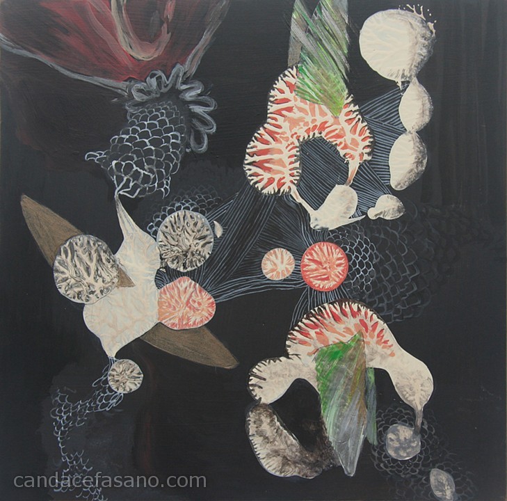
You know sometimes I love a piece of artwork so much I wanna wear it. Like all day, every day. This month’s Featured Artist, Candace Fasano has oodles of lovely new work, but this particular piece, Bird Pod, just keeps speaking to me. Alas, the painting is sold ( lucky duck, whoever you are! ), but that won’t stop me from dreaming about it!
jewelry | from top: Branch Bangle, Fan Ring, Geo Colour Bangle by Anthony Roussel
Don’t these sculpted pieces by jewelry artist Anthony Roussel remind you of Bird Pod? That same organic, cosmic magic could still be mine. Oh yes it could!
As much as we would love to be happily skipping through life at all times, there will always be moments that get us down. We get stressed, overwhelmed, and sometimes just plain sad. But in the darkness, there is always a light of hope. These abstract paintings by Tennessee artist Wendy McWilliams illustrate in paint that feeling of glimpsing the light in our dark moments.
I’m not sure this was the artist’s purpose when she set out to paint these canvases, but it is what these pieces are speaking to my own, slightly stressed mind today.. There is always something happening, something or someone clamoring for our attention. Sometimes the noise is welcome, other times, not so much. But in the light and color of McWilliams’ work, today I’m reminded that the stress doesn’t last forever.
We always manage somehow to come through the chaos, to tackle the seemingly insurmountable tasks before us or to just plain grin and bear it until it’s all over. Whether it is through our own strength, help from another or above, we get through it. The color returns and so does the light.
As much as I love the quiet of rural settings, there is something undeniably appealing about the structures in urban life. As we were showing Mr. F’s sister around Seattle last week, she was in awe of the architecture and I was reminded, too, to look up and around and take notice. The work of artist Daniel Everett takes those intriguing bits of urbanity and isolates them in all their glory.
Untitled, from Monument seriesThree recent untitled worksUntitled, from Monument seriesUntitled, from Monument series
Sometimes, the structure is set starkly against a colorful, seemingly computer generated hue, and then others seem to almost melt into a white sky, pastel lines graphically juxtaposed. Everett is taking those slices of urban infrastructure and challenging us to see them in a new way, for someone, this is the spot where they spend each day, perhaps a job they worked hard to get or their refuge from the rest of the world.
And just because it’s awesome and I loved it too much to not include it, I give you..
It will be a sad day if I ever develop lactose intolerance. I love milk. Especially with a big piece of chocolate cake. 😉 It looks like there are some other artsy folks who can’t get enough of the white stuff either! Check out these artsy milk carton designs–