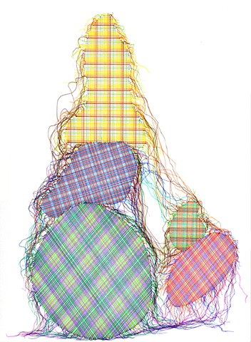
Sometimes we get so tied to a certain idea, person, or place, that we hold onto it so very tightly. That thing we’ve longed for finally comes to us, but it isn’t what we expected. And although things begin unravelling, we are still holding tight, even as the threads become ever more loose. These incredible ink drawings by San Francisco artist Steven Vasquez Lopez got me thinking about how we allow ideas to weave themselves into our psyche.
Patches 004, ink on paper, 9.5×13.25Patches 005, ink on paper, 9.5×13.25
We tend to think of ourselves in a certain light, I this way or that, I could live here but never there. But then a funny thing can happen. We grow, we evolve, we experience life in different ways and we end up surprising ourselves. The weavings unravel and we realize that idea we were so in love with was just that– an idea, not a reality. Those strings aren’t so tightly woven after all.
Patches 013, ink on paper, 9.5×13.25Patches 008, ink on paper, 9.5×13.25
Or maybe they were there to connect us in a different way altogether. Want to see more of Steven Vasquez Lopez’s work? Please visit his website.
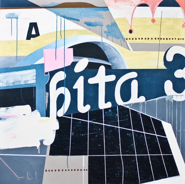
When you think of a breeding ground for creativity, Tulsa, OK is probably not the first place that comes to mind.. but let me tell you there are some artsy folks in OK! Mr. F lived in Tulsa for a few years, so we definitely know some cool and creative folks there ( and a few that have moved Northwesterly! ). Tulsa is home to an awesome contemporary gallery, Exhibit by Aberson, which is showing an impressive round up of young Oklahoman artists, including Tulsa painter ( and musician, Tulsa is a hotbed for the musically inclined ), Jason Lockhart.
Bita-PitaAlite
I fell instantly in love with this Lockhart’s work as soon as I saw it in Exhibit’s newsletter. The architectural elements juxtaposed with typography and painterly abstractions, then add in that color palette and BAM! This is an artist to watch, folks.
E4ET
It’s not just the elements being used, but the way in which he is fitting them together. That slightly hidden “A” in Bita-Pita, the suggestive aviation shapes in E4.. It all just works. Sometimes I get tongue tied, ok, keyboard tied when I try to describe why I love an artist’s work. It’s just good. Trust me.
Ding-On
Want to see more of Jason Lockhart’s work? If you’re anywhere near Tulsa, don’t miss the show at Exhibit by Aberson, opening Thursday, July 18th. You can also check out Lockhart’s blog.
Last night, Mr. F & I ventured out for our first ArtWalk since arriving in Seattle. I know, right?!! What took us so long? And this city is by no means lacking in ArtWalking opportunities. Like Farmer’s Markets, there seems to be one going on all the time. I knew there were a few shows in the Pioneer Square district opening last night, so off we went to fight the traffic and walk some art!
You can see all the photos of art I snapped over on the Artsy Instagram feed, but I wanted to give you a little sneak peek here on the blog. Something you should know about Seattle– it’s gray a lot ( well you probably already knew that ),but when the sun comes out, the light is dazzling. It was a beautiful light-filled evening last night and as I was going through the galleries, I noticed a theme of beautiful shadows cast by some of the work on display.
So much artsy goodness! Next time I think I’ll go early & let Mr. F meet me there. Too much to see in just a few hours. Any artsy plans for the weekend?
All images by Artsy Forager. More can be found by following Artsy Forager on Instagram!
Mr. Forager and I take turns choosing the films we watch together. So hopefully for every documentary about beer or politics, I get a turn at an artsy flick! Last weekend, we gave (Untitled) a viewing and although as a movie I didn’t find it anything to shout about, I did find the portrayal of the art world and its archetypes, hierarchies, pretensions, and perceptions really interesting.
Adam Goldberg, an actor I’ve always loved since his turn as the too-good-to-be-true-turned-crazy roommate to Chandler Bing on Friends, stars as a struggling avant garde composer who falls down the rabbit hole of the contemporary art world. Goldberg is the archetypical brooding starving artist, while his brother, played by Eion Bailey, is a “commercial” artist whose work is selling to a certain type of buyer, yet he longs for critical validation. Enter love interest/contemporary gallery owner Marley Shelton.
Adam Goldberg as Adrian Jacobs, photo by Parker Film Company/Samuel Goldwyn Films
Shelton’s Chelsea gallerist with her ubiquitous collection of trendy, non-prescription glasses embodies the gallerists’ struggle between the work that sells and the work seen as innovative, evocative, and important. While these two aren’t always mutually exclusive, there is often an art world snobbery that comes about when work is commercially successful or decorative rather than intellectual, isn’t there?
Marley Shelton as gallery owner Madeleine Gray, photo by Parker Film Company/Samuel Goldwyn Films
In addition to the main characters, the film also includes art world archetypes such as The Collector Who Will Buy Anything the Gallerist Tells Him To, The Maurizio Cattelan/Jeff KoonsishArtiste, The Artist Who Makes Art Out of Nothing ( but who are we to tell him it’s not? ), The Consultant With an Eye For Work People Actually Want to Buy and Live With, and of course, the Supportive Parents of Artists, who let’s face it, often don’t have a clue what exactly it is you do, they just want you to eat.
Zak Orth and Marley Shelton as Collector & Gallerist, photo by Parker Film Company/Samuel Goldwyn Films
Are the characters in the film stereotypical and a bit caricature-ish? Absolutely. Is there truth behind each one? Most definitely. Anyone who’s been around the business of art for any length of time has likely encountered some or all of these types. But I think the film successfully gives us a glimpse into the humanity of these archetypes– how they struggle against who they are expected to be and as some accept who they actually are. As there are millions of artists, so are there millions of opinions on what art is. And there is room for all.
It’s so difficult to capture the feeling of a place, a moment, a mood. Sometimes I get so caught up in the beauty of moment that I forget to snap a photo or more often, I don’t want to take myself out of the moment to grab the camera. New York photographer Mimi Ko creates an ambience of feeling in each captured click of her camera.
Though her subjects are occasionally dressed in period garb, there is a timelessness to the spells she is weaving. The shadows and soft light create a quiet moodiness and feeling of anticipation.
With each image, she is letting us into a small part of the story. The possible narrative is only one element in the composition, the scenes she is setting are more about what isn’t being said rather than what is.
Want to see more of Mimi Ko’s work? Please visit the artist’s website.
Summer always feels like the perfect time to bring out the graphic ethnic prints, comfy sandals, and color, color, color! Living an artsy life means showing your artsy spirit in everything you do– including how you present yourself to the world through the clothes you wear. Wanna channel your inner kokopelli? This ensemble, inspired by this month’s Featured Artist Ally Burguires‘ Kokopelli painting is perfectly comfy and colorful– perfect for an afternoon of gallery hopping in Santa Fe!
Doesn’t a skirt like that just make you want to sashay when you walk?! Or maybe do a wee little kokopelli dance. 😉 This pairing just makes my little artsy heart sing!
For Mr. Forager and I, the natural world plays a big role in who we are, what strengthens and calms us. Getting out among the trees and streams renews our energy and every time we go, we are reminded how precious it is. The work of Berkeley artist Myong Stebbins captures that transportive feeling of our cherished natural world.
Yeonkkoch II, mixed media on paper, 29.5×24.5New Morning, mixed media on paper, 22.75×17
Stebbins’ soft, translucent layers mimic the filtered light to be found deep in the forest. The isolated flora could be seen as a reinterpretation of scientific specimen drawings. Like dried and pressed petals, the flowers have a sense of papery fragility.
Morning Calm II, mixed media on paper, 14×18
Whenever we are out in the woods or beside the water, I try to capture the magic with my camera, but somehow, the lens never seems to do justice to the mystical beauty of the landscape. In paint, Myong Stebbins has captured that essence that is so fleeting.
Kibun II, oil on canvas, 24×32Echo, acrylic on paper, 31×38.5
Want to see more of Myong Stebbins’ gorgeous work? Please visit the artist’s website and the websites of her representing galleries, Pryor Fine Art and Bryant Street Gallery.
Every new place Mr. Forager & I go, I try to hit the local art museum. Not only because I think it’s important to patronize local art resources ( artsy duh ), but I also find them to be an interesting gauge of the local tastes and what’s important to the surrounding culture. After being in Seattle for six weeks, we finally ventured to the Seattle Art Museum last week.
In addition to their current special exhibition, Future Beauty ( more on that in a separate post ), there were a few other intriguing exhibitions on display. I was especially excited to see 50 Works for 50 States, selections from the Herb and Dorothy Vogel collection.
[ Codex Morales Braccio Sermugnano by Michael Goldberg and Untitled by Tony Smith ]
I am continually amazed by the collection this couple put together on a modest income! Truly inspiring to anyone who is intimidated by the prospect of collecting artwork. The Vogels collected many smaller works and works on paper, making them more financially accessible but allowing them to build an enviable collection. Such a great example to follow!
One of the things that impressed me the most about the SAM experience was the thoughtfulness given to how each exhibition was displayed and how the galleries interacted with each other. Glimpses of work seen not just within each exhibition but from one gallery to another allow the work to relate and interact in a way that allows the viewer’s eye to flow naturally throughout the space.
[ Thicket by Martin Puryear ]
A delightful surprise was the small show currently on display in the Knight Lawrence Gallery, In a Silent Way, “a quiet reflection on African American identities and histories”. This small gallery is tucked in a corner of the museum, away from the crowds and bustle of the larger galleries, which was perfectly fitting for such a thoughtful group of works. The palette of the show was almost exclusively black and white, a subtle nod to the subject matter, but each piece filled with subtext of what it means to evolve as a person of African descent in America.
From the museum’s permanent collection, an exhibition of mid-twentieth century work, From Abstract Expression to Colored Planes, features superstars of the era such as Frank Stella, Jackson Pollock and Helen Frankenthaler. The progression of that era of modern art is always fascinating– you can literally see the artists deconstructing and reconstructing the meaning of form across time. It is without a doubt one of my favorite periods of art history!
[ contemplating Frankenthaler ]
In keeping with the special exhibition’s focus on fashion, I was especially drawn to the work of Yinka Shonibare, whose Nuclear Family installation shows us a “traditional” family dressed in the structure of Victorian garb in textiles reminiscent of modern Africa. In a different, but no less interesting textile sculpture, Walter Oltmann‘s Caterpillar Suit mixes two destructive species, the caterpillar and the conquistador, while exposing their vulnerabilities and tenuous existences.
[ Nuclear Family by Yinka Shonibare ]
[ Caterpillar Suit III by Walter Oltmann ]
I love the way the Seattle Art Museum is blurring the lines between ancient and modern, leading the visitor down familiar paths only to introduce them to something new and exciting. Can’t wait to see what else is in store!
I’ve always had a love/hate relationship with collage. My first college art professor loved collage and it figured heavily in her basic drawing classes. At the time, I found the cutting, arranging, and pasting pretty tedious. I was more of a thrown some paint around a canvas kind of art student.. but I did love how flexible a collage composition could be. In their work, French artistic duo Max and Adele of Atelier Bingo utilize collage, gouache, ink, screen print AND digital media to create abstract compositions as expressive as any painting.
..
The flattened panes of bright color immediately reminded me of the famed collages of Henri Matisse— his Blue Nude remains one of my all time favorite pieces of art, ever. The layering of such simplistic shapes assists our eyes in completing the composition. No details are needed– we are allowed to fill in the blanks– but only by choice.
The flat planes of color are mixed playfully with pattern, keeping our eyes moving across the plane and helping us to add to the story our eyes are concocting along the way.
Want to see more work from Atelier Bingo? Of course you do! Check out their website, Tumblr and Facebook page.
One of my favorite things about Seattle, or any big city for that matter, is the people watching. Anywhere we go, there is always such an intriguing array of humanity to be observed! New York artist Scott Duce must agree, because his latest series, In Public, focuses on observations of urban individuals.
Pink Stripes, oil on panel, 12×12Woman With Flowers, oil on panel, 12×12
Walking in a big city, you definitely get a sense of being on display, but then there is also a strange contradictory feeling of the ability to melt into the crowd. Duce’s choice to isolate each figure against a monochromatic background serves to call attention to the specialness of each individual and the uniqueness of each moment.
Skinny Man, oil on panel, 12×12Summer Stop, oil on panel, 12×12
As we each move through life, we do not do so in a bubble. We are one of many, each individual an important part of the the entire sum.
Fashion Runner 4, oil on panel, 12×12
Want to see more of Scott Duce’s work? Please check out his website.