Once upon a time, I was bored by white. The more color the better. And around age 13, the more purple the better! 😉 But as my eye has grown and matured, I’ve developed a deep appreciation for the purity and peace of white. It calms us, brings shadows and textures to life and provides a place of rest in a saturated world. Would you like to join me on a little mini-vacay from color today?
Untitled 11.6 ( detail ) by Natalie Abrams, wax on panelEmpathy by Lauren Browning, italian ice alabaster on black graniteFlutter by Sana Krusoe, porcelain, 30x4x5 ( via Davis & Cline Gallery )Burqa by Shayna Lieb, glass, 6x30x5Magnolia by Heather Knight of Element Clay Studio, ceramic, 9x9x3
Ahh.. don’t we all feel calm & relaxed now? Have a wonderful, peaceful weekend, Artsies! Be sure to check out the artists’ websites for more loveliness.
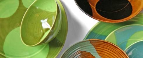
Happy Valentine’s Day, Artsies! I hope you have plenty of love being lavished on you today and lots of folks in your life to love on. Here’s something I love: serving pieces that are a perfect balance of function, beauty and artistry. Here are a few beauties I found, pretty enough to serve the ones you love!
Hope you enjoy a wonderful V-day, hope it includes a meal with your favorite person ( or people ! ) and if served from a beautiful, handmade bowl, even better!
Featured image is the Dots Collection by Liz Kinder, available here.
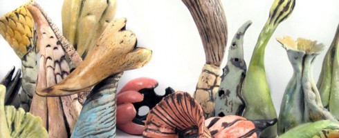
I love it when an artist’s work causes me to do a double take. When I spotted the ceramic sculptures of Anne Goodrich amongst the work at Guardino Gallery in Portland, I almost passed them by. From afar, they just seemed like botanical ceramics, which would likely just have elicited a “nice” from me. But upon closer inspection, I saw that these were something more.
Wall 10
These beautifully formed ceramics, in their soft pastels and rich earth tones play a delightful little trick on the mind. At first glance, you may think you know what you’re seeing– Oh, pretty seashell, no wait, flower, no wait, gourd.. snail? alien? What is it?!
7A
It is in the ambiguity that Goodrich’s work finds its simple, sweet power. We aren’t sure exactly what these forms are, but even still, they speak to us. They are achingly familiar, like the face of a stranger who reminds us of a long lost friend.
Wall 4
They may remind us of forms that exist inside our own bodies. Or of organisms surrounding us, both seen and unseen.
Nest 1 by Anne Goodrich
Whatever they are, I want to bring one home, give it a name, let it speak to me and discover its mysteries.
To see more of Anne Goodrich’s work, please visit her website. If you’re lucky enough to be in or near Portland, OR, you can see her work in person at Guardino Gallery in the Alberta Arts District.
I love art. I love design. Why not put the two together on the blog? There was a time in my life when I thought my career path lay ( Thank you, Suzanne Decuir for the grammatical help ) in Interior Design. I took courses, devoured design and shelter magazines. As often happens in life, circumstances got in the way and the path detoured. But that’s a story for another time. Let’s focus on the fun stuff today!
One of my absolute favorite things while designing ( OK, it was THE absolute favorite thing ), was creating moodboards. To begin with an inspiration and build a room or facility around it was thrilling to my color, texture and pattern lovin’ soul. And for me, it always began with the artwork. While doing project management/art consulting, I worked with a lot of designers and many ( but by no means all! ) viewed the artwork for a design as an after-thought. Like adding sprinkles to a cake. Still a cake without the sprinkles, but oh, if we add them, won’t that be pretty! But if we don’t have sprinkles, it’s OK. It’s still a nice cake. Instead, I think of the artwork as the frosting– not just smoothed across the top, but spread between the layers and all over. It is what holds the cake together and gives it the extra texture and sweetness that keeps us going back for more.
( Wow, anyone else craving cake now? )
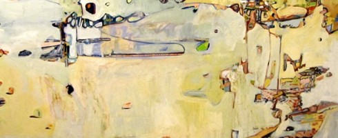
So you’ve purchased this beautiful painting by Christina Foard. You love it, it speaks to your heart and reflects your style and everything you love about life. But maybe you live at the beach and are unsure how to design a room around it. Aren’t all beach houses supposed to be full of palm trees & seashells?
Seaside Reflections by Christina Foard, oil on canvas, 60×48
This piece to speak more to the feeling of being on the beach just after a storm, while the skies are still a bit gray but the sun is beginning to peek through, warming up the sand to both the eye and the touch. So let’s take our cue from that and begin with soft, grayish tones, layering on the warmth of the sun in our accent chair, rug and window coverings. An important component in Christina’s work is texture, so we’ll make sure there are plenty of interesting surfaces to draw our eyes in, just as Christina’s painterly build up does in her work.
Modern Reflections, a beachside home for a contemporary art lover
Have you ever designed a room around a piece of artwork? Or bought a piece of artwork not knowing where exactly to hang it in your home but you couldn’t live without it? Have a beloved piece of art sitting in a closet somewhere because you don’t think it “goes” or can’t figure out how to incorporate it with your current furnishings? Um, yeah, me too. 🙂
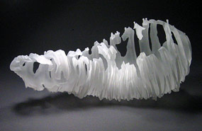
 by Natalie Abrams")