So you have amassed a little art collection for yourself, huh? Well done, you! But maybe you’re stuck on how to display your finds.. Creating “art walls” in your space will allow you to stylishly show off your favorites.
via Pinterest via Raines Design via olofjakobina.blogspot.com
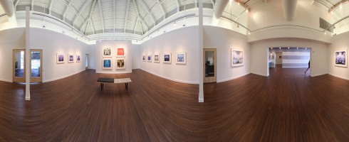
One of my favorite things about art walls also known as hanging art “salon style” is how flexible the arrangement is. It’s a gathering of artwork you love, so there are no set rules. As in the graphic arrangement above, you can group artwork with like elements. Above, the simple, black graphics are the unifying factor.
Or, use frames in all the same color to unify your favorites. All white or black frames ( or gold, silver, wood, whatever! ) will create an instantly well-designed, intentional feel to your collection.
via From The Right Bankvia Pinterest via herwhitesunrise.blogspot.com
For a more traditional or sleek look, you can go stream-lined and symmetrical. Hang works from the same series in a grid format for a clean, contemporary arrangement.
via Timothy Whealon Interiors
Or, just go loosey-goosey and have fun! Start with the largest piece, either in actual size or visual weight and work out from there. Lay your artwork on the floor and play with the configuration until it feels right.
via Pinterest via blog.apieceapart.com
Fill the wall as much..
via Pinterest
.. or as little as you like!
via Pinterest via Blissfulblog.com via House Beautiful
The actual hanging process may seem daunting, but this foolproof method will help you along. If you need a little assistance coming up with a design, check out these templates for a some inspiration!
There will be lots of gathering of friends and family around our dining tables this Thursday. Grandma’s china comes out of storage, the crystal sparkles and the silver shines. For some dining rooms, this is the most action they see all year! We eat in the kitchen, over the sink or on the couch in front of the tv. But this gathering place is not a room to neglect! It’s a place, to quote Simon dePury, “Be bold, be amazing!” ( Are you watching Work of Art?! )
The dining room, even if not a formal, separate space is the spot to make a big statement. So in this edition of Artsy Dwelling, I’ve gathered up some images of inspiring spots, a feast for the eyes!
Want to have fun dinner parties? Make sure the art in the room reflects your cheeky style!
Via Sketch42blog.comVia Apartment TherapyVia Belclairehouse.blogspot.com via Coastal Living
Or maybe you want to throw ultra-cool and hiply intellectual soirees? Add some graphic punch with your artwork.
Via 2.bp.blogspot.comVia Apartment Therapy
Or maybe you like to keep things fresh and elegant? Let oversized artwork shine, so if guests need a break from conversation, give them oversized artwork to get lost in.
Via Traditional HomeVia Timothy Whelan
Want to be really bold? Paint the walls a deep, rich color and let simple, graphic artwork be the star of the show!
Via Elements of Style blog via Elle DecorVia Rue MagazineVia Lonny Magazine blog
Wouldn’t even a frozen pizza seem like a gourmet meal in an artsy environment? Pass the parmesean!
Ninety-nine percent of the time I completely love my life in the Pacific Northwest. But occasionally, there is that nagging little 1% that longs to be back in my hometown of Jacksonville, Florida, just so that I can be in the thick of the exciting artistic resurgence happening there. Though the arts in Jax were hit hard by the recession, artists and art supporters are determined to make Jacksonville a cultural destination. Among them, artist Steve Williams is bringing home forward-thinking, atypical art with his new gallery, Florida Mining.
CPHACE by Laird, inaugural exhibition at Florida Mining
Williams is no stranger to playing gallerist. He’s been at the heart of several successful galleries in Jacksonville over the years. As an artist, he thrives on being involved with other artists and their creative processes. And, being the generous soul that he is, wants to help them succeed and in the process, is bringing his unique vision for the arts to his hometown.
Florida Mining
Florida Mining’s mission? To present emerging to mid career artists who are thought provoking and fresh with a mix of medium and perspective. And they were off to a slammin’ start with their first show featuring a new series of work by Northeast Florida photographer Laird, a series infared photographs which begin with organic surroundings and are composited and mirrored so that the resulting image becomes almost hauntingly alien, yet familiar.
CPHACE series by Laird
Florida Mining’s sleek, contemporary space, designed by the brilliant team at Designmind, Larry Wilson and Rebecca Davisson ( both artists in their own right ) is the perfect showcase for making avant-garde work accessible to North Florida.
Florida Mining
Up next for Florida Mining is a new show, Tonya Lee: All Smiles, a new series from the Jacksonville-native, current Philadelphian featuring paintings and wallpaper ( yes, you read that right! ), embracing Lee’s fascination with alternative materials.
Tonya Lee: All Smiles
Tonya Lee: All Smiles opens at Florida Mining this coming Friday, 11/11/11. If you are anywhere nearby, you will not want to miss it! Big things are in store for this new venture. Go and experience it for yourself.
If you’re not in Florida, be sure to check out Florida Mining on their website, Facebook and Twitter. Always interesting and cheeky fun to be had.
As promised, here’s our 2nd Christina Baker feature of the day. The fabulous Mrs. Baker has four (!) pieces of artwork featured in the Nashville Southern Living Showcase Home. So I thought it would be fun to give you a peek at her work in this beautifully designed space.
Commissioned work for master bedroom, Twinkle Twinkle Little Star, acrylic on canvas, 48×48Master bedroom, Lazy Day, acrylic on canvas, 30×40Master Bedroom Inspiration Board, Southern Living Showcase Home
I am constantly inspired by how people live with art in their own homes. I love the way folks are thinking outside the box in terms of the art they collect, where and how they display it. I’m hoping these short little visual features, Artsy Dwelling, will help inspire you!
We spend so much time in the kitchen these days– let’s face it, this room is the hub of any home. It is where people inevitably gather during any party! So why not display some of your favorite art in the spot where you spend so much time? The only guideline? Keep valuable original art away from cooking & prep areas to prevent damage. Otherwise, feel free to think outside the icebox!
How about you, Artsies? Do you have art in your kitchen? Or have images of how you live with art in your home that you’d like to share? We would love to see! Feel free to email digital images to artsyforager@att.net and we might just feature your home on the blog!
Image sources can be found by clicking on the image.
From the New American Paintings blog, the fantastic home of LA gallery owner and blogger Heather Taylor. Simple, humble furnishings mixed with amazing artwork give her home personal, inviting style.
Artwork has the power to facilitate change. Most importantly, in our minds, spirits and hearts. But today, we’re going stay in the more shallow end of the pool. 🙂 Let’s have some art + design fun and take a look at a beautifully designed room and see how just changing up the artwork can transform the way the room feels.
For our first go ’round, we’ll start with a fairly classic, neutral room:
Look #1: In keeping with the classic, slightly beachy style of the room, we’ll add an oceanscape by Tennessee artist Christina Baker.
The shift from mirror to artwork, in this case, is subtle, but what an impact! Makes for a much more interesting room, yes? Even the pup seems more pleased!
Look #2: Though the space is gorgeous, it could use a well-placed pop of color! So let’s see what a Michelle Armas abstract does for it..
The lovely colors and lively brushstrokes really bring the space into a shinier, happier territory, don’t they?
Look #3: The best way to help elevate a traditional room into something with a bit more personality? A graphic and quirky piece by Sarah Ashley Longshore from her Audrey Hepburn series.
This look works because what’s more classic than Audrey Hepburn? That’s right, nothing. So her iconic image keeps with the traditional vibe, but the bright colors and pop-style of the painting add a punch of the unexpected.
Hope you enjoyed our little peek at how varying styles of art can change a room’s personality! What’s your home’s art-style? Do you change things up or keep your favorites up ’round the clock?
Be on the lookout for future installments of this new Artsy Forager feature, [ Insert Art Here ]!
Featured room image via House of Turquoise, architect James Cullion and interior designer Eileen Marcuvitz, photographed by Robert Benson.
I love art. I love design. Why not put the two together on the blog? There was a time in my life when I thought my career path lay ( Thank you, Suzanne Decuir for the grammatical help ) in Interior Design. I took courses, devoured design and shelter magazines. As often happens in life, circumstances got in the way and the path detoured. But that’s a story for another time. Let’s focus on the fun stuff today!
One of my absolute favorite things while designing ( OK, it was THE absolute favorite thing ), was creating moodboards. To begin with an inspiration and build a room or facility around it was thrilling to my color, texture and pattern lovin’ soul. And for me, it always began with the artwork. While doing project management/art consulting, I worked with a lot of designers and many ( but by no means all! ) viewed the artwork for a design as an after-thought. Like adding sprinkles to a cake. Still a cake without the sprinkles, but oh, if we add them, won’t that be pretty! But if we don’t have sprinkles, it’s OK. It’s still a nice cake. Instead, I think of the artwork as the frosting– not just smoothed across the top, but spread between the layers and all over. It is what holds the cake together and gives it the extra texture and sweetness that keeps us going back for more.
( Wow, anyone else craving cake now? )
So you’ve purchased this beautiful painting by Christina Foard. You love it, it speaks to your heart and reflects your style and everything you love about life. But maybe you live at the beach and are unsure how to design a room around it. Aren’t all beach houses supposed to be full of palm trees & seashells?
Seaside Reflections by Christina Foard, oil on canvas, 60×48
This piece to speak more to the feeling of being on the beach just after a storm, while the skies are still a bit gray but the sun is beginning to peek through, warming up the sand to both the eye and the touch. So let’s take our cue from that and begin with soft, grayish tones, layering on the warmth of the sun in our accent chair, rug and window coverings. An important component in Christina’s work is texture, so we’ll make sure there are plenty of interesting surfaces to draw our eyes in, just as Christina’s painterly build up does in her work.
Modern Reflections, a beachside home for a contemporary art lover
Have you ever designed a room around a piece of artwork? Or bought a piece of artwork not knowing where exactly to hang it in your home but you couldn’t live without it? Have a beloved piece of art sitting in a closet somewhere because you don’t think it “goes” or can’t figure out how to incorporate it with your current furnishings? Um, yeah, me too. 🙂
CONFESSION TIME: One of my biggest pet peeves is artwork hung incorrectly. And by this I mean too high, too low, staggered when there is no reason for staggering ( i.e., up a staircase wall ), etc. While there are no set rules when it comes to hanging artwork, there are guidelines. Knowledge is power, ya’ll, and you’ll thank me for it when my eyes aren’t twitching uncontrollably when I come over and see how your artwork is hung. I’m too polite to say anything, though.. I am a Southern girl, after all.
Guideline #1: Normal height for hanging artwork is to center it at eye level.
But whose eye level? You may be 4’11” but your husband is 6’4″– how do you decide? Law of averages, my friends. I’m 5’5″ ( ok, 5’4 1/2″ ), so my eye level is actually spot on. The safest height at which to hang artwork is 60″ from the center of the artwork to the floor.
Guideline #2: Use picture hooks and D-rings for hanging whenever possible
Plain ol’ nails might be super cheap, but picture hooks are the best way to go to get your artwork to hang levelly and securely. The weight of a piece of artwork will drag down a nail, but the picture hooks are designed to set the nail at an angle so that the laws of physics hold the picture up, instead of putting all the weight on the nail. There are different size hooks available according to the weight of what you’re hanging, so if you’re in doubt about the weight, go with the heaviest weight hook so you’ll be sure your artwork won’t fall on someone’s head.. or toes.
D-rings are God-sends for hanging artwork and should be used instead of wire, if possible. Simply install two d-rings at the same horizontal level on the back of the picture frame. It’s true, you’ll need to put two holes in the wall instead of one, but your artwork will be more secure and won’t have that annoying habit of going crooked anytime it get’s bumped a little or someone closes a door a bit too hard.
Guideline #3: When hanging multiple pieces together, be aware of the space between them and how they relate to each other
If you’re hanging a pair or series of artwork above a piece of furniture, measure and treat the pieces as if you were hanging one solid piece– taking into account a bit of space between them and center the overall size horizontally above the furniture and center each piece vertically at 60″.
Guideline #4: Some rules were made to be broken
Not Guideline #2, the picture hook thing is always important, not just for aesthetics, but for safety. The other two, however, might be flexible depending on the situation.
Broken rule #1– It is OK to hang artwork lower ( or higher, I guess, though this is less common ) than eye level if it helps the work relate to its surroundings
Broken rule #2– Sometimes extending a grouping of work outside of the borders of a piece of furniture or other furnishing helps the artwork to make more sense within the room, as in the case of the room below. In this instance, more is more, yes?
Broken rule #3– The rules are, there are no rules.. Sometimes the positioning of artwork doesn’t really need to relate to the surroundings at all.. randomness & asymmetry can be beautiful! If done well, of course.
If you ever find yourself unsure of how to hang your latest acquisition, I hope these guidelines are helpful. If you’re really stuck, drop me a line– I’m happy to help! Happy hanging!