As artists and as people, we are so influenced by our surroundings. Northwest friends will tell you that SAD is real and can hit hard during a Northwest winter! As Mr. Forager & I travel, we find it so interesting the way each different place effects us. In her work, Woodstock artist Jenny Nelson expresses her own reaction to her surroundings.
Instead of abstractions where the landscape might still be detected, Nelson’s paintings feel more like a reaction to the energy and activity in a certain place, at a certain moment. Each one is filled with layer upon layer of paint and brushstroke, as if the push to record the scene came at the artist fast and furious. I do wonder, if we were to try to record the “feel” of each situation in which we find ourselves, rather than the actuality of the moment, how different might our memories be?
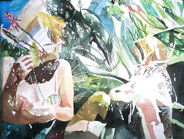
Oh the sun drenched days of summer! It’s February and while I love winter and don’t mind the misty rain and clouds of the Northwest, I do love those lazy summer days. These watercolors by Oakland artist JD Olerud, transport me back to those days when the sun wasn’t such a stranger.
There is something about watercolor as a medium that captures the magic of dappled sunlight so perfectly. Olerud using his white spaces to create that wonderful sense of the warmth and light of a summer day. I almost feel like squinting or wearing sunglasses when looking at these! Oh to lie down in the grass and feel the radiant light once more! Of course, Mr. F and I will be spending the next three months on the soggy Northern California coast, so I expect it will be some time unit l get to experience that bliss. 😉
Here goes, ya’ll, I’m ready to share the second painting in my new series, Feminine Wiles( see the first one here ). This new series of paintings are abstract color studies based on the fashion of iconic female film roles. While Faye Dunaway as Bonnie Parker in Bonnie & Clyde may not have been the most glamorous of wardrobes, it definitely conveys a sense of the time and of the character.
Dunaway’s earthy neutral wardrobe palette fit well with her role as a woman taking on a life usually the domain of men. Yet Bonnie’s fashions still maintain a sense of femininity and aren’t entirely cold– a bit of warmth showing through the callous exterior.
Faye Dunaway as Bonnie Parker, acrylic on panel, 6×6
What do you think, Artsies? This series is making me so uber aware of the way color is used in film wardrobe design. And it is an excellent excuse to stream some classic films!
Source for Dunaway image linked above. Artwork by Lesley Frenz.
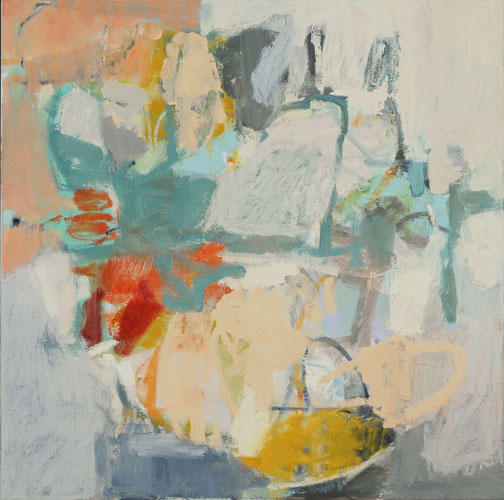
One of the things I love best about abstract painting is its ambiguity. Without the direction of an artist statement of some sort, the viewer can have no idea the artist’s source of catalyst, inspiration or proclamation. These paintings by artist Anne Sherwood Pundyk originate from a string of images and moments in the artist’s mind.
There is an incredible amount of depth and energy to each piece, almost as if the artist can’t get that string of images out of her mind and onto the canvas fast enough. But then each has a moment of rest, like a still frame shot of the motion picture moving from mind to canvas. While each piece stems from specific imagery in the artist’s imagination, the ambiguity of the abstraction means its interpretation is left entirely to the viewer. What you see is what you see.
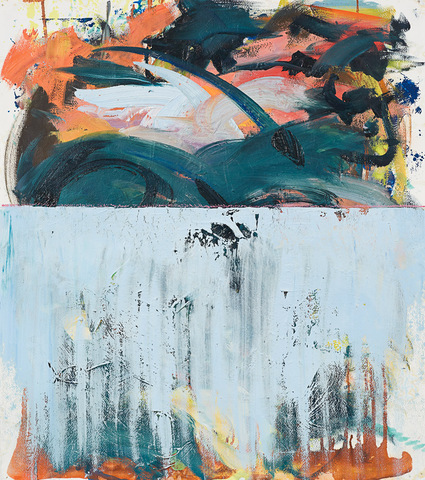
Being out here in the Northwest versus growing up in Florida, I’ve gotten more of a sense of what it would have been like to see this wild and glorious country for the first time. It is difficult in this day to comprehend the hardship and sluggishness of that world. How it could take weeks, even months to convey the simplest of communications. In his latest series of paintings, American _Tier, Denver artist Shawn Huckins explores the juxtaposition of the artwork of the 19th century in America versus our 21st century technology-driven vocabulary.
Judging from the names they gave some of the places out here, such as Cape Disappointment and Dismal Nitch, I can imagine Lewis & Clark would have been texting WTF all over the place during their expedition. Huckins’ series surely brings to mind the evolution of language between then and now, especially in our written communications. I find it interesting to think about how people are the same as they were then, in their feelings and emotions, what has changed is in mode and frequency in which those emotions are expressed.
Every place has its own personality, just like any person. Some places are a bit dark and brooding, while others are so sunny and bright they are almost annoying.. Victoria artist Stacey Rees captures the sensual and spiritual atmosphere of her surroundings in her paintings and illustrations.
I always find it interesting to compare the feel and palette of the different places we visit. Between some, there are only minor differences, but in other spots, it feels like being in an entirely different world. And in those places, often times our personalities may absorb some of that difference, too. As in Rees’ work, in which there is a wonderful sense of not just earthly but spiritual atmosphere, we can take on not just the physicality of a place but some places get into our souls– for better or worse.
Mr. Forager & I have visited a few soul-filling places. Do you have any place you’ve visited that had a profound effect on you?
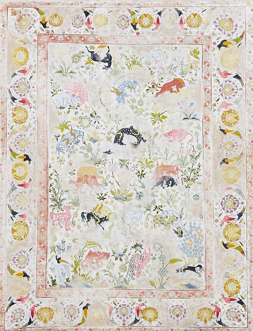
Things are just things, it’s true. Life is about our relationships and what we say and do, yet the objects that we live with become a part of who we are. Artist Kour Pour methodically recreates intricately patterned carpets similar to the ones he grew up with in his father’s England rug shop.
We may not take much notice of those objects that surround us each day, but they become a part of our associations and our memories. It’s why after the death of a loved one it’s so hard to go through their things, to touch those pieces of life that beloved fingers held each day, but will no more. Those objects become a part of our history, as carpets did for Pour, and when we least expect it, those associations may help bring about healing.
In love, as in life, things aren’t always neat and orderly. Emotions go awry, we find ourselves sliding down the rabbit hole of sensitivity, going from sadness to anger to regret to tenderness and back again. These large scale floral paintings by Florida artist Carmelo Blandino capture that undeniable exquisite mess that comes with loving another person.
Paint is applied thick and frenzy-like, just like the whirlwind of those first moments of falling in love, every touch, every minute together is dripping with excitement and overwhelming beauty. Then, as time goes on, we settle into a different kind of messy loveliness, the kind that knows what you look like first thing in the morning, but can’t wait to kiss you anyway. The kind that loves you through your moodiness and emotional outbursts. The kind that fights honestly and fairly and then loves you even more when it is over.
On this Valentine’s Day, I wish you the messiest sort of love, dear Artsies! If you’d like to see more gorgeous flowers by Carmelo Blandino, please visit his website.
If you’re following along on Instagram, you might have noticed a little sneak peek into something I’ve been working on lately. Since starting my #colorforaging2014 project at the beginning of the year, I’ve had more creative energy than ever. And I’ve begun taking full advantage of it. I’ve always worked in a series format ( thanks, Prof. Ladnier for creating that habit! ) and have already completed 5(!) paintings in one series while my mind is pondering, researching, contemplating the beginnings of seven more different series of work.
Early on, my above mentioned college painting prof labeled me a colorist. It’s true, I’ve always been drawn to color and color theory. I’m sure one of my first experiences with color was in admiring the fashion in my favorite curl-up-on-a-Sunday classic films. As a little girl, I imagined myself in those beautiful clothes, becoming those charismatic leading ladies. Then as a grown woman, I’ve found myself analyzing the use of color in the establishment of character– the reasoning why the film’s costume director chose that particular gown in that particular shade for that particular scene. There was a method to all that beautiful madness.
Each series of paintings I have in mind will deal with the psychology and effect of color in some way. For this first series, which I’ve tentatively titled Feminine Wiles, I’m focusing on the fashion of iconic female film characters, especially those used in scenes in which the character is capitalizing on her feminity in some way.
Each piece is a small abstract portrait of that character at the moment and how the character is defined by that particular costume choice. All that intellectual stuff plus I just love pretty dresses and pretty paint..
The first painting in the series is a study of Audrey Hepburn’s Holly Golightly from Breakfast at Tiffany’s. While the character’s series of elegant little black dresses is synonymous with the character, I’ve always been drawn to the pink Givenchy cocktail dress. The character wears this confection while in the midst of wooing her Brazilian millionaire would-be fiancé. She is no longer fashioned as cool and elegant, her style for Jose is warm and feminine and festive. It is such an interesting contrast to the devastation that happens later in the scene.
Through a sequence of layers in shades of grey, red, purple, pink and white in acrylic on a 6×6 inch canvas panel, I finally came to a point where I felt like I had a representation of my own interpretation of the character in that dress, in that scene.
Audrey Hepburn as Holly Golightly, The Pink Dress by Lesley Frenz
acrylic on canvas panel, 6×6
I’ve always worked on larger canvases in the past but our current vagabond lifestyle doesn’t include much room for storage of bulky canvases. I would love to translate these BIG, but for now, these little studies are proving satisfying. I can’t wait to share more of the Feminine Wiles series with you! Do you have any iconic female film characters to suggest? I have a list of possibilities, but am completely open to suggestion. I’ve been focusing on classic films, but may eventually move into contemporary characters, too. Can you tell I’m having a ball and completely obsessed with this? I hope so, because I totally am!
Art and logo by Lesley Frenz/Artsy Forager, other image sources linked above.
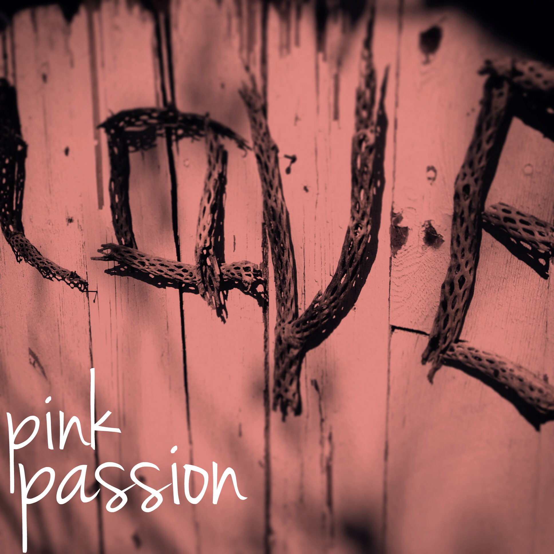
I don’t wear much pink, I’ve never decorated with it much, but it seems to have some strange kind of power over me ( see blog logo & graphics! ). I find the shade completely irresistible in artwork, and in, well, pretty much everything, about this time every year. I’m going to blame it on succumbing to mass advertising! Ha. You must admit, it is a lovely shade, this shade of love. The color of lips and roses and sunsets, it isn’t any wonder we find it so gosh darn romantic.
image by artsy forager
Here’s a little round up of a few rose-colored favorites from around my Pinterest boards lately..