Today I was stuck on what or who to feature on the blog. Nothing was jumping out at me. Desperate, I asked my husband. His first ( joke ) repsonse was “Thomas Kinkade”. Hardee har har. His next suggestion was “Guy Art”. I was like art featuring guys? Art by guys? No, art guys like. Oh! I asked if the blog was becoming too girly.. he said no, but I have my doubts. There’s been a plethora of pink around here lately. Not that there’s anything wrong with that. But my taste in art isn’t always so feminine. I like a bit of edge and irony, too. So in honor of my hubby, whose own appreciation for art is growing every day, here are some examples of art that any guy would be happy to hang in his swingin’ bachelor pad.
Martyr by Alwin Jackson
Alwin Jackson is a painter. He doesn’t put up a front of pretentious, artsy bullsh**. Maybe that comes from having been in the corporate advertising world for twenty years. His images are clean and bold and I think most guys would appreciate their no-nonsense attitude. This girl certainly does.
Untitled ( History Painting ) 2011 by Tony Rodrigues
Tony Rodrigues’ work takes an introspective look back at icons from childhood and pop culture. What grown man doesn’t have memories of playing “cowboys and indians” when he was young? His sentimental take on figures and themes take us back to the “good ol’ days”, but leave us wondering, how good were they, really?
Beats in Paint by Robert Leedy
It is a truth universally acknowledged that most guys wish they were musicians. ( My hubby will attest to this fact, though I think he’s a better guitar player than he gives himself credit for ). How many rockstars started out by picking up an instrument as a way to meet girls? I bet Robert Leedy’sBeats in Paint make you want to wail on a drumset like you’re Keith Moon.
Building Faces- Crown Fountain Juxaposition, Chicago, IL by Doug Eng
Boys love to build stuff. It’s why Erector Sets and Legos have been around for so long. Many men have contributed to the architecture of great cities like New York and Chicago. Doug Eng captures a glimpse of humanity among the concrete and steel, reminding us that these buildings are built for, built by and filled with, people.
Freedom by Steve Williams
Teddy Roosevelt was a man’s man president. A boxer, a soldier, a hunter and outdoorsman, embodying his ideology to “Speak softly and carry a big stick”. Artist Steve Williams pays his due to this former president in his Currency series.
Stoic by Brian McGuffey
For those guys who want to show off their bagged game, but not actually, you know, kill a beautiful wild creature just for the bragging rights, Brian McGuffey’sStoic is just the thing. I don’t know, this deer looks seriously ticked off for having been decapitated. I wouldn’t cross him if I were you. Just nod gently and let him be.
Remember that thing about guys wanting to be rockstars? Is there a rockstar cooler than the gravelly-voiced Tom Waits? Seriously. John Duckworth renders his steely glaze perfectly. And yes, there’s some pink in there. Duckworth and Waits aren’t afraid to rock the pink.
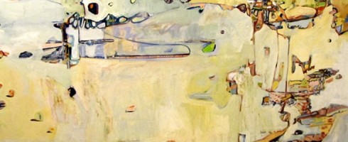
We are headed to Seattle this weekend, one of my favorite cities in the world, the city where George and I fell in love. And while I was falling in love with G ( I was probably a little in love with him when we were friends in FL, but that’s a story for another time ), I was also falling in love with Seattle. I adore visiting cool cities– the urban landscape and architecture fascinates me. So it carries over that I would adore the art of the cityscape.
For this Friday Fave round-up, I’d like to share some of urbanist artists whose work I’m crushing on lately:
Hill Houses 2 by Brin LevinsonPassing 1 by Jason WebbSolitary I by John DuckworthLoew’s Hotel, 33rd Floor, Philadelphia by Sara YeomanMiyami by Darra CrosbyGreat Tortoise Hostel, Seattle by Robin WeissBoulevard Windows by Sharon Dowell
Looking forward to bringing you more from these artists soon! In the meantime, take a gander at their websites..
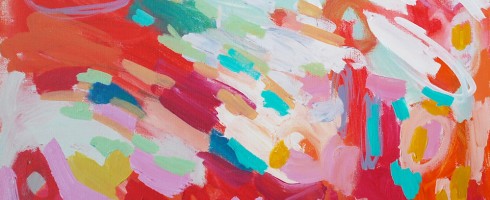
Pablo Picasso once asked ( rhetorically, of course ), “Why do two colors, one put next to the other, sing?” Good ol’ Pablo had no answer, nor do I. But they do. Color calls out to us, reaches out to something in our spirit and psyche, evoking emotion. Not every artist gets color, how different hues complement and interact with each other. Michelle Armas gets it. She gets it and puts it on canvas for all the world to see and enjoy.
Sophia
Michelle began professional life, not as an artist, but in graphic design and corporate branding in New York. Talk about baptism by fire! To help cope with the stress of working in NYC, Michelle began painting. After about a year, she decided to trade the corporate world for the art world and began painting full-time.
Rosalia
Her canvases explode with color, joyous, juicy and fluid. It’s as if she’s captured the hues of the warmth of a sunny day, of being a kid again, running and jumping with full abandon.
Arelis
Lovely, sketchy scribbles and seemingly-spontaneous pops of color remind us what it was like before we were “taught” to draw and color– that magical time when we, as young children, were only concerned with the feel of the crayon on paper, fascinated by the variety in our Crayola 64. We weren’t trying to create anything.. we were just completely submerged in the process of creating.
Spooky
Filled with the colors of poppies and popsicles, sundaes and springtime, her work does sing. Sappy, happy love songs, you know, the ones that we all know the words to. Because we recognize this artist’s vocabulary– these are stories of pure color, that speak to the very basic of creative instincts that began deep within all of us. They sing us a sparkling lullaby as we bask in their sunshine, dreaming of coloring in the clouds.
To see more of Michelle Armas’ work, check out her website and be sure to stop by her blog. Her writing style is as cheeky and colorful as her paintings.
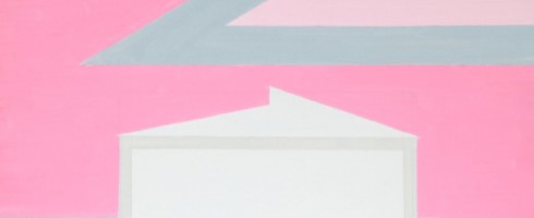
As a color, pink has often been looked down on as “too girly”. Tomboys scoff at wearing anything close to that shade. “Serious” businesswomen wear suits of black, navy or grey, not pink. Real men don’t wear pink. As a painter, Lily Stockman embraces the power of pink. Pink is the color symbolizing the fight against breast cancer. Pink is power, baby.
Pink Mughal
Pink also figures prominently in Jaipur aka The Pink City ( the capital of Rajasthan, India ), where Stockman found herself living and painting for the past year. Rather than painting iconic Indian architecture, she instead focused her brush on industrial and agricultural structures such as silos and grain elevators.
Bubble Steel
Stockman grew up on her family’s farm in rural New Jersey, so perhaps it is no surprise that she chose to focus on the agriculture of India. But the subject matter isn’t the only thing that makes these paintings so interesting. The simplification of the forms, coupled with the unexpected use of such a happy color work in contradiction to our notions of what modern India is like– busy, bustling, dirty, impoverished.
Full Humidity
Inspired by the bougainvillea blooming all over Rajahastan, vibrant pinks and fuschias of saris and turbans and the walls of The Pink City itself, Stockman takes these mundane, ordinary structures and empowers them with blasts of color.
Punjabi Remix
Her bubble-like lines, swirly forms and fresh, unaffected forms remind me of the early work of Georgia O’Keeffe, another artist who tapped into the power of pink and made it her own. Quite a legacy of feminine power she left us, but it looks like Lily Stockman is well on her way to leaving one of her own.
Check out Lily’s website for more of her “Agro Pop” series from India, as well as other work. She also writes a wonderful, witty blog full of artistic, culinary and literary goodness at BigBANG Studio.
I love art. I love design. Why not put the two together on the blog? There was a time in my life when I thought my career path lay ( Thank you, Suzanne Decuir for the grammatical help ) in Interior Design. I took courses, devoured design and shelter magazines. As often happens in life, circumstances got in the way and the path detoured. But that’s a story for another time. Let’s focus on the fun stuff today!
One of my absolute favorite things while designing ( OK, it was THE absolute favorite thing ), was creating moodboards. To begin with an inspiration and build a room or facility around it was thrilling to my color, texture and pattern lovin’ soul. And for me, it always began with the artwork. While doing project management/art consulting, I worked with a lot of designers and many ( but by no means all! ) viewed the artwork for a design as an after-thought. Like adding sprinkles to a cake. Still a cake without the sprinkles, but oh, if we add them, won’t that be pretty! But if we don’t have sprinkles, it’s OK. It’s still a nice cake. Instead, I think of the artwork as the frosting– not just smoothed across the top, but spread between the layers and all over. It is what holds the cake together and gives it the extra texture and sweetness that keeps us going back for more.
( Wow, anyone else craving cake now? )
So you’ve purchased this beautiful painting by Christina Foard. You love it, it speaks to your heart and reflects your style and everything you love about life. But maybe you live at the beach and are unsure how to design a room around it. Aren’t all beach houses supposed to be full of palm trees & seashells?
Seaside Reflections by Christina Foard, oil on canvas, 60×48
This piece to speak more to the feeling of being on the beach just after a storm, while the skies are still a bit gray but the sun is beginning to peek through, warming up the sand to both the eye and the touch. So let’s take our cue from that and begin with soft, grayish tones, layering on the warmth of the sun in our accent chair, rug and window coverings. An important component in Christina’s work is texture, so we’ll make sure there are plenty of interesting surfaces to draw our eyes in, just as Christina’s painterly build up does in her work.
Modern Reflections, a beachside home for a contemporary art lover
Have you ever designed a room around a piece of artwork? Or bought a piece of artwork not knowing where exactly to hang it in your home but you couldn’t live without it? Have a beloved piece of art sitting in a closet somewhere because you don’t think it “goes” or can’t figure out how to incorporate it with your current furnishings? Um, yeah, me too. 🙂
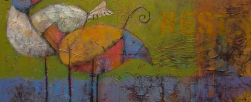
It seems that the hipster craft craze has given birds a bad name in the art world. If you’ve seen the “Put a Bird On it” sketch from IFC’s hilarious Portlandia, you know what I’m talkin’ about. Bird “art” is everywhere. It’s those mixed-media collagey things that you see at outdoor art festivals and markets, it’s the ubiquitous black bird on a bare branch. Now don’t get me wrong, some of this bird art is lovely and fun. But after a while, it all begins to look the same.
I want to set the record straight. Restore the good name of bird art. Here’s a round up of my favorite pieces featuring our fine feathered friends…
Barn Owl by Mary Alayne ThomasTrespasser by Camille EngelClover by Jim DraperGolden Light by Diane FarrisBeginnings by Susan HallCaeli by Vicki Sawyer
Think we may be doing a bit of bird watching this weekend. If you’d like to do some online birding, check out the featured artists’ websites for more ornithological goodies.
Coco Chanel once said, “I consider lace to be one of the prettiest imitations ever made of the fantasy of nature; lace always evokes for me those incomparable designs which the branches and leaves of trees embroider across the sky..”
Shoreline, oil on panel, 48×43
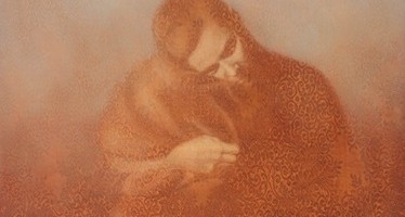
I came upon Susan Hall’s paintings as we ascended the stairs up to Butters Gallery in Portland, our last gallery stop of a long day spent in that art mecca. Through the glass doors, I spied beautiful tone-on-tone figures, peaceful in their exquisite solitude.
Vision, oil on panel, 60×48
As they drew me in, I realized that I was viewing these figures through a veil, not one over my own eyes but through the intricate patterns in which Chicago artist Susan Hall ensconces each of her subjects.
Companion, oil on panel, 35×40
Veils may have both negative and positive connotations– The view through the veil of a bride is lovely and full of hope, while the view through the veil of a burqa may be considered by some as the prospect of a prisoner, someone not allowed to view the world through naked eyes.
Reverie, oil on panel. 27×27
Hall’s work also has a bit of a voyeuristic quality, as if we were gazing through lace covered windows, intruding upon a private moment or catching a glimpse of a ghostly deer’s visit before he disappears into the dark night.
Arrival, oil on panel, 43×48Clearing, oil on panel, 48×43
We see him but does he see us through our gossamer covering? Or perhaps he is merely an apparition of our imagination? Either way, I am enthralled.
Please visit Susan Hall’s website to see more of her breathtaking work. If you are in the Northwest, a visit to Butters Gallery to see her work in person will be a delight for your eyes, pinky promise.
Candace Fasano is a painter and a poet. Where the paintings end and the poetry begins is not always distinctive. According to Wikipedia, “poetry primarily is governed by idiosyncratic forms and conventions to suggest differential interpretation to words, or to evoke emotive responses.” Substitute words for images and you’ve hit just the beginning of what makes Fasano’s work so interesting.
Topographical Remembering, mixed media on canvas, 48×48
Like poetry, Fasano’s paintings abound with symbolism and rhythm, their ambiguous nature often leaving them open to interpretation. Though they may have been created with a certain narrative in mind, the visual elements expressed are more suggestive than overt.
OMGGMO, oil on canvas, 96×72 diptych
Just as Candace the poet plays with words, Candace the painter plays with paint. Building up texture, leaving whispy washes of color and sketchy lines contrast with typographical verbiage.
Balancing Act, oil on canvas, 30×36
Layers of imagery create layers of meaning. Objects within the works are often rendered realistically, but are not necessarily resting in their reality. They may become transparent, weaving in and out of the composition like the ghostly marks left behind after an pencil eraser has done its work.
Warmth, oil on canvas, 66×56
imaginary landscapes attract
pictures from our collective mythologies.
text or fragments take hold like scaffolding
constructing and deconstructing
realities into temporary truths
revealing fragile limitations
of growth and decay –
viewed through a cardboard kaleidoscope
–c.fasano
To see more of Candace Fasano’s work and to read more of her poetry, visit her website and blog. If you like her work as much as I do, please fan her Facebook page to keep up with all her latest news. If you’re in the North Florida area, be sure to visit the Cummer Museum‘s “The Neighborhood As Art” show, which features one of Candance’s pieces.
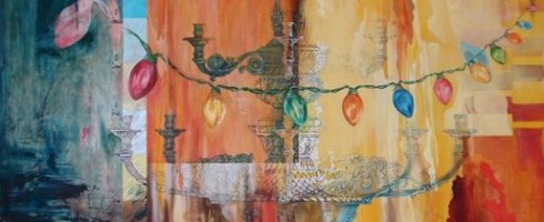
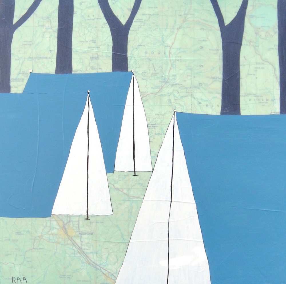
Happy 4th of July weekend, Artsies! As soon as the hubby gets off work today, we’re heading out for a little camping in the Port Townsend area ( For all my East Coast readers, that’s North of where we are in Aberdeen, PT is on the Northeastern tip of the Olympic Penisula ). I’ve never been further North than Seattle, so I am super excited. Anyone else doing a little holiday camping this weekend? To get me ( and you! ) in the mood, here’s some of my favorite campy art..
Bear Mountain by Rachel Ann AustinCaravel by Leah GibersonChaise de Camping by Ronald BowenAirstream Alice by Carrie Goller
Have a wonderful weekend, everyone! Mix in something artsy along with all your outdoor celebrating!
PDX is slang for Portland, apparently. I kept seeing it everywhere in Portland this weekend and being from Florida, of course had no idea what it meant. Was it some sort of secret code? Some inside joke only super-hip Portlandians knew about? Nope, just Portland’s airport code, which has become short for Portland, just like JAX is short for my hometown of Jacksonville. I must admit, I was a bit disappointed that there wasn’t some sort of subversive meaning to PDX, at least not one I could find on Google.
After a month in the Northwest, George & I finally made the 2 1/2 hour drive from Aberdeen, WA to Portland last Saturday. We’ve already hit a couple of smaller artsy destinations nearby ( Olympia, WA & Astoria, OR ), but finally worked our way up to the mac-daddy of them all, Portland. The home of hip. We were only in Portland for the day, so decided it would be best to limit ourselves to one section of the city. So we chose The Pearl District, for its galleries for me and its proximity to Powell’s Books, Stumptown Coffee & Rogue Brewery for George. I try to make sure that when I drag him gallery-hopping, there is always the promise of beer. This makes for a much happier husband.
Work by David Slader at Gallery 903
Gallery 903 was filled with contemporary painting, sculpture and mixed-media work. I can usually tell the minute I walk into a gallery whether or not I’m going to enjoy my visit and find artists to blog about. As soon as I saw wonderfully textured abstracts and thoughtfully placed sculpture, I knew Gallery 903 was a good stop. The work of the artist above, David Slader, got George’s attention before than mine. Slader is a former high-powered attorney turned artist and after reading his tongue-in-cheek artist statement, I had a better appreciation for him. His work has deep texture , a powerful palette and expression. Here’s an even better shot of “You Want to Dance”, that gallerist Herschel was nice enough to email me..
You Want to Dance, Oil on canvas, 24×24
This was just the first of the delights to be found at 903. While George continued to admire the Sladers, I rounded the corner and happily came across a little niche and what was to be found there? Some thrilling little Salvador Dali prints!
Salvador Dali prints at Gallery 903
Complimenting the Dalis in the same little space were two epoxy-resing pieces by Alan Fulle. One of my favorite things about working in a gallery was designing & creating tableaus of artwork that coordinate together in unexpected ways. Virtual congrats to whomever hung the work in this gallery.
I absolutely loved this bronze geese sculpture! George wasn’t quite as enamored. What’s not to love about lovey-dovey, fat bronze geese? I mean, really, how could you not love them?! Oh well, moving on..
Augen Gallery had two interesting exhibitions showing, the first, work by Wendy Franklund Miller– I am a sucker for encaustics. There is just something about that waxy texture that I adore.
Artist: Wendy Franklund Miller, Augen Gallery
The kind-of cosmic feel to Franklund Miller’s work was a great complement to their other exhibition, Light Drawings by James Minden.
Artist: James Minden, Augen Gallery
These “light drawings” are scratched/etched PETG ( plastic ) reflecting light. They are totally trippy in the best sense. We had so much fun looking at these from all different angles. Check out this slide show to see better photos than I could have taken: James Minden on Vimeo.
Continuing the equestrian kick I seem to be on lately, Froelick Gallery happened to be showing Equine, a juried group exhibition showcasing the horse. A diverse showing of work centered around our four-legged friends, it was fun to see the variety of interpretations, including a plate from the famous MuybridgeAnimal Locomotion series. George was drawn to the work of Miles Cleveland Goodwin, which while beautifully rendered, was a bit on the dark side for my tastes. I love how the differences in our tastes spark lively discussion!
Artist: Miles Cleveland Goodwin, Froelick Gallery
I, on the other hand, fell in love with the giant below. White Shadow by Rick Barstow is pastel on paper, 74″ long and it is fabulous. I’m not sure what I love more, the lovely layering of the pastel, the unfinished, sketchy-quality or the scribbled “HORSES” at the bottom. It’s all workin’ for me. Or maybe it is that the straight-on gaze of the horse reminds me of an illustration of a story my grandmother used to read me as a little girl, The Goose Girl.
Artist: Rick Barstow, Froelick Gallery
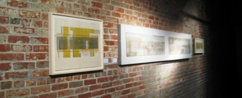
Our next stop, Bullseye Gallery has a kick-a$$ space. Two levels, full of exposed brick and metal work, rustic wood and these amazing little installation rooms. I got so caught up in admiring my surroundings that I failed to take many pictures. I know, bad little blogger. The gallery is part of Bullseye Glass Company, maker of colored glass for art & architecture. Oh, that explains why there was so much incredible art glass!
Our final destination was Butters Gallery. Are ya’ll tired yet? Because I sure was by this point in the day. ( We’d also hit the Saturday Market, Stumptown Coffee, Powell’s Books and Rogue, in addition to all the galleries. ) Butters reminded me of some of the Chelsea galleries in NYC, as it was kind of hidden away, on the 2nd floor of a walk-up building.
Artist: Susan Hall, Butters Gallery
Butters had some really interesting work on display, I hope to bring you more on those artists very soon, especially the one whose work is pictured above, Susan Hall. I fell head over heads for her work– my crappy picture doesn’t even begin to do it justice. I’ll feature her more in depth in a separate post in the next few weeks.
So ends our little jaunt through Portland’s Pearl District galleries. I can’t wait to go back to PDX and explore the other art districts. This weekend we’re headed North!