Category: Abstract Art

  • Mysterious Amalgamations: John Sabraw

    Mysterious Amalgamations: John Sabraw

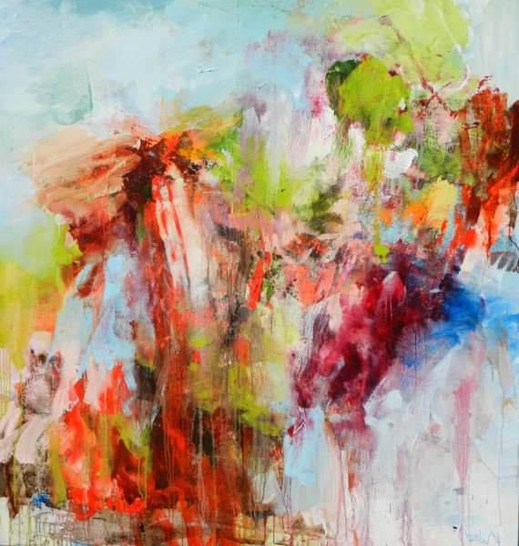
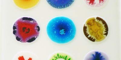
    Through my travels with Mr. Forager, I’m always struck by the many similarities there are to be found in such vastly different landscapes. And how, the elements of each interact with one another in a very specific way.  The Chroma series of Ohio artist John Sabraw, a passionate environmentalist, are inspired by the micro and macro worlds we find ourselves in and our connection to every one of them.

    Phyto: 2 by John Sabraw
    Phyto: 2, mixed media on aluminum composite panel, 24×24

    These unique works are created by layering paints of varying viscosities, allowing them to intermingle and naturally evolve in response to the environment of his studio.

    Karst: Opal by Sabraw
    Karst: Opal, mixed media on aluminum composite panel, 12×12
    Joules 12-4 by John Sabraw
    Joules 12-4, mixed media on aluminum composite panel, 12×12

    In each we see what could be the tide pools of Yellowstone or blood cells within our own bodies.  They could be images made by satellites or microscopes.  Whatever it is that we see, is a part of our world, whether it be nearby or far, far away.

    Synchline: Tumeric by John Sabraw
    Synchline: Tumeric, mixed media on aluminum composite, 12×12

    To see more of John Sabraw’s work, please visit his website.  You can read more about his Chroma series, including information on the artist’s sustainability practices here.

    All images are via the artist’s website.

  • Illusory Compilations: Sarah Awad

    Illusory Compilations: Sarah Awad

    To me, the best stories are those that are carefully layered and woven together with a touch of mystery.  Artist Sarah Awad’s work intertwines seemingly disparate elements to create wonderfully complex and cryptic visual narratives.

    Power of Aphrodisia by Sarah Awad, oil on canvas, 67x60
    Power of Aphrodisia, oil on canvas, 67×60

    In some of Awad’s work, we seem to be looking into a classical museum, filled with artifacts and precious antiquities.  These pieces have a eerieness to them that give us a sense of happening upon an unfolding story.

    Tender Recurrence ( On Visitation ) by Sarah Awad, oil on canvas, 72x60
    Tender Recurrence ( On Visitation ), oil on canvas,72×60
    The Visit by Sarah Awad, oil on canvas, 24x20
    The Visit, oil on canvas, 24×20
    Gemutlichkeit by Sarah Awad, oil on canvas, 72x54
    Gemutlichkeit, oil on canvas, 72×54

    In each piece, we wonder what just happened here or what is about to happen?  There is an anticipatory feeling and a slight unease to each work.

    Untitled ( Temple ) by Sarah Awad, oil on canvas, 24x20
    Untitled ( Temple ), oil on canvas, 24×20

    To see more of Sarah Awad’s work, please visit her website.  If you happen to be in the Seattle area, you can see Sarah’s work in person at James Harris Gallery.

  • Bursting Forth: Todd Hunter

    Bursting Forth: Todd Hunter

    For the past few weeks, I’ve been visiting at my brother’s home in Florida, rooming with an extremely energetic seven year old, my niece Kendall.  My dad gave Kendall the nickname of Firecracker— a nod not only to her fiery red hair but also to the tiny bundle of explosive energy that she is.  The frenetic energy in the work of Australian artist Todd Hunter is definitely Firecracker level.

    Who's that Riding by Todd Hunter
    Who’s That Riding, oil on canvas
    Hiding Today by Todd Hunter
    Hiding Today, oil on canvas

    Hunter’s work is filled with the types of gestural strokes, saturated color, and wild movement that makes my heart skip a beat.

    Pretty Strangers 4 by Todd Hunter
    Pretty Strangers 4, oil on paper

    This is work that grabs you, draws you in, and leaves you breathless.  While the visual intensity of each work may be what captures our gaze initially,  the moments of quiet within the composition end up being what keeps us coming back for more.

    Barrenjoy Lighthouse by Todd Hunter
    Barrenjoy Lighthouse, oil on canvas
    Bronte to Bondi by Todd Hunter
    Bronte to Bondi, oil on canvas

    To see more of Todd Hunter’s work, please visit his website.  Which types of work are you most drawn to?  Peaceful and quiet or full of crazy good energy?

    All images are via the artist’s website.


  • December Featured Artist: Marsha Glaziere

    December Featured Artist: Marsha Glaziere

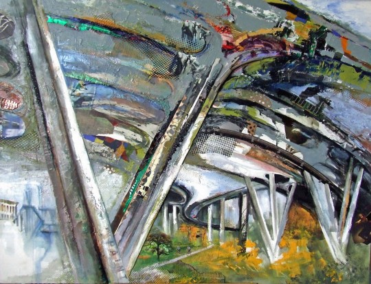
    The work of this month’s Featured Artist, Marsha Glaziere is filled with luscious layers, texture, pops of bold color, and a skilled hand at good old fashioned drawing.  No matter the subject she undertakes, her style and way of working is unmistakably hers.

    Nalley Valley Viaduct by Marsha Glaziere
    Nalley Valley Viaduct
    Portals

    Her work straddles the line between representational and abstract, almost as if she begins in realistic mode and then her abstract altar-ego takes over.  The resulting work then becomes more about the energy of her subject rather than perfecting every small detail.

    No Speed Limit

    Marsha’s latest series, Coffee Spots, features her interpretations of the eclectic coffee houses in and around the Puget Sound.  It’s no secret that Northwesterners ( especially those in or near Seattle ) take their coffee very seriously.  Marsha decided to begin painting her favorite local spots in celebration of the coffee culture that began in the PacNorthWest and has since spread across the country and around the world.

    Cafe Ladro Espresso Bar & Bakery
    Olympia Coffee Roasting Company

    The Coffee Spots series has been made into a 2013 calendar and fabulous “table COFFEE book”, both of which would make wonderful holiday gifts for the artsy coffee lover in your life!  Both the calendar and book are available for purchase on the artist’s website.  While you’re there, don’t miss all the other incredible artwork on Marsha’s site, some of which you can also see in her album on the Artsy Forager Facebook page!


  • Sketch & Slash: Pinkney Herbert

    Sketch & Slash: Pinkney Herbert

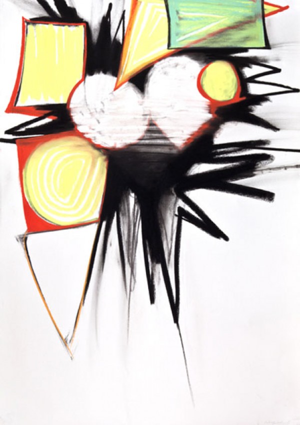
    There is a temporary, transitory nature to drawings that always make them seem much more loose and free than their painted counterparts.  The pastel work of Memphis artist Pinkney Herbert explodes with the energy of an artist unfettered.

    Pinkney Herbert
    Fanfare 2, pastel on paper, 29×41

    Maybe it’s the relative inexpense of paper vs. canvas or the fact that work on paper is usually seen as merely preparation and practice for more permanent work.  Herbert’s work on paper, for me, has a frenetic energy that is incredibly appealing and engaging ( not that his painted work isn’t– check out his paintings here! )

    Tower 1, pastel on paper, 29×41
    Tower 2, pastel on paper, 29×41

    You can practically see the artist’s movement as his hand sweeps feverishly across the surface of the paper.

    Attune, pastel on paper, 29×41

    To see more of Pinkney Herbert’s work, please visit his website.

    Artist found via David Lusk Gallery.  All images are via the artist’s website.

  • Artsy on Escape Into Life: Lucy Mink

    Artsy on Escape Into Life: Lucy Mink

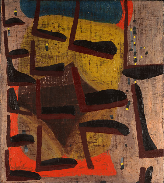
    While I adore abstracts full of wild, expressive brushstrokes, sometimes abstracts with a focus on quiet shapes and patterns are a welcome respite.  In today’s Artist Watch over on Escape Into Life, I’m featuring the work of Lucy Mink, whose paintings feature muted tones and the comfort of repetitive patterns.  See Lucy Mink’s Artist Watch here!

    Lucy Mink
    What He Does and He Thinks About Notches, oil on linen over panel, 8×9

    Lucy Mink on Escape Into Life

  • Social Media: Laura Hudson

    Because of the transitory nature of my life currently, many times Mr. Forager and I will purposely seek out coffee shops, art openings, and pubs merely for the opportunity to interact face to face with other people.  Baltimore based artist Laura Hudson takes such opportunities a few steps further, cultivating events in order to draw people together, observe their scenes of interaction, then distilling selected scenes as life-scale paintings.

    Laura Hudson

    Laura Hudson

     In her series “Art Opening“, the artist took images from other events which were put into life-size paintings that would serve as a framework for new interactions with viewers who then become a part of the composition simply by observing.

    Laura Hudson

    Laura Hudson

    To see more of Laura Hudson’s work, please visit her website.  She is an artist in residence at Gallery Four in Baltimore.

     Artist found via New American Paintings.  All images are via the artist’s website.

  • The Simple Joy of Color and Light: Judy Ledgerwood

    It’s no secret that colors can have an effect on our mood.  There are certain shades that just make me happy and artwork that concentrates on the interaction of colors and their properties make my heart sing.  Chicago artist Judy Ledgerwood’s work explores the ways in which the placement of color creates graphic interplay and the illusion of light.

    Is This an Audience or..?, acrylic gouache & oil on canvas, 60×54

    Ledgerwood’s large scale works are drenched in saturated color, focusing on simple shapes and patterns.  The eye isn’t distracted by detail but can concentrate on the sheer beauty of color and shape.

    Floridita, oil on canvas, 38.1×38.1
    Tangerine Sun and Summer Sea, oil on canvas, 15×15
    Tequila Sunrise, oil on canvas, 80×96

    She uses the placement of color to play with pattern and light.  Shadows and movement emerge through the simple interaction of color.

    Garden Gate, oil on canvas, 50×60

    To see more of Judy Ledgerwood’s work, please visit her page on ArtSlant.

    Artist found via The Art Cake.  All images via ArtSlant.

  • Drops of Jupiter and Other Cosmicness: William Loveless

    Drops of Jupiter and Other Cosmicness: William Loveless

    In the book I’m currently reading, The Opposite of Fate, author Amy Tan writes a great deal about the concept of fate, how much of what happens is in our own control or predetermined or even mere chance?  In that same vein, how much control does an artist truly have in the creative process?  Yucca Valley, CA artist William Loveless takes his own chances with the action & reaction of his materials in his series of glue paintings, which I first saw ( and fell in love with ) last weekend at The Red Arrow Gallery here in Joshua Tree.

    #116 ( Resonance Strategy ), mixed media on panel, 36×36

    Through this work, Loveless is able to “probe the intersection where the creative act meets the mystery of creation itself. Through experimentation with materials and their various autonomous interactions, I seek an organic empathy with the complex patterns and processes of the physical world.”

    #12-53, mixed media on panel, 3.5×3.5×1.5
    #12-13, mixed media on panel, 3.5×3.5×1.5

    Although the primary way in which the materials will react is known, what cannot be foreseen is the unique end result of every interaction.  The final result being a record of a unique synergy to be found between the materials in that one moment.

    #1204, mixed media on panel, 10x10x1.5

    I see these interactions as similar to the way in which we connect with the world around us.  Each moment we exist is a unique interchange between other individuals, other creatures, and the world around us.

    To see more of William Loveless’s work, please visit his website/blog.  If you’re Southern California, you can see his work in Culver City, in the exhibition ELEMENTal at Fresh Paint Art and in Joshua Tree at The Red Arrow Gallery.

    All images are via the Fresh Paint Art website.

  • Mod Scene: Gary Petersen

    Mod Scene: Gary Petersen

    I grew up around Mid-Century culture way before it was hipster cool.  No, I’m not old enough to have experienced it first hand!  But my dad did and we were heavily involved in a 1950s classic car club, one that celebrated mod style by restoring vintage cars, showing them off and even putting on the occasional sock-hop.  Needless to say, when I spotted the California pop-tastic abstract work of New York artist Gary Petersen, it reminded me of the innovation and fantastic design that came from the atomic age.

    What’s Between Us, acrylic and oil on masonite board, 16×20

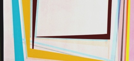
    Petersen uses overlapping and intersecting lines to create forms that play with our sense of perspective and place.

    Step Up, acrylic and oil on masonite panel, 16×20
    Passage, acrylic and oil on masonite board, 16×20
    Don’t Go Anywhere, acrylic and oil on masonite board, 16×20

    While perhaps the shapes may seem random, they create a palpable sense of movement across the canvas and even between each other.  To see what I mean, try scrolling through down & up the post kind of quickly.  The shapes seem to move, don’t they?  Totally groovy.

    Surround Sound, acrylic on masonite panel, 16×20

    To see more of Gary Petersen’s work, please check out his website.

    All images are via the artist’s website.