I am continually fascinated by what inspires each artists. It seems that the more unique the work, the more intriguing the inspiration. Los Angeles artist Melissa Manfull takes her artful cues from the beliefs of Southwestern utopian communities of the 1960s and 70s.
Interior, ink on paper, 42×56Diffusion, ink on paper, 16×18
According to Manfull’s website, these communities held a strong affinity for geometric forms and patterns and “just as the polygonal forms of minerals and the cellular structure of plants formed perfect complex systems, the growth patterns of these communities often resembled fractals in which a single shape repeated itself until a complex, organic cluster was formed.”
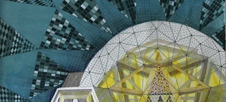
Web, ink on paper, 16×18Dome ( Soleri Meet Gaudi ), ink on paper
The artists work embraces these affinities by beginning with a simple grouping of geometrical shapes which then build upon one another to form a fantastical structure, linking the architectural world with the natural one. To see more of Melissa Manfull’s work, please visit her website.
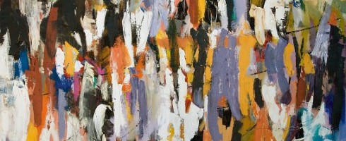
To paint the feeling of a person or place, rather than a representation of your subject can be quite the task. An artist must be able to interpret their impression into nothing but line, texture, color and form. Through her abstract work, Los Angeles artist Julie Schumer gives us fleeting glimpses into the world around her.
Crowdscape, mixed media on canvas, 84×64
Through her use of color, expression, and texture, each canvas is given a sense of place. You can feel the swish of people rushing by, feel the shade between the canyon walls, sense the warmth of the sun beating down.
Landscape Composition 21, mixed media on panel, 42×36Canyon Suite 3, acrylic and cold wax on panel, 30×40
Just as music can abstractly transport us to another time and place, so can art like Julie’s. It speaks to us visually, perhaps not in a language we speak, yet one that can understand.
Canyon Suite 1, acrylic and cold wax on panel, 40×30
To see more of Julie Schumer’s work, please visit her website. Her work can currently be seen at several galleries across the country– see her website for more info on one near you!
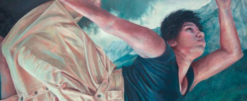
Reading an enthralling tale comes pretty close to the joy I get from viewing incredible artwork. Some of my absolute favorite books have been the work of “classic” female authors such as Charlotte Bronte and Jane Austen. I still pick up my well-worn paperback of Persuasion from time to time. North Florida artist Brianna Angelakis marries her own passion for literary characters with feminist surrealism in work that is as wonderfully layered and moody as any Bronte novel.
God’s Orchestra, graphite and oil on canvas board, 36×24
Angelakis explores the idea of isolated femininity by placing her female subjects alone in wild landscapes and in her most recent series, Wonders of the Invisible World, we see young women falling from an unknown place to an unknown destination.
Neurathenia, graphite and oil on wood, 24×24Modern Hero, graphite and oil on wood
Her use of a cool, limited palette add to the eery mood of Angelakis’ work. We are caught in the midst of the story she is telling and left wondering.. and wanting to hear more.
Blind Contentment, graphite and oil on canvas board, 24×36
To see more of Brianna Angelakis’ work, please visit her website. The painting above, Neurathenia, can be seen as a part of the Folio Weekly Artist Invitational at the Cummer Museum of Art & Gardens in Jacksonville, FL until December 6th. Her work can also been seen beginning in December in Minneapolis, MN and in the United Kingdom. More details on her website!
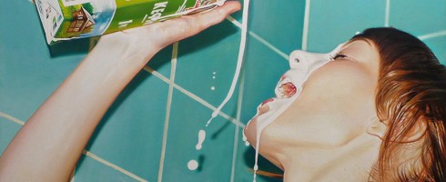
There are some artists whose work I respond to on a visceral level, visually. I see it. I love it. I don’t have to know what it’s about or the super secret story behind the meaning of each piece. The paintings of Argentinian artist Diego Gravinese grabbed me when I spotted one on Pinterest last week.
The Love of Renault and Burritoes Obsequious ( diptych ), acrylic and enamel on canvas, 79×51
The artist’s earlier work ( such as The Love of Renault.. & In the Future.. ) are conglomerations of painted memories.. scenes from childhood and current memories mix with nostalgic elements to give us visual tales of how each experience builds on the ones that came before it.
Milk Girl, oil on canvas, 40×27.5The Method, oil on canvas, 71×47.2Mimesis, oil on canvas, 71×47.2
His more current work, ( Milk Girl, The Method & Mimesis, above ), leave behind the nostalgia, focusing instead on fleeting everyday moments. Painted in a photorealistic style, the palette of each painting seems carefully selected and limited, so that not only do we get a sense of situation and place, but the resulting image is arrestingly graphic.
In the Future, We Will Colonize the Exterior Planets, acrylic on canvas, 75×39.5 ( overall )
To see more of Diego Gravinese’s work, please visit his website.
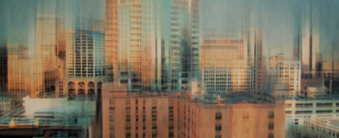
I don’t know what it is about this time of year, but it makes me crave a big city. A city with bustling sidewalks and tall buildings. Mr. Forager and I are still trying to figure out if we’re urban or small town people. The work of British Columbian artist Jennifer Seymour definitely has me leaning toward big city life.
Oscillations, mixed media on panel, 48×24
Seymour’s works begin as photographs she’s saved and collected over time and are then reworked with layers of charcoal, pastel and glaze resulting in pieces that glow. It’s as if all those reflective surfaces and city lights are caught in one hurried moment after another.
Jump Start, mixed media on panel, 24×24Distant Constellation, mixed media on panel, 48×24
These mixed media works capture what I love most about urban centers– the energy, that glimpse of mountains or river just beyond the skyscrapers, the feeling of endless possibility and opportunity.
Skywalk, mixed media on panel, 48×24
To see more of Jennifer Seymour’s work, please visit her website. I’ll be here in yet another small town, dreaming of a more metropolitan life. 😉
Artist found via one of her representing galleries, Sopa Fine Arts.
I recently saw a clip of Jim Gaffigan in which he does a riff on our modern propensity to take photos of everything and then post them on all of our various social media outlets. I’ll admit, I’m guilty of taking a photo of my dinner and posting it on Facebook for all of my friends to see. The Defaced series by Los Angeles photographer Jen Gotch, ( which I’m featuring in my Artist Watch over on Escape Into Life today– see it here! ) reminds us that even before Instagram, we were still a society obsessed with capturing memories and sharing them. Check out her work on EIL today AND if you love her style, Jen has teamed up with HGTV host and stylist extraordinaire Emily Henderson on a lovely little round-up of Jen’s work on Open Sky. Check that out here!
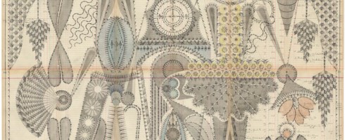
Although I’m a pretty detail-oriented person, my own drafting and drawing style is much more intuitive than precise. Architectural drafting was torture for me. So the exquisitely elaborate and deliberate compositions of Brooklyn artist Louise Despont leave me speechless.
Dancer, graphite and colored pencil on antique ledger book pages, 49.5×81Small Performers, graphite, watercolor, and colored pencil on antique ledger pages, 58.4×40.6 cm
Despont creates these intricately graphic drawings on the pages of antique ledger books, providing a natural grid upon which to weave her compositions. Reminiscent of Persian rugs and other ancient patterns, the artist is creating her own “abstract language of symbols”.
Couple With Clock Tower, graphite on antique ledger book pages, 50.5×55
These are works to take in as they were created.. slowly, deliberately, and with careful attention. You wouldn’t want to miss out on any of the delicious details.
The Bodhi Tree, graphite and colored pencil on antique ledger book pages, 170.2×174.6 cmJester Inversion, graphite and colored pencil on antique ledger book pages, 54×82.5
To see more of Louise Despont’s work, please check out her website, where you can see close-ups of these wonderfully complex drawings!
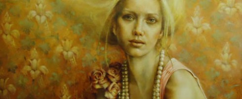
We are all guilty of over-sharing these days. Thanks to Facebook, Twitter, Instagram, Pinterest, Four Square, etc., the world has become privy to our innermost thoughts, what we ate for lunch, how many miles we ran that day. We scoff at reality shows detailing the daily lives of the Kardashanians, Snookis, and Honey B00-Boos of the world. We wonder, whatever happened to the allure of mystery? UK artist Pam Hawkes reaches back into the iconography of illuminated manuscripts and Renaissance portraiture to cleanse our palate of the modernly overexposed.
Unbound, oil on copper leaf on board, 61×104 cmTracing Mythologies II, oil on copperleaf on board, 62×122 cm
The stillness and serenity of Hawkes’ figures are at such odds with how we live today. The often classical poses reminiscent of religious iconography of the Virgin Mary and other figures may at first seem foreign to our contemporary eyes. Yet there is a softness and vulnerability in these women, as if the ancient had come alive and found itself somehow wandering about our modern world.
You Made Me II, oil, beeswax, and dutch metal on board, 30×41Fading, oil on copper leaf on board, 122×122 cm
There is a sense of bound freedom to Hawkes’ figures, as if they are only just discovering the door to their cage is open. We wonder why they sit so still, resisting the temptation to be free. Perhaps they, like us, have grown fond of their cages.
Birdsong, oil on copperleaf on board, 76×122 cm
To see more of Pam Hawkes’ work, please visit her website— a great many gorgeous works to see there!
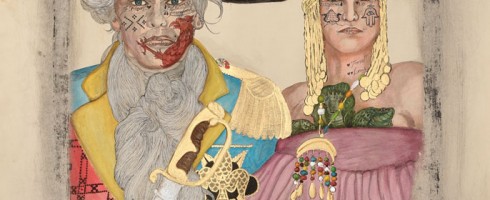
‘Tis election season in the US which for many ( including myself ) = the season for cynicism, frustration, and the eventual choosing between what we hope will be the less destructive of two not-so-great choices. Throughout history many a nation has had a habit of creatively reinterpreting their own backstory to slant history more to their favor. In his work, Los Angeles artist Frohawk Two Feathers calls out the ridiculousness of such reinvention, echoing the growing dissatisfaction with the political status quo.
He Dead. Amen! LaDonna, inventor of the hot comb and widow of Andre I of Hispaniola Maitresse of Mambo Erzulie Freda Dahomey, 30×44
Two Feathers’ ( born Umar Rashid ) works are a fictional retelling of periods in history, his latest series being a fictionalized version of the conquest of Haiti. The overall style of his work bases itself in traditional colonial portraiture yet the artist tweaks it to tell his own version of the story.
Let Me Upgrade You. A farewell embrace for Duke Tarik Ibn Rashid and the Duchess Josefina of Margarita and Tortuga. Tarik was called to Frengland to Tirain the artillery corps by Lord Protector Casimir Theroux of the Republic of Frengland. Josefina is running shit for real man, 30×44The Spanish Main 1794 (3BB) Blanca, the motherfucking Queen of Spain Jacinta, Queen of the Tairona (Deceased) Carlota, Queen of Santo Domingo (Deceased), 60.5×44.75
While the works are satirical in nature, I can’t help but think that they aren’t that far off from how our own histories have been subtly reshaped over time in order to gloss over certain ugly facts or to push a powerful group’s agenda.
Solid. Solid as a Rock Lord protector Casimir Theroux of Pomerania (Poland) and his wife Helen Sidney of London, 30×44
To see more of Frohawk Two Feathers’ work, please visit the website of his representing gallery, Taylor De Cordoba. I’m not sure how much time I’ll have to explore LA galleries while we’re in Joshua Tree, since I’ll be heading to Florida for a month in November, but seeing this work in person at Taylor De Cordoba is high on my list.
Who’s in for some artsy pinning fun with Artsy Forager and Erin Cassidy of art social? We’ve been gettin’ our pins on and are psyched to present a new Art Associations contest!
In case you missed the debut contest last month, here’s the gist– You create a Pinterest board around one work of art ( which we provide ), filled with anything and everything that pops into your mind while gazing at the inspiration piece.
For October, we’re associating with the piece below, Mailing ABQ 10-12 Lines by Kate Farrall.
Mailing, ABQ, 10-12 Lines by Kate Farrall
The prints from Kate Farrall’s Mailings to Myself series are made by sending un-exposed photo paper through the mail, allowing it to expose during its trip, and then developing it when it arrives. Such a serendipitous way of art making!
But now for the real fun, the CONTEST! Here’s how our little artsy mad scientist experiment will work–
Step 2 | You create a Pinterest board titled Art Association, like mine here, where you pin any and all images you associate with the featured artwork ( like word associations, only visual )– here’s a little sneak peek at my board to get your creative juices flowin’
Step 3 | Leave a link to your Art Associations pinboard in the Comments section of this post
Step 4 | Follow both art social and Artsy Forager on Pinterest ( if you already are, you’re ahead of the game and doubly awesome )
Here’s what you can win–
Once you’ve completed the steps above, you’ll be entered for a chance to win Mailing 10x8x8, a unique chromogenic print by Kate Farrall ( below ). Thanks to Kate for generously donating this work for our little contest!
Mailing Overlap 10x8x8 by Kate Farrall
The pinner with the best art associations ( as judged by me and Erin ) will be chosen on Wednesday, October 24th at 5pm (mountain standard time). Last month’s boards were incredibly creative, can’t wait to see what artsy associations you see in Kate’s work!
Ready.. set.. associate!!
Would you like your artwork to be featured as an Art Association subject? Shoot Erin an email at artsocialonline@gmail.com for more info.


16x18")
_ink on paper")