Tag: abstract art

  • Artsy Dwelling: Art on Wood Walls 4 Ways

    Artsy Dwelling: Art on Wood Walls 4 Ways

    Once upon a time, wood paneling was the epitome of dated and dreary.  Think back to that 70s basement.. yikes! But wooden wall treatments are seeing a resurgence lately and they are coming back stronger and more artful than ever!  You may love the look of these modern paneling interpretations, but not sure how to incorporate art on wood walls?  There are as many ways to style a wood paneled room as their are trees in the forest.  Since painting over wood gives you basically the same canvas as a painted wall and I like a challenge, we’re going to focus on art on wood walls with a more natural finish/stain.

    Here are just a few ways you can go–

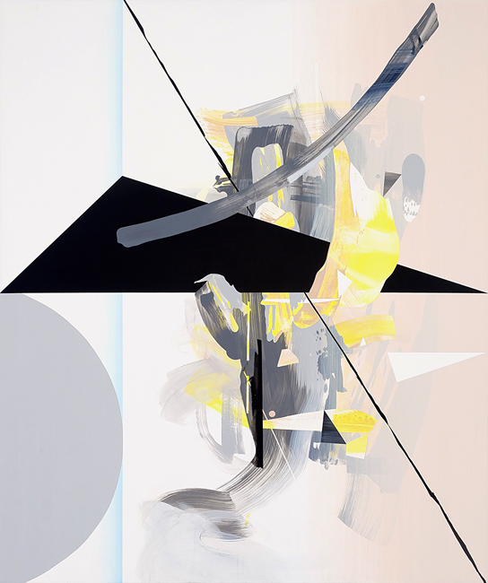
    1 | beachy keen, jelly bean.  Lightly stained or pickled wood lends the perfect bleached out style to a coastal setting.  If your taste in art tends toward a pastel palette, keep the softness and natural calm going.  Pieces like these by Leora Armstrong with a strong horizontal vibe recall that perfect spot where the sky meets the sea.

    Art on Wood beachy

    image found here

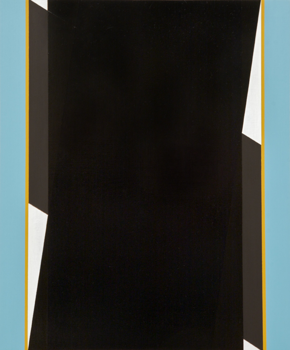
    2 | mid-century glam it up.  Love Mad Men?  Live for Saturday afternoons spent combing vintage shops and thrift stores for Mid-Century treasures?  Secretly want to wear a pencil skirt and heels while serving cocktails?  Large cut wood panels in a uniform stain are the ideal backdrop for some MCM goodness.  Abstract artwork in earthy tones complete a room Don Draper would be proud of.

    Art on Wood Mid Century Glam

    image found here

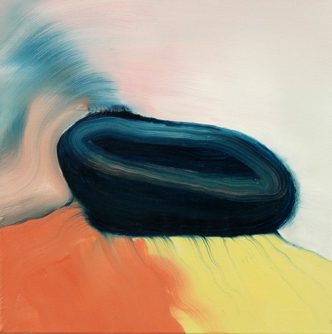
    3 | cozy up to modern warmth.  Sometimes the elements we love about modern spaces, like concrete floors and soaring ceilings, can lead to a less than inviting atmosphere.  But juxtapose warmly stained wood walls against those details and it’s like cozying up to a warm fire.  Artwork with lots of texture as well as pops of color and pattern add to the warming effect.

    Art on Wood Modern Warmth

    image found here

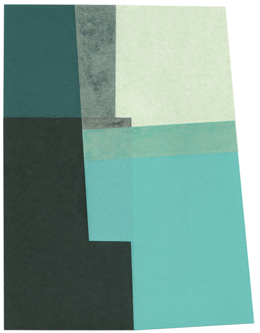
    4 | elevate to rustic elegance.  Pickled wood walls can be taken in so many directions.  Their greyed-out tone makes them ultra versatile.  In Jackie Aster’s NYC apartment, as featured in Elle Decor, the wood walls add just a hint of neutral texture and ground the formal finishes with just the right amount of rusticity.  A Damien Hirst etching adds a bit of playfulness turning what could have been an uptight room into space filled with snuggly joie de vivre.

    Art on Wood Rustic Elegance

    image found here

    Do you live with art on wood walls?  How is it working for you?  Or maybe this inspired you to embrace that wood paneling you used to hate!  Work with the grain, not against it. 😉

    All images are linked above.  Want to see more in the Artsy Dwelling series?  Check out the archives here.

  • Artsy on Film: Cutie and The Boxer

    Artsy on Film: Cutie and The Boxer

    Mr. F & I have recently established a democratic movie-night selection system.  It goes something like this, His, Hers, Ours.  We love a well done documentary and after the last two disturbing political picks by Mr. F ( Dirty Wars & The Act of Killing ), it was time for a joint movie night selection.  Documentary for Mr. F + art-related story for me, we settled on Cutie and the Boxer.  Win win.  The Sundance Film Festival winner follows the story of the 40 year marriage between famed “boxing” painter Ushio Shinohara and his artist wife Noriko.

    AoF_Cutie

     image found here

    Ushio Shinohara came to notoriety as an artist in Tokyo in the 60s, eventually leaving Japan for New York, where he was a relatively unknown working artist and met Noriko, then an art student around twenty years his junior.  Not long after meeting and falling in love, Noriko became pregnant with their son, Alex.  She would spend the next forty years raising Alex and taking care of Ushio, a temperamental alcoholic ( who is now sober ).

    AoF_Cutie_kitchen scene AoF_Ushiro and Noriko

    images found here and here

    There are obvious parallels between the relationship of Ushio & Noriko and that of Jackson Pollock and Lee Krasner— the boisterous, alcoholic artist husband overshadowing his artist wife and caretaker.  But in Ushio & Noriko’s story, the long-suffering wife regains her artistic identity not with the death of her husband, but by taking it back for herself.

    AoF_Cutie_Shionara painting AoF_Cutie painting

    images found here and here 

    I do wonder if, had Pollock lived and gotten the treatment he needed, whether that couple’s story would have had a similar ending– the tortured artist finding health and peace while his wife finally comes out from behind her husband’s shadow to find her own voice.  Krasner, of course, would eventually gain her own well deserved notoriety but only many years following Pollock’s death.

    We love documentaries for all the questions they bring forth, leading to great conversations between Mr. F & I, usually over coffee the next morning.  Cutie and The Boxer led to questions like Is there truth to the stereotype of the tortured artist?  Why do so many female artists end up putting their own work on hold while caring for husband and family?  Was that a generational thing or is it still happening today?  Is all art cathartic for the artist in some way?  What say you, Artsies?  Would love to hear your thoughts on these questions and the film, if you’ve seen it!

    All image sources linked above.

  • Fragile Lives: Tanis Saxby

    Fragile Lives: Tanis Saxby

    Flustered.  Anxious.  Stressed.  Extra crabby.  These are just a few ways to describe how I’ve been feeling lately.  My freelance work is busier than ever, I’m working under a deadline for a project debuting in March that I’m really excited ( and super stressed ) about, and I’ve just added more by creating an Instagram project for the month of February!  The work of sculptor Tanis Saxby is just exactly what I need to focus on right now.. pure, flowing, and delicate, they remind me of the fragility of this life.

    Tanis Saxby Tanis Saxby Tanis Saxby Tanis Saxby Tanis Saxby

    Life is such a delicate balance.  Too much of one thing or another is enough to set us off into dangerous territory.  How much I sometimes envy the birds and animals of the woods, how simple their needs and how instinctual their purpose!

    Much of Tanis Saxby’s work is an embodiment of the vulnerability of life, the sculptures in her Flow & True series speak to the delicate strength possessed by all life and the movement and transitory forms of every element in nature.  Her Dandelion & Bone series continue along this theme, especially focusing on the ethereal dandelion seed.  The flower, often thought of as a weed, has held the wishes of many a young child ( and this Artsy adult! ).

    So I plan to gaze awhile at these lovely creations and focus on the flow of good coming into and going out of my life.  There is so much more to be thankful for than to be stressed over.

    To see more of Tanis Saxby’s work, please visit her website.

    Thank you to artist M.A. Tateishi for introducing me to Tanis’s work!  All images are via the artist’s website.

  • Embracing Intuition: Vince Contarino

    Embracing Intuition: Vince Contarino

    A blank canvas can be a scary, intimidating thing.  Many artists have some kind of end product in mind when they make that first mark.  But for me, it is the ones who embrace what is happening spontaneously and throughout the painting process that create the most interesting work.  For Brooklyn artist Vince Contarino, the practice is one of careful balance between the plan and the process.

    Halcyon by Vince Contarino Old Black by Vince Contarino Fertile Green by Vince Contarino Organ Donor by Vince Contarino NT/NF/11 by Vince Contarino

    According to his artist statement, Contarino develops ideas for paintings through small graphite drawings.  Once a painting begins, it is a “continual balancing act between embracing the intuitive nature of the painting process and making aesthetic choices through patient, considered moves.”

    I’ve been learning this lesson in my own painting practice recently, perhaps starting with an idea, sketch or palette in mind, but allowing myself to follow the brush where it leads, even if that means something completely different from where I began.  The times I’ve allowed myself to do that– still learning not to force myself to conform to a preconceived ideal– are the works I’ve been most proud of.  I think Mr. Contarino is definitely on to something!

    To see more of Vince Contarino‘s work, please visit his website.

    All images are via the artist’s website.

  • Shifting Shapes: Don Voisine

    Shifting Shapes: Don Voisine

    All the world can be boiled down to the simplest shapes and forms.  Our eyes tend to focus on details, yet when we really look, we can see the world as a system of circles, triangles, and rectangles.  Brooklyn artist Don Voisine focuses on the relationship of shape, the forms that exist and the various ways our eyes will perceive them.

    Your Idea by Don Voisine Tumble by Don Voisine Ava by Don Voisine Seque by Don Voisine Flexor by Don Voisine

    Using a limited palette and flat color, Voisine’s shapes seem to shift, moving forward and back within each panel’s picture plane.  You can never be quite sure which shapes are in the foreground and which in the background, so that even with the relative simplicity of form, there are complex perspectives happening.  And with their tightly cropped composition, we’re left wondering what happens to each line and color once it leaves the confines of the panel.

    To see more of Don Voisine‘s work, please visit his website.  If you happen to be in the New Haven, CT area, a solo show of his work can be seen through March 1st at the Fred Giampietro Gallery.  Don’t miss it if you’re in the area!

    All images via the artist’s website.

  • Insert the Artsy: Color Three Way

    Insert the Artsy: Color Three Way

    There’s a school of thought that white walls = boring.  But white walls + wooden textures + pops of colorful artwork?  Anything but!!  And this Artsy is here to prove it to ya.  Let’s take a beautiful, airy space like the one below.  The white surfaces have already been warmed a bit by pops of cozy wood textures.  The way the light bounces off those walls make this the perfect place for some color.  And that beautifully curved staircase wall?  It’s just crying out for a fabulous wall sculpture or installation.  Don’t believe me?  Let us count the ways..

    There are lots of different ways you could take the artwork in this space– those white walls are the perfect blank canvas!

    1 | happy texture Smooth surfaces abound in this space, which leaves ample room for adding pattern and texture.  A Liz Tran sculptural installation is like a party on a wall, providing an instant shot of joyful movement.  Or how about gettin’ a little groovy with a retro-ish weaving?  Tanya Aguiniga‘s Multi Knot Wall Hanging is a bit more minimalistic, but still adds just the right amount of texture and color.  Making a simple, bold statement is hardly ever the wrong choice and one of Jen Pack‘s fabric & wood wall sculptures packs just the right amount of punch.

    ITA_Jan_happy texture collage

     images found here here here and here

    2 | organic elegance Not only can a space like this handle something dynamic and full of color but a single elegant representational sculpture can add just the right amount of elegance to bring the slightly casual atmosphere up a notch.

    ITA_Jan_organic elegance collage

    images found here here here and here

    3 | slick pop Interesting juxtapositions your game?  Graphic, pop inspired pieces provide an intriguing touch of je ne sai quois when paired with these white walls and warm textures. Think of the neon signs, sand and palm trees of Miami– opposites never looked so good together.

    ITA_Jan_Slick pop collage

    images found here here here and here

    Have I convinced you yet?  Are you running out to buy gallons and gallons of white paint? 😉  See more of my favorite artsy interiors on my Artsy Dwelling Pinterest board.  Oh and like what I put together here?  I can do it for you, too!

    All image sources linked above.

  • Moving Paint: Francesc Ruiz Abad

    Moving Paint: Francesc Ruiz Abad

    Artists, let me ask you a question.  When you paint, do you find yourself mesmerized by the way the paint is moving across the canvas?  Not in an I’m a painting genius kind of way, but in an omigod paint is the most beautiful, wonderful thing ever, way?  Just me, then?  Ooookay.  Seriously, it is the gorgeous movement and blending of paint that draws me to the work of artist Francesc Ruiz Abad.

    Francesc Ruiz Abad Francesc Ruiz Abad Francesc Ruiz Abad Francesc Ruiz Abad Francesc Ruiz Abad

    You can see the gentle stroke of the brush, imagine it filled with paint, the colors mixing on the palette first and then the canvas.  Light, luscious, cotton candy like movement through the surface of the paint.  Colors bleed beautifully into each other, creating a sense of light and softness.

    Paintings like these make me want to paint!  And run my fingers over each canvas.

    To see more of Francesc Ruiz Abad‘s work, please visit his website and Tumblr.

    All images via the artist’s Tumblr.

  • Surfaced Memories: Jane Hambleton

    Surfaced Memories: Jane Hambleton

    Thumbing through an old photo album.  Spending an afternoon sifting through the contents of a cedar chest.  These are things I took for granted before we started traveling.  I’m even a bit envious of friends posting childhood photos of themselves all over Instagram for “throwback Thursdays”.  All of my nostalgic ephemera is tucked away in a storage unit in Seattle.  So I couldn’t help gushing over the work of Berkley artist Jane Hambleton whose mixed media pieces layer together glimpses of time into collected memories.

    Fragment III by Jane Hambleton | artsy forager #art #mixedmedia

    Hambleton_Fragment II

    Fragment Installation by Jane Hambleton | artsy forager #art #mixedmedia Memoria XIV by Jane Hambleton | artsy forager Write It Down by Jane Hambleton | artsy forager #art #mixedmedia Patterns in Place II by Jane Hambleton Color Dive by Jane Hambleton

    Beautifully textured, these created fragments seem torn from life’s scrapbook.  Sweet, momentary glimpses into a day, a summer, a moment that may have long been forgotten.  Each piece is lovely on its own, but when put together into installations, as the artist intends for each series, we see not only black and white memories, but blank canvases of color.  Perhaps these are the times that aren’t specifically remembered, yet in our minds they are still colored with feeling.

    To see more work by Jane Hambleton, please visit her website or the website of her representing gallery, Seager Gray Gallery.

    All images via the artist’s or gallery’s website.

  • Paper, Scissors, Color: Courtney Price

    Paper, Scissors, Color: Courtney Price

    There is a school of thought that in order for something to be good, it has to be complicated.  A special meal must mean slaving for hours in the kitchen, the latest tech gadget must be filled with buttons and apps of every variety.  But there is also beauty and tranquility to be found in the paring down.  Portland artist Courtney Price distills her paper collages into the most elementary of forms, yet the results are filled with dimension and sophistication.

    Courtney Price Courtney Price Courtney Price Courtney Price Courtney Price

    Overlapping paper shapes one on top of the other just so, Price is mixing color with light and shadow, creating varying shades just as she might with paint.  The forms advance and recede according to their hues and how our eyes perceive their shapes.  And oh, those palettes!  Each piece seems to be a study in color relations.

    To see more of Courtney Price‘s work, please visit her website.

    All images are via the artist’s website.

  • Artsy Happening: I Am.. #acontributor #selfie #miniproject on Instagram

    Artsy Happening: I Am.. #acontributor #selfie #miniproject on Instagram

    My friend Veronica and I had an interesting discussion recently about women and photography.  Specifically, how so often the wife and mom ends up missing from so many photographs because she is usually the force behind the camera, eager to document big events and special small moments.  I think sometimes we’re uncomfortable with being the focus of a photograph because of what it may reveal about who we are at that moment– maybe frustrated with our family or having a bad hair day or feeling bloated.  We’d rather be the ones to decide the image we present to the world.

    I’ve been thinking a lot about the idea of image and influence.  So when We Are The Contributors co-creators Sandra Harris & Melanie Biehle announced a mini-week-long Instagram #selfie project, I was intrigued and wondered how I could express something different and worthwhile with my selfie contributions?  

    20140108-104258.jpg

     i am.. o’keeffe

     Project participants take one photograph of themselves and post it on Instagram each day for a week.  I started with a simple selfie Mr. Forager and I took while celebrating our anniversary in Coeur d’Alene this weekend.  But as I was lying in bed that night, waiting for sleep to come, I thought, I can do better.   I can say something more with this project.  Something about who I am.

    I thought about the roles I’ve played in the past and the ones I’m playing now, about the people who have influenced me.  Then it struck me, what I wanted to explore– the artists who’ve had a profound effect on me.  The ones whose lives, work, and words inspired me to begin my journey along this art strewn road and those I keep discovering anew.

    So for the rest of the week, I’ll be posting on Instagram a selfie paying homage to my greatest artistic influences, along with a short story about their impact on who I’ve become. I hope you’ll follow along and, if you’d like join in the project!  To join, just post a self-portrait on Instagram with the hashtags #selfie #miniproject #acontributor.

    Image by Artsy Forager, featured artwork Grey Lines with Black, Blue, and Yellow by Georgia O’Keeffe.