Tag: abstract art

  • Artsy Reads: Lessons Learned from Lee Krasner

    Artsy Reads: Lessons Learned from Lee Krasner

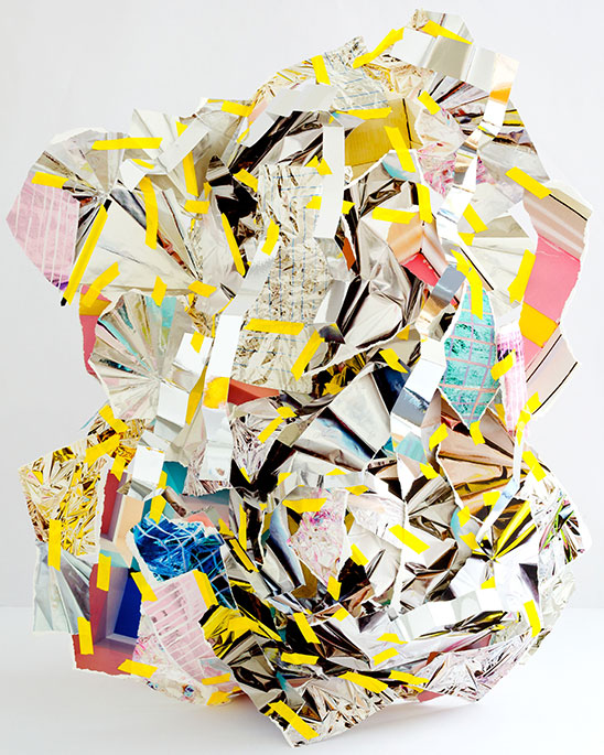
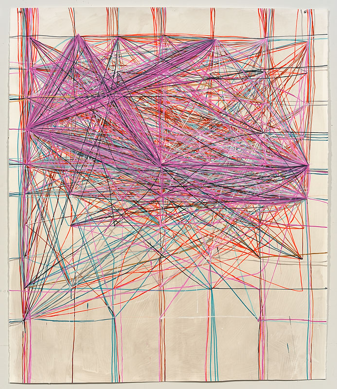
    It seems a long while since I shared thoughts on my latest artsy read!  As a woman, it does follow that I’ve always been interested in the female artists who’ve made their marks on art history.  But lately, I’d been especially intrigued by a female artist who hated being gender labeled, but whose career trajectory veered a bit off course, thanks to becoming a wife.  Mrs. Jackson Pollock aka abstract expressionist artist Lee Krasner.

    In her biography of Krasner, Gail Levin  introduces us to a fiercely independent, sensual, and opinionated young woman who would become one of the founding members of the Abstract Expressionist movement.  She would be eclipsed for much of her career not just by the talent, personality and notorious nature of her husband, but by the sexist leanings of the modern mid-century art world, eventually winning for herself the respect and recognition she so deserved.

    What struck me most, when reading Levin’s account and Krasner’s own words, were her formidable strength when opposed, yet tenderness, graciousness, and respect reserved for the man she willingly sacrificed for.  I found myself dog-earing pages so that I could go back and take in her words again.  This artist who was always studying, taught me some valuable lessons.

    1 | buck tradition.

    Krasner collage1

     found here and here

    This young girl, raised in a traditional Russian Orthodox Jewish home, early on saw the inequities in her familial religion, soon relinquishing its hold.  She fought against tradition when expected to marry her widowed brother-in-law after her older sister died.  But she remained true to her fiercely independent self and her desire to become an artist.  She spoke out against inequalities and injustices whenever she recognized them.  At a time not long following women finally gaining the right to vote, Krasner was a leader among early abstract painters.

    2 | recognize and nurture greatness in others. 

    Krasner collage2

     found here and here

    I think few who knew her would describe Krasner as humble.  Yet, she recognized, supported and nurtured the talent in her husband.  She was his biggest fan and champion, and after his death, the manager of his estate.  She describes being “blown away” by first seeing his work.  She had a great deal of respect for her husband’s artistic mind and sensibilities, bolstering his career while still working away on her own.  When it was speculated that Krasner may have acted differently had she & Pollock gotten together in the age of feminism, she maintained, “I think I would do the same, identical thing all over again in the presence of talent like that..

    3 | don’t be afraid to share the spotlight or even give it up for a while.

    Krasner collage3

    found here here and here

    In Levin’s biography, it is intimated often that Krasner believed Pollock to be the greater artist.  She was confident in her own talent and work, and yet she recognized and respected his genius.  “Painting is revelation, an act of love.  There is no competitiveness in it.  As a painter, I can’t experience it any other way.”, Krasner said when asked about the prejudice she’d experienced as Pollock’s wife.  She worked away on her own, building her own portfolio and figuring out her own visual language, while allowing Pollock to shine.  Her time would eventually come.

    4 | fight for what is rightfully yours.

    Krasner collage4

    found here and here

    Krasner wasn’t afraid to fight for the recognition she deserved as an artist and member of the Abstract Expressionist movement.  She knew her place in art history wasn’t merely being the wife of an important painter.  She rightly believed she was a noteworthy artist in her own stead and, with the advent of the feminist movement and the increased interest in female artists, she was finally given the respect and recognition she deserved.  She never once wavered in her steadfast belief that she was an good an artist as any of the male artists of her time which were so widely adored.

    5 | never stop learning. 

    Krasner collage5

    found here and here

    Before Krasner’s retrospective show opened at the Museum of Fine Arts in Houston, the artist chose to keep one finished painting so that she could have it at home to study.  “I wanted to keep the one I just finished because I need to have my work to look at.  Even when I’m just looking; I am working.” 

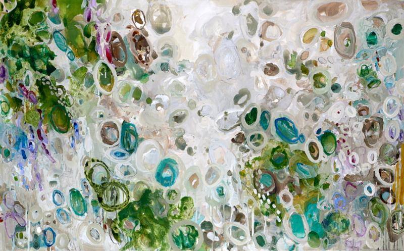
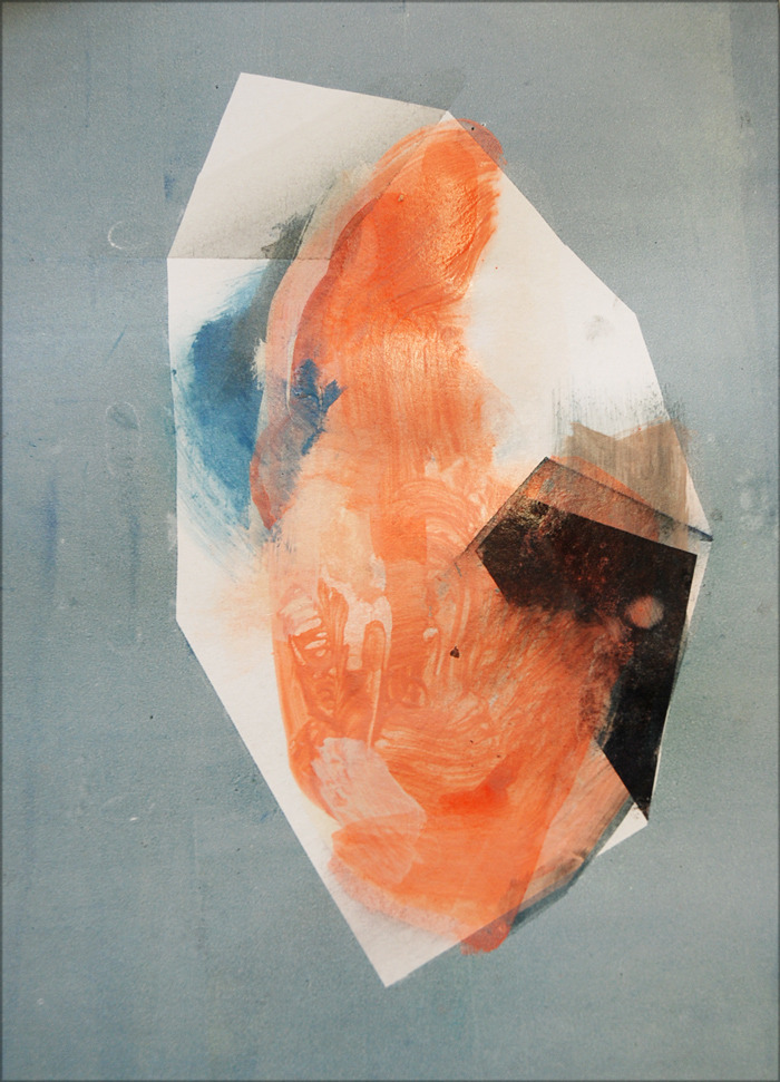
    Here was a modern female painter, who though overshadowed by the enormous talent of her husband, quietly produced a body of work that holds its own alongside any of her contemporaries.  She was no shrinking violet, to be sure and her place in art history as someone other than the wife of Jackson Pollock was hard won.  Yet never saw herself in competition with him.  He was an artist.  So was she.  That was enough.

    You can find Gail Levin’s Lee Krasner, A Biography on amazon.com or in many libraries and bookstores.  I finished this book enlightened and inspired.  I think you will be, too.

    All image sources linked above.

  • Sculpted Illusions: Erin O’Keefe

    Sculpted Illusions: Erin O’Keefe

    So much of what we see depends on how our eyes and brain work to create perception.  Last week, I shared the work of a photographer who creates work to change our perception of the body.  In her series, Things Fall Apart and Collection, artist Erin O’Keefe uses our methods of perception to create what seem to be three dimensional sculptures.  Or are they?

    Folded Mirror by Erin O'Keefe Scholar's Rock by Erin O'Keefe Venus by Erin O'Keefe Cicada by Erin O'Keefe Red Box by Erin O'Keefe

    Magicians and illusionists have been using our perceptions to create seemingly impossible tricks for centuries.  In order to process information at such a rapid pace, our brains take short cuts for us, but sometimes, they get it wrong.

    Erin O’Keefe crafts these “sculptures” from cut and torn photographic images.  Using the visual elements within the images themselves, she creates the illusion of a three dimensional object.  The “objects” are then photographed as if a piece of sculpture, further adding to the illusion and our brains’ confusion!

    Were you fooled?  To see more of the work of Erin O’Keefe, please visit her website.  Be sure to have a peek at all her other stunning work!

    All images via the artist’s website.

  • Vulnerable Abandon: Heather Chontos

    Vulnerable Abandon: Heather Chontos

    I’ve been reading up on the Abstract Expressionists lately and have found myself completely enraptured by the movement and the entire era.  Working intuitively, many abstract artists set out without a clue as to where their composition will ultimately end up.  The work is an extension of who they are in that moment in time– a big part of what fascinates me about abstract work and abstract expressionism.  In the work of Heather Chontos, I see much of that same intuitiveness and freedom.

    Heather Chontos Heather Chontos Heather Chontos Heather Chontos Heather Chontos

    Heather made a name for herself in the world of fashion publications, styling and set designing for the likes of Barneys & Anthropologie.  And in these abstract works, there carries over that sense of composition, you can almost see her rearranging her shapes and lines on each canvas, much in the same way she might stage & style for a shoot– moving things around until it feels just right.  She isn’t afraid to let us in on that process, too.  Smudges in charcoal and paint let us know where perhaps she switched out one shape or line for another.

    Of course, there is beauty in the slick and perfectly painted canvas– but often being able to let go of our need for perfection and allow ourselves to be vulnerable as artists is a deeper challenge.  It is an act of truly putting yourself out there, there is no hiding, you are laid out on canvas for all the world to see.  Completely scary, for sure, but amazingly liberating, too.

    One of my own resolutions  goals for 2014 is to get serious about painting again.  I’ll be starting a little daily exercise over on Instagram ( come follow along! ) and will share more on that later this week.  It’s a daunting prospect, especially as I hope to be busy with freelance work too, this year, but my heart is longing for it.  Artists like Heather are reminding me that the work isn’t always about the result but about learning from the process.

    To see more of Heather Chontos’ work, please visit her website, and follow her on Facebook & Instagram.  You can purchase her work through the Milk Farm Road shop.

    All images are via the artist’s website.

  • Artsy Holiday: Casey Matthews

    Artsy Holiday: Casey Matthews

    Mr. Forager & I have been going back and forth about what type of meals we’ll have on Christmas Day.  It’s just the two of us and while that’s never stopped us from making elaborate meals before, we’re thinking a sweet little brunch and then a bit of antipasto later.  But no matter how simple the holiday meal, it always feels more festive when the table is set in an artful way!  So if you’re like me and still figuring out your holiday tablescape, here’s a little inspiration from this month’s Featured Artist Casey Matthews

    Artsy holiday Casey Matthews

    found via art | ornaments | trees | float | votives | placemat | tableware | napkins | paperweight | glasses

    I mean, those greens are just calling out holiday cheer like nobody’s business!  Add in a judicious dollop of snowy white, rich jewel tones and glittery metallics and you’ll have a table scape perfect for celebrating the season.  Casey’s painting Sitting Pretty at The End of the World is full of delicious shape and color, a Casey inspired table can’t help but sit pretty, too!

    If you’d like to see more artsy holiday inspiration, please take a peek at my Artsy Holiday Pinterest board, where I’ve been gathering all sorts of inspiring holiday images, DIYs and just plain prettiness.  To see more of Casey Matthews‘ work, please visit her website.

    All image sources linked above.  Artwork is a cropped detail of the original.

  • Unfettered Sensibility: Corey Mason

    Unfettered Sensibility: Corey Mason

    I have a firm belief that if you are a creative person, your artistic sensibility needs multiple outlets, it fairly oozes out of you not only in the form of art, but maybe in the way you prepare a meal, decorate a home, write a letter or design a garden.  Landscape designer and artist Corey Mason of Clyde Oak extends the creativity he lavishes on his outdoor designs into his wonderfully unaffected mixed media abstract work.

    Salem II by Corey Mason Voyager Queen by Corey Mason Caballos by Corey Mason Old Man Holds Tight to the Pole by Corey Mason Untitled by Corey Mason

    Mason’s work has that kind of loose, scribbly feel that I personally struggle so hard to let into my own work.  Each piece is so perfectly imperfect.  From the smudges on the page to the backwards text so reminiscent of a child’s handwriting.  And did you spot the chicken?!  We are becoming acquainted with our landlords’ chickens.  I’m learning to delight in them so much!

    Back to Mason’s artwork– truly in looking at these I see that unfettered, naive sensibility that I think so many artists are striving for but that perhaps has been educated out of us.  I don’t know whether Corey is a trained or self taught artist, but either way, he is drawing with the carefree spirit of a child, an aim even Picasso strove to reach.

    To see more of Corey Mason‘s work, please visit his art page on the Clyde Oak website.

    All images via the Clyde Oak website.  Artist found via The Fresh Exchange.

  • Artsy Lately: Christina Foard

    Artsy Lately: Christina Foard

    I know I should be unbiased and objective.  But art is subjective ya’ll and I have my faves.  And this artist, dear Artsies, is one of them.  If you’ve been reading the blog for awhile, you’ve seen her work before.  If you’re new, well then I’m happy to introduce you!  Jacksonville, FL ( soon to be Athens, GA ) artist Christina Foard continues to amaze me each time she puts brush to canvas.

    Foard_That Sweet Night Foard_Oil Spill Garden Foard_Sliding Falls Foard_The Not So Still Life Foard_Tangled Below the Surface

    Christina creates work that is so incredibly layered with texture and color, with physical and visual depth, photos on a digital screen barely do them justice.  Not to mention size– Christina often works on a large scale, Sliding Falls, 3rd down is downright monumental at over eight feet wide.

    There is so much to see, so much to take in on each canvas, your eye almost isn’t sure where to begin.  But once you dive in, it is so wonderful to get lost in beautifully interconnecting lines and shapes.  Your eye will eventually find its way through to the lovely, light filled swaths of color, a beautiful respite among the glorious chaos.

    If you’d like to see more of Christina Foard’s latest work, please visit her website.  If you’re in North Florida, Christina will be showing work in the upcoming Our Shared Past exhibition at the Cummer Museum of Art & Gardens, opening December 17th.

    All images are via the artist’s website or Facebook page.

  • Drawing the Journey: Mel Prest

    Drawing the Journey: Mel Prest

    At the end of our traveling, I think it might be interesting for Mr. Forager & I to map out all of our journeys, connecting the places we’ve lived and visited.  As we enter into our 3rd year of traveling together, I have a feeling our map might eventually look like one of these mixed media pieces.  San Francisco artist Mel Prest uses an eccentric system to plot out grids of dots corresponding to Japanese metro routes, connecting the dots to reveal a complex system of connections.

    VSCJP Berlin S-Bahn by Mel Prest VSCJP NY Metro I by Mel Prest VSCJPLZ_Amsterdam Metro + Rock and Roll by Mel Prest VSCJP NY Metro 2 by Mel Prest VSCJP Berlin U-Bahn by Mel Prest

    Grid points are based on spelling out map relationships as Japanese characters.  The artist connects the grid points, including mistaken lines ( in gold ) so that the mistake, instead of detracting from the beauty, adds to it.

    I am especially intrigued by this aspect of Prest’s work.  Although the path we take or the place where we find ourselves wasn’t necessarily what we wanted or intended, it can still add meaning and beauty to our life’s journey.

    To see more of Mel Prest‘s work, please visit her website.

    All images via the artist’s website.

  • Color Harvest: Radiant Orchid, 2014 Pantone Color of the Year

    Color Harvest: Radiant Orchid, 2014 Pantone Color of the Year

    Well, it’s that time of year again!  The folks at Pantone have made their pronouncement predicting the color that will be most on trend for the coming year.  The Color of the Year 2014 is.. drumroll.. Radiant Orchid!

    CH_Radiant Orchid

    I’ll admit, at first I was underwhelmed.  I haven’t been a huge fan of purples since  Christmas 1985 in which every single gift I received was of a lavender hue.  It was the favorite color of my 13 year old self, but I eventually tired of it and moved on, pretty much abandoning it forever.  But once this news got out, I decided to do a little foraging for color amongst the art on my Pinterest boards and what ho, I spy a bunch of this very shade!

    So maybe my inner 13 year old is subconsciously seeping through into my pins.  Or, more likely, these artists know what Pantone folks have discovered– this particular shade, dubbed Radiant Orchid, is much more versatile than it may seem upon first glance.

    It can be soft and feminine, as its floral moniker implies.  These artists know that pairing this color with creamy neutrals and fellow floral shades creates a feeling of delicate suppleness.

    Radiant orchid_soft_collage

     clockwise from top left casey matthews | riley lester | ada wang | bahman farad | laurence amelie | christina baker

    When paired with darker shades and jewel tones, Radiant Orchid takes on a rich, earthy quality.  Pairing such a feminine color with more heavy, masculine tones makes these abstract pieces perfectly balanced.

    Orchid_Rich and earthycollage

     clockwise from top left elizabeth condon | eva lundsager | scott cumberland | charline von heyl

    And of course, artists know when to capitalize on a color’s inherent pop factor.  In the work below, these artists have used Radiant Orchids bright and bold sensibility to bring vibrant fearlessness to their work.

    Orchid_bold pop_collage

    clockwise from top left julie cockburn | eva eun sil-han | shannon rankin  | francois nielly | andy gilmore

    Are you a fan of this lavender shade?  If you’re an artist, are you using it in your current work or have plans to try to incorporate it in 2014?  Designers & consultants, think your clients will be itching for artwork to incorporate this color into their interiors?  Artsy minds want to know!

    All image sources are linked above.  Some images are cropped details of the original.

  • The Softness Under the Surface: Sara Maragotto

    The Softness Under the Surface: Sara Maragotto

    When an artist chooses to concentrate their attention on one certain subject, I’m always amazed by the diversity of ways in which they explore that form. Especially when an artist is  seeking to look beyond representation to abstraction.  In this series of Minerale paintings by  Italian artist Sara Maragotto, the artist delves into the world of rocks, examining their opposing qualities of solidity and vulnerability.

    Maragotto_minerale_8 Maragotto_minerale Maragotto_minerale_17 Maragotto_minerale_4 Maragotto_minerale_6


    We think of mountains and rocks as solid, immovable objects.  But they have their vulnerabilities, just like everything else on this earth.  Rocks can break and erode, sometimes quickly, but more often slowly over long periods of time.

    In this series of mixed media paintings, I see Sara Maragotto, examining these characteristics in an abstract way.  She retains the hard, sharp lines and surfaces, yet diffuses them with soft brushstrokes and washes of color.  We can see what may be a weaker area beneath the surface, ready for exploitation by water or wind.  I have no idea if this is what the artist had in mind when creating these works, but it is what my own eye has found.  What do you see?

    To see more work by Sara Maragotto, please visit her website.

    All images are via the artist’s website.

  • Surrendered Textures: Patricia Larsen

    Surrendered Textures: Patricia Larsen

    I have to stop myself from running my fingers over paintings in galleries and museums.  I’m such a sucker for the texture of paint and the way it informs and enhances a piece of work. Sometimes, the texture is merely a by-product of the artist’s process, but for artists like Patricia Larsen, the texture is the star.

    Water Gardens by Patricia Larsen Painting No. 38 by Patricia Larsen Painting No. 11 by Patricia Larsen Painting No. 21 by Patricia Larsen Breathing Under Water by Patricia Larsen

    I know that often, for me, when I’m painting, I get caught up in the deliciousness of the juxtapositions of texture and color.  There is a certain zen like state that happens when an artist surrenders to what is happening on a canvas.  A kind of stream-of-consciousness type of painting tempered with a thoughtful composition results in a wonderful tension.

    To see more work by Patricia Larsen, please visit her website.  If you happen to be in the Tulsa area, you can see her work in person in the current exhibition at Exhibit by Aberson.

    Artist found via Exhibit by Aberson.  Images via the artist’s website and Exhibit.