There are so many things I’d never experienced before living on the West Coast. In Florida, I don’t think I ever experienced “marine layer“, these air masses create the most beautiful foggy formations above the coastal waters. Of course, everyone loves bright, clear skies, but there is a mysterious beauty to life seen through a fogged lens. In his Steam Portraits series, photographer David Ryle creates these sensitive captures of portraits seen through or looking through a curtain of steam.
We all have our days when it feels like we’re moving through the fog. Bogged down, without a clear vision of the road ahead. What’s so lovely about these portraits is that although the subjects are seen gazing through the vapor, in most cases much of the haze is already depleted. There is something incredibly hopeful in that– to know that although we may be temporarily socked in, slowly, surely, the fog will lift and all will be revealed.
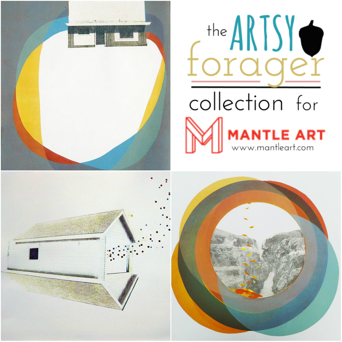
If you’re following along with my Foraging on social media, you may have seen me let a little cat out of the bag last week.. Since the end of last year, I’ve been working on a limited edition collaboration with the Seattle based online art & framing company, Mantle Art, and I’m thrilled to announce that the Artsy Forager Collection for Mantle Art is now live!!
In partnership with the folks at Mantle Art, I’ve pulled together this first collection of four emerging artists, each one of whose work I feel speaks strongly and beautifully a unique visual story. Allow me to introduce you!
alexandra bellissimo | Alexandra is one of my favorite finds of the past year and was the Artsy Forager Featured Artist just last month. Her work has an edgy elegance to it that I am particularly drawn to. That top left piece is perhaps one of my all time favorite pieces of work, EVER. I can’t get enough of it.
click the image above to shop Alexandra’s collection on Mantle Art!
kelda martensen |Kelda was a new discovery for me through this process, but the minute I saw her work, I fell in love with it. In her original mixed media pieces, Kelda is seeking to define what home may be and though the answer for each of us is different, her work speaks a universal language. Look for an Artsy Forager feature on Kelda soon!
click the image above to shop Kelda’s collection on Mantle Art!
matt sawyer | Mr. F had a circle of really super cool friends during his Tulsa days. And photographer Matt Sawyer just happened to be among them. When I was putting together artist options for the collection, I wanted a photographer who was treating traditional imagery in a modern, fresh way so I was thrilled when the folks at Mantle Art loved Matt’s work as much as I did!
click the image above to shop Matt’s collection on Mantle Art!
anna kincaide | One of the most thrilling things about writing Artsy Forager has been the joy of finding an artist and following the growth of their work. Anna is one of the artists I’ve been most excited to watch emerge! I fell in love with her work the first time I saw it and she has only gotten better and better since. Her compositions are always stunning and the playfulness of pattern, as well as her use of light just create such lovely juxtapositions.
click the image above to shop Anna’s collection on Mantle Art!
Each piece in the Artsy Forager for Mantle Art Collection is available as a limited edition print on Hahnemuhle fine art paper and is available in three sizes 11×14, 16×20, and 20×24. Edition sizes are limited to 200 pieces per size, and each piece will be shipped with a certificate of authenticity. Mantle Art also offers matting and framing options for each piece– one stop shopping, ya’ll!
I hope you’ll wander through the collection, perhaps you’ll fall in love and add one of these beauties to your collection!
*This post contains affiliate links. As curator of the Artsy Forager for Mantle Art Collection, I receive a small commission on each piece sold from the collection.
If you’ve been following along my own little artistic journey, then you already know I’ve been a bit obsessed with color lately. Color has an incredible psychological effect on mood and atmosphere and when I saw the work of Chilean born, Berlin based artist Macarena Ruiz Tagle on The Jealous Curator last week, I immediately fell in love.
The series, aptly titled Atmosphere is a collection of works of acrylic and watercolor on paper. Amazing, right?? With their deep, tunnel-like darker center, we are plunged into these worlds of color. As the hue radiates out from the middle, lightening toward the paper’s edges, the fields of color almost seem to be these moving and vibrating auras. These are pieces it may be tempting to just pass by, but with a second look, there is so very much to see.
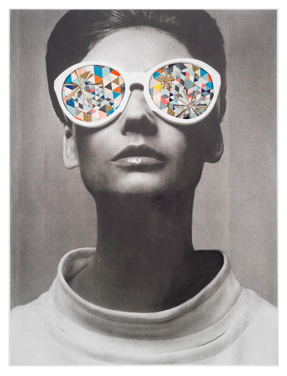
I don’t know about you, but I could really use an escape right now. To Wonderland, to the Chocolate Factory, to anywhere I don’t have to answer emails, make dinner or otherwise in any way be a grown up! I want to go to a place where no one speaks an unkind word and everyone is insanely happy. Where trouble melts like lemon drops. Truly, what I want is to get lost in the crazy wonderland of Texas artist Kelly O’Connor.
OK, perhaps I take it back. Like the fictional Stepford, O’Connor’s collages of vintage vacation destinations juxtaposed with candy colored geometrics and crazy-eyed mid-century ladies is a bit loopy. But then it’s meant to be. From the artist “My intention is to create an immortal or dreamlike space, such as one that could only exist in a person’s subconscious.” These worlds are like those dreams from which you wake, feeling exhilarated, but relieved that it wasn’t real.
To see more of Kelly O’Connor’s work, please visit her website. If you happen to be near Houston, be sure to check out Kelly’s solo show Blinded by the Light at David Shelton Gallery, up until June 7th! Now if you’ll excuse me, I’m going to put on my sparkle ray glasses and get back to work.
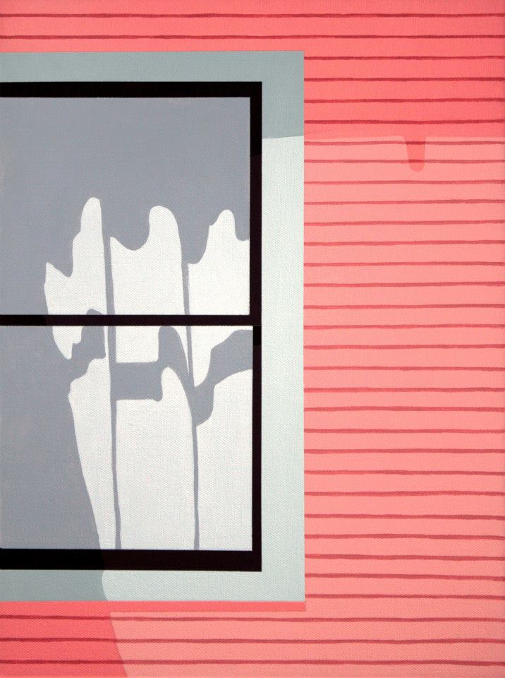
We never know what someone else’s life is really like. Oh sure, we see carefully edited glimpses of the lives of others on Facebook, Instagram and the like, but often what we are seeing ( and sharing ) is exactly what we want to see. Houston artist Cary Reeder emphasizes the secrets kept behind the suburban blinds in her Neighborhood series.
Why do we have the tendency to close the world out when we’re at home? When we’re out in public, we’re usually not shy about letting others in. Certainly, there are particular homebound acts we’d rather not share, but what about those days when we’re just hanging out? I love seeing glimpses of happy couples and families through open windows. In these times when we rarely get to know our neighbors, it’s reassuring to see slices of the lives being lived in the other boxes around us. How about throwing those windows open this weekend, Artsies?
If you follow me over on Instagram, you’ve probably noticed that I’ve been a bit obsessed with flowers this spring. Growing up in Florida, we really only had two seasons, summer and not summer. Until we started traveling out West, I’d never really experienced a true Fall, Winter, or Spring. Spring in the Northwest is especially lovely given all the amazingly beautiful blooming trees, shrubs and wildflowers! Ever since my first glimpse of cherry blossom petals littering the Seattle sidewalks, I’ve been smitten by Spring here.
left| cherry blossoms, right| Seattle Sidewalks, acrylic on paper, 18×24
The juxtapositions of colors and textures inspired me to begin a new series on paper, Rain and Rhododendrons. I’m still continuing with the Feminine Wilesseries, but was itching to get back to painting in a larger format and thanks to a nice big pad of Canson Mixed Media Paper, a portable drawing board, and a sturdy travel portfolio gifted to me by Mr. F for my birthday last month, I was ready to dive in.
Forest Blossoms, acrylic on paper, 18×24
Like the Feminine Wiles series, these too are color studies, but I’m enjoying experimenting with a looser style, being able to work much more quickly and freely on larger paper than I’ve been able to ( so far! ) on small panels.
top| Arcata Marsh Wildflowers, acrylic on paper, 18×24, bottom| Allen Pond with wildflowers
I haven’t had dedicated painting time in a few weeks and I am itching to get back in, especially after Mr. F and I took a camping trip this weekend up to the Trinity Alps. I am so full of inspiration for this series, I am about to burst! So there will undoubtedly be more to come, soon.. In the meantime, you can see full shots of each of the pieces I’ve already completed in the Rain and Rhododendrons gallery page. And in case you missed it, there is also a Feminine Wiles gallery page, both under the My Work heading in the top navigation bar. I’ve also added an artist statement and bio on the My Work page– so much harder to write those things for yourself than it is to help others!
Some people dream of a perfect utopian existence. But utopias always seem more Stepford-ish to me, communities where every house looks perfectly the same, every person has the same ideals, there is never any conflict. But where there is no conflict, there is no contrast and it’s in the differences that true life comes through and true beauty shines. The work of Vancouver artist Scott Sueme exposes those contrasts found outside of the perfect.
Sueme uses landscape like compositions mixed with graffiti ideology to reference human interaction within nature. Whether it be from overdevelopment filled with strip malls or a small cabin in the woods, landscape is different and loses its sense of balance and perfection once the hand of man has been laid upon it. It’s hard to imagine a world without street lights and signs and parking lots. Would we even recognize it?
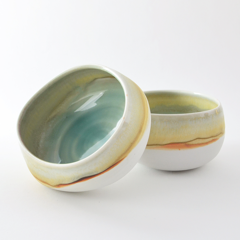
My favorite aesthetic is work that feels both organic and modern. Maybe it’s my competing loves of cities and the woods. The work of Brooklyn artist Elaine Tian in her Studio Joo ceramics embodies that juxtaposition in the most elegant way.
Light washes of color remind me of wispy landscapes seen through squinted eyes, her translucent glazes making each piece seem as polished as a river rock. The shapes and palettes feel organic in nature, but there is a restraint and simplicity to the forms that create a collection that is thoroughly modern. I’ll take one of each, please!
You know that phrase, you get more flies with honey? Candy-coated truths always seem a bit more digestible. Whether its revealing political truths through comical satire or historical truths in frosted palettes as in the work of Australian artist Stefan Dunlop, difficult ideas can be approached more easily from a less threatening perspective.
Dunlop’s simple use of form and bright pastel palette immediately draw the eye, thinking we’re in for a fun ride. But his subject matter and old master-like composition lead us to want to investigate a bit further. There is a darkness lurking beneath that cotton candy surface.
Post WWII prosperity ushered in a turning point in the world of advertising and manufactured goods– packaging and design were no longer concerned mainly with function, even the most mundane of objects were created with an appealing aesthetic. This month’s Featured Artist Holly Farrell celebrates the beauty in these old objects, breathing new and fresh life into designs of the past.
With a bright and light modern palette, accentuated with touches of muted color. Pops of graphic, retro pattern along with sleek metals recall the dawn of the industrial age, with those colors and a few carefully placed wood tones keeping the view warm and fun. I can’t decide which of these looks I like best! Which is your fave?
To see more of Holly Farrell’s work, please visit her website. The above painting, Soap, is a 10×24 acrylic and oil on masonite, available through Holly’s studio.