Now that Spring is here and we are eager to explore our new spot, Mr. Forager & I have been getting back into a regular hiking routine, weather permitting, we are out on the trails every Saturday. One of my absolute favorite things about hiking is the chance to marvel at the natural world just outside our back door. Every hike is filled with wonder and discovery. Perhaps that’s what has drawn me to the work of today’s artist. The ceramic sculptures of Susan Beiner are bursting with organic whimsy, making me want to peer closer to take it all in.
Clusters and orbs remind me of the mussels and anemones that we delighted in among the tide pools along the beaches in Trinidad this weekend. Each piece seems teeming with life, ready to explode with movement at any second. All the nooks and crannies, where there may be hiding a new shape, a new creature to be discovered. These pieces are like the best of hikes– there is always something new to see and each glance leaves us looking forward to the next discovery.
So you’ve found an artist whose work you LOVE and you want to commission the artist to create a piece of work especially for you. How exciting!! But you don’t know where to start. If you’ve never done it before, commissioning an original work by an artist can be intimidating ( for you and the artist! ). So here are a few guidelines on how to commission artwork that I hope will help when you’re ready to take the plunge!
1 | know the artist, know yourself
As enticing as it might be to instantly fall in love with an artist’s work and immediately set off on commissioning them, you’ll be better off slowing down a bit. Take some time to really get to know the artist’s work, their palette, style, medium, what you love about it, ask yourself if living with a piece of this artist’s work will make you happy forever and ever.
Once you’ve done that, figure out what you want. If you’re commissioning for a specific location, figure out what size would work best ( often an artist can help guide you if you’re uncertain ). Do you prefer a work on canvas or paper or another substrate? Maybe the artist works in a few different styles like our Featured Artist, Erin McIntosh. If so, determine which style you’d like your commission to follow. And then there’s the most fun decision of all– palette. What colors would you like to see incorporated? Is there a certain palette the artist works within that you love? Collect fabrics, paint samples, photos, anything the artist can use for reference and guidance. Help the artist by creating a vision of what you’re expecting.
2 | communicate what you want
Reach out to the artist first and find out if a| they are accepting commissions, b| what their current lead time might be, and c| the price for a commission in the size you’re desiring. It’s possible that the answer to any of these questions might mean putting off the commission until the artist has time or you have the necessary funds ( though always ask about payment options– many artists will work with a payment plan! ).
Once those basics are agreed upon, chat with the artist via phone or email about your expectations ( email is best, so you both have a record of what was discussed ) . Share all the visual references you can, use as many descriptive phrases as you can– like happy, serene, intense, organic, bright, light, etc. Give the artist your specifics regarding size, substrate and style and be sure to include information like where the piece will hang, who it is for ( if a gift ), if the work will commemorate a special occasion, etc. All these elements will help guide an artist into creating a work of art that fits your vision.
3 | expect a written agreement
Once you and the artist have communicated fully your exact needs and expectations and agreed upon a price and lead time, the artist should provide you with a written statement of what is to be done, including all specifics regarding price, size, substrate, palette, shipping arrangements if not local, deposit and payment arrangements, etc. for your approval and acceptance. This step protects both your interests and the artists, certifying that both parties understand what is expected of each other.
4 | don’t mistake an artist for a machine
Let’s say you’ve commissioned an original based on another existing but unavailable work by the same artist. Same style, same substrate, same palette, same everything. But don’t expect an exact replica of that piece you loved. An original piece of artwork is a completely unique undertaking, each piece will have its own personality. Just like a snowflake, no two are exactly alike. On the other hand, if you receive progress photos from the artist and things don’t seem to be going in the direction you’d specified either stylistically or palette-wise, don’t be afraid to communicate your concern to the artist. They want you to be happy with your finished piece, so your feedback will be necessary and appreciated.
5 | be patient, be available
You’ve paid your deposit and the artist has given you a lead time. Now just sit back and wait. I know it’s hard!! We live in such an instant gratification society, we want what we want and we want it NOW. But creating an original work of art takes time and the artist may have other projects due to be completed before yours. It will be done, just be patient. And be available if the artist has questions, wants your input or needs your opinion. ( see #4 ).
6 | accept your finished piece with grace and thanks
Wham, bam, thank you ma’am is no way to finish off commissioning a piece of artwork. Yes, you’ve paid the artist, but said artist has put a tremendous amount of time, creative energy and spirit into your creation. A heartfelt, gracious thank you goes a long way! And helping spread the word about your beautiful new work of art and lovely commissioning experience will support and encourage the artist’s career and soul.
Now all that’s left to do is to live with and love your work of art for always!
We are all creatures of our past and present. Influenced and affected by what has come before us, as well as our current experiences, our future selves a hybrid of what was and is. In her latest portraiture, Australian photographer Jacqui Stockdale weaves fantastical tales of identity inherited and identity discovered.
Her work has a vintage, tin-type feel, yet the figures we see are utterly contemporary. Modern masks mimic ancient ritualistic garb and figures pose rigidly as if sitting for a daguerrotype. But there seems to be a defiance in each face, a fight against a past, perhaps an assertion of the future.
While I have a great love of work with lush, chaotic patterns and texture, there is always something so lovely and intriguing in work that embraces visual economy. Barcelona based, German born artist Sabine Finkenauer breaks down the world into simple lines and shapes, creating a signature visual language that is a little whimsical, a little retro and altogether lovely.
There is a childlike playfulness to her work, but her use of space and palette bring a sense of sophistication. Light-hearted enough to seem like Sunday afternoon doodles, looking closer and at her body of work as a whole, you can see the thought and calculation as she works her way through her use of space, line and color in drawing, painting, collage and sculpture.
Want to see more of Sabine Finkenauer‘s work? Please visit her website. Wouldn’t it be lovely to see the world in such a simple way? I’m making that a goal this week– ignore the distractions and see what is simply before me.
It seems that spring in Eureka is a very windy season. The sun is shining and from our cozy apartment, it looks deceptively warm. But upon stepping outside we’re quickly reminded that we are in a transitional season– the air still has a chill and the warmth of stillness is welcome. The breezes blow and scatter fallen leaves, branches and petals, but at the same time, they are carrying away the grey and damp of winter, ushering in the peace and warmth of the coming summer. In her Room to Breathe series, artist Laura E. Pritchett explores the magical influence of a breath of air.
Pritchett has made a big splash in the Instagram world with her breathtakingly beautiful photography– studies of light, air, and seasons ( follow her IG feed here for regular doses of serene inspiration ). While perhaps more well known for her photography, these paintings translate the same quiet wistfulness found throughout her work. You can almost feel the soft breeze as it wafts up, up, and away, taking with it cares and troubles.
Some people are urbanites. And I used to think I might be one. But then we lived in Seattle for three months ( and not even in a super-urban neighborhood! ), and I quickly confirmed that while I love and occasionally need a visit to a concrete jungle, the city just isn’t me. Give me trees and an unobstructed view across the landscape and my heart is at peace. In her series, Marjory’s World, New York photographer Rebecca Reeve captures the experience of our loss of connection to the natural world.
Taking inspiration from the 1800s Dutch practice of covering mirrors, landscape paintings and portraits, Reeve chose to point her lens toward the disappearing landscape of the Florida Everglades. Using household drapery to frame each scene, the photographer reminds us of our continuing forsaking and consumption of the natural world.
To see more of Rebecca Reeve‘s work, please visit her website. Happy weekend, Artsies! Mr. F and I are planning to immerse ourselves in the magnificence of the Redwoods a bit this weekend. Hope you can get out and enjoy the beauty around you.
Another week, another painting in my Feminine Wiles series to share with you! Feminine Wiles is a series of small abstract color studies based on iconic female film characters. My introduction to many of these films and characters came through my mom, with whom I share a love of sappy love stories, witty characters, and gorgeous design. One of her favorite character turns ( and mine!! ) is Barbara Streisand as Fanny Brice in Funny Girl.
I’ve always loved the palette of this film– filled with warm earthy browns and oranges, highlighted with delicate pinks and passionate reds– but when thinking about this project, I was struck by the reoccurring use of lavender hues on and around Fanny. Of course, this could have something to do with how the cool hues so beautifully compliment Streisand’s creamy complexion! But I like to think that costume designer Irene Sharaff and the production team were delicately clueing the audience in to the fact that the character of this young girl from Henry Street was destined for greatness.
Barbra Streisand as Fanny Brice in Funny Girl by Lesley Frenz
acrylic on canvas panel, 6×6
Purples hues are often associated with royalty, riches and power. So it isn’t surprising that Fanny would often assume a lavender glow. She was a star, but unlike Jo Stockton, one of her own making. She was confident in her talent and passionate in her pursuit of fame and stardom, even at personal loss.
In the end, despite setbacks and heartache, Fanny perseveres and shows that the strong will always survive. I’ve always thought there were great lessons to be learnt from Funny Girl— of tenacity, talent, love, humility and perseverance. Oh and let’s not forget that unbelievably beautiful voice!
To see more from the Feminine Wiles series, check out the archives here. Next week, a polarizing character and one of the most iconic! Hint: drapery.
Film image sources linked above, art images by Lesley Frenz.
As many artists know, much of the time, art making is a matter of knowing when enough is enough. Or even when enough is just a bit too much. In her work, New York artist Miya Ando is creating pure moments of simply just enough.
By working in a process in which she hand-dyes metallic surfaces, Ando creates pieces with an incredible sense of stillness and light. Translucent layers of color reflect not just the light without but the light within. By keeping the compositions simple, the work is free from distraction, allowing the viewer to fall into its spell, to meditate on the purity of color and transformative power of light.
Do you ever think about what kind of legacy you will leave behind? I’m not thinking of material wealth or possessions, but the impact that your life will have had on the people who’ve known you? It’s a sobering thought, to be sure, to contemplate what your impact will have been. Brooklyn artist Zaria Forman ‘s series Chasing the Light is the culmination of the impact of a mother’s dream on her daughter.
The artist’s mother originally conceived the idea to lead an art expedition up the Northwest Coast of Greenland, the only other expedition here of this kind not done since 1869. Illness overtook her mother and the daughter kept her promise to carry on with the expedition.
The hyperreal pastel drawings of the disappearing glacial landscape remind us that we are continually impacting the world around us, whether we are aware of it or not. These monumental mountains of ice are slowly melting away, perhaps forever. We are losing a loved one, gradually, reluctantly.
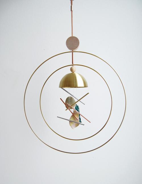
I have a great love for wind chimes. My paternal grandfather used to fashion his own from aluminum pipes and every time I hear breezy chimes, I’m transported back to summer days in the cool grass of my grandparents’ backyard. So when I spotted these Aura Chimes by Seattle based design house Ladies & Gentlemen Studio ( in collaboration with artist Nicholas Nyland ) on The Jealous Curator, I just had to share them with you!
Handmade in small edition, each chime is unique, made of metal, wood, and leather components complimenting Nicholas Nyland ceramic pieces. Such a lovely modern take on an ancient ornament!