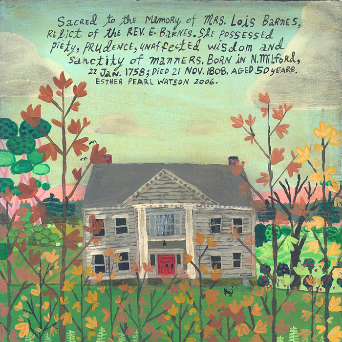
Lately, I’ve been rediscovered the joy of finger painting. Sometimes a brush just won’t do the trick and your digits are the best way to get it done. And for me, it makes me feel even more connected to what I’m creating– I’m physically in the work, no middle man. It got me thinking about how I made art as a child and I hate to say that what I really remember is feeling frustration when what I created didn’t turn out as perfect as the vision in my head. But what I’ve come to understand and what so many artists do, is that it is in the naiveté and imperfection that the heart of an artist is revealed. In her folk style paintings, Los Angeles based artist Esther Pearl Watson tells her own unique stories through childlike eyes.
Growing up in the Dallas/Ft. Worth area, Watson’s father was a bit of an eccentric, an inventor who would spend hours working on what he believed to be the future of transportation– hover vehicles. Her folkloric inspired paintings are a sweetly odd mix of nostalgia, present reality, and idealistic dreams of a futuristic world.
To see more of the work of Esther Pearl Watson, please visit her website. Her work can be seen in the current exhibition, Sky, at the Bedford Gallery in Walnut Creek, CA through May 25th.
Perhaps this is sacriledgious type talk, but I’ve never been a fan of the Wizard of Oz. I just never really connected with it. But I do love me some Judy Garland. Meet Me in St. Louis? Easter Parade? I’ll take those over flying monkeys any day! When it came time to think about an iconic Garland role to do a color study of for the Feminine Wiles series, A Star is Born‘s Vicki Lester seemed the quintessential choice.
In Lester’s rise to fame and the effects of her success on her marriage, we see a story of drive, devotion, self-sacrifice, and desolation. A sweeping melodrama filled with mountainous highs and the deepest of lows, it made sense for costume designers Jean Louis and Mary Ann Nyberg to dress Garland’s Vicki in moody lavenders, blues, and greys.
Judy Garland as Vicki Lester in A Star is Born, acrylic on canvas panel, 6×6
If you’d like to see more in the Feminine Wiles series, check out the archives! Gathering up inspiration for some more to come! Do you have a favorite you’d like to see me tackle? Let me know in the comments below!
All film image sources linked above. Art by Lesley Frenz aka Artsy Forager.
Some of my art experiences here in Eureka have been of the “iceberg tip” kind. I discover artists by seeing work in person that is a bit interesting, then upon further online investigation, discover that there is so much more. San Diego artist Jessica McCambly, whose work I saw recently at the Morris Graves Museum of Art, works in the very nature of a first glance drawn into an intimate viewing.
McCambly creates these tiny paintings ( the larger pieces pictured above are zoomed in details, most work is on 7×7 or 10×10 paper ) using a unique mixture of acrylic and glass fragments. The resulting paintings are these beautiful little jeweled microcosms. They could be geodes or macro images of crystals, or aerial views of geothermal pools. There is a quality of a world to be discovered in each minute piece, drawing us in for a closer view.
When you think about it, our entire world, every organism, every object is composed of a system of layers. Artwork included, especially the work of process driven artist Pam Saturday. Employing layer upon layer of paint and other media, the artist creates a universe in which we see only a fraction of reality.
Bold stripes and other forms may dominate, but for the close observer, there are small glimpses and surprises waiting to be discovered. Colors peek and peer from beneath their blankets of paint and we have no idea how much there is to be unearthed.
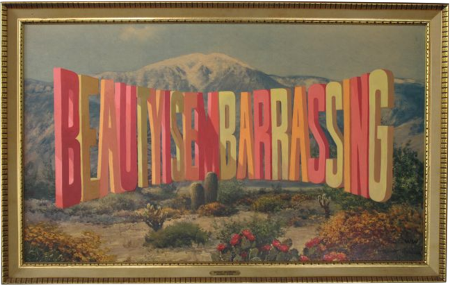
Mr. Forager’s tastes are a bit unpredictable. I never know which artist’s work he’s going to connect with and I’m often surprised by the ones he choses as favorites. But when we were looking for something to watch after an afternoon of imbibing at a local home-brew festival, I knew we couldn’t go wrong with Wayne White. Neil Berkeley’sBeauty is Embarrassingtakes a look at the highs and lows in the career of this Southern boy turned media and art world darling.
There are a lot of ways in which Mr. F & I identify with White and his journey. Growing up in rural Tennessee, White knew the struggle of loving home yet finding it suffocating. Knowing that to stay might mean to give up on who you truly are, to forfeit a dream. Leaving Tennessee was a turning point for White, just as leaving Florida was for both Mr. F and myself. Sometimes, it is only upon leaving the familiar to realize our dreams and our authentic selves.
We’ve both at times found ourselves not quite buying into the expectations that were set before us. That in order to belong, we had to conform to the commonality around us. Traveling has opened our eyes to different ways of thinking, different ways of living and being. We’ve learned that there is no right or wrong way, there is only the way that is right for you.
For White, art-making does not mean being a serious artiste. His self-proclaimed goal is to “bring humor into fine art. Not art world funny but real world funny.” Mr. F has a wicked sense of humor and we are both huge believers in the insight and ease humor brings to complicated subjects and feelings. Just because White’s work makes us laugh, doesn’t mean it doesn’t have something important to say.
As an artist, White also allows himself and his work to evolve, yet retain his own genuine artistic voice. Whether he is illustrating a cartoon, designing sets or gigantic Lyndon Johnson heads, what comes out is authentically White– irreverent, playful, but filled with dark truths. It seems that for White, the finding happens along the way, different paths of creativity lead over, around and into one another. His artistic journey mimics the connectedness of the way our own pathways evolve and intersect. But he does it while playing the banjo. Match point to Mr. White.
If you’re looking for a few hours of inspiration and truth veiled in lots of Southern humor and explicit language ( the “F” word is White’s fave, he & Mr. F have that in common.. ), check out Beauty is Embarrassing. Wayne White wants you to persevere in whatever your creative path and after you watch, you’ll believe you can.
I may have mentioned before how enchanting I’m finding our new temporary home. Eureka’s Victorian architecture is very well preserved, many of the buildings have been lovingly restored or revamped. There is such beauty, grace and elegance to be found in every detail. The work of Bainbridge Island artist Kathe Fraga recalls the fanciful beauty of those departed days.
Modern frescoed canvases bring to mind Chinoisserie wallpaper, layers of reminders of sweet lives and loves of the past. Dark, smudged edges reinforce that feeling of antiquity, yet Fraga’s painterly style and composition give the work a modern edge. Like wearing your grandmother’s pearls with a biker jacket. Sweet but not saccharine.
To see more of Kathe Fraga‘s work, make sure you check out her website. You can see her work in person at a number of representing galleries, including one of my favorites, Gallery Orange in New Orleans. Oh and she is now offering gorgeous pillows featuring her imagery!
You know what made for a perfect Sunday afternoon for a young Artsy Forager? A few lazy, rainy hours and Pillow Talk on my parents’ bedroom TV. If I was ever tempted to trade my brunette locks for blonde, Doris Day could make me do it. As an awkward preteen growing up in the 80s, I was always drawn to Day’s down to earth flirtiness. So when I began the Feminine Wiles series, I knew without a doubt that Doris Day would make my list of inspirations.
The first of three movie pairings of the quintessential romantic comedy duo of Doris Day and Rock Hudson, Pillow Talk not only launched their iconic partnership, it also drew box office and critical acclaim. In the movie, Day plays Jan Morrow, an independent Manhattan interior decorator who finds herself sharing a party line with Hudson’s composer playboy Brad Allen.
Like many films of the era, Pillow Talk is painted in the pastel frosted palette of the late 1950s. Perhaps owing to Day’s trademark blonde locks, noted designer Jean Louis and the film’s costume designer Bill Thomas often dress Day’s Morrow in buttery yellows and creamy ivories.
Even in the set design, she is often surrounded by lemony hues. Maybe a nod to the innocence of this unattainable “golden girl” or the hidden warmth buried beneath the icy ( at least to Hudson’s Allen ) exterior.
Doris Day as Jan Morrow in Pillow Talk, acrylic on canvas panel, 6×6
Day’s natural sunniness and the joie de vivre of this classic romantic comedy made a creamy yellow color study a natural choice for this piece. Although Pillow Talk doesn’t necessarily hold up well in terms of gender equity, its brightness outshines its dated conventions.
Want to see more in my Feminine Wiles series? Check the archives! I’m beginning to brainstorm how to display and where to show these pieces. Think I have some fun ideas! If you’re a boutique or gallery owner or know someone who might be interested in partnering, give me a shout!
Film image sources linked above, painting by Lesley Frenz aka Artsy Forager.
There are artists whose work inspires one of two reactions in me– either I want to strive to be even a fraction as good as they are or I want to throw my brushes down and never pick them up again. Russian-born Philadelphia based artist Alex Kanevsky, with his painterly style and beautiful light is just such an artist.
Kanevsky’s work has this amazing sense of chaos and freedom, as if these were dashed off quickly as the artist moved on to the next canvas. Yet each piece is a carefully composed, heavily layered composition, his process often taking weeks or even months of immersion into and retreating from each painting. Are there stories being told? Perhaps. But more than mere narrative speculation is the feeling each piece projects– sadness, desolation, satisfaction.
If you’d like to see more of Alex Kanevsky‘s incredible work, please visit his website. Be sure to check out his fascinating Progress page in which he shares sequences of paintings in various stages of progress!
Often when we think of spring, our thoughts turn to light, pale pastels but this season, I’ve noticed just how saturated everything around me seems. Maybe it’s just a shock to my eyes following the white and grey winter or perhaps this has just been an unusually sunny and bright season. In any case, I’m finding myself more drawn than usual to heavy doses of color and I’m blaming this saturated spring!
Here are just a few of the full color palettes inspiring me on Pinterest lately–
Remember that tendency towards simplicity I mentioned yesterday? We’re continuing on that theme today! Wisconsin based artist Robert Atwell creates striking paintings using shapes so simple they are almost instantly recognizable, yet still remain ambiguous.
Atwell draws upon his graphics background to great effect– the bold colors and simple forms communicate to the viewer instantly, although we may not know exactly what it is we’re seeing, we know we recognize it. A swing, a kite, a camera, who knows? It is in the not knowing that the art is found.
To see more of Robert Atwell’s work, please visit his website. You can see his work in person at his representing galleries Gilman Contemporary in Ketchum, Idaho and Simon Gallery in Morristown, New Jersey.